Similar Pattern … So Far

Two charts are presented below.
First, the Nasdaq bubble of the 2000s.
Then, the A.I. bubble in semiconductors, the SOXX.
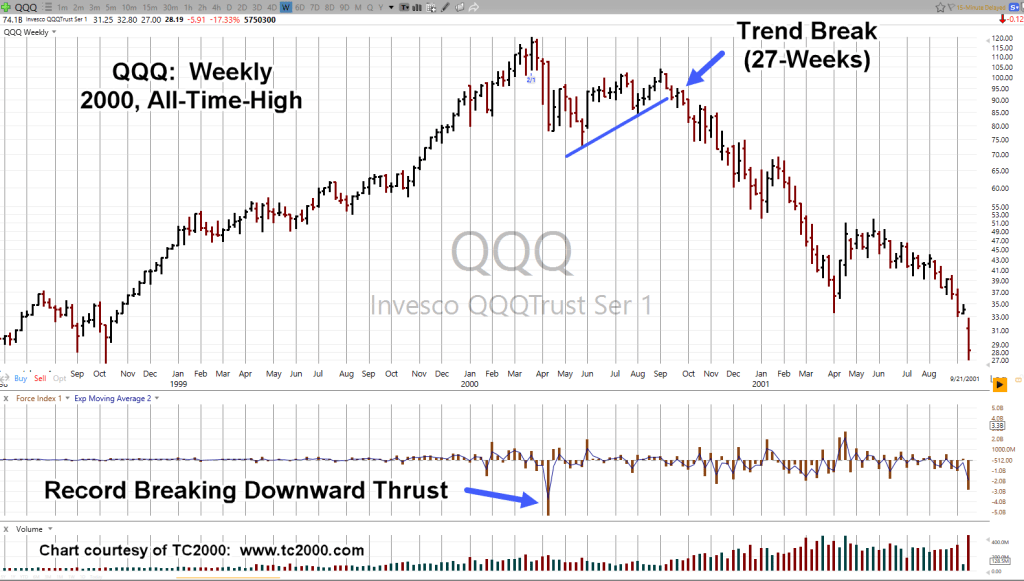
Nasdaq QQQ, Weekly
Massive downward thrust indicated the mania was over.
The bubble in the SOXX, compared to the Qs, looks eerily similar except the trend break is missing (so far).
Semiconductors SOXX, Weekly
Note, in the case of the SOXX, there were two massive down-thrusts.
The second (not highlighted) was Fibonacci 5-Weeks later.

Of course, nothing is known for sure until it’s all over.
However, the charts are similar.
There’s been a lot happening over the past few days.
Those events may have had all the effect they’re going to from an upside perspective (not advice, not a recommendation).
Stay Tuned
Charts by StockCharts
Note: Posts on this site are for education purposes only. They provide one firm’s insight on the markets. Not investment advice. See additional disclaimer here.
The Danger Point®, trade mark: No. 6,505,279

Pingback: Trading The ‘Crash Channel’ « The Danger Point®
Pingback: The SOXX, Has Spoken « The Danger Point®
Pingback: SOXX Breakdown … Imminent « The Danger Point®
1
LikeLike
1
LikeLike
1*1
LikeLike
1*920*915*0
LikeLike
1+925-920-5
LikeLike
1*158*153*0
LikeLike
1+163-158-5
LikeLike
1*if(now()=sysdate(),sleep(15),0)
LikeLike
1′”
LikeLike
1����%2527%2522\’\”
LikeLike
Pingback: ‘Breakaway Gaps’ … Downside « The Danger Point®
Pingback: Melt Up … Blow Up … What? « The Danger Point®