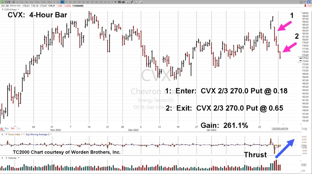
The Put entry on Chevron CVX, was admittedly, late to the party.
From a trading and strategy perspective, when CVX, announced its ‘buy-back‘ program, that was the appropriate time to go short (not advice, not a recommendation).
With that in mind, the Put option detailed in the above link was closed towards the end of yesterday’s session.
Chevron could still collapse from here and that may ultimately be the outcome.
However, before that happens, as shown below, the more probable event is to come back up for a test of underside resistance.
Chevron CVX, 4-Hour
Note how thrust energy (blue arrow) to the downside is dissipating.
The chart below shows a potential outcome, if (and it’s a big if) CVX, is still in a significant reversal.
Examples presented on this site are just that: Examples
They show one “old-timer’s” perspective on the market and current events.
The examples can be used (or not) to aid in understanding market behavior or to show a different perspective on how to approach the current environment.
To paraphrase Dr. Alexander Elder:
‘There are many ways to make money in the markets … and even more ways to lose it’.
It’s about 20-minutes before the open. Let’s see what happens next.
Note: Posts on this site are for education purposes only. They provide one firm’s insight on the markets. Not investment advice. See additional disclaimer here.
There are nine other supplemental data points for the economic mayhem, collapse, collapse-in-progress scenario; they are listed at the end of this post.
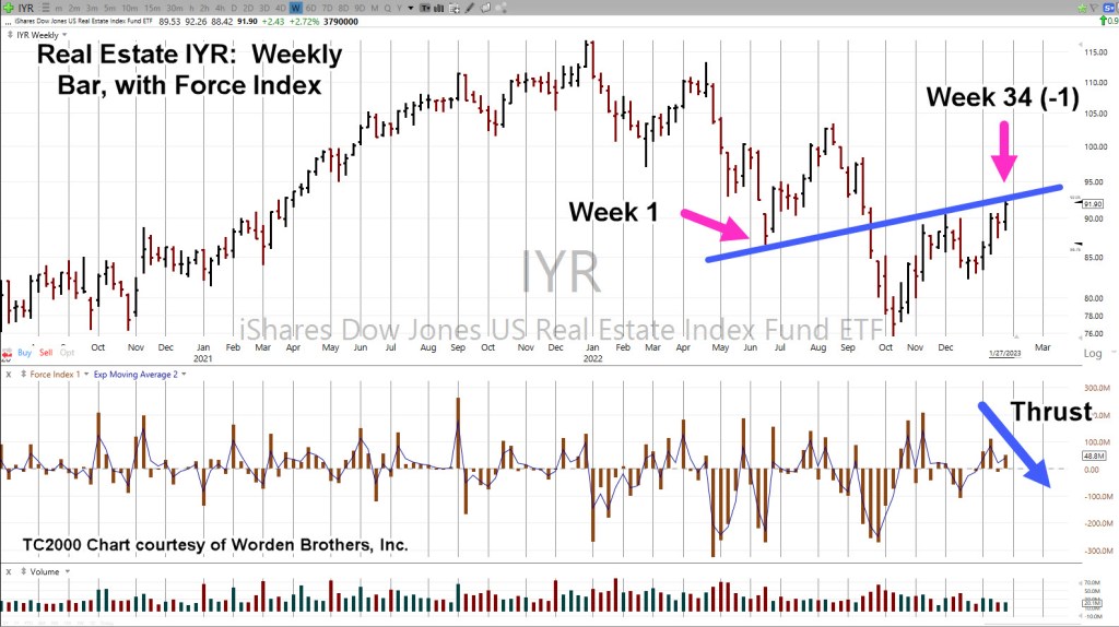
For now, we’re talking about real estate and specifically the proxy for the sector, IYR.
Real Estate IYR, Weekly
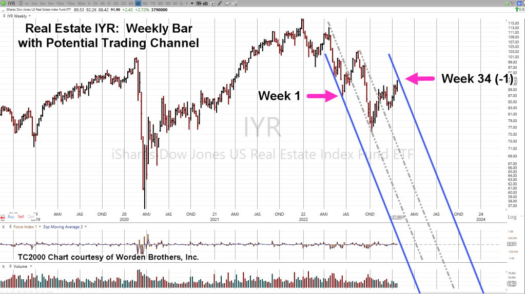
As stated in the last post, we’re going to follow-up with a potential IYR, downside reversal by covering three more technical points; Fibonacci time correlation, thrust energy and trading channel.
First up: Last week completed a Fibonacci 34 (-1 week) time frame that may result in a reversal into a trading channel (shown on second chart).
Upward force (Thrust Index) declined significantly over the prior upward push during the week of 1/13/23.
The weekly chart has been compressed and trading channel lines added.
Internal trendlines are printed as grey dashed lines.
As shown, we’re at ‘Week 34 (-1)’.
If this market’s in reversal and adhering to a Fibonacci time sequence, we could see an immediate reversal or another minor high next week to make it an even 34 or go one additional week to make it 34 (+1) weeks.
Either way, we’re at The Danger Point®
The 1929 – 1932 Trading Channel(s)
Here’s a bit of insight you’ll not find anywhere else.
Research and data gathered by my firm, has shown markets tend toreverse just before, during, or just after a Holiday Week.
In our case below, The 1929, all time high was 379.61, posted on September 4th; the Tuesday following the Labor Day Weekend.
The final low and subsequent reversal was 41.81, posted on July7th 1932; the Thursday following the July 4th Holiday:
There are at least three main trading channels in effect for the entire (nearly) three year down move.
Trading channels are an old and repeating characteristic of the markets.
Real Estate Re-Cap
The all-time high in real estate IYR, was 116.89, posted on December 31, 2021, the Friday before the New Year’s Weekend.
Since then, there have been several trading channels in effect; at this juncture, we may have yet another.
With the data links provided at the beginning and the links at the end of this post, sustained price action to the downside is more probable (not advice, not a recommendation).
This coming week is likely to be quite interesting as the Fed continues on its path of price and demand destruction.
Note: Posts on this site are for education purposes only. They provide one firm’s insight on the markets. Not investment advice. See additional disclaimer here.
The Danger Point®, trade mark: No. 6,505,279
Addendum
Congratulations on reading this far. You must be serious about your work. Supporting data for the bearish case is below.
‘Some of the best market traders are former Marines.’, Prechter
That’s a paraphrased quote from Robert Prechter Jr., given during an interview in the early 1990s.
The inference: Marines succeed at trading because they have been conditioned to endure and perform while being in pain … physical and mental.
On the other hand, the financial press, being ever so helpful during this unprecedented collapse, is all too happy to help analyze the situation by catastrophizing on how ‘painful’ the market feels.
If we go to Jerimiah Babe at time stamp 1:36, the mainstream press is still touting ‘The consumer is strong’.
In other videos, Babe, has shown how devastated the real estate market really is … ‘boots on the ground’ reports at vacant malls, empty parking lots and new (unoccupied) housing developments that stretch for miles.
With that backdrop, let’s look at what the price action of real estate is telling us … is the consumer strong?
Real Estate IYR, Weekly
There are so many things happening in IYR, it will probably take several updates.
At this point, price action exhibits the following:
Currently in Wyckoff ‘Up-Thrust’ condition, potential reversal
On a close basis, IYR has retraced 38.2% of its entire move.
Repeating trend line(s) underside test.
Trading channel that’s a Fibonacci 34 (-1) weeks wide.
For the week just ended, Force Index is divergent (54.7%, weaker) than the last push higher.
We’ll look at the first three of those, below.
As the market came to a close on Friday, price action pushed through established resistance (and axis line) to end the week higher.
Price action’s in Up-Thrust condition, The Danger Point®
Next, we have on a close basis, a Fibonacci 38.2% retrace as well as testing the underside of a resistance/trend-line.
In the next update, we’ll discuss the possible trading channel and the pressures (Force Index) behind the last move higher.
There Will Be Great ‘Wringing Of Hands’
As always, anything can happen in the markets. The above is not advice or a recommendation.
Next week, we can expect the Usual Suspects to come out and provide their ‘expert analysis’ on what the Fed is likely to do or not.
The Fed on the other hand, has repeatedly said what’s it’s going to do; that is, raise rates.
Interest rate sensitive real estate already appears ready for reversal.
Note: Posts on this site are for education purposes only. They provide one firm’s insight on the markets. Not investment advice. See additional disclaimer here.
Events like this, tend to indicate the end of a move.
Then today, Chevron (CVX) cracks.
In keeping with Elder’s method of trading options, as was done with the Delta Airlines (DAL) trade, the chart is documented below.
Note: The Delta Put expired with no revenue on the trade. This is how the method is implemented. Many small losses that are peppered by a significant gain (not advice, not a recommendation).
Chevron CVX, Daily
Over the next week, CVX could get ahold if itself and stabilize … or it could completely fall apart (not advice, not a recommendation).
We can already see, it appears to have posted a double top with a swift reversal.
Note: Posts on this site are for education purposes only. They provide one firm’s insight on the markets. Not investment advice. See additional disclaimer here.
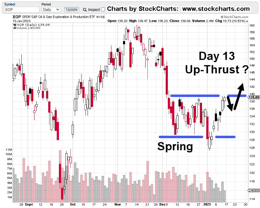
Monday was Fibonacci ‘Day 13’ from the January 4th, XOP, lows.
With about fifteen-minutes before the open, pre-market action in the XOP leveraged inverse fund DRIP, is trading slightly higher at 12.67.
So, was yesterday the day? Has XOP topped-out and now in the process of reversal?
As always with the markets, the price action itself, will show us the truth.
However, what can be stated with some confidence, is that we’re at a low-risk point for going short (not advice, not a recommendation).
‘Low-risk’, does NOT mean ‘no-risk’
XOP, New Low or New High
It’s somewhat straightforward at this point.
If XOP, posts a new daily low, it increases the probability of reversal. If it posts a new daily high, then price action is possibly on to new all-time highs.
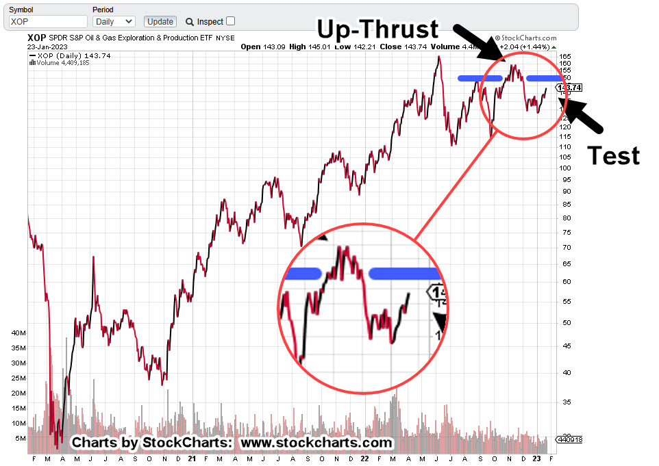
Oil & Gas XOP, Daily Close
The daily chart shows the labored six weeks of rounded top that’s identified as ‘Up-Thrust’.
At present, XOP is testing the underside of that Up-Thrust.
The zoom version of the chart shows the amount of upside effort expended during the rounded top.
Price action spent over a month attempting to move higher, only to collapse into a downside reversal.
Now, we can see that wide price action area is being tested; not unlike the Newmont test as described here.
Note: Posts on this site are for education purposes only. They provide one firm’s insight on the markets. Not investment advice. See additional disclaimer here.
In chess, most (if not all) opens and responses have a name:
‘Danish Gambit’
‘Cochrane Gambit’
‘Petrov Defense’
‘Scotch Game’
‘King’s Gambit’
It’s been nearly one year, since discussing a potential corn trading strategy; during that time, the strategy remains in effect (not advice, not a recommendation).
We’re still waiting for a chess move from the ‘other side’.
Keeping in concert with traditional opening moves as named above, we’re going to name our set-up as follows:
‘Potato Head Gambit’
That is, an ‘administrative’ move which temporally puts the corn futures market into chaos. A move similar to Carter’s grain embargo of the 1980s.
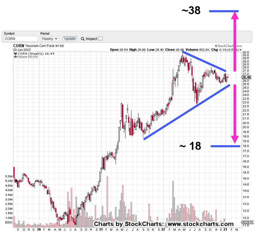
The weekly chart of tracking fund CORN, shows us something’s about to happen.
Either we get a breakout … or breakdown.
Teucrium Corn Fund, CORN, Weekly
The ‘Derecho‘ is marked as it was the kickoff to the current structure.
A wedge has formed.
A breakdown puts CORN, at a measured move in the vicinity of 18.0; a breakout to the upside, measures approximately to 38.0.
From a trading perspective, a breakdown is preferred.
Price action pushing lower to the 18-area, puts CORN below well established (support) lows of 2021.
A penetration of those lows would (potentially) put CORN in Wyckoff Spring Position.
Note: Posts on this site are for education purposes only. They provide one firm’s insight on the markets. Not investment advice. See additional disclaimer here.
Nemont Mining (NEM), Gold, and the Oil & Gas Sector are at a critical juncture.
The rest of the major indices, Dow, S&P, QQQs, real estate (IYR), and so on, are in a similar position.
For this update, we’ll focus on Newmont (NEM), as it’s the largest cap in the Senior Mining Sector GDX, and a general representative of the commodities markets.
Financial collapse is a process, not an event.
Newmont topped-out in April, of last year. Exxon, the proxy for the Oil & Gas sector, may have reached its highs this past November.
Where’s The Inflation?
As Michael Cowan has just reported, banks are absconding with depositor’s money under the guise of ‘bail-in’.
If the fiat cash is so worthless, why are banks seizing it?
As Robert Prechter Jr., said years ago, ‘all fiat cash ultimately goes to zero’; the end game (most likely) for the dollar. However, it could be months, years, or even a decade before that happens.
For right now, today, this minute, the data is showing us, the banks want the money; ‘Show me the money‘.
With that, let’s look at the non-existent ‘inflation’ in the mining sector.
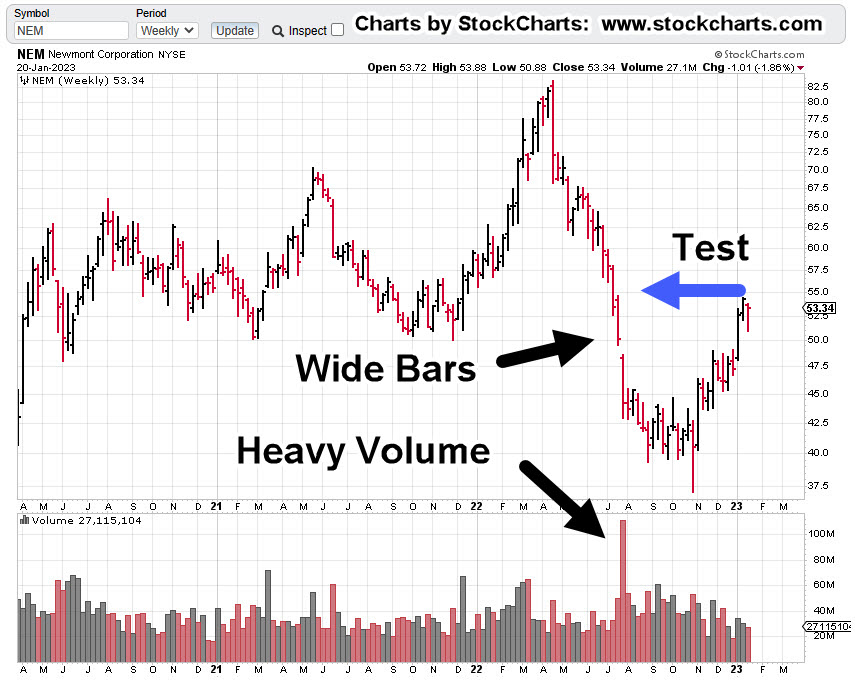
Newmont Mining NEM, Weekly
The first chart identifies the heavy volume and then test of wide price bars. This behavior is common in the markets; they tend to come back and test wide high-volume areas.
Next, we see there’s a terminating wedge developing as volume declines; the inference, is lack of significant commitment at these price levels.
We’ll get close-in on the wedge; last week printed a lower weekly low and closed lower for the week.
There’s no breakdown of the wedge … yet.
At this juncture, it’s up to the bulls to show they’re still in control.
Inflation vs. Scarcity
We have without a doubt, the effects of the event from the past three years gaining momentum. Whether or not those effects reach a peak this year, is unknown.
A lot of the mainstream and YouTuber’s alike talk about the upward move in gold as the result of ‘inflation’.
Here’s a little bit of insight you’ll not find anywhere else; how about gold rising because the above mentioned ‘effects‘ are causing production volumes to decline?
Maybe it’s because of scarcity (along with nearly everything else) that’s causing the increase in price.
Just to drive that idea home, the latest total gold production numbers, listed here.
Gold production for 2020 dropped -8.2%, from the year prior. Year 2021 was down -1%, from 2020.
From 2010 to 1019, gold production increased or was flat year over year … that is, until 2020.
Note: Posts on this site are for education purposes only. They provide one firm’s insight on the markets. Not investment advice. See additional disclaimer here.
There was a larger than expected crude inventory build, as ‘the consumer is weaker than expected’.
The ‘consumer’ is not weaker than expected, they’re tapped out.
There’s real potential, events accelerate from here.
The reversal in the sector, XOP, was anticipated to happen on Friday, tomorrow.
At this point, it looks like it came early.
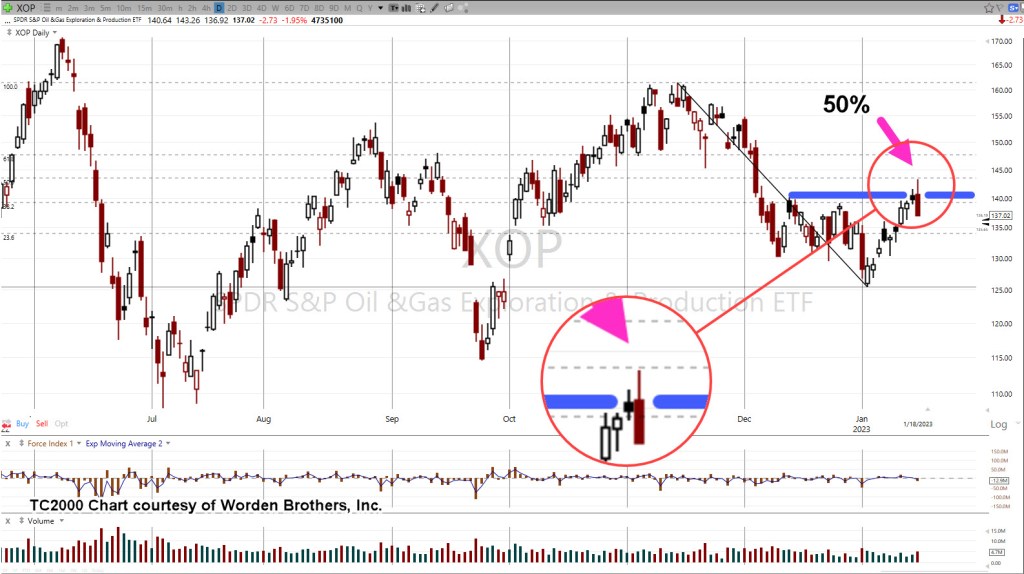
The daily chart of XOP, below shows a reversal at the Fibonacci 50%, retrace.
Oil & Gas XOP, Daily
The next chart zooms-in on the reversal.
We’re about fifteen-minutes before the regular session and set to open lower.
Look for the market to print lower, then attempt a rally as a test of the reversal.
That retrace, if it occurs, may be a low-risk area for a short via DRIP (not advice, not a recommendation).
If the anticipated test fails, and price action makes a new daily high (above yesterday’s print), it’s then likely the sector is on its way to all-time highs.
Note: Posts on this site are for education purposes only. They provide one firm’s insight on the markets. Not investment advice. See additional disclaimer here.
There was no Oil & Gas, XOP breakout, last Friday.
What did happen as shown on the chart below, was a test of resistance.
The market can certainly reverse from here. If so, it would be called a ‘double top’.
Those types of reversals are common; but from a trading perspective, that’s not what we are looking for (not advice, not a recommendation).
We’re looking for ‘trapped money’.
That means, as many market participants on the wrong side of the trade as possible so they are the ones that provide fuel for the downside.
Marsha … Marsha … Marsha
Just like The Brady Bunch and its chant of ‘Marsha’ … ‘Marsha’ … ‘Marsha’ … we have the public being led into a similar mantra; ‘Inflation’ … ‘Inflation’ … ‘Inflation’.
With that kind of single mindedness, who’s even looking for a downside reversal?
That does not mean a reversal is imminent … it just means the public is not looking for one; in itself, a requirement.
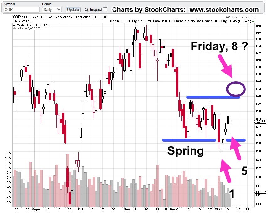
On to the charts
Oil & Gas XOP, Daily
We’ll re-post the original chart to show how price action has progressed.
This past Friday marked Fibonacci Day 8.
The next chart is how action looks now.
Included, is a forecast (not advice, not a recommendation) of where and how price action may proceed.
If it’s a double-top, we may have already reversed.
If not, Fibonacci Day 13, might be this coming Friday or next Monday.
It could be as early as Friday (actually, 12-days of price action) based on work done years ago.
That is, when an American Holiday occurs while the rest of the world’s markets remain open, that day of closed markets can (sometimes) effectively count as an actual trading day.
So, it’s this coming Friday, or Monday-next, that may be a set-up for reversal.
Note: Posts on this site are for education purposes only. They provide one firm’s insight on the markets. Not investment advice. See additional disclaimer here.
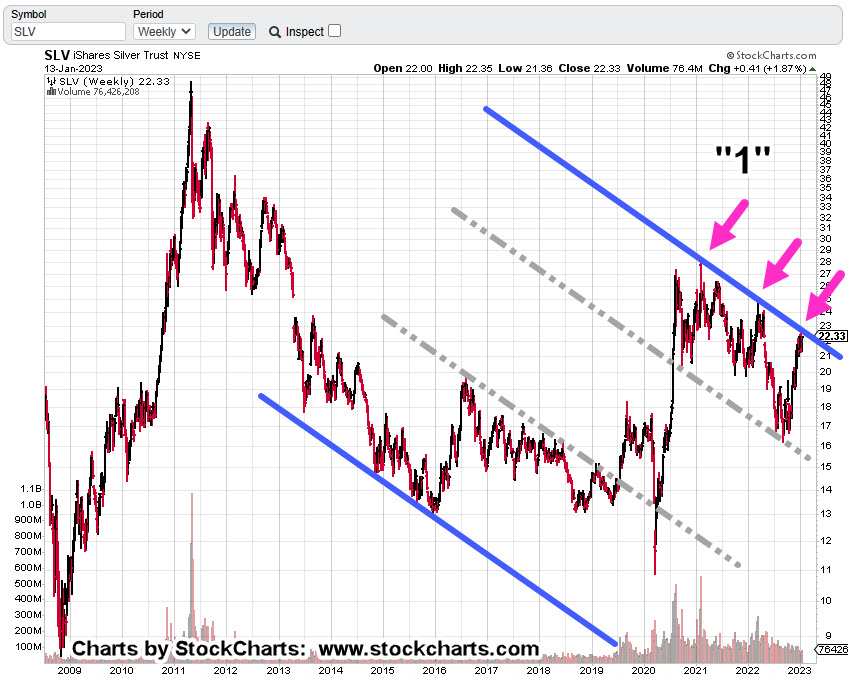
Something’s not right in the precious metals sector.
Gold’s just off -8%, from its highs while other monetary metals (Palladium, Platinum, Silver) are far below their highs; silver’s off a whopping -51.75%, from its 2011, highs.
In addition, as we’ll see below, silver (SLV) is just now contacting the right side of a trend line and potential downward channel structure that goes all the way back to the lows of 2015.
The ‘Squeeze’ of 2021
Below on the weekly chart of SLV, is a point labeled “1”.
That’s the location of what turned out to be a right-side trend line contact. Back then, an update on the ‘squeeze’ was posted, linked here.
Taken from that update was the following (emphasis added):
Those attempting garner forces (the little guy) to move the markets, such as silver, will find out soon enough who’s in control … and it’s not them.
It’s unlikely silver is going higher any time soon. There could be some upward spasms as the crowded trade exhausts itself; it’s likely we’ve seen the SLV highs for quite some time.
So, here we are nearly two years later; SLV never posted higher than the February 2nd, squeeze of 2021.
So, what’s next? Is there something else going on?
We’ll look at that question after the charts.
Silver SLV, Weekly
First, is the un-marked chart.
Next, we see a pattern that’s not so clear without mark-up.
For SLV, to break out, there needs to be an absence of motivated sellers (prices drift higher) or sufficient buying demand to overcome the downward trend.
Inflection Point
For an idea of what’s likely to happen next, we’re going to go to an unlikely source; Daniela Cambone and Gregory Mannarino.
It’s not about ‘controlling’ inflation and it never was, going all the way back to 1913. It’s about the ‘end game’, as discussed by Mannarino.
“Eliminate The Middle Class” (time stamp 11:40)
The sticky wicket is the ‘debt bubble’ and the ‘elephant’.
The Elephant Grows
The chart of silver (and other precious metals) and its non-confirmation with gold, could be an indicator of debt collapse and demand collapse first, before hyperinflation.
Multiple times a day now we have reports like the following flooding into the marketplace:
COVID Vaccines Are “Obviously Dangerous” And Should Be Halted Immediately, Say Senior Swedish Doctors
Multiple Young Athletes And Former Athletes Died Suddenly This Past Month
Doctor Calls For Withdrawal Of Pfizer, Moderna COVID-19 Vaccines Following New Research
The above list is just since yesterday and it’s only 2:00 p.m., Central Time, today!!!
Monetary & Manufacturing
Silver is unique more so than gold, in that it’s an industrial metal as well as monetary.
The collapse in manufacturing demand could be the reason silver’s not confirming gold’s move.
It may also be telling us, as the effects of the elephant take hold, a huge liquidation of all assets could be coming; paradoxically as the need for fiat cash (not precious metals) to pay off debt, increases.
Note: Posts on this site are for education purposes only. They provide one firm’s insight on the markets. Not investment advice. See additional disclaimer here.