Let’s take a look at silver’s upside breakout.
First off, silver spikes as seen in the chart below, are nothing new.

Even trading genius Ed Seykota lamented in his interview for Market Wizards (1989) about getting ‘impaled’ on numerous silver spikes.
It’s just the nature of the very thin market.
For example, as of this post, there are 176,008 silver futures contracts active (Open Interest) out to January 2021.
That compares to 835,037 active gold futures contracts for approximately the same time-frame.
So, at this point, the gold market has over 370% more active futures contracts than silver. Silver is indeed a thin market; therefore lending itself to radical (spike) moves.
The spike lower in March and then higher over the past week, is quite evident. However, if we pull out and look at the big picture, there’s trouble ahead for the bulls.
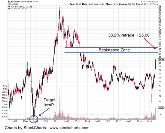
On the SLV chart is a massive multi-year resistance zone in the 23 – 26, area.
Not only that, it’s a 38.2%, Fibonacci retrace of the entire down move from the top in April of 2011, to the bottom in March this year.
Thus, price action itself implies that silver (SLV proxy) is still in a bear market.
The chart allows for the probability of further downside action once the upside objectives are met. We can see a hint of that downside objective (circled) as somewhere below the 2009, lows.
Of course, expect the market and analysis hysteria to ramp up as (or if) SLV approaches the 25-area.
If or when that happens, we’ll be looking for clues that a reversal is imminent or if by some other measure, “this time is different”, suggesting that silver will continue higher.
Charts by StockCharts

Pingback: Silver … Straight Up. Now What? « The Danger Point
Pingback: Random Notes « The Danger Point
Pingback: Silver Top? « The Danger Point