The inverted chart of IYR, shows the extremes of current price action.
The chart has a compressed time scale which may be hard to see. It was necessary to present it this way to show extreme action.
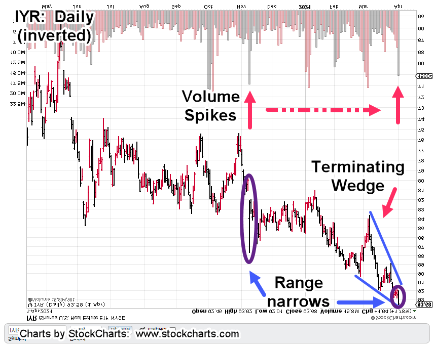
The prior update, has a wedge ‘throw-over’ that’s been one year in the making. The daily above, has its own terminating wedge formed over a six-week period.
The important part, is the range and volume.
Back on November 9th, 2020, there was a large volume spike and a move whose (total) range equated to 9.77%
Thursday, April 1st, was a similar volume spike but total range was just 1.83%; a huge (range) contraction when compared to the prior move.
This tells us massive volume is not having a significant result. Of course, if the volume persists, sellers in this area will be absorbed and IYR will move higher.
If not, this could be distribution; a reversal can be expected.
Charts by StockCharts

Pingback: More & Less « The Danger Point