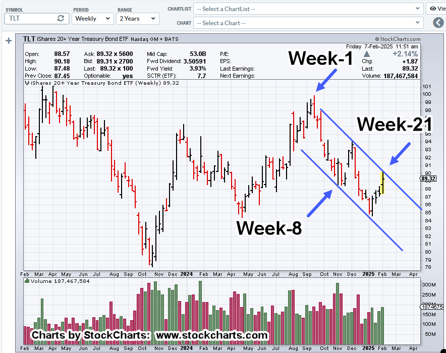
Bond Market Catalyst

The bond market’s on fire; yields screaming higher, bond prices lower.
Since the end of the forty-year bull market (TLT) in 2020, the view on this site, has been consistent.
That is, ‘unless there’s a market melt-down and even if there is, bond prices are likely to remain under pressure’ (not advice, not a recommendation).
That sentiment, recently echoed by Ox Talks, link here (Time Stamp: 6:40).
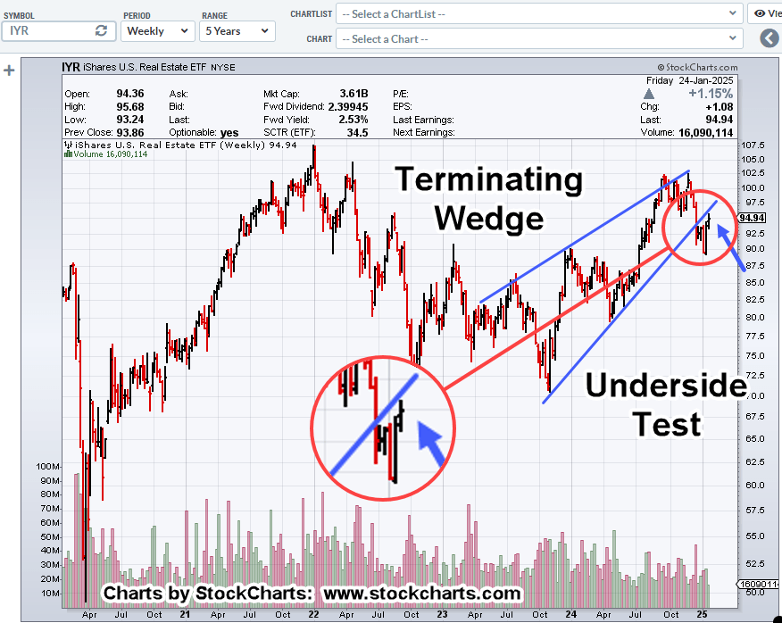
All of which, brings us to real estate.
Real Estate ETF, IYR, Daily
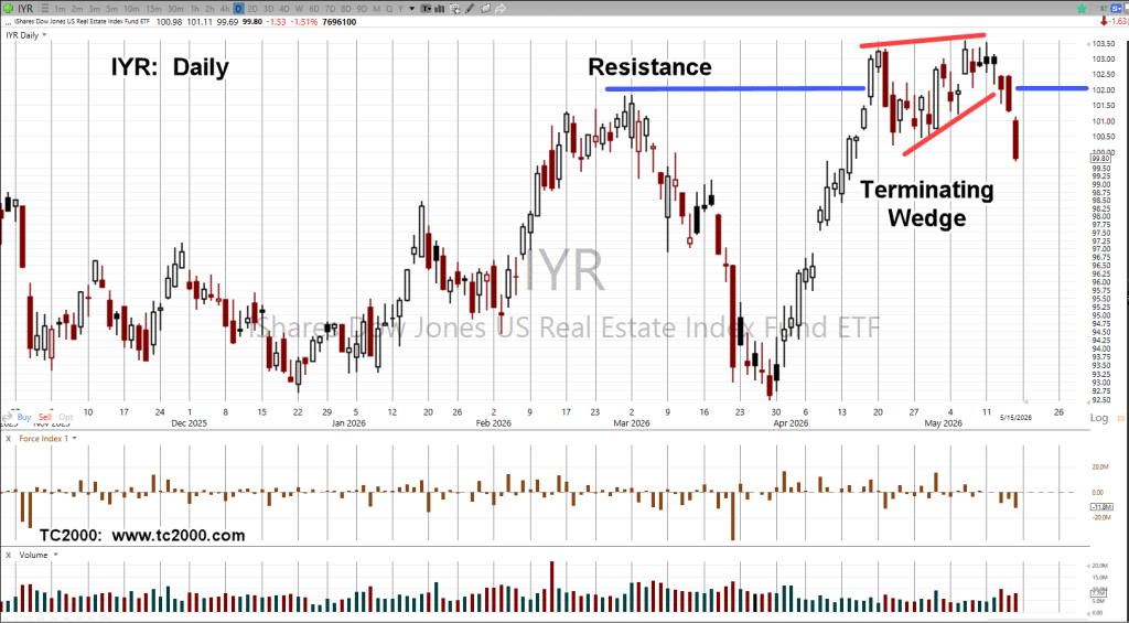
There were twenty-days struggling at resistance, forming a terminating wedge.
Day 21 (this past Friday) was the breakout to the downside.
Stay Tuned
Charts by StockCharts
Note: Posts on this site are for education purposes only. They provide one firm’s insight on the markets. Not investment advice. See additional disclaimer here.
The Danger Point®, trade mark: No. 6,505,279