Mass Liquidations?

During gold’s (GLD) way to the top, or potential top, it has posted gap-higher, after gap-higher.
That is, until now.
This past week, it has come down to fill one of the gaps.
Is this the start of other downside fills?
Before we look at the chart of GLD, let’s review a prior commodity blow-off top.
We’ll chose silver (SLV), for this example.
Silver SLV, 3-Day
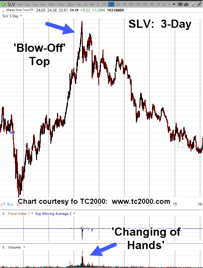
There’s a lot going on in this chart.
First, this is what a commodity blow-off looks like.
Second, once this happens with volume, there’s been a significant ‘changing of hands’; it takes a long time to recover.
In fact, here we are, fourteen years later and silver SLV, has yet to reach the levels of early May 2011.
Prices are still far below, even with non-stop propaganda, experts, and grifters cheering it on.
Now, we’ll put up the chart of gold GLD.
Gold GLD, Weekly
The last time GLD posted a Force Index of 1.8B, was back in 2011, just before the last major top.

It’s important to note, the huge reading in Force Index, did not come at the exact top. It came before the top.
We’re in a similar situation. The massive Force Index reading has already posted (not advice, not a recommendation).
Then, two weeks later, we have near record liquidations in the GLD, ETF, link here.
Stay Tuned
Charts by StockCharts
Note: Posts on this site are for education purposes only. They provide one firm’s insight on the markets. Not investment advice. See additional disclaimer here.
The Danger Point®, trade mark: No. 6,505,279

Pingback: Gold Down … China Sells « The Danger Point®
Pingback: Miners, Call It Quits « The Danger Point®