Gold … Set-Up & Strategy

Testing Underside Resistance

There’s no shortage of bullish prognostications for gold.

Said many times, as soon as there’s a blip higher, it’s near lunacy.

One of the latest installments is linked here and go figure … it’s the Russians, again!

Let’s get real.

Remember, the last time it was the Russians and the time before that?

From the date of the second link above in April, this year, gold (GLD) is down about -8.5%.

Not exactly a crash but definitely not a ‘paradigm shift the world has yet to fully process’.

Just from a contrary standpoint, if ‘everybody’s doing it’, there must be something else going on.

Let’s take a look at the actual facts, the price action, and see what it’s telling us.

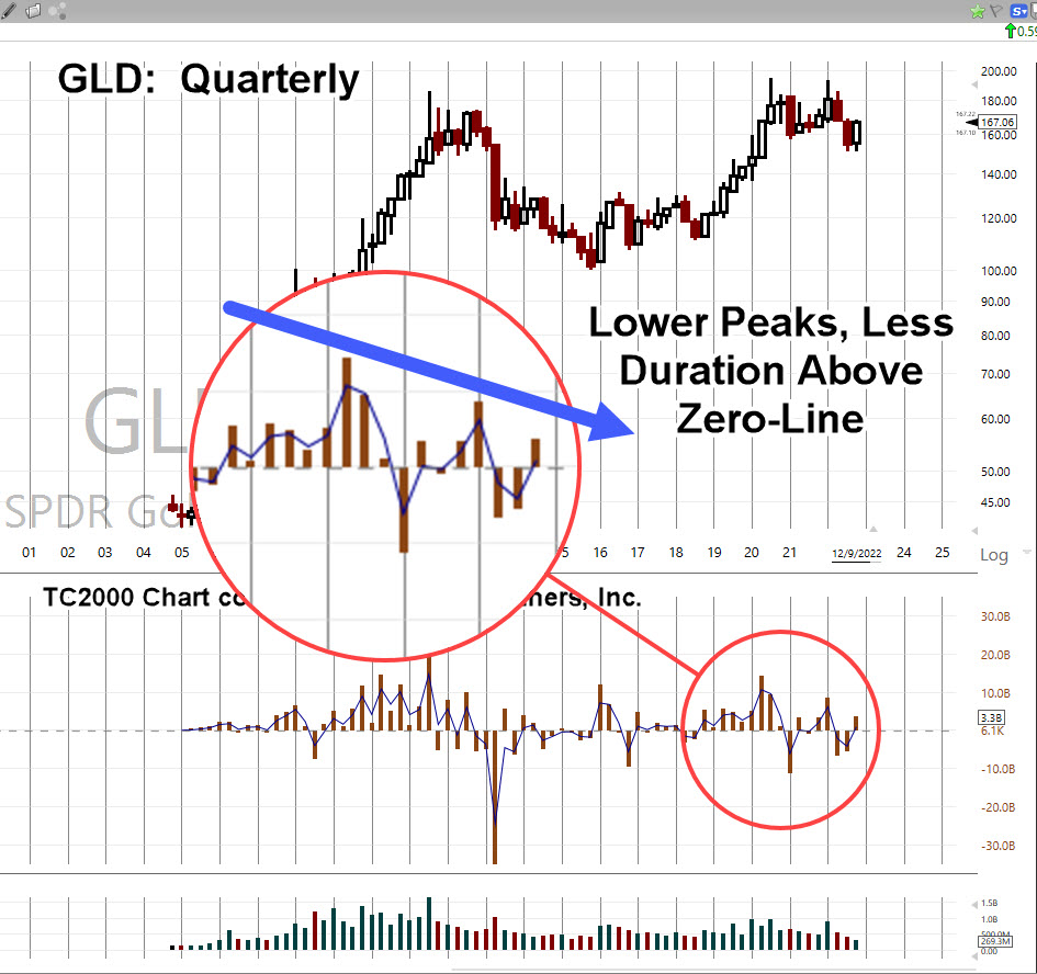
Gold (GLD), Quarterly

Looking at the big picture first; the quarterly chart.

Elder’s Force Index (shown in the middle section) has been expanded to detail the thrust energy behind the move(s).

It’s important to note, for at least the past 10-Quarters, two and a half years, the upward thrusts have been successively declining in energy.

That decline is highlighted below.

Next, we’ll drill down to the monthly chart.

It shows GLD, trended (slightly) higher for at least sixteen-months, before breaking down.
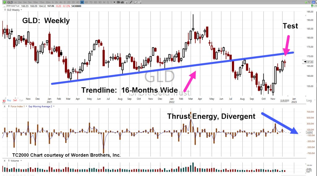
GLD, Monthly

Now, as the right-most magenta arrow shows, we’re at the test of underside resistance.

Tests may pass or fail; obviously, what happens next is important.

Also note, as with the quarterly, upward Force Index on the monthly, is declining.

We’ll take it one step further and go the weekly … it too, has declining and also diverging upward thrust.

GLD, Weekly

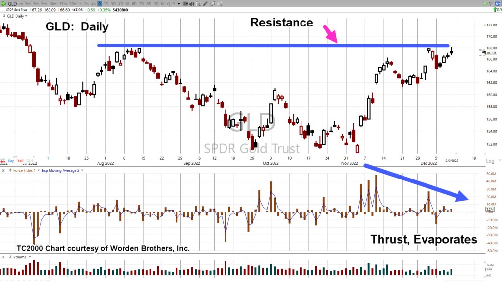
Ok, you talked me into it. 🙂

Let’s go to the daily and see the same thing.

GLD, Daily

Does all this mean gold will immediately go lower at the next open?

The short answer … it’s not known. However, from a probability standpoint, lower is more likely than higher.

No ‘Capitulation’

There’s nothing to indicate downside capitulation.

Nothing like the ‘changing of hands’ that took place this past March 8th, here and here.

It appears we’re still in the initial stages of a long-term downside reversal.

Downside? … How’s downside, even possible?

‘What kind of idiot comes up with that type of analysis?’

Moving Parts, A-Plenty

Every day, we see things going on in the background that could not be known or fathomed; like missing $80 Trillion?

All it takes, is for some kind of sovereign debt or derivatives blow-up, requiring that country to sell its assets like gold, silver, oil, grains and so on.

A huge dump on the gold market, would of course trigger stops and that in itself, could result in a contagion of selling.

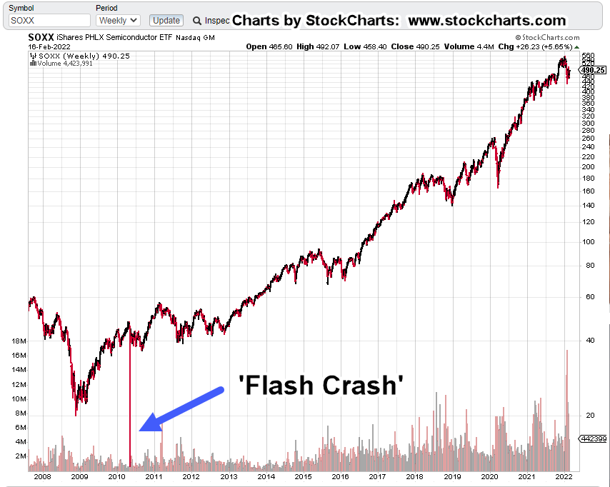
If or when it happens, the downside might be temporary like the Flash Crash of 2010, or oil going negative, or it could be longer.

The ‘powers’ don’t seem to be too concerned with precious metals demand, prices, and low stock of physical at the commodities exchange(s).

It’s as if they know, it will work itself out.

They’re on to something else more basic. Something ‘crude but effective‘ like destruction of the food supply.

Stay Tuned

Charts by StockCharts

Note:  Posts on this site are for education purposes only.  They provide one firm’s insight on the markets.  Not investment advice.  See additional disclaimer here.

The Danger Point®, trade mark: No. 6,505,279

SOXX, Ready To Drop

All The Good News Is Out

Liquidity Risk?

It’s been long enough; most have forgotten the ‘Flash Crash‘ of 2010.

That crash happened in May of that year.

May of this year, would make it 12-years and interestingly, a Fibonacci 144, months.

Normalcy Bias:

As Nissam Taleb said in his book, ‘The Black Swan’, every day is like every other day on the farm, for Mr. Turkey … that is, until Thanksgiving Day.

Let’s take a look at the historical chart of Semiconductor ETF SOXX, and see the effect of a Flash Crash.

Easy to spot … prices did recover by the end of the day.

What about the next time?

This report just out on ZeroHedge, shows liquidity is drying up in the bond market. Actually, liquidity has been drying up ever since Dodd-Frank of 2010.

All of this is working (to increase risk) in the background.

Let’s take a look at another unprecedented event … the downthrust and apparent recovery in the semiconductor index, SOXX.

SOXX, ETF, Daily Chart

First up, is the unmarked chart of the index.

Next, we’ll show the recovery higher is on diminishing volume.

There’s no real commitment to the higher prices …. they are just drifting upward.

We’ve already shown the Elliott Wave assessment of the current structure. Now, let’s look at it from a Wyckoff standpoint; Up-Thrust and Test.

Price action posted an Up-Thrust, declined and now has come back for an apparent test.

Confirmation Bias

At this juncture, both Elliott Wave and Wyckoff Analysis present a price action structure that’s set for downside reversal.

In a way, we’re at the danger point for both methods.

Summary

From a personal and corporate standpoint, going long in this market and all markets for that matter, was abandoned long ago (not advice, not a recommendation).

To borrow a phrase from Dan at i-Allegedly, he repeats over and over in his videos, ‘We’ve had warning, after warning’.

So, we have.

The SOXX, is telling us, it’s ready to resume action to the downside. After-hours, already has the index trading lower.

Stay Tuned

Charts by StockCharts

Note:  Posts on this site are for education purposes only.  They provide one firm’s insight on the markets.  Not investment advice.  See additional disclaimer here.

The Danger Point®, trade mark: No. 6,505,279

p.s. The insight of 2010 Flash Crash, anniversary of Fibonacci 144 months in May of this year, is exclusive to this site.

Never More Fragile, as Now

Stretched, Stretched, Stretched

Slightest Dip, Cascading Effect

The last update had what some might consider a hyperbolic statement:

” … a market break anywhere from 20% to 50% (in our view) can happen at any moment.”

Less than an hour after that post, we had this from ZeroHedge.

” …in other words, stocks may be at a record high, but they have also never been more fragile and more sensitive to even a modest drop.”

Of course, nobody’s going to come out and publicly say we could get a ‘disconnect’ that results in a 20% drop or more, overnight.

Remember the Flash Crash of 2010?

In the entire history of the market, that’s never happened before, either.

Biotech Backdrop:

We’ve got empirical and anecdotal evidence pointing to the real objective of the ‘experiment’; now, we’re fortunate enough to have a data analyst doing what the medical establishment used to do.

That is, maintain and present the data.

The analyst at this link, is parsing the government database of adverse reactions. That analysis can be viewed here.

Reviewing the data solidifies the fundamental case even more for biotech implosion (taking down the broad market as well).

Mr. Benavidez estimates: 100,000 – 200,000 already dead in the U.S.

Let’s not forget; nearly half of the states have approved ‘liquefaction‘ of the deceased to be used as ‘fertilizer’. These are facts.

Seems like everything’s well planned … far in advance of current events.

Biotech Technical:

Since the SPBIO, index does not provide volume data, we’ve done a modification.

The SPBIO, weekly chart is below but it’s inverted. The weekly Force Index of leveraged inverse fund LABD, has been added.

On a closing basis, SPBIO (inverted) has penetrated just below support. It’s done so on significantly divergent energy.

Drilling down to the daily, it’s a similar picture; except we see the axis line (now support) more clearly.

Summary:

With the conditions noted above, SPBIO’s in position to pivot. Heading lower while LABD moves higher.

Potential USO Model:

When the big reversal takes hold, conditions may be similar to oil (USO) from July 2014, to the interim bottom of February, 2016.

During that move, the market retraced no more than 23.6%, at any stage of the decline.

However, if you recall, newsletter writers, pundits and YouTubers were putting out their prognostications; get into oil’s ‘big rebound’.

By February 2016, USO’s down a whopping – 81%. The oil market never came back.

Final Notes:

One commenter to a Jerimiah Babe video observed:

‘Most people think the worst is over when it’s not even started.’

That exemplifies the mindset required. This economic and societal decline is going to be a very long ordeal.

The normal at this point, is anything that wasn’t normal before.

Stay Tuned

Charts by StockCharts

Note:  Posts on this site are for education purposes only.  They provide one firm’s insight on the markets.  Not investment advice.  See additional disclaimer here.