Demand Collapse?

Across the pond, the U.K. seems ready to introduce Universal Basic Income; welcome to Neo Feudalism.
Meanwhile, back at the ranch in Germany, we have Survival Lilly giving us updates near daily, on that pending implosion.
‘You will own nothing‘, time Stamp 6:20
With all of that said, including the military hijinks in the straight, you would think uncertainty results in oil prices ever higher.
At this point, it’s not happening.
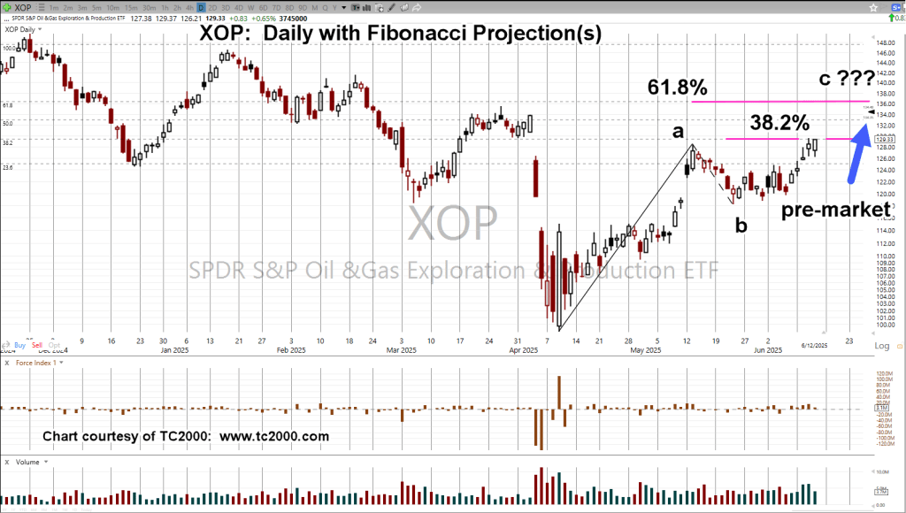
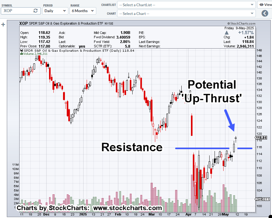
Oil & Gas Exploration ETF, XOP, Weekly
Oil & Gas Sector XOP, has been declining for three straight weeks (not advice not a recommendation).
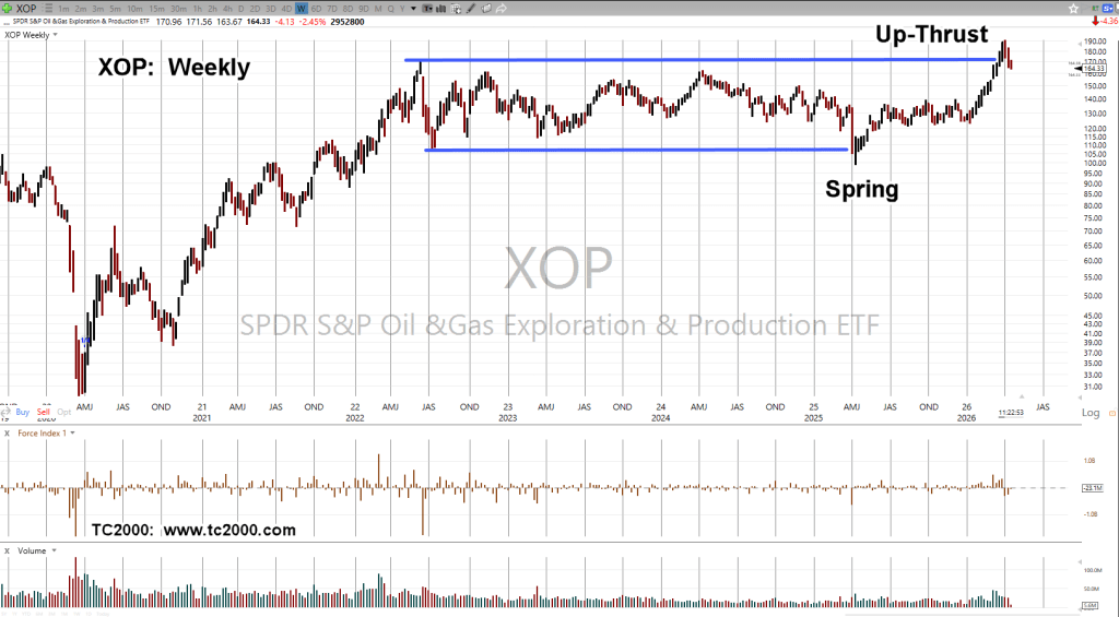
There’s the familiar pattern: Spring-to-Up-Thrust
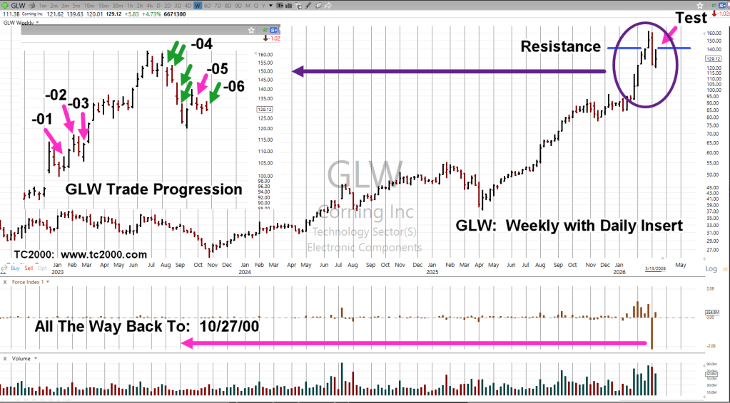
Like previous posts, we need to be reminded (at least I do), of the massive scale of events.
Stay Tuned
Charts by StockCharts
Note: Posts on this site are for education purposes only. They provide one firm’s insight on the markets. Not investment advice. See additional disclaimer here.
The Danger Point®, trade mark: No. 6,505,279