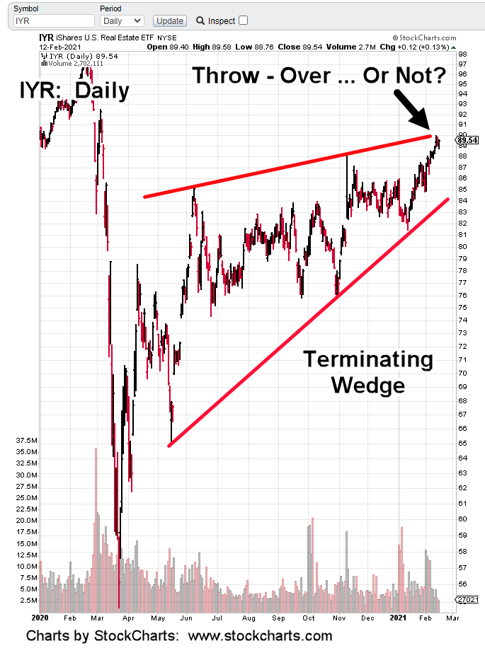
IYR’s in a terminating wedge … will it throw-over, or reverse from here?
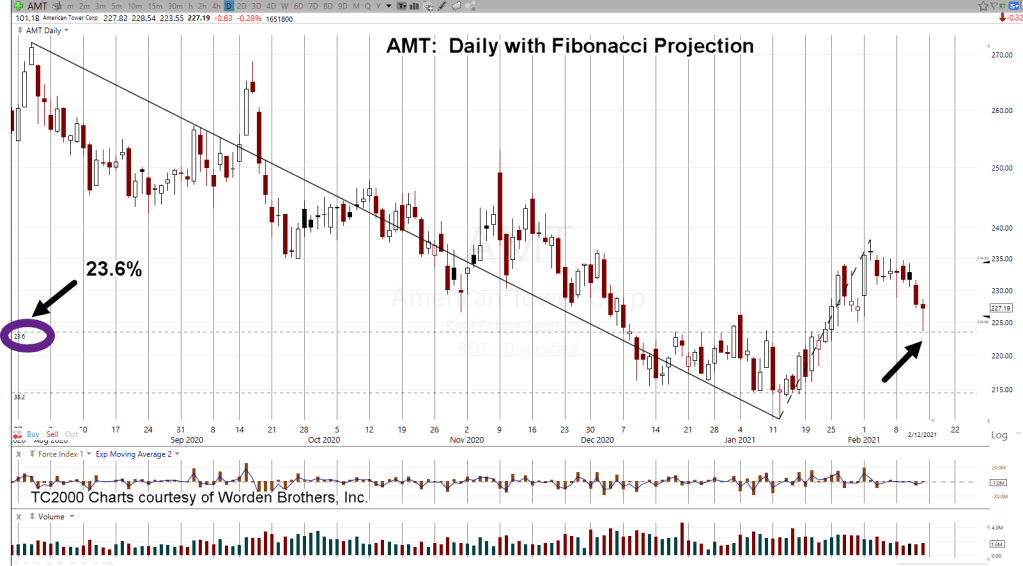
American Tower (AMT), the largest cap in the ETF, bounced off a 23.6% projection during last Friday’s session.
That keeps a short term bullish possibility alive. Longer term, AMT still remains in a downward trading channel.
Bonds and the dollar continue at extremes. On the dollar side, it looks like a significant bottom is in the works.
Weekly UUP, MACD has posted a bullish divergence along with an MACD lines cross (to the upside) signal.
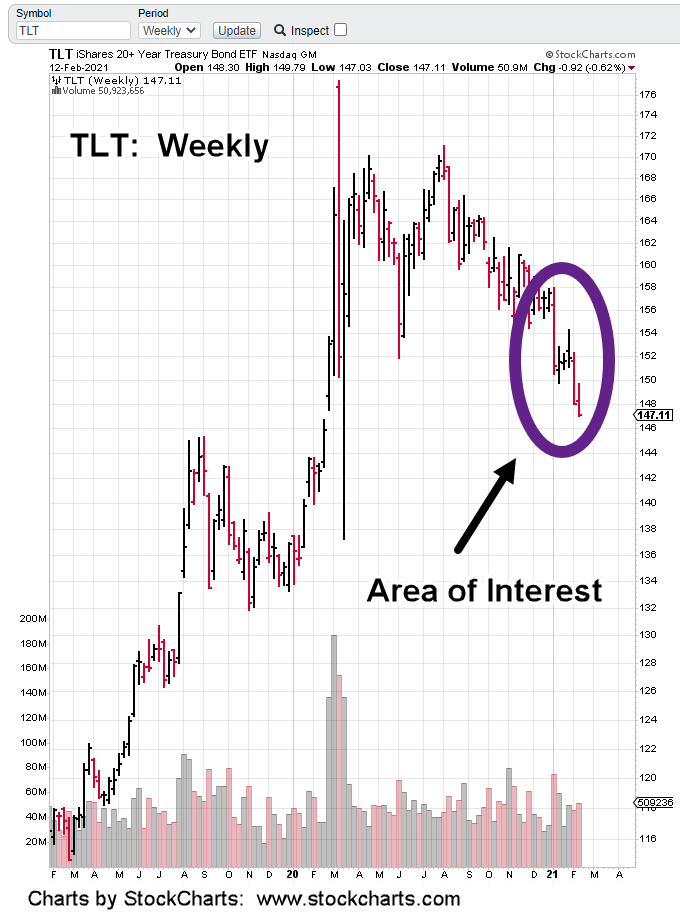
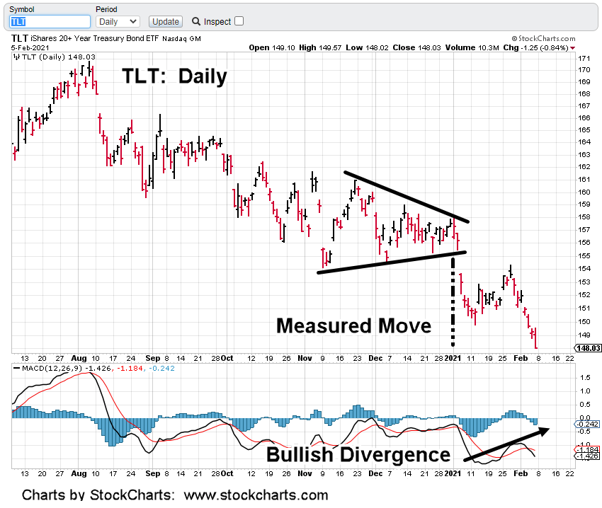
Bonds (TLT) remains at its near term lows; near support levels formed back in September, 2019.
IYR is right at the upper wedge boundary and volume (upside pressure) has dropped significantly.
It could still levitate higher … however, it seems that getting a significant ‘throw-over’ is going to require more energy than is currently available.
We’ll see what price action has in store for Tuesday’s session.
Note: Posts on this site are for education purposes only. They provide one firm’s insight on the markets. Not investment advice. See additional disclaimer here.
Price action has the final say. It’s saying not yet but close.
The weekly chart of TLT shows the area we’re going to look at a bit closer.
The chart has been expanded below:
In the past six weeks, there have been three decisive down weeks.
The black arrows on those weeks show each successive down week has less net travel.
Last week was the shortest net travel of the three. In addition, that week had higher volume than the week prior.
Less range, more volume.
The late David Weis in his Wykoff analysis video (link here) discussed a similar situation using Apache Oil (APA).
The short version of the story is: Less range, more volume … ‘somebody’s buying’.
Although not really a bond fan, the opportunity is there. Risk has been or is being removed (never entirely) and one way to participate in a reversal and bull move is using leveraged funds (not advice, not a recommendation).
This past Friday, I positioned the firm in TMF, a 3X leveraged bond fund.
Volume (liquidity) is acceptable at around 600,000 – 800,000 shares daily (allowing pre-market entries/exits).
It’s important to note, while TLT was making new daily lows, the high yield HYG, ticked just 0.01-point above its post recovery high. Since August of last year, TLT and HYG have been inversely correlated.
On way to read this, we’re at extremes.
We’re just one ‘incident’ away from sending things violently in the opposite direction; complete with down-gaps, trading halts, brokerage lock-ups … the whole nine yards.
Note: Posts on this site are for education purposes only. They provide one firm’s insight on the markets. Not investment advice. See additional disclaimer here.
Last week, the analysis of American Tower Corp., signed off with this:
“The expectation for the coming week; AMT continues its reversal and takes the IYR sector with it.”
The chart above was provided to support that analysis.
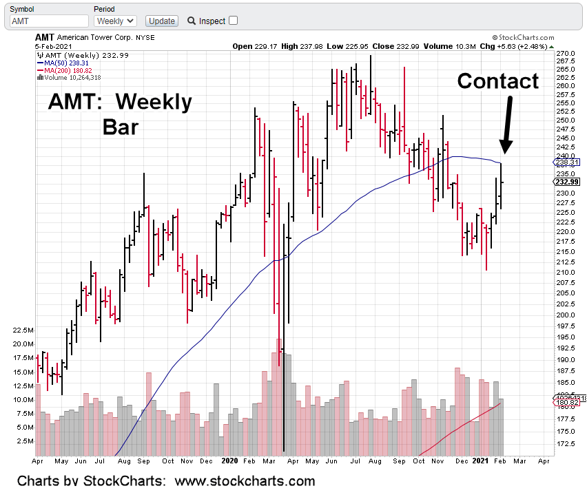
The chart below shows the result:
So, AMT met expectations by reversing on cue. Did it take the rest of the market (IYR) with it? Before that’s addressed, let’s look more at AMT.
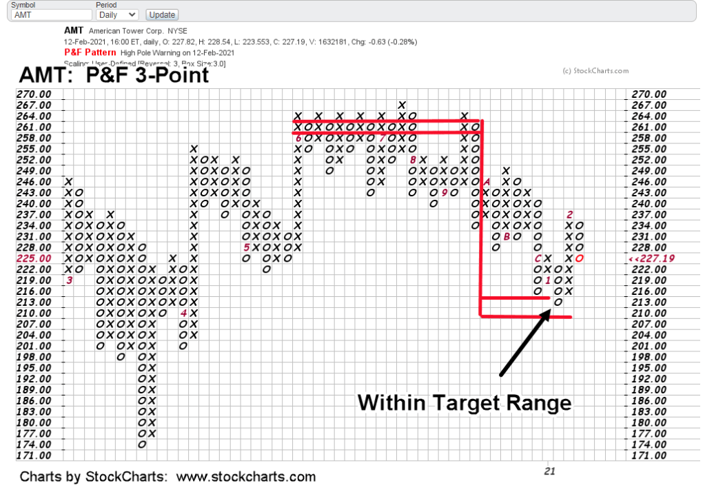
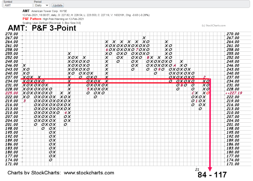
The 3-Point P&F chart is shown below with projected targets.
For over a hundred years, this is how P&F charts are used to identify potential.
Price action indeed, met the target and then reversed.
What’s more, we can see AMT bounced off the top of the projection (~216) area first, then came back to the target.
AMT then went on a counter-trend move to ~238, before again, reversing lower last week … which brings us to now.
Stated several times in these updates, if and when IYR reverses, because of its own price action, it will create even lower targets.
A good illustration is to use AMT:
Now that its moved lower, met targets, rebounded only to reverse again, we have a new projection.
When and if IYR reverses, it will create similar downside targets.
The daily chart (below) has AMT price action overlaid with Fibonacci projections to lower levels.
It might be a little hard to see but Friday’s action bounced off (exactly) at the 23.6%, projection.
What this means is, AMT price action is “respecting” the Fibonacci level.
That gives high probability the level is valid. If we really are in a continued AMT reversal, now we have high probability downside targets.
Tying this all together and using the weekly chart of AMT (with the Fib targets) we get this:
Note how the 1:1 projection (shown as 100.0) is near exact at the March 2020, low of 174.32.
Price action itself defines what levels are important.
The ultimate P&F projection of 84 – 117, is far below what’s shown on the weekly chart.
However, AMT: 77 – 78, does correspond to Fibonacci projection at 261.8%, … very near the ’84’ P&F low.
There’s a lot more to AMT and IYR but the post has gone on long enough.
There’s also no guarantee AMT and IYR will meet any projected levels. That is the way of the markets.
However, what’s being done is to (continue to) present a significant case for long-term sustained downside reversal; carrying the real estate sector to levels (ultimately) below that of 2009.
Note: Posts on this site are for education purposes only. They provide one firm’s insight on the markets. Not investment advice. See additional disclaimer here.
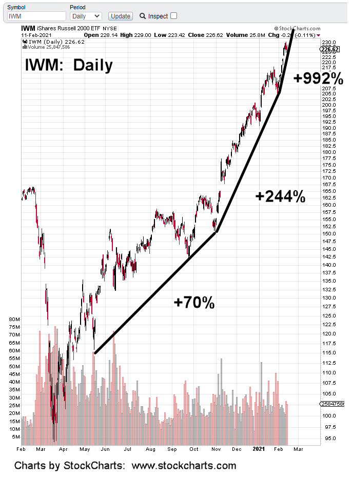
Trending higher at nearly 1,000% annualized, it’s obvious a break is coming.
Exactly how or when of course, is not known.
However, it has been proposed by this site (for years), when the final bubble-break comes, it’s likely to be an over-the-weekend event that results in a severe gap down open.
A gap down of say, 20% – 50%.
Can’t happen? After the events of 2020, we should all know that anything can happen.
Theoretically, a gap down of -25% from current levels, puts IWM right at long-time support around ~170.
Under such conditions when a severe disconnect is possible, one approach is to prepare on the short side (not advice, not a recommendation).
Using Wyckoff analysis techniques (for bear markets), that means to look for sectors not participating in the mania. When the downdraft hits, those markets will (potentially) move lower farther and faster.
That brings us to real estate, IYR
Using the same time-scale and trend line notations, we get the chart below:
From a purely visual perspective, the struggle to move higher is obvious. The past two sessions have made no net progress.
Looking more closely at recent action, IYR is following a Fibonacci time sequence.
From the low on January 12th, to the most recent high on Wednesday the 10th, is a Fibonacci 21 days.
The added bonus is the inflection point on Day 13.
Bid/Ask spreads on inverse fund DRV, in the pre-market are not that reliable; at this juncture, 8:10 a.m., EST) they indicate a higher open.
Note: Posts on this site are for education purposes only. They provide one firm’s insight on the markets. Not investment advice. See additional disclaimer here.
Note: Posts on this site are for education purposes only. They provide one firm’s insight on the markets. Not investment advice. See additional disclaimer here.
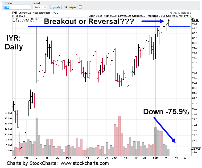
Yesterday’s action in IYR, looks like a breakout higher.
That is, until you look at volume.
Price action levitates higher while everyone leaves the party.
From the start of the last thrust higher on February 1st, volume has declined over 75%.
There are two possibilities:
Buyers and Sellers are backing away; letting prices drift.
There’s no bullish commitment at these levels; reversal imminent.
Two quotes that accurately sum up the overall market situation; from Johnny Bravo and Steven Van Metre respectively:
‘One thing or the other, something’s going to break’
‘This is pretty dangerous stuff going on here’.
Before we wrap up, we’ll add just one more thing.
Junk yields have sunk to record lows.
Why buy TLT at ‘relatively’ safe 1.55%, when you can have junk yield at 3.95%, that’s going to blow-up (launching TLT into the stratosphere) at any time.
Note: Posts on this site are for education purposes only. They provide one firm’s insight on the markets. Not investment advice. See additional disclaimer here.
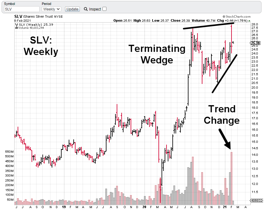
Massive volume in SLV, points to significant reversal.
Not since the week of May 13th, 2011 has there been higher volume.
The week prior in 2011, was the highest volume ever, for SLV at 1.1-Bilion shares.
Those two weeks culminated in a crash over -31% and were just after SLV reached its all-time high.
Total down-draft for the three weeks combined (the top and two weeks following) was nearly -34%.
Will it be any different now?
Probably not.
At this point, it’s important to re-state, this site is following principals and techniques set down by three market masters of the early 1900s; Livermore, Wyckoff and Loeb.
Markets do not change. Using the techniques outlined by those early masters are still applicable today.
Arguably, the father of technical analysis was Wyckoff.
The terms “accumulation, distribution, support and resistance” originated from him.
His technical publications had the largest subscriber base in the States at the time; larger than all other publications combined.
At one point he got so successful, his buy or sell recommendations were beginning to move the markets all on their own. The year was 1918.
Instead of stroking his ego on how ‘his recommendations’ were affecting the markets, he saw it as a disservice to his clients.
In May of 1919, he discontinued his newsletter publication ‘The Trend Letter’. It had become so popular, it was impossible to provide recommendations without those same tips moving the market.
What a contrast to today.
Those attempting garner forces (the little guy) to move the markets, such as silver, will find out soon enough who’s in control … and it’s not them.
It’s unlikely silver is going higher any time soon. There could be some upward spasms as the crowded trade exhausts itself; it’s likely we’ve seen the SLV highs for quite some time.
Note: Posts on this site are for education purposes only. They provide one firm’s insight on the markets. Not investment advice. See additional disclaimer here.
Note: Posts on this site are for education purposes only. They provide one firm’s insight on the markets. Not investment advice. See additional disclaimer here.
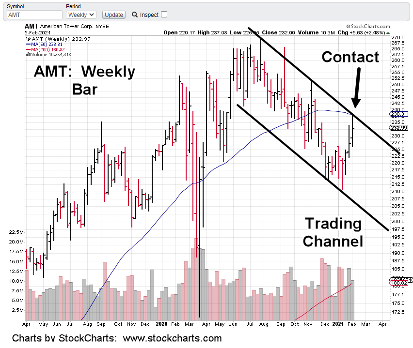
The largest cap equity in the real estate sector IYR, is American Tower Corp. (AMT).
We’re going to spend some time dissecting this equity but first, let’s look at the big picture (above).
The same chart is posted below having two areas highlighted with blue circles.
Zooming into the upper-right circled area (shown below). The circle has been removed to help provide clarity on the technical situation:
Next, we’re going to add a trading channel to the chart:
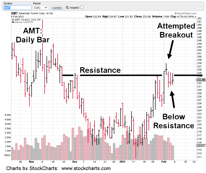
Now, we’ll zoom into the daily charts:
Drilling down even further on the daily:
From a fundamental standpoint, AMT has a P/E of 55, and is yielding an anemic 1.94% (as of 2/5/21, bigcharts).
That compares to a current TLT, yield of 1.55%
The last three earnings releases have each been downward surprises; averaging -6.6%, against expectations.
Getting back to the technical condition.
The second weekly chart had two areas circled. These are the only two places (in over fourteen-years of price action), where the 50-Week MA is pointed down at similar angles.
The first circle, AMT was rising into the declining MA as part of a long term bullish reversal.
The proposition at this juncture, based on fundamental and technical conditions, AMT is rising into a declining 50-Week MA as part of a long term reversal to the downside.
Price action is the final arbiter. Anything can happen.
The next earnings release for AMT is scheduled for February 25th (Yahoo Finance) so it’s not going to be a near term factor.
The expectation for the coming week; AMT continues its reversal and takes the IYR sector with it.
Note: Posts on this site are for education purposes only. They provide one firm’s insight on the markets. Not investment advice. See additional disclaimer here.
Note: Posts on this site are for education purposes only. They provide one firm’s insight on the markets. Not investment advice. See additional disclaimer here.