Note: Posts on this site are for education purposes only. They provide one firm’s insight on the markets. Not investment advice. See additional disclaimer here.
Storage facilities in Texas are paying to have someone take excess Nat-gas.
As this link says, the ‘reason’ for negative Nat-gas, is high oil prices prompt drillers to increase oil production, along with (by-product) Nat-gas, driving down the price.
We’ll cover Nat-gas (UNG) in a separate update which by the way, on Friday, posted another Wyckoff spring set-up.
The question du jour is, ‘does oil go higher from here?‘
If oil is going higher (or likely to go), then Nat-gas may be pressured downward for longer.
International Chaos
The amount of ‘pontificating’ from the media on what oil is, or is not going to do, is mind-numbing.
Wyckoff himself said, we’re attempting to find out ‘the next probable direction’ for the market, which of course, can never be known for sure.
With that, let’s go to the truth of the matter, the chart.
Oil Tracking Fund, USO, Weekly
Shown on the chart, is a Fibonacci projection from the lows of March 2023, to the first wave high of April ’23, then back down to the wave low, in May ’23.
It might be hard to see, so the first waves are highlighted with green dashed lines.
At this point, instead of asking the question ‘where’s oil going?’, a better question may be, ‘is the chart of USO “respecting” the Fibonacci projections?’
Looking at the chart, it’s an obvious, yes.
Right now, we’re at the 161.8%, projection and USO is hesitating; at the same time, Nat-gas, UNG, appears to be forming a long-term bottom (not advice, not a recommendation).
Note: Posts on this site are for education purposes only. They provide one firm’s insight on the markets. Not investment advice. See additional disclaimer here.
I like the metals as much as the next guy, but that doesn’t help when it’s time to stay focused on what the market’s (really) saying.
This week’s volume in SLV, was more than last week by about 16%, but net distance traveled (at the close) was far less … about 74%, less net travel … ruh, roh.
Silver SLV, Tracking ETF, Weekly
There’s a wide price spike for the week but it’s the close, that’s the important part, holding just above resistance.
Obviously, what happens next is important.
Typical market behavior for silver suggests we’re at or near a top and due for some kind of downside move if not a complete reversal (not advice, not a recommendation).
Different This Time
If this time really is different and we’re in the long-awaited hyperinflation move, we’ll probably find out soon.
If that’s the case, meaning, it really is different, one would expect the behavior of the metals to change; like silver holds its current level, moves higher, or starts congesting for another up-wave.
Note: Posts on this site are for education purposes only. They provide one firm’s insight on the markets. Not investment advice. See additional disclaimer here.
In just one day, Globe Life closes down – 53.14%, on historic volume, over 35-million shares.
No matter the narrative, it shows just how fast a market can implode.
Years ago, while watching an episode of Wall Street Week, with Louis Rukeyser, one of his guests commented on a corporation that released (unexpectedly) bad earnings.
He said … ‘I believe in the cockroach theory. Where there’s one, there’s more’.
Does anyone think Globe Life is, or will be, an isolated incident? This could even be a ‘Lehman Moment‘ and we just don’t know it (not advice, not a recommendation).
Up-coming (potential) problems with life insurance have already been covered; best described in this brief four-minute clip, link here.
The Biotech Connection
The connection between biotech and life insurance can be correlated with this link and this one.
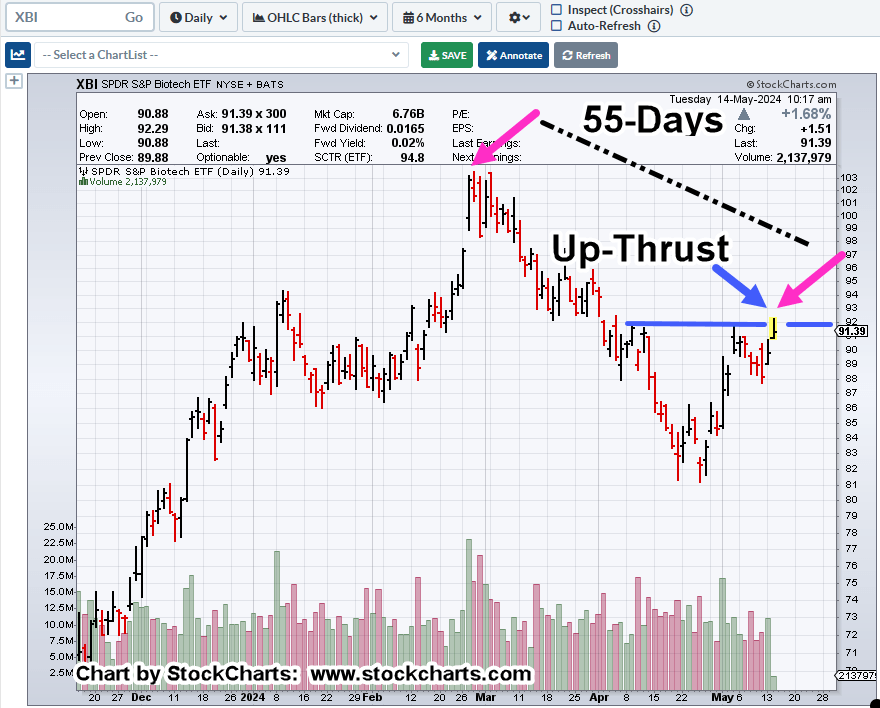
Biotech, XBI, Daily
The chart below, is slightly different from one’s typically presented on this site.
It’s on the daily timeframe but it’s compressed to better show the sector sub-dividing lower.
Yesterday’s Fibonacci analysis may still apply but we won’t really know until we see tomorrow’s action.
Note: Posts on this site are for education purposes only. They provide one firm’s insight on the markets. Not investment advice. See additional disclaimer here.
Here’s the latest news (as of 2:03 p.m., EST), link here.
Note, the article says the shares ‘tumbled’ … hardly, it’s a crash … take a look at the chart, link here.
The life insurance sector, and more specifically Globe Life (GL) along with Met Life (MET), have been on the watch list for reasons discussed many times on this site.
The Biotech Link
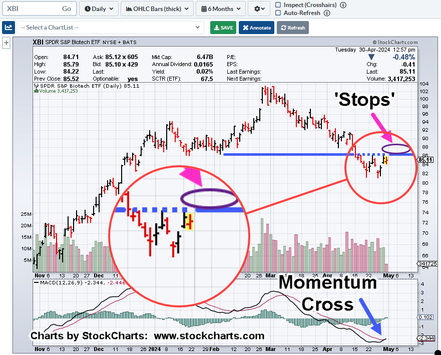
Possibly related (correlated) to the life insurance industry is biotech.
We’ll discuss that sector, XBI, in an upcoming update. The synopsis is that XBI could make a brief new daily high today (or at the open tomorrow).
If so, it could put the sector in a minor up-thrust position, while still in an overall down trend.
Note: Posts on this site are for education purposes only. They provide one firm’s insight on the markets. Not investment advice. See additional disclaimer here.
Biotech’s been beat up and down so much, you can lose track of what’s really happening.
Include the financial media side-show, and it’s a recipe for confusion and delay.
In the case of biotech XBI, it had a ‘change of character’ on March 21st, then morphed into a trading channel.
Now, it looks like it has a Fibonacci time correlation.
It all sounds complicated, so let’s take a look.
Biotech XBI, Daily
The original change of character, identified in this post.
Yesterday, Tuesday, was Fibonacci Day 13, from the point where the ‘change’ was noted.
It appears, the market used Tuesday, to post the right side (supply side) of the current trading channel.
Of course, there have been no ‘confirming’ hits on that right side so far; we just have one data point.
As the action unfolds, the key is to look for the market to adhere to the channel or tell us that something else is happening (not advice, not a recommendation).
Sorry, No Rate Cuts
That’s news to some.
On this site, it’s been a working premise for over a year.
Remember, back then, it was called ‘The Pivot’:
“Like ‘bread and circuses’, the ‘pivot’ discussion is a distraction … keeping the proletariat placated.”
Now, the man behind the curtain has been exposed, here and here, it may get very dangerous … as if it’s not already.
This post is being released (12:52 p.m., EST) before the Fed minutes. No telling what kind of volatility may, or may not, ensue from there.
Note: Posts on this site are for education purposes only. They provide one firm’s insight on the markets. Not investment advice. See additional disclaimer here.
Way back in 2001, it was all bearish on the gold front as well; lows were around $254/oz. – $255/oz.
How did that work out?
No, Nat-gas is not gold but at this point, it’s possibly just as ignored as gold was, then.
The strategy or potential reasons for a rally in Nat-gas, have already been addressed here and here.
So, we’ll cut to the chase, looking at the proxy, UNG.
Natural Gas, UNG, Daily
It’s possible, the March 27th, penetration of support (covered here) and subsequent recovery, is a Wyckoff spring set-up (not advice, not a recommendation).
If we’re in a spring with the wedge in-effect, meaning, the market’s not going to morph into another structure, then it’s likely, Friday’s action was a test of both the spring and the wedge (breakout).
Supporting the ‘test’ scenario, we have Friday’s action pulling back to the lows; volume contracts by over 37%, when compared to the day prior, Thursday.
Of course, this is all very nuanced action and can be blown away at the next session.
However, as with our gold example, no one was looking for a major, long-term reversal at the time.
Note: Posts on this site are for education purposes only. They provide one firm’s insight on the markets. Not investment advice. See additional disclaimer here.
Yesterday, biotech (XBI) had the chance to reverse off Wednesday’s lows, continue higher into an upside move, a Wyckoff spring.
It didn’t happen.
The move failed spectacularly.
The ‘Street’ pays attention to such failed moves. Thus far, unless there’s some kind of massive demand, biotech XBI, has penetrated and tested support, now resistance, and is moving lower.
Strategy First
Recall, the work was done (three weeks ago) indicating high probability of a long-term reversal in this sector.
Adding some entertainment with the Fed is, or the Fed isn’t (going to cut rates). How about the Fed never was. 🙂
Until proven otherwise, we’re in a high, and higher, interest rate environment.
Biotech XBI, 4-Hour
Moving closer-in on the chart, the 4-Hour.
As we can see, on March 21st, XBI had a change of character.
Price action was relatively ordered and well behaved but then became more volatile on the 21st; it all fell apart, declining sharply on April 2nd.
At the point where the ‘change’ is noted, it also looks like XBI, began to form its (current) trading channel.
P&F Projection
If XBI, continues its decline, where’s it going?
What’s a likely target?
There are several methods that can be used; Fibonacci projection, measured move, and P&F to name a few.
A basic P&F projection is shown below:
What’s shown is the maximum projection range (not advice, not a recommendation).
As this post is being created (11:52 a.m., EST), XBI continues to grind its way higher in what’s likely a move to test resistance in the 90.50 – 90.60, area.
For the breakdown to be negated, we would need to see a decisive upside penetration of the right-side channel line.
It’s close but so far, price action is within ‘normal’ correction boundaries.
Note: Posts on this site are for education purposes only. They provide one firm’s insight on the markets. Not investment advice. See additional disclaimer here.
There’s been something wrong with the precious metal’s, gold and silver, for years.
Gold and silver used to move essentially in tandem, over the long term; not anymore.
This link shows there’s a huge divergence in the correlation between the two metals. Gold has launched higher, while silver has lagged.
Right around June of 2020, the correlation began to break down. What else was going on (or being ‘rolled out’) around June of 2020?
Recall, silver’s primarily an industrial metal; affected much more (than gold) by manufacturing demand.
Strategy First
Shown by the market itself, direct correlation between silver and gold no longer applies (or has somehow changed into a new construct), silver’s not confirming the ‘inflation’ shtick, possibly influenced more by industrial demand.
Thus, we have the following.
Silver SLV, Weekly
Just listening to what the market’s telling us, it says, when SLV, reaches a top and inflection point (to reverse lower), it tends to print heavy upside volume bar(s).
Looking at the chart, price action’s all over the place. Wide bars, volume spikes, the gamut.
Markets like this are unstable and usually can’t mount a sustained move in either direction.
Typically, if there’s going to be a breakout (or breakdown), price action tends to get tight, or get itself into a ‘coil’.
Even so, we need to account for the market itself.
Having traded silver futures contracts during the last run up and meltdown from 2011 – 2014, the silver market is thin and likes to ‘spike’.
That (spike) behavior is confirmed by Ed Seykota in Market Wizards and David Wies in his (formerly) daily market updates.
We may be at the beginning of a set-up for a Wyckoff up-thrust (above resistance) and then reversal.
A possible measured move for SLV (to be covered in another update), puts the tracking ETF, right around 25.60, about 2-pts. from where we are now (not advice, not a recommendation).
Note: Posts on this site are for education purposes only. They provide one firm’s insight on the markets. Not investment advice. See additional disclaimer here.