Trading A Silver Collapse: Part 3

No One Expects A Long Term Siege

This time is different.

This is not 1987, or 1998, or 2000, or 2008.

In those cases, once the market reached bottom, the recovery was sharp (’98, ’09) and if not, was steady as in ’87 and ’03 – ’04.

In each case, interest rates were high enough to allow ‘fiddling’ that would in turn, result in the desired (i.e., up) market response.

Ammo Is Spent

This time, we’re in another melt-down and there’s no ammunition left to save the market.

That all got spent in ’08.

Back then, those witnessing firsthand, efforts like TARP, could feel in their gut, ‘there won’t be a (save) next time’.

So, here we are.

Always Fighting The Last Battle

It’s been said, Generals are always fighting the last battle; that is, what happened last time.

In line with that thinking is the (YouTube) idea, once we get a ‘collapse’, it will be time to rush in and scoop up ‘assets’ at fire sale prices.

That idea would have worked quite well in ’08 – ’09, which was last time.

On The Brink

Last time, there was no threat of nuclear war.

There was no infrastructure collapse or crop failures and looming world-wide famine (just to name a few).

There was no ‘elephant’ either.

This article, just out, has California front running the elephant with ‘composting’ signed into law a few days ago.

Silver, The Collapse of Demand

It’s not the metal itself that’s the problem. Having some is always a good idea.

It’s the idea of trusting in these ‘things‘ to be one’s savior.

There are larger forces at work that will likely overshadow owning something you can’t eat.

Once again, this just out: World’s largest produce market (Paris) goes up in flames.

At some point, there will be a collective world-wide realization … it’s the food supply.

When that happens, the expectation is, all ‘assets’ will be heavily sold off, including precious metals.

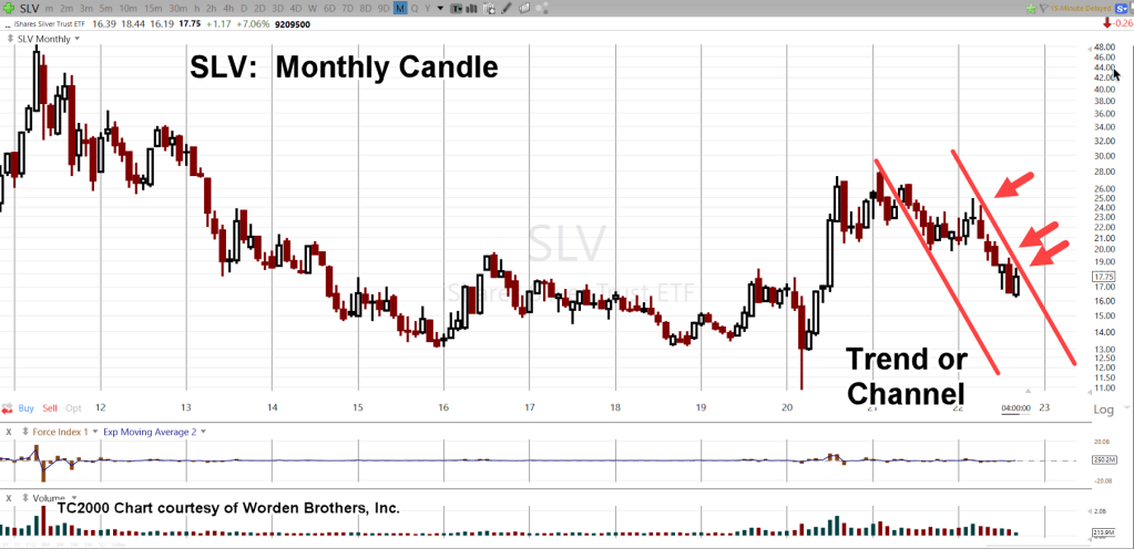
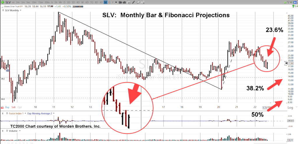
Silver (SLV), Monthly Close

The monthly chart shows the line to watch; the downtrend that started in late March of this year.

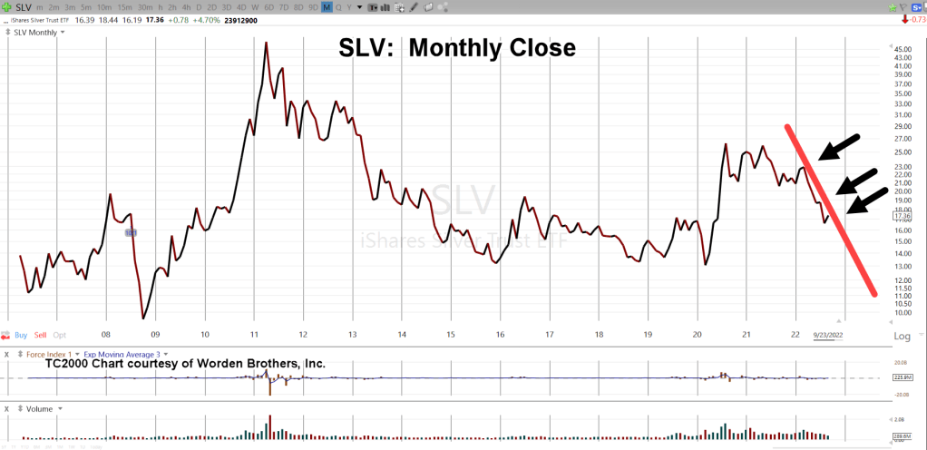
If SLV maintains its current rate of decline, it will be April of next year before we get to the support level shown below.

Pushing (and closing) below well-established multi-year support (orange line), is no easy task.

We would likely need to have some sort of catalyst to help price action get to those levels.

Once below support (‘Target Area’), SLV would then be in Wyckoff spring position.

Summary

As always, anything can happen; precious metals could rally starting at the futures open in a couple hours.

Price action itself, is the final arbiter.

Most ‘investors’ are not prepared for a long-sustained siege-grinding rachet lower, possibly to single digits.

If that happens, then will be the time to assess the potential for a significant long-term rally.

Stay Tuned

Charts by StockCharts

Note:  Posts on this site are for education purposes only.  They provide one firm’s insight on the markets.  Not investment advice.  See additional disclaimer here.

The Danger Point®, trade mark: No. 6,505,279

The Biotech Breakdown …

Massive Short Volume, Proves Correct

Short-side volume was the key.

The August 13th, update linked here, identified unprecedented volume posting on the short side.

It’s also interesting to note in the very same report, there’s a link to ‘bears capitulate’.

If there was actually some value to the financial press, this would be it; help provide contrary indicators.

So, here we are just over a month later and biotech SPBIO, appears to be in free fall.

Biotech SPBIO ($SPSIBI), Weekly Close

The prior update had this so say about positioning (not advice, not a recommendation):

“Figuratively speaking, everything’s been dropped to focus exclusively on this sector. It’s obvious, what’s going on at this juncture is unprecedented.”

From that August 13th update, the main account for my firm has increased the size of its short position (LABD-22-05), by approximately 34% (not advice, not a recommendation).

Summary

Unprecedented short-volume, points expectations to some kind of unprecedented bad news.

When the market goes south, bad news comes out.

Stay Tuned

Charts by StockCharts

Note:  Posts on this site are for education purposes only.  They provide one firm’s insight on the markets.  Not investment advice.  See additional disclaimer here.

The Danger Point®, trade mark: No. 6,505,279

No ‘Soft Landing’ or ‘Hard Landing’

There’s Only, ‘Collapse’

The ‘narratives’ are false.

There’s no ‘recovery’, no ‘soft landing’, no ‘hard landing’.

There’s no ‘housing boom’, no ‘inflation’, and maybe most of all, no (sustainable) ‘Electrical Vehicle’ market.

What there is …. is ‘collapse’.

Collapsing food supply, collapsing economy, collapsing real estate, collapsing employment and collapsing (electrical grid) infrastructure.

How do we know that?

The price action (the market) itself, says so.

Wyckoff, The Rest, and Gold

As stated in the last update, unlike other analysis methods, Wyckoff looks at what the market is saying about itself.

The market itself, defines the next likely course of action.

Two days ago, gold was used as the example.

Contrary to the ZeroHedge report linked in the prior update, Wyckoff analysis revealed the most probable direction for gold, was down.

The Gold (GLD) Market

The Fed announcement late Wednesday, resulted in a ‘blip’ higher for gold that stalled-out, the next day.

However, that announcement, may have confirmed a trend change in GLD.

Looking at the chart below, it’s possible that Wednesday identified a more aggressive trendline, lower.

Gold (GLD), Daily

It’s about an hour after the open.

This is how it looks for GLD.

The new trendline and trading channel are clear; trending lower at approximately -60%, annualized.

The next chart is a zoom of the pivot area.

If there ever was going to be a Fed ‘Pivot’, this was it. 🙂

The price increases being touted as ‘inflation’ are clearly the result of supply destruction.

You can’t have 90+ ‘food processing plant fires’ in the past year or so and not have it affect prices at the supermarket.

Same goes for crop failures or lack of harvest world-wide.

Summary

As always, anything can happen. Gold could reverse and mount some kind of rally.

If somehow, there’s a change of demand, it will show up on the tape (the chart) as a change of character.

So far, there is none.

Most likely direction remains to lower levels.

Parting Shot

Just to illustrate the point of ‘collapse’, we’ll leave off with this recent report from Scott Walters.

The real estate example shown is the River Oaks area of Houston … Highly affluent.

There’s no debate.

It’s a collapse, when a house has to drop $20 million, from $26.5-mil to $6.5-mil, and Still Not Sell!

Stay Tuned

Charts by StockCharts

Note:  Posts on this site are for education purposes only.  They provide one firm’s insight on the markets.  Not investment advice.  See additional disclaimer here.

The Danger Point®, trade mark: No. 6,505,279

‘Tipping Point’ For Gold ?

“Sentiment Is Negative” … So What?

No sooner had the bearish report on silver been released, than we have a bullish report on gold at ZeroHedge; linked here.

We’re going to address the bullish view briefly but succinctly, with the weekly chart of gold (GLD) below … but first.

When ‘Sentiment’ Works

One little trading nugget that took about 25-years to find out (your mileage may vary), was that in a sustained up or downtrend, sentiment is largely, irrelevant.

In the ZeroHedge report linked above, the ‘little guy’ (i.e. sentiment) is bearish or negative. We all know the little guy is nearly always wrong.

Not to worry.

If gold and silver move decidedly lower from here, our ‘little guy’ will think he’s a genius.

He’ll begin (or continue) to post all kinds of philosophical memes on twitter and Facebook; then set himself up for the big whammy farther down the road. 🙂

The pros will get their money no doubt; they’re patient.

Now, on to the weekly chart for gold (GLD).

Gold (GLD), Weekly Close

We’ve already discussed how penetrating support will put gold (GLD) in Wyckoff spring position.

It’s clear we are there now.

As it says in the chart, support penetration was preceded by a very weak bounce.

The difference between Wyckoff analysis and others is that Wyckoff focuses on what the market’s saying about itself.

At this juncture, price action to the upside (the bounce) is weak; suggesting that momentum remains to lower levels.

The following chart is a zoom of that bounce area.

Summary

This update’s several hours before the 2:00 p.m., EST, Fed announcement … likely to be a non-event, anyway.

Nonetheless, if there’s a significant change in price action, we’ll review it at that time.

Stay Tuned

Charts by StockCharts

Note:  Posts on this site are for education purposes only.  They provide one firm’s insight on the markets.  Not investment advice.  See additional disclaimer here.

The Danger Point®, trade mark: No. 6,505,279

Trading A Silver Collapse: Part 2

No One Expects The Bulls To Fail

How can the bulls fail with all the ‘money printing’ and rampant fiscal irresponsibility?

It’s a sure thing … a slam dunk.

That is, until it’s not.

The day for silver and gold to start a sustained rally, was yesterday.

Yesterday, both GLD and SLV closed slightly higher and left the window open for a follow-on move upward.

It didn’t happen.

However, neither index has posted a new weekly low; that leaves an ever so miniscule chance, price action could mount a rally.

At this juncture, it’s still possible we’re in a move up to the SLV 19.50-area; that appears to be low probability based on the monthly chart of SLV, below.

Trading Vehicles

Other than owning the physical metal (discussed in the last post), the most common trading vehicles are Futures, ETFs and Leveraged ETFs.

Of those vehicles, futures contracts and especially the micro-contracts, are illiquid.

The futures market for silver is thin; that makes getting impaled by a low-liquidity spike a very real possibility.

For the purposes of trading an extended or sharp decline, the vehicles of choice (for my accounts) will be leveraged ETFs (AGQ, ZSL) and the physical.

Follow The Money

Depending on how you look at the monthly chart of SLV, price action’s either following a down-trend for the past seven months or has been in a trading channel for the past 17-months.

Zoom Chart

Summary & Strategy

It’s generally agreed, having some amount of precious metals is a good idea.

What’s being presented here and potentially on a go-forward basis, is strategy to position for windfall profits (or to acquire physical) during a mass-psychosis event; where it looks like (albeit temporally) precious metals and specifically silver may be of no value.

We’ve already seen over the past two years, how a wide swath of the public can be easily manipulated. Why not manipulate them to think they need (or will be forced) to dump precious metals?

Next Update

We’ll discuss how precious metals could be heading for a sustained or sharp decline, Fed announcement notwithstanding.

Stay Tuned

Charts by StockCharts

Note:  Posts on this site are for education purposes only.  They provide one firm’s insight on the markets.  Not investment advice.  See additional disclaimer here.

The Danger Point®, trade mark: No. 6,505,279

Trading A Silver Collapse

No One Expects The ‘Spanish Inquisition

No one expects the Spanish Inquisition like no one expects a collapse in silver.

From a contrarian standpoint, just because it’s not expected does not in itself, mean it’s going to happen.

However, this site’s been building a strategic premise for years, food supplies come first then precious metals (not advice, not a recommendation).

Here are links that span over two-years; successively building on the case, we’re (potentially) in a ‘Genesis 41‘ situation first more than a Wimar Republic event.

Corn Flattened

“Ten percent of the U.S corn crop was instantly wiped out last week during what’s described as an inland hurricane.”

‘Stacking’ … Strategic Error ?

“As we continue on, it’s becoming clear that single-mindedly stockpiling inedible metal in hopes of surviving what’s here now, and what’s coming, is a major (if not potentially fatal) blunder”.

Putin’s Gold … Paradigm, Not

Gold has never been the same since the Derecho of 2020.

In fact, that was the pivot point for both gold and corn which are now, inversely correlated.”

Corn Train Wreck, Continues

“The food supply is, and is going to be destroyed; one way or another.”

… And This, Just Out

As if to drive that last bullet item home, we have:

Turkey Shortage This Fall? | “Bird Flu”

The ‘Right Side’ of The Trade

Being on the right side of the trade means by definition (nearly) everyone else, is on the wrong side.

The last report said that both silver and gold are at The Danger Point®; The location where risk is least for positioning either long or short (not advice not a recommendation).

Based on prior analysis, the expectation is for a continued decline in the precious metals.

Silver Trading ‘Vehicles’

There are many ways to work the silver market.

Several trading vehicles are silver futures (mini futures), silver ETFs, options on ETFs, leveraged bull and bear ETFs and lastly, the physical metal itself.

As of this date (9/18/22), quotes for a typical bag of ‘junk silver’ are below:

SD Bullion

$100 Face Value Bag: $2,006.44

Apmex

$100 Face Value Bag: $2,064.92

Kitco

$100 Face Value Bag: “Out of stock”

This is not an endorsement. The purpose here is to have ‘place-holder’ quote(s) going forward.

Summary

The post is already lengthy.

Next up on the ‘Silver Collapse’, we’ll discuss the other trading vehicles; futures, options, ETFs and leveraged ETFs.

Stay Tuned

Charts by StockCharts

Note:  Posts on this site are for education purposes only.  They provide one firm’s insight on the markets.  Not investment advice.  See additional disclaimer here.

The Danger Point®, trade mark: No. 6,505,279

Silver … Cue The Hype

What If Europe Abandons ‘Green Energy?’

The ‘Texas Freeze‘ laid bare the farce that is ‘renewable’ energy.

Will this coming winter do the same for Europe?

Like a limpet on an ocean liner, the ‘silver squeeze’ idea won’t go away.

Here we have yet another report; linked here.

The data in the report’s not in dispute. If that data is to be believed (no reason not to), silver stockpiles are shrinking.

Even so, the major trend-change (down) in silver was identified way back in February of 2021; reports are linked here and here.

The second report stated silver had ‘changed hands’ from strong to weak.

It’s been nearly 20 months since then; silver remains below that February 1st, 2021, level and is down -35.7%, as of Friday’s close.

I like silver as much as the next guy but what we’re discussing here, is strategy.

Silver To Single Digits?

Is that even possible?

Well, was oil going negative possible?

Not until it happened.

The monthly chart of SLV below, has a standard Fibonacci projection shown. Note how at 23.6%, the projection shows price action tapped and reversed down.

Next up is 38.2% at around 13.75, and then 50%, below the 10-area.

Silver SLV, Monthly Chart

Zoom version

And then, a trading channel.

Both silver and gold, are at The Danger Point.

Gold has pushed below support and is currently in Wyckoff spring position.

Silver is below the 20-area, which is established support.

If a rally is in the cards, this is the place to start.

A failure to move decisively higher at this point signals the potential for much lower prices ahead.

Summary

The next update will discuss various tactics that could be used if/when there’s a major downdraft.

Stay Tuned

Charts by StockCharts

Note:  Posts on this site are for education purposes only.  They provide one firm’s insight on the markets.  Not investment advice.  See additional disclaimer here.

The Danger Point®, trade mark: No. 6,505,279

Gold Penetrates Support

The ‘Inflation’ Narrative Is False

How do we know the ‘narrative’ is false?

Because the price action tells us at this juncture, we’re in some kind of ‘deflation’ impulse.

Taking it a step further, what happens if we don’t get the much assumed ‘hyperinflation’.

What if something else is afoot?

Remember, a Black Swan can also be an upcoming event that’s widely accepted as fact but does not happen.

Now, to the ‘inflation’ indicator itself: Gold

Gold (GLD) Weekly Close

The downside penetration is clear.

GLD, is at The Danger Point.

If we really do have inflation and gold’s going to launch much higher, the last report stated, penetrating support and setting up a Wyckoff ‘spring’ condition would be a good place to start.

So, here we are.

As this post is being created, GLD is rebounding higher by about +0.50%.

This is normal market behavior.

However, the next chart says gold’s likely to have a hard time moving decisively higher.

On a weekly close basis, gold’s in a confirmed downward channel.

It’s going to take a lot of demand to break out of that trend.

Summary

So, far, the attitude of the ‘average investor’ to gold’s decline is “Good, I’ll just buy more.”

Six months or a year from now, when food supplies have run out or become so expensive, only ‘zee bugs’ will be reasonably priced, one has to wonder if we’ll all have the same attitude.

Stay Tuned

Charts by StockCharts

Note:  Posts on this site are for education purposes only.  They provide one firm’s insight on the markets.  Not investment advice.  See additional disclaimer here.

The Danger Point®, trade mark: No. 6,505,279

There is no ‘Spoon’

Paradigm Shifts

We’re living in the surreal.

Only those who can ‘see’, understand it’s like something out of The Matrix.

The old paradigms no longer apply.

There is no ‘Pivot’

There never was a ‘pivot’; just like there never was a goal of 2% inflation, or full employment.

Way back in 1921, Jesse Livermore pegged it when he told Wyckoff, the whole premise of Wall Street, was to spread “deception”.

Deception is the key.

Attempting to figure out the next earnings release, the CPI or employment numbers, inflation, or what the Fed is likely to do, is to buy into the deception.

Following that deception, is the path of the amateur.

Meanwhile, back on the professional side; as early as 1909, Wyckoff discovered market prices move based on an energy and objective or their own … completely removed from any fundamentals.

A few days ago, this update, discussed how biotech SPBIO, was potentially at a pivot point and ready to reverse lower.

Well, downside reversal is what we have.

Biotech SPBIO, Weekly Close

Even though we still have three trading days left, SPBIO, appears to be confirming the right-side trading channel.

Last Week.

And … this week

With the overall markets down sharply, events appear to be set in motion to continue downside action.

Summary:

As stated in prior updates, the current trade; LABD-22-05, was initiated in anticipation of a significant break lower (not advice, not a recommendation).

On the biotech fundamentals side (not that it matters), the wheels have come off.

The top weighted equities have no P/E … a decent conclusion may be the lower weightings don’t either.

Nobody’s making any money; rates are rising and we’re heading straight into an economic depression.

Stay Tuned

Charts by StockCharts

Note:  Posts on this site are for education purposes only.  They provide one firm’s insight on the markets.  Not investment advice.  See additional disclaimer here.

The Danger Point®, trade mark: No. 6,505,279

Gold … Ready To Move

Up or Down ?

Before we get started, no analysis would be complete without the latest mega bull forecasts for gold.

Here they are:

“Everyone Is WRONG About This Cycle” – Peter Schiff

Well, ok. I only have one bullish report.

Since it’s from Schiff, do we really need more? 🙂

Remember, back when it was the Russians that were going to move gold higher? You really can’t make this stuff up.

So, let’s move on and take a look at the truth … the price action for gold (GLD).

Gold (GLD), Daily Close

The un-marked daily chart shows about three-years of price action.

The next chart shows the ‘Changing of Hands’ that was first identified over four months ago in this post.

Also shown is the current (channel) trendline that appears to be in effect; GLD, is ‘respecting’ the line.

The left side channel line is grey in color so that multiple hits are shown more clearly.

However, the next chart is where it gets interesting.

If or when GLD penetrates support, it would by definition be set-up in Wyckoff ‘spring position’.

If GLD, was going to launch to new all-time highs, getting itself into ‘spring position’ would be an excellent place to start the move.

If and when there’s penetration of support, one thing to watch closely is the volume.

Would it be another high volume ‘changing of hands’ (for the upside) or a low volume affair that grinds on down.

Summary

From a fundamental standpoint, where’s the money going to come from to increase the demand for gold?

We’re already at the front end of (very likely) the largest real estate crash in U.S. history.

The consumer’s tapped out with record high credit card debt; mass layoffs have already started.

Bankruptcies in some areas are up over 100% from last year. Bankruptcy means ‘liquidation’ and that includes any precious metals.

Anything can happen and gold could rally.

However, the backdrop of demand destruction and asset collapse, suggest the direction for gold continues to be to lower levels.

Stay Tuned

Charts by StockCharts

Note:  Posts on this site are for education purposes only.  They provide one firm’s insight on the markets.  Not investment advice.  See additional disclaimer here.

The Danger Point®, trade mark: No. 6,505,279