Note: Posts on this site are for education purposes only. They provide one firm’s insight on the markets. Not investment advice. See additional disclaimer here.
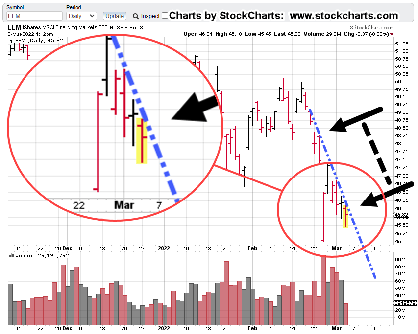
A new daily low for EEM, Emerging Markets, confirms the trend-line, outlined below.
Looking at the components of EEM, has it essentially a Taiwan Semi (TSM), and Tencent Holdings trade.
Taiwan Semi, topped-out mid-January, this year and has declined nearly – 25%, since its high.
Looking at the weekly chart of TSM (not shown), has it currently hovering right at support levels … possibly giving price action a positive bias.
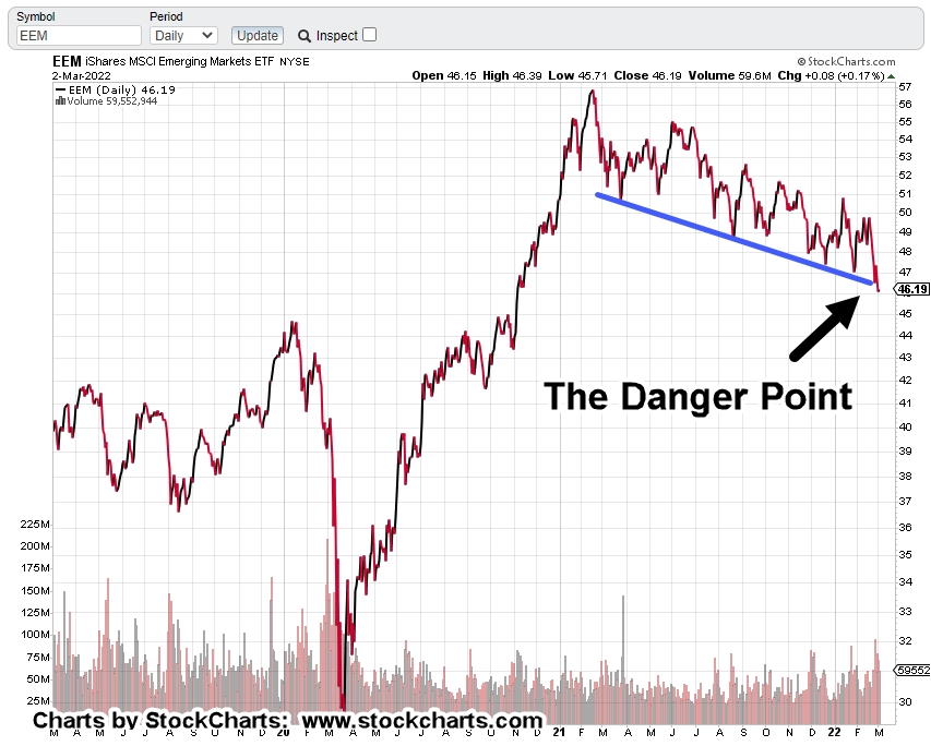
Even though today’s action confirms the trend, we’re still at the danger point; just a little bit of a shove either way, can cause EEM to bounce higher or collapse.
EEM Daily Chart
At least six trend hits above, provide confirmation.
We’re about midway through today’s session and price could still make a recovery.
However, momentum indicators (MACD) on three time-frames are all pointing down: Monthly, Weekly and Daily, thus tilting probability for lower action.
The chart below zooms-in on the trend-line hits.
The low(s) of the wide bar from February 24th, are likely to provide some amount of support.
If price action continues its decline, expect some amount of hesitation or indecision in this area.
Summary:
It’s about two hours before the close and anything can happen.
Trendline contact(s) and momentum indicators all show probabilities favor the downside.
Similar to yesterday, U.S. markets are mixed-to-higher (but with those gains eroding) while Emerging Markets, EEM continues to show weakness.
Note: Posts on this site are for education purposes only. They provide one firm’s insight on the markets. Not investment advice. See additional disclaimer here.
Note: Posts on this site are for education purposes only. They provide one firm’s insight on the markets. Not investment advice. See additional disclaimer here.
We’re at a juncture with gold and the market itself, determines the next trading move.
From the chart of the Junior Miners, GDXJ, below, it shows a now obvious upside reversal from a spring condition.
That is, when price action penetrated weekly lows at the end of January, it set up possibilities for reversal.
Junior Miners, GDXJ, Weekly
In what should be a very familiar looking set-up, we can see GDXJ, is heading for a potential up-thrust condition (magenta oval).
As a reminder, this is what the daily gold (GLD) chart looked like back in September last year, before a similar (downside) reversal:
The resistance line is there, the wide (high volume) bar, everything.
Gold To New Highs ?
For the GDXJ set-up to come about, it would make sense that gold would head higher.
As stated, we’re already at the 1:1, measured-move, a-b-c, level.
It’s important to note, that level (GLD, 182.60) has not been breached. Today’s action could have been a test of the highs in anticipation of downside reversal.
However, there’s a Fibonacci projection slightly higher to the GLD 196, area … just above the all time high of 194.45, set way back in mid-August of 2020.
Summary:
At this juncture, all short positions have been closed (not advice, not a recommendation).
It’s obvious world (and market) events are moving rapidly; the above analysis could be negated at the very next session.
Even so, it still provides a framework of what to expect should gold continue on to new highs … including the next target location, GLD 196.
Note: Posts on this site are for education purposes only. They provide one firm’s insight on the markets. Not investment advice. See additional disclaimer here.
Note: Posts on this site are for education purposes only. They provide one firm’s insight on the markets. Not investment advice. See additional disclaimer here.
Note: Posts on this site are for education purposes only. They provide one firm’s insight on the markets. Not investment advice. See additional disclaimer here.
It all lined up for gold in the form of international tensions, military on the move, then outright invasion.
The ‘safe haven’ metal of course, launched higher.
It’s what happened next that’s the important part.
Steadfast on this site, is the premise, It’s not inflation … at least not the kind in the form of credit creation with persistent rising wages and prices.
The charts themselves show the retrace from the lows of March 8th, 2021, to now (today), is a counter trend move.
Unless today’s reversal bar is penetrated to the up-side, the main trend is either sideways or down.
Gold (GLD) Weekly:
Re-stating again, Elliott Wave is not used as the main analysis tool.
However, it can’t be denied that GLD, looks as if it just completed an ‘a-b-c’ correction with both ‘a’ and ‘c’ waves of equal length (vertical blue lines are equal).
It’s a near textbook example.
Adding to the potential reversal case is the up-thrust position as shown.
For the bearish assessment to change to bullish … this resistance area will need to be penetrated and successfully tested.
Anything can happen … so we’ll see what happens next.
Enter, The Famine
Here is a link that only requires the first 50-seconds of one’s time. The presenter is an offensive character to say the least.
However, this site searches out as many sources as possible; sifting through the trash to find kernels of truth is a necessary requirement.
With that said, restricting the food supply results in a compliant population.
That’s most likely the next area(s) of focus for our benevolent controlling oligarchs.
Summary:
This is gold’s chance for a continued breakout to the upside if it’s really a bull market.
If it fails and reverses, we know the main trend is down and potentially leading to some kind of deflationary impulse.
Note: Posts on this site are for education purposes only. They provide one firm’s insight on the markets. Not investment advice. See additional disclaimer here.
Note: Posts on this site are for education purposes only. They provide one firm’s insight on the markets. Not investment advice. See additional disclaimer here.
Gold (GLD) has pushed past prior resistance and is now hovering at the 177.00 – 177.50 level.
International tensions are the usual excuse for the metal’s move but has it really done anything out of its recent norm?
This is a good time to see what the gold market is saying about itself.
Gold (GLD) Daily Chart
We’re going to use a somewhat compressed version of GLD. The reason for that will become apparent.
Starting with the un-marked daily chart below:
First is the obvious Wyckoff up-thrust (potential reversal) condition.
Price action has pushed past resistance and is now hovering at the 177.50, area … as if unsure what to do next.
GLD can come back and test on its way higher; it can come back, test and fail into a downside reversal.
The next chart is where it gets depressing for the bulls.
Price action in GLD, shows the current rally’s distance, is no different than it’s been for at least the past year.
We’ve highlighted the most recent move in blue and then moved that same line back to prior moves of nearly the exact same distance (magenta lines).
So, gold’s not doing anything out of the norm (so far) that it hasn’t done already.
Note how the entire twelve months shows price action as choppy and over-lapping.
This type of deep retracement action is characteristic of a countertrend move … that is, gold moving higher in choppy action is actually counter to its main trend … down.
Summary
With the dollar moving higher and the continued possibility of gold/dollar inverse correlation, somebody’s likely to reverse … soon.
The dollar’s been in a year-plus long upside reversal. The weight’s on the gold bulls to prove the dollar/gold inverse correlation is disconnecting.
Note: Posts on this site are for education purposes only. They provide one firm’s insight on the markets. Not investment advice. See additional disclaimer here.
A massive four-year top, along with the latest ‘road-map‘, has this one going down; most likely, for good.
While other chip makers, have gone to near stratospheric levels such as Nvidia, with its 23,960% gain from 2009, lows, Intel has languished.
The rest of the markets, S&P, Dow, QQQs, have pushed on higher while INTC, has spent the last four years, in a trading range.
A sideways market is a bear market.
Intel never recovered its luster after the Dot-Com mania of the 2000s. Price action spent eight years heading sideways-to-down before bottoming out in early 2009.
After that, it’s been a long struggle to current levels.
Now, the markets have reversed and the economy’s collapsing. We’ve likely seen market highs that won’t be repeated in the lifetimes of anyone reading.
Friday’s announcement may be the kick-off for sustained price action to the downside.
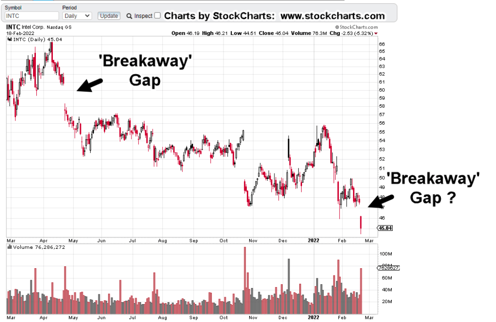
INTC, Chart Analysis
The daily chart shows at least one breakaway gap and possibly two.
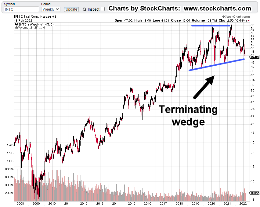
The next chart is on the weekly timeframe and identifies the long, multi-year, topping pattern.
When looking at these patterns, be reminded about the scale of what’s happening.
This wedge is massive … at least four years in the making.
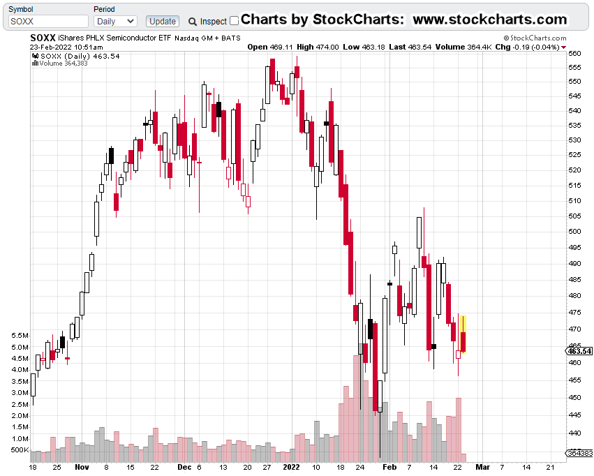
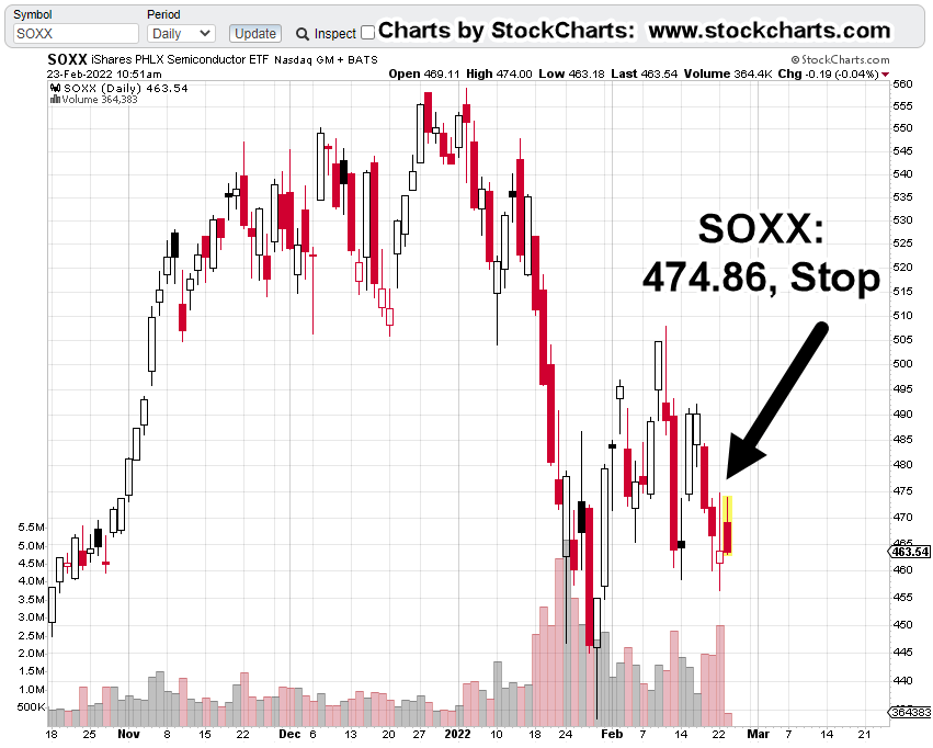
Note: Price action finished the day right at the lower support. There could be a rebound on Tuesday (market’s closed Monday) or we could just keep going lower.
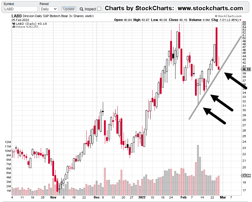
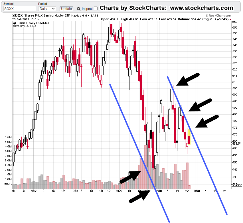
The SOXX Connection
Intel’s fifth in market cap of the SOXX, with Taiwan Semiconductor (TSM) at the top of the list.
Even the leader TSM, may not be immune to trouble.
Here are Fab locations for Taiwan Semi, located just off the coast of mainland China … nothing bad going to happen there, right?
In the case of the ‘wave’ analysis, if it proves correct, we’re possibly in for a sustained ride lower.
The daily chart of SOXX, shows each analysis point where a reversal lower was projected.
It’s clear from the chart and documented links, both methods nailed it … to the day.
Elliott was earliest and caught the exact point of inflection.
Wyckoff caught the test of the up-thrust.
Here’s the important part:
Wyckoff is a practical, bread and butter method. It looks at what the market’s saying about itself … is price action showing pressure to the upside or down?
Elliott Wave looks at where the market could be or is going.
If we’re really in an Elliott Wave Three down, it’s likely to be a decline like no other.
There are other indicators not market related, giving us hints, a massive collapse is ahead.
A Decline of ‘Biblical’ Proportions
Warning:
The following contains scriptural references.
Those who are in ‘it’s all a myth and fairy tales’ crowd, feel free to scroll to the ‘Summary‘.
For the rest of us, the secular world calls it ‘systems collapse’. The spiritual world calls it ‘judgement’.
Stated many times on this site, ‘the church’ is corrupt. Here’s just the latest salvo proving that point.
Along with the corruption, we now have the strong delusions prophesied over 2,000 years ago.
In reference to a Stew Peters broadcast, linked here, on the numerous media lies, is this comment (emphasis added):
“The only people to blame for this Stew are the ones who put on the mask, who distanced, who took the shot, who harassed other people and who advocated for my freedoms being taken away. Without doing five minutes of research.”
It’s not too much of a stretch to say, those who voluntarily injected themselves were (or are) in a place of delusion.
“And for this cause God shall send them strong delusion, that they should believe a lie:”
However, the injections are no lie … but the reasons for those injections are false.
Can this (spiritual assessment) really connect with what’s happening in the markets? How does it relate to actual price action?
Obviously, it can’t and shouldn’t be said that any specific price movement has been prophesied.
However, we can use the scriptural references to point us to the probability of events; the big picture, the situation at hand, the signs of the times.
The probability that we’re at some kind of major inflection point of Biblical proportions, seems exceedingly high.
Summary
Both Elliott Wave and Wyckoff Analysis, support the probability of lower prices ahead for the SOXX.
Because Intel (INTC) has been a laggard in the sector for years, suggests it may be one of the downside leaders.
As if to confirm the assessment we’re past the pivot, that generational highs have been reached, we have this just out, on ZeroHedge.
At the very bottom of the article, is a quote.
No, they’re not quoting from the King James Bible of 1611; they’re quoting from Shakespeare’s Richard III, of 1594.
Note: Posts on this site are for education purposes only. They provide one firm’s insight on the markets. Not investment advice. See additional disclaimer here.