Same Target, Different Method

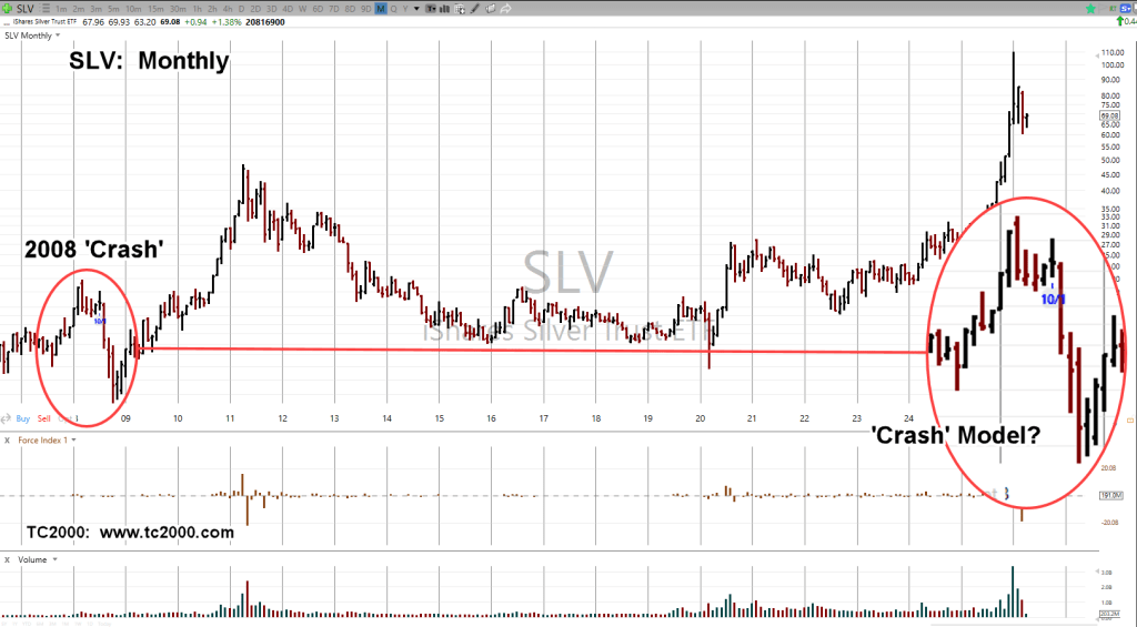
The last update on Silver (SLV) was back in April, link here.
This past week’s action had SLV, breaking down from a wedge, targeting a measured move (not advice, not a recommendation).
The April link above, contained the prior ’08 meltdown scenario as an example, targeting a 60% decline; 43 – 44 area (not advice, not a recommendation).
Now, the wedge formation, targets ~46 (not advice, not a recommendation).
Silver ETF SLV, Weekly
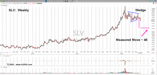
We can see the breakout to the downside.
However, we’re near support levels; penetrating those would technically put SLV in Wyckoff ‘spring’ position.
That would imply some upside testing before continuing lower (not advice not a recommendation).
Stay Tuned
Charts by StockCharts
Note: Posts on this site are for education purposes only. They provide one firm’s insight on the markets. Not investment advice. See additional disclaimer here.
The Danger Point®, trade mark: No. 6,505,279