Exxon’s is one of the large-caps in the Oil & Gas sector ETF, XOP.
The potential for (downside) reversal in XOP, first presented here.
As part of the prep work to position short, the question was whether to short XOP, or one of the big caps.
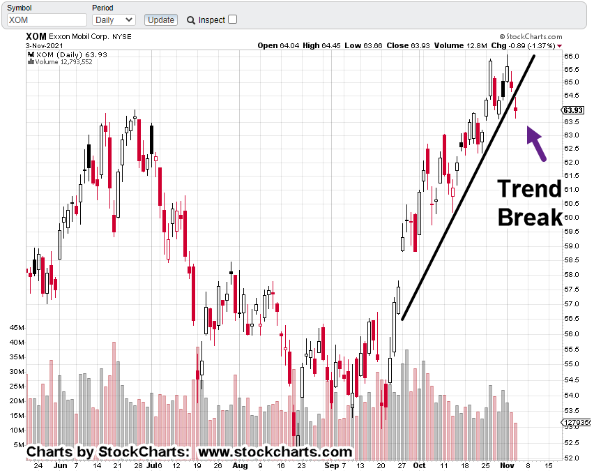
As you can be seen, since XOM-25-01, is in the sidebar, we’ve gone short Exxon during yesterday’s session (not advice, not a recommendation).
As the chart shows, there was a small gap lower yesterday, presenting the risk that it would be filled before action continued lower.
That might still happen.
However, with XOM down 1.83 pts., in the pre-market (as of 9:12 a.m., EST), upside probabilities have lessened.
Exxon XOM, Daily
We have what appears to be, a picture-perfect Wyckoff up-thrust, and reversal.
If yesterday’s gap-lower open is not filled, then it’s a ‘breakaway’ gap, indicating (probability for) much lower prices ahead (not advice, not a recommendation).
Note: Posts on this site are for education purposes only. They provide one firm’s insight on the markets. Not investment advice. See additional disclaimer here.
Nemont Mining (NEM), Gold, and the Oil & Gas Sector are at a critical juncture.
The rest of the major indices, Dow, S&P, QQQs, real estate (IYR), and so on, are in a similar position.
For this update, we’ll focus on Newmont (NEM), as it’s the largest cap in the Senior Mining Sector GDX, and a general representative of the commodities markets.
Financial collapse is a process, not an event.
Newmont topped-out in April, of last year. Exxon, the proxy for the Oil & Gas sector, may have reached its highs this past November.
Where’s The Inflation?
As Michael Cowan has just reported, banks are absconding with depositor’s money under the guise of ‘bail-in’.
If the fiat cash is so worthless, why are banks seizing it?
As Robert Prechter Jr., said years ago, ‘all fiat cash ultimately goes to zero’; the end game (most likely) for the dollar. However, it could be months, years, or even a decade before that happens.
For right now, today, this minute, the data is showing us, the banks want the money; ‘Show me the money‘.
With that, let’s look at the non-existent ‘inflation’ in the mining sector.
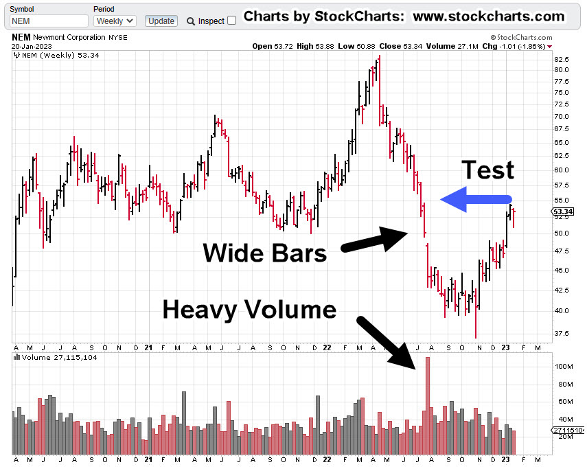
Newmont Mining NEM, Weekly
The first chart identifies the heavy volume and then test of wide price bars. This behavior is common in the markets; they tend to come back and test wide high-volume areas.
Next, we see there’s a terminating wedge developing as volume declines; the inference, is lack of significant commitment at these price levels.
We’ll get close-in on the wedge; last week printed a lower weekly low and closed lower for the week.
There’s no breakdown of the wedge … yet.
At this juncture, it’s up to the bulls to show they’re still in control.
Inflation vs. Scarcity
We have without a doubt, the effects of the event from the past three years gaining momentum. Whether or not those effects reach a peak this year, is unknown.
A lot of the mainstream and YouTuber’s alike talk about the upward move in gold as the result of ‘inflation’.
Here’s a little bit of insight you’ll not find anywhere else; how about gold rising because the above mentioned ‘effects‘ are causing production volumes to decline?
Maybe it’s because of scarcity (along with nearly everything else) that’s causing the increase in price.
Just to drive that idea home, the latest total gold production numbers, listed here.
Gold production for 2020 dropped -8.2%, from the year prior. Year 2021 was down -1%, from 2020.
From 2010 to 1019, gold production increased or was flat year over year … that is, until 2020.
Note: Posts on this site are for education purposes only. They provide one firm’s insight on the markets. Not investment advice. See additional disclaimer here.
First, we’ll review oil; tomorrow, we’ll look at gold.
From an intuitive standpoint, you can almost feel it.
The oil and gas sector has launched to unsustainable highs.
Behemoths like Exxon (XOM) with its 63,000 employees have gone from below $30/share to above $110/share, an increase over 280%, in just two years.
In the history of the equity, going all the way back to 1984, that’s never happened.
Even in 1987, before the crash, XOM was up for the two-year period, a paltry 108%, by comparison.
Now, data is coming in nearly by the day about collapsing demand, layoffs accelerating, and inventories piling up.
The latest from Steven Van Metre, at time stamp 4:25, discusses just how fast the downdraft is, and will be.
Important Note:
Before we leave the Van Metre link above, at time stamp 8:50, the assertion is made of what the Fed will do when slower growth data comes in. i.e., interest rates will be halted or lowered.
Nassim Talib called this kind of thinking “Normalcy Bias”.
The opinion of this site is, it’s a trap. Thinking what happened last time, will happen this time.
Let’s mentally bookmark this post and come back six-months from now to see what happened.
We’re in uncharted territory and other agendas are at work.
Like ‘bread and circuses’, the ‘pivot’ discussion is a distraction … keeping the proletariat placated.
Demand Collapse
We’ve got demand collapsing on a daily basis right in front of our faces and yet, it’s a big mystery (to some).
What’s not known, is how the general population will react to undeniable truth when it finally hits, en masse.
We have a good hint of what’s in store as reported by Jerimiah Babe during the first minute of this report.
Moving on to the Oil & Gas Sector.
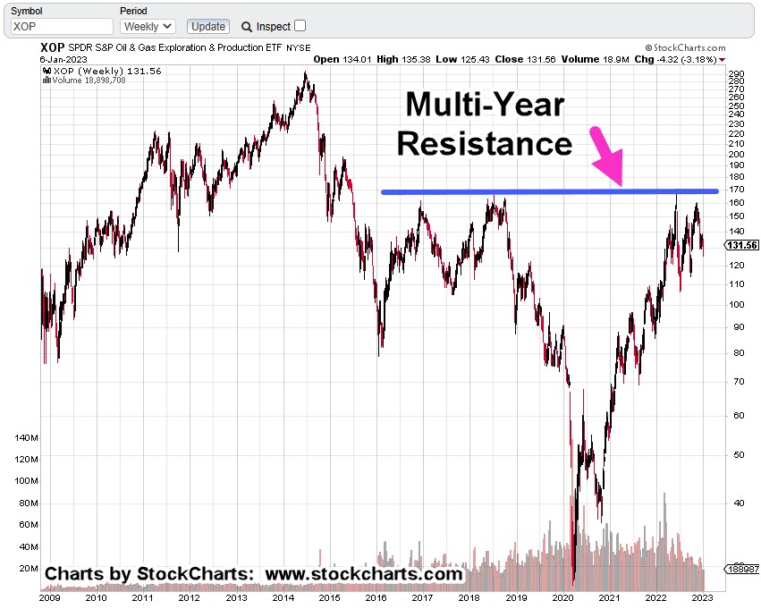
Oil & Gas XOP, Weekly
The weekly chart shows the multi-year resistance area that was tested (and rejected) back in mid-June, last year.
The next chart shows we also have a terminating wedge.
Price action has come back to the lower boundary; suggesting a breakdown is a probability.
If we get a breakdown, measured move support is identified at approximately -47%, below current levels.
Strategy & Trading
Obviously, the charts paint a bearish picture.
Over the past week, XOP was covered here and here.
The first link discussed how price action was very close to making a new daily high. That happened the next session (Friday) and indeed, it had Wyckoff ‘spring’ characteristics.
Price action moved higher and closed higher for the day, but it did not post a new weekly high … keeping the bearish case on the table.
A popular leveraged inverse fund is DRIP (not advice, not a recommendation).
At The Close
As this post comes to a close, a quick check on ZeroHedge turns up this: ‘Tipping Point‘
We’ve jumped over ‘recession’ and have gone straight into crisis and depression.
Note: Posts on this site are for education purposes only. They provide one firm’s insight on the markets. Not investment advice. See additional disclaimer here.
XOM’s the largest cap in the sector. We’ll use it as the proxy.
Last update has us exiting a short via DUG (not advice, not a recommendation) and standing aside for now.
It’s no secret the overall markets are insane … possibly in some kind of massive blow-off, FOMO top.
At the same time, they look like they’re ‘thinning-out’; that is, only a few are participating in the upward launch.
It’s a bearish warning
Thinning-out, tends to happen at the end or near the end of bull markets.
Looking For The Short
The big money’s made on the downside with down moves being two or three times faster.
The Daily closing chart of XOM above shows it’ still grinding itself higher.
Trend lines below say the upside may be reaching a limit:
If we zoom-in, it looks like there’s significant resistance at the 69 – 70 area for XOM … if it gets that far.
Looking For The News
With the current instabilities, world events, food supply, energy supply, earthquakes, volcanoes, we could get some kind of upset to launch the oil sector higher.
It may not happen.
If it does, that could be the time to re-enter short (not advice, not a recommendation).
Note: Posts on this site are for education purposes only. They provide one firm’s insight on the markets. Not investment advice. See additional disclaimer here.
Trouble for Moderna was spotted a while back and discussed in this post … along with a prediction that class-action may be forthcoming.
Our stopwatch is still ticking.
Positions
The account positions are short Oil & Gas XOP, using DUG as the vehicle (not advice, not a recommendation).
So far, its been a lot of banging around without much progress either way. However, at this point, a new low for DUG, below today’s low would signal trouble for the short side.
Stay Tuned
Note: Posts on this site are for education purposes only. They provide one firm’s insight on the markets. Not investment advice. See additional disclaimer here.
Note: Posts on this site are for education purposes only. They provide one firm’s insight on the markets. Not investment advice. See additional disclaimer here.