Record Extreme

One report covering the historic narrowing of the market is here.
Never before seen narrow breadth: What does it mean?
It means the market’s ‘keeping up appearances’ while the foundation’s been removed.
That way, the professionals can get out the door; sell or sell-short, funnel capital to the only three tickers left (AAPL, AMZN, MSFT), while the public looks at the SPY, and says ‘Where’s the collapse?’
Let the crowd focus on the S&P … probably the most computer controlled, AI driven, Machiavellian manipulated market in the world … but hey, I’ve got my i-phone trading app and I’m going to ‘Put it to the man’.
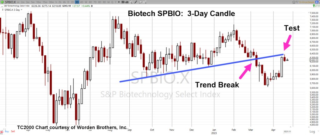
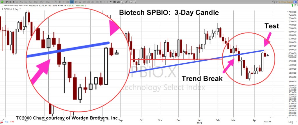
Meanwhile, downside leader biotech, inches lower.
Biotech SPBIO, Daily
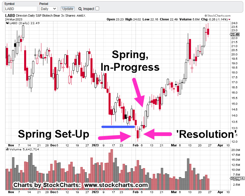
Let’s review where we are with SPBIO, with the full understanding that anything can happen.
For now, we’re heading lower (not advice, not a recommendation).

It’s obvious. Biotech’s following a Fibonacci time sequence.
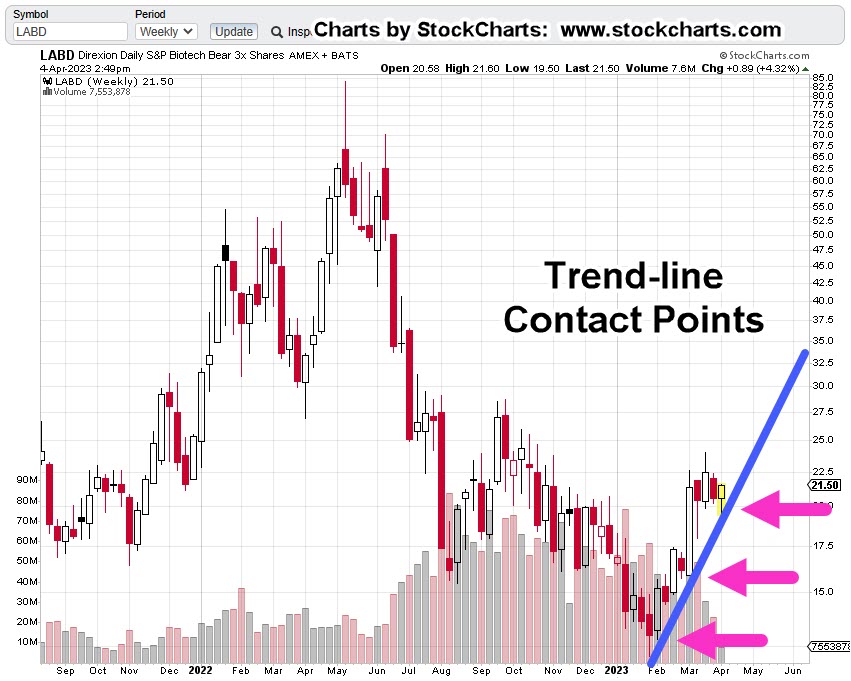
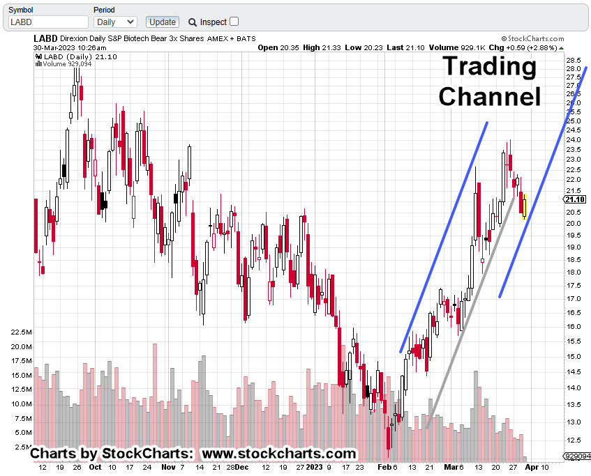
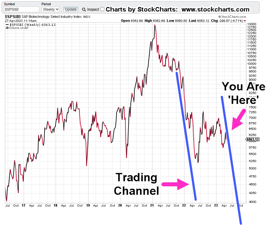
Let’s pull out to the larger weekly chart and see something really scary.
Biotech SPBIO, Weekly Close
If we really are at the right side of the trading channel, it’s not looking good for the bulls.
Of course, it all makes sense.
The market’s at record breadth divergence. Banks are collapsing, Ukraine (fabricated, or not) coupled with trade wars, the consumer’s tapped-out (credit at maximum) and on it goes.
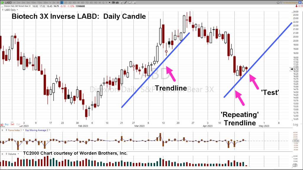
Positioning
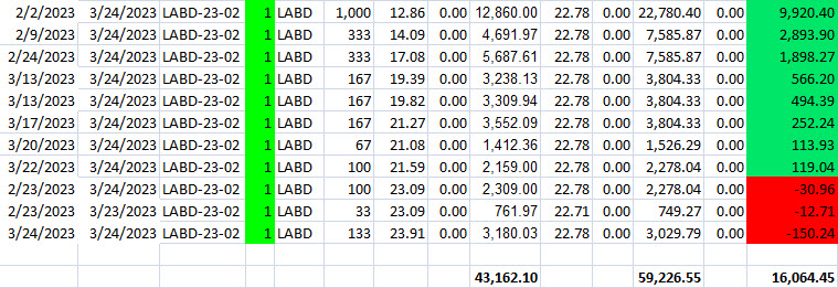
Early this session, the short position in biotech (via LABD) was increased (not advice, not a recommendation).
The table below shows the trading (entry) activity during the on-going reversal (not advice, not a recommendation).
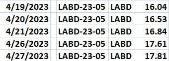
Hard Stop: 16.79
The notation ‘LABD-23-05’, indicates this is the fifth trading campaign (or trade series) in LABD for the year.
Stay Tuned
Charts by StockCharts
Note: Posts on this site are for education purposes only. They provide one firm’s insight on the markets. Not investment advice. See additional disclaimer here.
The Danger Point®, trade mark: No. 6,505,279