Note: Posts on this site are for education purposes only. They provide one firm’s insight on the markets. Not investment advice. See additional disclaimer here.
Although none of the above directly affects day to day price action of INTC, what it does do, is provide the fundamental backdrop; Portland and immediate vicinity is heading down and the pace is accelerating.
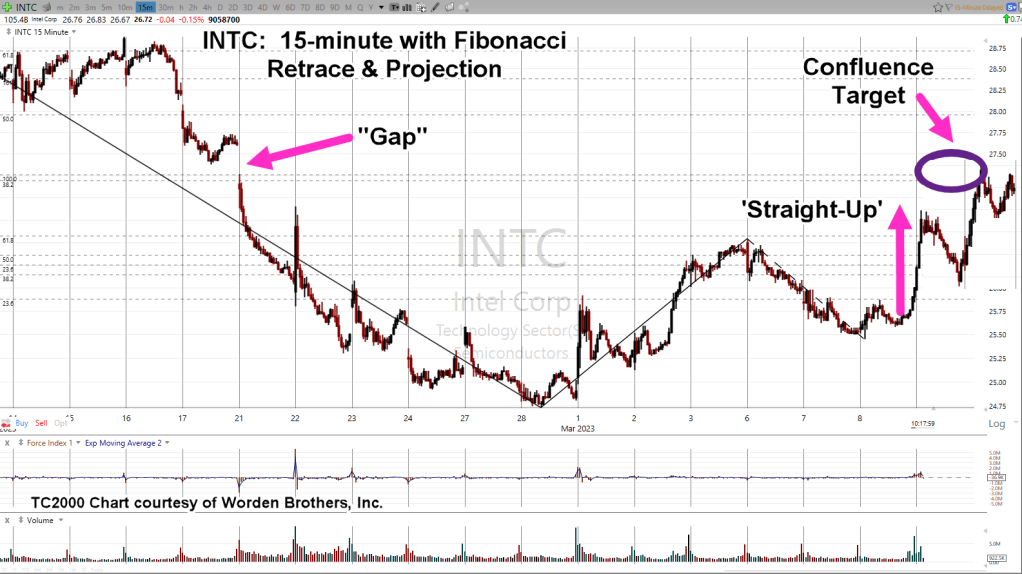
Intel Daily Close
At this juncture (11:38 a.m., EST), Intel is clawing its way back to test a potential trendline.
All lines are exactly parallel.
The grey trendline in the chart is there to show, we have repeating trendlines throughout the price action when taken from the left side of the trading channel.
If price action continues to struggle and closes near the level as shown (grey arrow), it’s a potential indicator that we have a right side trendline contact (not advice, not a recommendation).
Note: Posts on this site are for education purposes only. They provide one firm’s insight on the markets. Not investment advice. See additional disclaimer here.
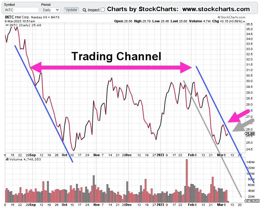
With a potential right-side trend (and channel) contact confirmed; shown below at – 86% annualized, odds are now favorable for a Put strategy.
In addition to the technical factors discussed, listed at the bottom of this post are no fewer than 22-links to the current fundamental state of biotech and their ‘handiwork’.
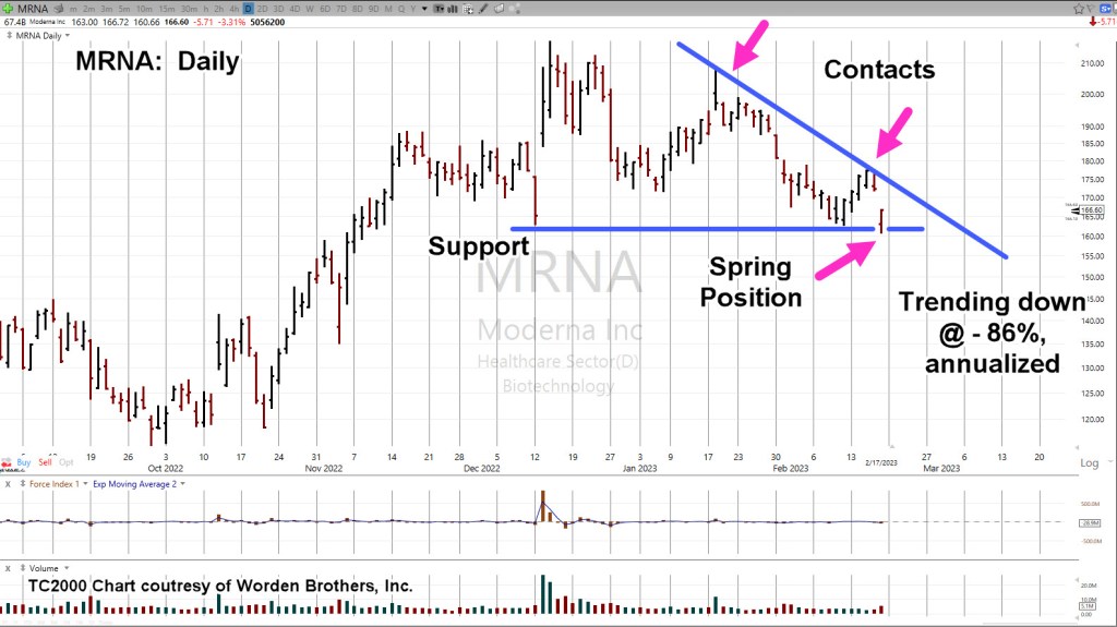
The weekly chart of MRNA, has a Wyckoff Up-Thrust and a test, confirmed by the downside pivot.
Moderna MRNA, Weekly
Notice the reversal action took place at a very weak Fibonacci 23.6% retrace.
The two blue lines on the daily chart (below) are exactly parallel.
The grey lines are parallel to the blue lines and intended to show MRNA, exhibits a repeating (downtrend) pattern.
Moderna MRNA, Daily
The expanded version on the daily has support being penetrated (horizontal blue line) and then ‘spring’ action last Friday as a result.
Of course, it’s ‘what happens next’, that’s the question.
In a prefect scenario, price action would thrust lower for a day or several days and then come back up to test the underside of resistance.
Elder Option Strategy
This strategy is taken from Elder’s book ‘Come Into My Trading Room’, and seeks to use as short-dated options as possible.
Doing so, requires the discipline to wait sufficient amount of time for price action to get into position and for option time value to bleed-off.
Potential Upside
Since we’re already in spring position and price action moved off the lows on Friday, MRNA could continue the upside right back to, or past the downtrend line.
However, with massive (undeniable) fundamentals building buy the day, and MRNA being mentioned specifically in at least one link below, probabilities favor the downside.
Supporting Links For The Bearish Stance
Florida Surgeon General Warns Life-Threatening VAERS Reports Up 4,400 Percent Since COVID-19 Vaccine Rollout
US Says Government, Not Moderna, Should Face COVID-19 Vaccine Lawsuit
New Medical Codes For COVID Vaccination Status Raise Concerns Among Experts
Watch: Rand Paul Grills School Of Nursing Head On Student COVID Vaccine Mandate
US Navy Lifts COVID Vaccine Mandate For Sailor Deployment
Mainstream Media Continues To Push False ‘COVID Heart’ Narrative To Explain Excess Deaths
NFL Players’ Association Urged To Screen for Heart Issues Over Vaccine Side Effects
WHO Suddenly Shelves Plans For Second Phase Investigation Into Origins Of COVID-19: Report
Watch: CDC Director Suggests It Will Never Change Child-Masking Policy
Rand Paul Introduces Bill To Halt Funding For Hospitals Denying Care To The Unvaxxed
Welfare State Weakens… 30 Million Americans Are About To Lose ‘COVID’ Food Stamp Handouts
IMF Says World Needs To Prepare For The “Unthinkable” After COVID, War In Ukraine
Note: Posts on this site are for education purposes only. They provide one firm’s insight on the markets. Not investment advice. See additional disclaimer here.
The large number of VIX (volatility) Calls, tells us, not to expect an immediate sharp move lower.
Those Calls will likely need to be bled-off in value, before we get a significant downward spike … if there is one.
Market Summary, Watch List
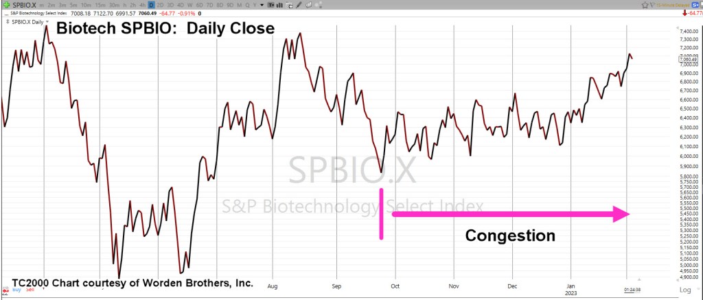
Over the past week, there are two markets that are being monitored for short position entry: Real Estate and Biotech; IYR, and SPBIO, respectively.
After nearly five months of price action whipsaw and congestion, biotech appears to be in a nascent downside reversal. Real estate looks to have reversed today (not advice, not a recommendation).
Biotech has been the weakest (technically) of all the major indices (except miners, GDX and GDXJ).
We’re going to look at the daily chart of SPBIO, to see the opportunity and the risk.
Biotech SPBIO, Daily Close
Since late September last year, there has been sideways-to-up, price action congestion.
Price action today, appears to have resolved into a nascent reversal.
We’re going to invert the chart to mimic the leveraged inverse fund LABD, showing the opportunity and the risk.
SPBIO, Daily Close (Inverted)
The prior two days of Fed induced bullish short-covering hysteria, have resulted in a decisive penetration of the support level, as shown.
By definition, this puts us in Wyckoff ‘Spring Position’; be on guard for a potential reversal.
Positioning
There have been many false starts to this sector’s reversal as evidenced by previous posts.
However, today’s action is consistent with resolution of the five-months of congestion (not advice, not a recommendation).
Every trading/speculator has their own style and this site does not give financial advice.
With that said, a (highly leveraged) short entry via LABD, would have a hard stop at today’s low.
At present (2:15 p.m., EST) and entry at LABD 12.91 would have a stop at 12.45, yielding a ‘risk’ of 0.46-pts.
Note: Posts on this site are for education purposes only. They provide one firm’s insight on the markets. Not investment advice. See additional disclaimer here.
Note: Posts on this site are for education purposes only. They provide one firm’s insight on the markets. Not investment advice. See additional disclaimer here.
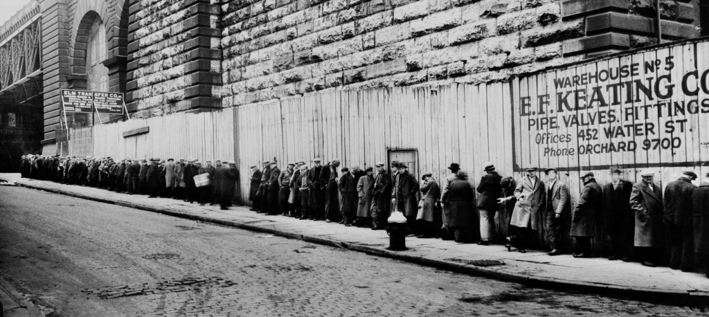
Provided many times on this site, the assessment we’ve gone straight past recession and directly to: ‘The Greater Depression’, or ‘The Great Depression 2.0’
By now, we’re all aware of this data, just out from ZeroHedge.
That data is at the ‘peak’ or the depths of 1932, and we in our current market, haven’t even got started!
The Fed’s interest rate announcement is due out at 2:00 p.m., Eastern, today; does it really matter?
We can see with unbiased observation; the wheels have already, irrevocably, been set in motion.
The economy along with the ‘elephant’ that no one talks about, are juggernauts on a downward course.
The 1929 Crash, Then Bull Rally
Remember, the big market speculators of the early 1900s typically made their fortunes on the way down (not advice, not a recommendation).
Let’s also not forget, one of, if not the largest market rallies up to that time (in percentage terms), happened right in the middle of The Great Depression.
Of course, to trade that mid-1930s rally, you had to have the capital to do so.
Which brings us to the next topic: Real Estate.
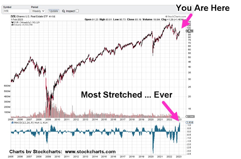
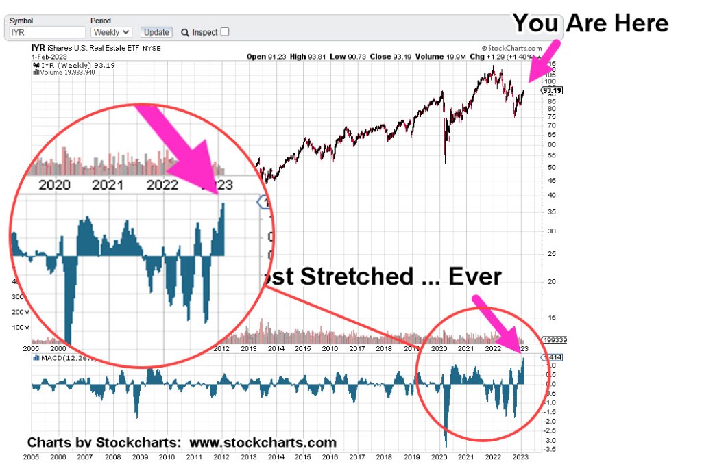
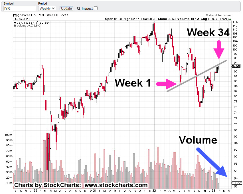
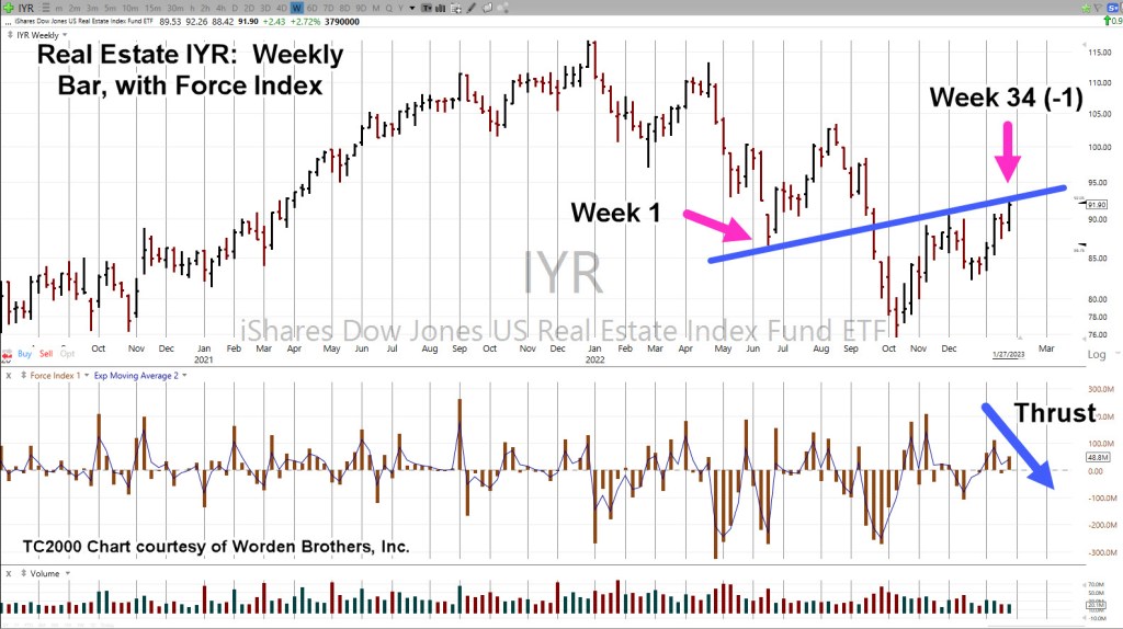
Real Estate IYR, Weekly
With yesterday’s new print high, we’re at Fibonacci Week 34. That puts us at a potential trading channel or inflection point as discussed in this post.
There’s no guarantee of a trading channel or even a reversal.
However, we do have a confluence of events; upside volume (pressure) declining, marginal new highs and the potential Fed pivot point, due out today.
It’s about 20-minutes before the open. Let’s see what happens next.
Note: Posts on this site are for education purposes only. They provide one firm’s insight on the markets. Not investment advice. See additional disclaimer here.
There are nine other supplemental data points for the economic mayhem, collapse, collapse-in-progress scenario; they are listed at the end of this post.
For now, we’re talking about real estate and specifically the proxy for the sector, IYR.
Real Estate IYR, Weekly
As stated in the last post, we’re going to follow-up with a potential IYR, downside reversal by covering three more technical points; Fibonacci time correlation, thrust energy and trading channel.
First up: Last week completed a Fibonacci 34 (-1 week) time frame that may result in a reversal into a trading channel (shown on second chart).
Upward force (Thrust Index) declined significantly over the prior upward push during the week of 1/13/23.
The weekly chart has been compressed and trading channel lines added.
Internal trendlines are printed as grey dashed lines.
As shown, we’re at ‘Week 34 (-1)’.
If this market’s in reversal and adhering to a Fibonacci time sequence, we could see an immediate reversal or another minor high next week to make it an even 34 or go one additional week to make it 34 (+1) weeks.
Either way, we’re at The Danger Point®
The 1929 – 1932 Trading Channel(s)
Here’s a bit of insight you’ll not find anywhere else.
Research and data gathered by my firm, has shown markets tend toreverse just before, during, or just after a Holiday Week.
In our case below, The 1929, all time high was 379.61, posted on September 4th; the Tuesday following the Labor Day Weekend.
The final low and subsequent reversal was 41.81, posted on July7th 1932; the Thursday following the July 4th Holiday:
There are at least three main trading channels in effect for the entire (nearly) three year down move.
Trading channels are an old and repeating characteristic of the markets.
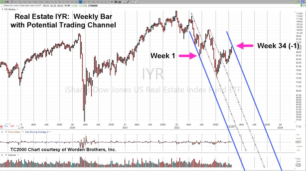
Real Estate Re-Cap
The all-time high in real estate IYR, was 116.89, posted on December 31, 2021, the Friday before the New Year’s Weekend.
Since then, there have been several trading channels in effect; at this juncture, we may have yet another.
With the data links provided at the beginning and the links at the end of this post, sustained price action to the downside is more probable (not advice, not a recommendation).
This coming week is likely to be quite interesting as the Fed continues on its path of price and demand destruction.
Note: Posts on this site are for education purposes only. They provide one firm’s insight on the markets. Not investment advice. See additional disclaimer here.
The Danger Point®, trade mark: No. 6,505,279
Addendum
Congratulations on reading this far. You must be serious about your work. Supporting data for the bearish case is below.
‘Some of the best market traders are former Marines.’, Prechter
That’s a paraphrased quote from Robert Prechter Jr., given during an interview in the early 1990s.
The inference: Marines succeed at trading because they have been conditioned to endure and perform while being in pain … physical and mental.
On the other hand, the financial press, being ever so helpful during this unprecedented collapse, is all too happy to help analyze the situation by catastrophizing on how ‘painful’ the market feels.
If we go to Jerimiah Babe at time stamp 1:36, the mainstream press is still touting ‘The consumer is strong’.
In other videos, Babe, has shown how devastated the real estate market really is … ‘boots on the ground’ reports at vacant malls, empty parking lots and new (unoccupied) housing developments that stretch for miles.
With that backdrop, let’s look at what the price action of real estate is telling us … is the consumer strong?
Real Estate IYR, Weekly
There are so many things happening in IYR, it will probably take several updates.
At this point, price action exhibits the following:
Currently in Wyckoff ‘Up-Thrust’ condition, potential reversal
On a close basis, IYR has retraced 38.2% of its entire move.
Repeating trend line(s) underside test.
Trading channel that’s a Fibonacci 34 (-1) weeks wide.
For the week just ended, Force Index is divergent (54.7%, weaker) than the last push higher.
We’ll look at the first three of those, below.
As the market came to a close on Friday, price action pushed through established resistance (and axis line) to end the week higher.
Price action’s in Up-Thrust condition, The Danger Point®
Next, we have on a close basis, a Fibonacci 38.2% retrace as well as testing the underside of a resistance/trend-line.
In the next update, we’ll discuss the possible trading channel and the pressures (Force Index) behind the last move higher.
There Will Be Great ‘Wringing Of Hands’
As always, anything can happen in the markets. The above is not advice or a recommendation.
Next week, we can expect the Usual Suspects to come out and provide their ‘expert analysis’ on what the Fed is likely to do or not.
The Fed on the other hand, has repeatedly said what’s it’s going to do; that is, raise rates.
Interest rate sensitive real estate already appears ready for reversal.
Note: Posts on this site are for education purposes only. They provide one firm’s insight on the markets. Not investment advice. See additional disclaimer here.
Nemont Mining (NEM), Gold, and the Oil & Gas Sector are at a critical juncture.
The rest of the major indices, Dow, S&P, QQQs, real estate (IYR), and so on, are in a similar position.
For this update, we’ll focus on Newmont (NEM), as it’s the largest cap in the Senior Mining Sector GDX, and a general representative of the commodities markets.
Financial collapse is a process, not an event.
Newmont topped-out in April, of last year. Exxon, the proxy for the Oil & Gas sector, may have reached its highs this past November.
Where’s The Inflation?
As Michael Cowan has just reported, banks are absconding with depositor’s money under the guise of ‘bail-in’.
If the fiat cash is so worthless, why are banks seizing it?
As Robert Prechter Jr., said years ago, ‘all fiat cash ultimately goes to zero’; the end game (most likely) for the dollar. However, it could be months, years, or even a decade before that happens.
For right now, today, this minute, the data is showing us, the banks want the money; ‘Show me the money‘.
With that, let’s look at the non-existent ‘inflation’ in the mining sector.
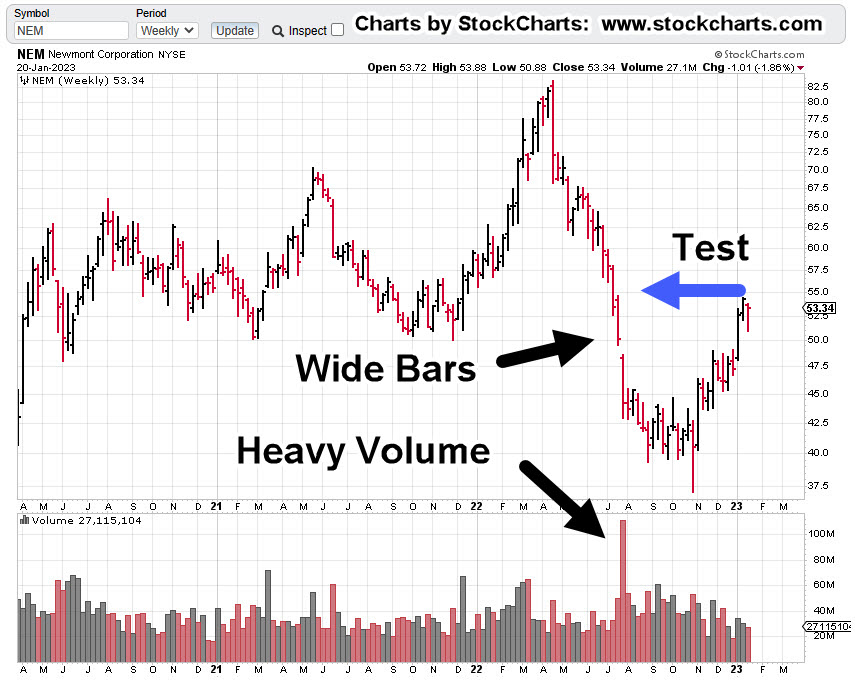
Newmont Mining NEM, Weekly
The first chart identifies the heavy volume and then test of wide price bars. This behavior is common in the markets; they tend to come back and test wide high-volume areas.
Next, we see there’s a terminating wedge developing as volume declines; the inference, is lack of significant commitment at these price levels.
We’ll get close-in on the wedge; last week printed a lower weekly low and closed lower for the week.
There’s no breakdown of the wedge … yet.
At this juncture, it’s up to the bulls to show they’re still in control.
Inflation vs. Scarcity
We have without a doubt, the effects of the event from the past three years gaining momentum. Whether or not those effects reach a peak this year, is unknown.
A lot of the mainstream and YouTuber’s alike talk about the upward move in gold as the result of ‘inflation’.
Here’s a little bit of insight you’ll not find anywhere else; how about gold rising because the above mentioned ‘effects‘ are causing production volumes to decline?
Maybe it’s because of scarcity (along with nearly everything else) that’s causing the increase in price.
Just to drive that idea home, the latest total gold production numbers, listed here.
Gold production for 2020 dropped -8.2%, from the year prior. Year 2021 was down -1%, from 2020.
From 2010 to 1019, gold production increased or was flat year over year … that is, until 2020.
Note: Posts on this site are for education purposes only. They provide one firm’s insight on the markets. Not investment advice. See additional disclaimer here.
There was a larger than expected crude inventory build, as ‘the consumer is weaker than expected’.
The ‘consumer’ is not weaker than expected, they’re tapped out.
There’s real potential, events accelerate from here.
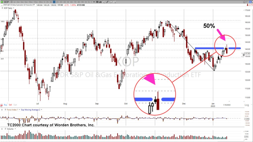
The reversal in the sector, XOP, was anticipated to happen on Friday, tomorrow.
At this point, it looks like it came early.
The daily chart of XOP, below shows a reversal at the Fibonacci 50%, retrace.
Oil & Gas XOP, Daily
The next chart zooms-in on the reversal.
We’re about fifteen-minutes before the regular session and set to open lower.
Look for the market to print lower, then attempt a rally as a test of the reversal.
That retrace, if it occurs, may be a low-risk area for a short via DRIP (not advice, not a recommendation).
If the anticipated test fails, and price action makes a new daily high (above yesterday’s print), it’s then likely the sector is on its way to all-time highs.
Note: Posts on this site are for education purposes only. They provide one firm’s insight on the markets. Not investment advice. See additional disclaimer here.