Real Estate (IYR) To New Highs ?

If The Bond Market Reverses

The previous bearish analysis was overwhelmed by the larger, upward trend.

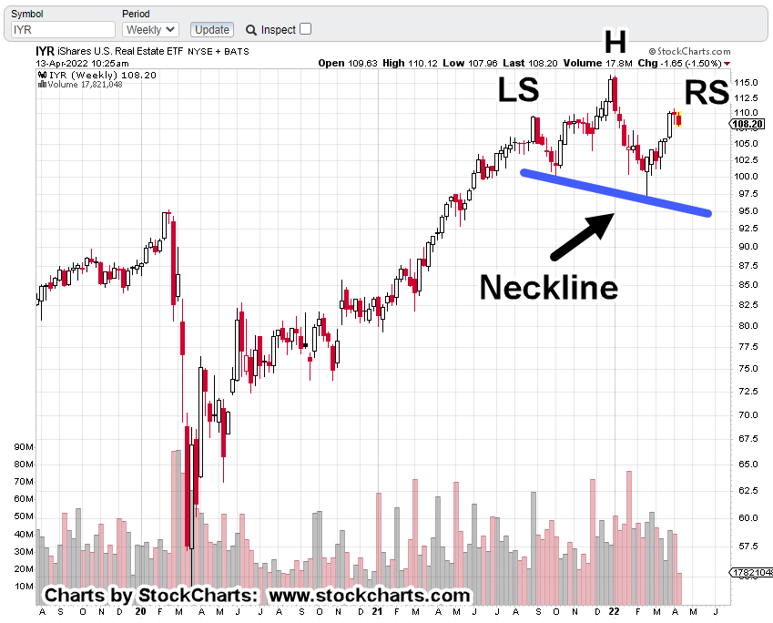
Instead of continuing lower, real estate IYR, moved higher. It’s now at another inflection point.

The position in DRV (DRV-22-01) was exited at 32.66, when it was obvious the trade was going to fail.

Taking a hit like that gets one’s attention; there must be something else going on … something on a larger timeframe.

There’s nothing wrong, with being wrong.

However, there is something wrong with being wrong and staying wrong.

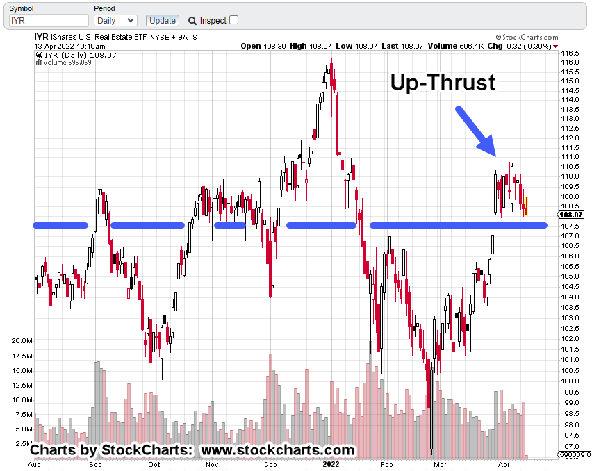
If we pull farther out to the longer, weekly timeframe, it looks like there’s danger ahead; possible new all-time highs and Wyckoff upthrust (potential reversal).

Real Estate IYR, Weekly

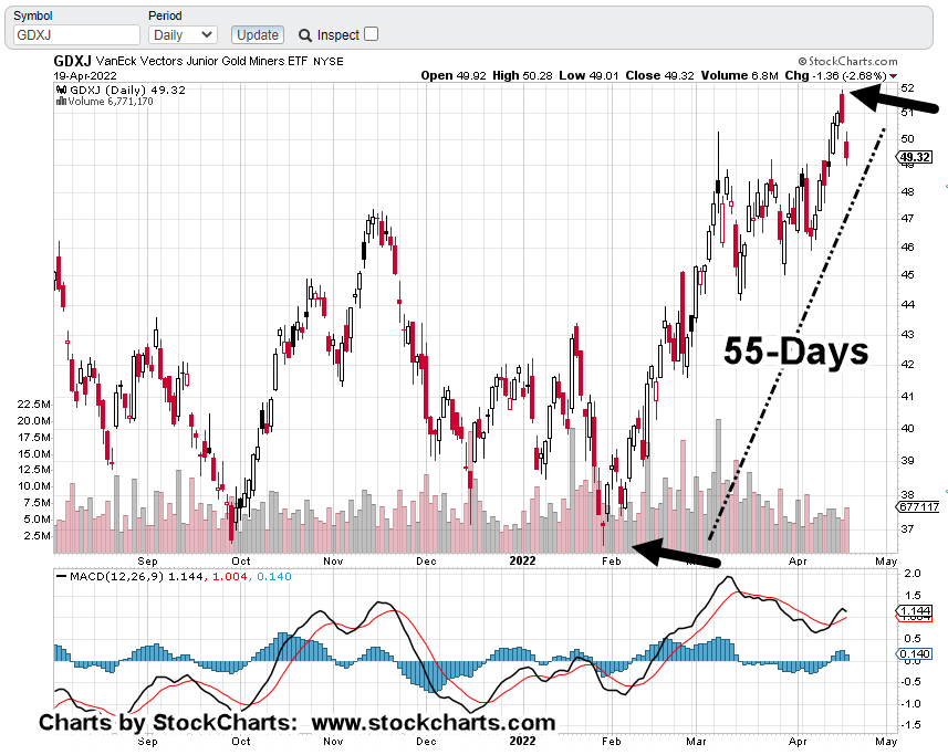
As with the Junior Miners, GDXJ, it looks like we have yet another Fibonacci time correlation.

During the financial crisis, IYR, posted its low the week of March 6th, 2009.

Thirteen years later, another major inflection point?

Shown below, is a terminating wedge that may have already completed a throw-over.

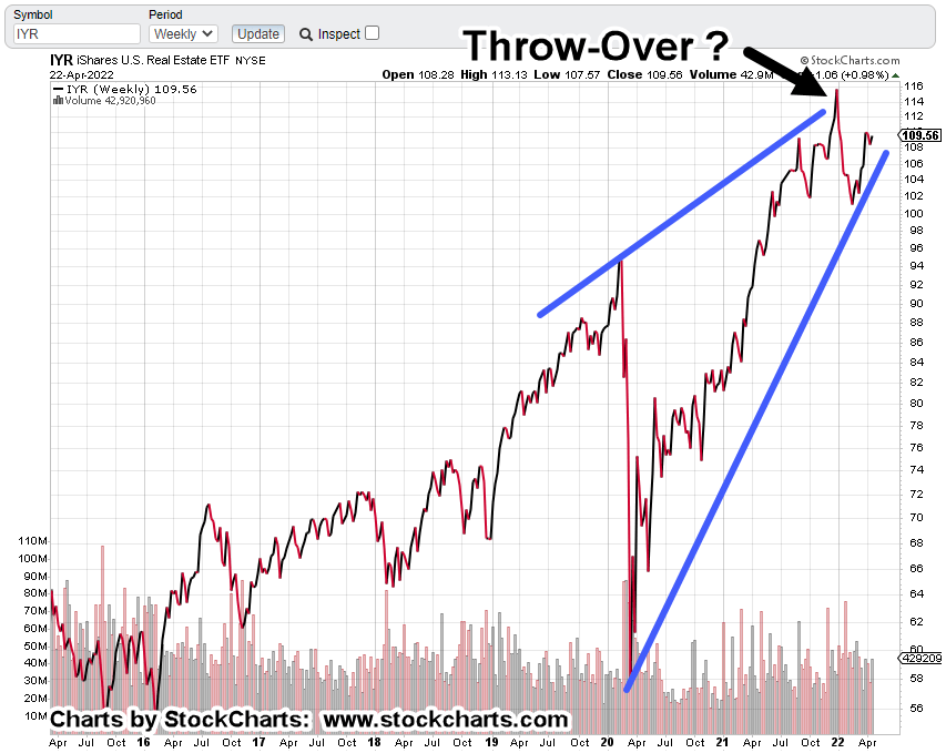
One probability suggesting new highs instead of a reversal at this point (which seems like even odds) is the repeating tendency of markets to go from ‘spring to upthrust‘.

This site has presented over and again, it’s a common market behavior.

Getting closer-in on the weekly, the spring set-up is identified.

Now, comes the Fibonacci time correlation.

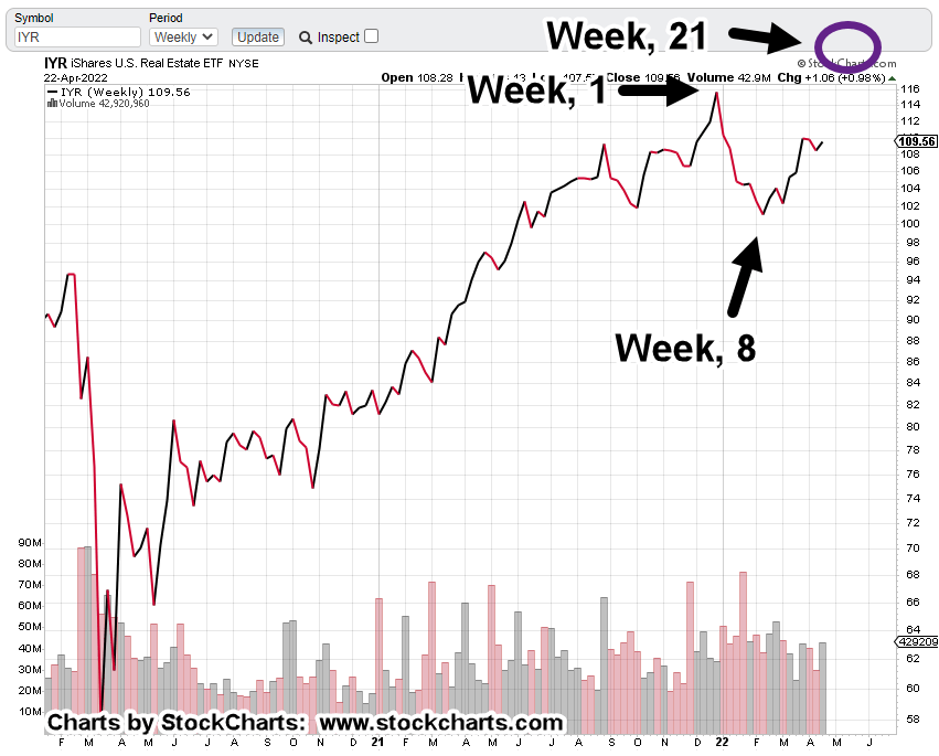
From the all-time highs, the market closed at the lows on Week 8. The print low came one week later.

Using that information and projecting forward, if this correlation is in effect, if it’s valid, we can expect an up-thrust high somewhere during the week of May 20th, to May 27th.

The Bond Connection

The economy is collapsing. The food supply is being destroyed. The consumer is tapped out and using credit to survive.

What on earth could be a catalyst to move real estate, the most illiquid market of all, to new highs?

Bring in the clowns … sorry, the financial press.

Word on the street is the bond market, may be in position to reverse higher.

No doubt, there’s a good technical reason for reversal, linked here.

It’s the financial press and their real estate narrative that will (may) be preposterous.

That is: If bonds (TLT) move higher, mortgage rates will come down, consumers will jump on the opportunity and therefore, she’s a witch !!!

Summary

We’ll see if IYR meets the price and Fibonacci time correlations for potential reversal.

Once there’s a reversal in this market, it tends to do so with a vengeance.

Rising rates have already cut off deals in the works. Prices are coming down and houses are on the market longer. The consumer is priced out.

The pig is already in the python … once that happens, this market sets up a dynamic of its own, a succession of lower prices and sales collapsing.

Stay Tuned

Charts by StockCharts

Note:  Posts on this site are for education purposes only.  They provide one firm’s insight on the markets.  Not investment advice.  See additional disclaimer here.

The Danger Point®, trade mark: No. 6,505,279

Same Then, Same Now … Gold

Common Characteristics

Every market has its own personality, its own characteristics.

After working the gold mining indices GDX, more specifically GDXJ, a repeating trendline tendency was observed in leveraged inverse, JDST.

That repeating market behavior, shown below.

Junior Miners, Leveraged Inverse, JDST

The un-marked daily chart, first

Repeating trendlines

The next several charts zoom-in on specific areas.

Set The Stop

And walk away …

As the tagline in this post shows with JDST-22-04, we’re already short the Junior Miners via JDST (not advice, not a recommendation).

The current stop, is set at yesterday’s low of 6.61.

Depending on price action today, that stop will be moved up to the recent low (presently @ JDST 6.855).

Summary

GDXJ, reversed at Fibonacci 55-Days, 13-Weeks from the January 28th, low.

As presented in this update, we’re also Fibonacci 89-Weeks (+1), peak-to-peak.

Time correlation coupled with price action, along with incessant financial press ‘gold standard‘ narrative, gives a near perfect backdrop for a significant downside reversal.

The trade may or may not work out … price action is the final arbiter. However, we’ve already shown the trend characteristic of the market.

A simple but effective way to manage the trade is to follow that trend, raise the stop accordingly and exit when stopped out (not advice, not a recommendation).

Stay Tuned

Charts by StockCharts

Note:  Posts on this site are for education purposes only.  They provide one firm’s insight on the markets.  Not investment advice.  See additional disclaimer here.

The Danger Point®, trade mark: No. 6,505,279

Gold Miners … Downside Reversal

Wait … What?

A major gold (miner) reversal?

Is that possible?

The last update on the subject highlighted a multi-decade Fibonacci time correlation.

Going all the way back to the 2001 lows for gold, there’s a correlation of 21-years, 89-weeks and 55-days as it relates to the Junior Mining Index, GDXJ.

This past Monday, 55-Days from the January 28th, low, GDXJ, posted a reversal.

The chart below, is an updated version of the one presented on Thursday, the 14th.

Junior Miners, GDXJ, Daily

The bearish MACD has completed with a momentum tick to the downside. Price action reversed exactly at Fibonacci 55-Days.

Getting closer-in, the chart below shows we’re at minor support.

It’s early in today’s session about an hour after the open.

Price action’s already pushing down on the support level, posting a new daily low.

If GDXJ continues lower and decisively penetrates support, the expectation is for some kind of upward test in the next session(s).

For the Junior Gold Miners, GDXJ, we’re at the danger point.

Obvious stop levels for a short position would be yesterday’s high or Monday’s high (not advice not a recommendation).

Summary

With so many convinced gold and the miners must move higher as a result of ‘inflation’, a significant, sustained reversal would be completely unexpected.

Of course, what’s not being discussed (except in alternate media) is the intentional destruction of the food supply and the supply chain.

That’s at least a significant contributor to the rising prices.

Stay Tuned

Charts by StockCharts

Note:  Posts on this site are for education purposes only.  They provide one firm’s insight on the markets.  Not investment advice.  See additional disclaimer here.

The Danger Point®, trade mark: No. 6,505,279

Real Estate … By The Numbers

Day By Day Look, At Potential Reversal

Using a method presented by the late David Weis in his training video (still available, linked here), we’re going to look at specific days on the daily chart of IYR, shown below.

In brief, the method looks at price action (and volume) on specific days, then formulates an assessment using Wyckoff analysis, on next move probability.

Real Estate, IYR, Daily

This is how it looks with no markup. Force Index, shown in the lower panel.

We’re going to address each numbered bar of the price action shown.

No. 1

Price action penetrates resistance (blue line) on moderate volume and posts a sharp upward spike on Force Index.

Such action can be labeled as a breakout or up-thrust (potential reversal) position.

No. 2

After hovering and then testing the breakout resistance/support level, price action attempts to pull away and move higher … but it’s unable to close higher and volume contracts.

Force Index as a result, posts a significantly lower peak than three trading sessions, prior.

This is the first sign of trouble to the upside.

No. 3

Three sessions later, IYR attempts to move higher again.

This time it’s able to close higher but volume contracts again and posts a lower Force Index.

This is the second sign of trouble to the upside.

No. 4

Five sessions later after IYR comes back down to resistance/support there’s another attempt to move higher.

This time, the range has narrowed while volume increases and subsequently posts yet another lower peak on Force Index.

Narrow, labored upside action with increasing volume suggests the market’s under distribution.

Summary

The day before price action bar No 4., this post was created to indicate real estate IYR, may be in position for downside reversal.

On the day labeled No. 4, a short position was opened via leveraged inverse fund DRV as DRV-22-01, with current stop at last Thursday’s DRV low of 32.64 (not advice, not a recommendation).

Heading Into Monday

The futures market is now about one hour into the Sunday night session.

The S&P is trading down 15 – 16 points or about – 0.36%.

Let’s see if that negative bias carries over to the Monday open.

Stay Tuned

Charts by StockCharts

Note:  Posts on this site are for education purposes only.  They provide one firm’s insight on the markets.  Not investment advice.  See additional disclaimer here.

The Danger Point®, trade mark: No. 6,505,279

Corn Train Wreck, Continues

One Way Or Another …

The food supply is, and is going to be destroyed; one way or another.

The latest in this ‘planned’ series of events, can be found here and here.

More information on the first link, is here. The initial paragraph says it all.

That second link calls the news a ‘Black Swan’ event.

Really?

It’s been known for years and reported by those who are brave (moving forward despite ridicule, threats, bank account closures), and who had insight, times like these were coming.

As a result, (i.e., since the Derecho) the commodities, specifically corn, have risen dramatically.

Teucrium tracking fund, CORN, Weekly

Looking and the chart, several items of note.

First: Volume picked up markedly in the fund, before the Derecho of 2020. Almost like someone knew something was about to happen … which it did.

Wyckoff said it best a century ago … those in the know, will have their actions show up on the tape.

Second: We’re currently in Fibonacci Month 21, since the Derecho. Does that mean we’ll have another market event?

Let’s see how the fertilizer news affects the futures market at the next open.

However, more specifically as posted in this update, we’re looking for some type of ‘administration’ announcement that temporally crashes the price of corn.

Third: Getting back to the chart of CORN, the right side is showing signs of potential distribution.

We’ve had the largest weekly volume, ever, during the week of March 4th.

After that, volume has remained elevated … a possible changing of hands and distribution.

Summary

Markets like to test wide high-volume print areas. There’s always a potential for that type of test in any market.

For CORN above, the high-volume area is around 23.00 – 23.50; an approximate drop of -21%, from current levels.

If we get some type of ‘export restriction’ announcement, a (temporary) 20-plus percent drop in CORN, is not unreasonable.

Stay Tuned

Charts by StockCharts

Note:  Posts on this site are for education purposes only.  They provide one firm’s insight on the markets.  Not investment advice.  See additional disclaimer here.

The Danger Point®, trade mark: No. 6,505,279

Gold & Silver, Timeline’s End ?

Government, Is Always Last

The laws enacted by the Government to prevent the crash of 1929, were passed in 1934.

So, now we have at least two states (here and here) eliminating sales tax on the purchase of gold and silver.

Where were they way back in 2001, as the metals were bottoming?

Interestingly (then again, not) it’s a Fibonacci 21-years, nearly to the day, from that 2001 bottom.

That’s not the only Fibonacci correlation being observed.

Let’s take a look at Junior Miners GDXJ, and see if it too, has a Fibonacci event.

Junior Miners GDXJ, Weekly

We’re just one week short of Fibonacci 13-Weeks, from the late January 2022, bottom.

One extra week is well within margin of error when considering the 89-Week timeframe as shown.

But wait, there’s more.

Looking at the daily chart, not only is there a bearish MACD divergence, we’re also just one day shy before it’s a Fibonacci 55-Days, from the 1/28/22, bottom.

Junior Miners, GDXJ, Daily

Can it all line up this perfectly?

Well, it can if no one is watching; that’s where the crowd and the government come in.

Summary

It’s a fairly safe assessment, nobody expects a downside reversal … nobody.

Even though time and again, we have clues that opportunity for precious metals may come later not sooner (not advice, not a recommendation).

The lockdowns in Shanghai with subsequent starvation and bartering (here and here), show under such conditions, precious metals are nowhere on the list.

Closer to home, the Texas Freeze of 2021, exposed that (lack of metals demand) as well.

Housing prices are starting to ease-off as well as prices for used cars.

Gold (GLD) may have reached its peak, March 8th, this year. Let’s see what happens next.

Stay Tuned

Charts by StockCharts

Note:  Posts on this site are for education purposes only.  They provide one firm’s insight on the markets.  Not investment advice.  See additional disclaimer here.

The Danger Point®, trade mark: No. 6,505,279

Bonds Down … Real Estate, Next ?

Visions of 2008 ?

The Head & Shoulders pattern on the weekly chart of IYR, could mean reversal ahead.

Price action’s been attempting to move higher over the past twelve trading days.

‘Attempting’, because it’s not making any significant net progress.

Essentially, we’ve got what’s called ‘evidence of a struggle’ where the bulls may be exhausting themselves.

The last update on bonds (TLT), said they’re at the danger point where an upside reversal was possible.

That update also said:

“At this juncture, there’s either a reversal and much higher levels or down, with rates higher; in turn, leading to the subsequent collapse of real-estate, a-la 2007 – 2008.

Since then, bonds are lower, rates higher. Housing affordability has collapsed.

Real Estate, IYR, Weekly

At this point it’s a clear H&S, pattern.

The daily chart shows IYR, oscillating around an axis, support/resistance line; struggling to move higher (in up-thrust condition) with no real progress.

As with bonds in the April 3rd, update, we’re at the danger point with IYR.

A decisive move below the axis (blue) line would indicate the bulls may be exhausted.

Because price action’s been in this range for over two weeks, lends support to the possibility any breakdown (or breakout higher), may be a sustained, directional move.

Stay Tuned

Charts by StockCharts

Note:  Posts on this site are for education purposes only.  They provide one firm’s insight on the markets.  Not investment advice.  See additional disclaimer here.

The Danger Point®, trade mark: No. 6,505,279

Putin’s Gold … Paradigm, Not

‘Nothing New Under The Sun’

Remember the ‘Silver Short-Squeeze‘?

How the little guy was finally going to ‘put it to the man’; forcing the SLV, ETF, to admit they don’t have enough physical silver to cover?

How did that work out?

Same as it always has … it was a non-event.

Now, we have a supposed paradigm shift the ‘world’ has yet to fully process.

Paradigm, Not

The ‘paradigm’ link above, promulgates the intended or mistaken notion, there are two sides to world events.

Sorry Charlie, operations at world government level(s) are working in how shall we say, ‘lockstep’?

Nothing is a surprise.

So it is with gold. At least it is at this juncture while always keeping in mind, anything can happen.

Gold, GLD, Weekly Close

The message of the weekly close, is straightforward.

We’re at the danger point. The location where it won’t take much to move price in either direction.

If we really are in a ‘new paradigm’, by definition, gold (GLD) must move to new highs.

If other governments world-wide are shifting to gold-backed currencies, by definition, demand will increase and move prices higher.

Higher by not just a one-day blip of 10 – 20 points or even a hundred … but thousands.

It could happen.

In the longer time frame, that may indeed be the case. However, at this point, we have something else afoot.

The Famine, Cometh

Gold has never been the same since the Derecho of 2020.

In fact, that was the pivot point for both gold and corn which are now, inversely correlated.

Here are just a few recent links concerning the food supply; here, here, here and here.

That last one … what a great way to cover the outcome of this link.

It’s a slow-motion train-wreck that’s obvious to anyone that can see.

Summary

Just like there was no ‘new economy’ during the Dot-Com bubble, there’s no ‘new paradigm’, now (not advice, not a recommendation).

The focus remains on what the price action, the market, is saying about itself.

At this juncture, GLD, is at the danger point.

The presence of huge volume during the week of March 11th, suggests a changing of hands from strong to weak.

That in turn, points probability to weak upside (if any) and more likely sideways, or down.

Stay Tuned

Charts by StockCharts

Note:  Posts on this site are for education purposes only.  They provide one firm’s insight on the markets.  Not investment advice.  See additional disclaimer here.

The Danger Point®, trade mark: No. 6,505,279

Russell … Hovering At Target Level

Price Action Confirming Fibonacci

It’s just past midway through the session.

The weekly chart of Russell 2000 IWM, is hovering at the first projection level … 23.6%.

Russell 2000, IWM, Weekly

We’ll get closer in, using the 4-Hour chart

Note how price action is oscillating about the 23.6%, level.

This type of behavior provides confirmation the market ‘respects’ that level.

Note in the weekly chart, there are no fewer than six weekly bars (including this week) that either had an open or close, near 23.6%.

As this post is being created, the market appears to be pivoting out and down from this area.

It may be on its way to lower levels (not advice not a recommendation).

Stay Tuned

Charts by StockCharts

Note:  Posts on this site are for education purposes only.  They provide one firm’s insight on the markets.  Not investment advice.  See additional disclaimer here.

The Danger Point®, trade mark: No. 6,505,279

Russell, Low(s) In Late June ?

Cycles & Fibonacci

Both time cycles and Fibonacci are aligned … targeting intermediate low(s) for the Russell (IWM), in June.

This post, released late on Monday, showed a potential reversal set-up for the IWM.

The next morning (yesterday), saw a sharp, brief move higher which quicky reversed into a sustained decline.

That decline continues during this session.

The weekly chart of IWM is below; marked up with a Fibonacci time sequence.

Russell 2000, IWM, Weekly

Week 34, identified with the back font, represents a 1 : 1, Fibonacci projection of the initial leg down.

Week 34, in the magenta font, is a 1 : 1.618 projection of the same initial move.

These are projections only (not advice, not a recommendation).

However, there’s a time cycle study available at this link.

Go to time stamp 8:27, for the Russell 2000. The method is different, but the projection is similar; heading lower into early Summer (mid to late June).

Stay Tuned

Charts by StockCharts

Note:  Posts on this site are for education purposes only.  They provide one firm’s insight on the markets.  Not investment advice.  See additional disclaimer here.

The Danger Point®, trade mark: No. 6,505,279