With that understood, we’ll present three potential scenarios for Moderna (MRNA) price action for the upcoming days, or week(s).
When we last left our chief cook and spike-protein injector, price action was in a downtrend but also in Wyckoff spring position; indicating at least a chance for upside.
As with the CarMax (KMX) analysis, still playing out with Scenario No. 2, and/or No. 3, at this link as the forecasted price action, we’ll show potential Scenario No. 1 – No. 3, for MRNA, below.
Moderna MRNA, Daily, Forecasted Action
Scenario No. 1
Upside wedge breakout
Scenario No. 2
Downside wedge breakout with no test
And now, the most probable, ‘If there’s a downside breakout.
From a short-dated options standpoint, Scenario No. 3, is the most desirable (not advice, not a recommendation).
If there’s a downside breakout with no test, there’s always the possibility at some point, there will be a test, which in turn completely wipes out any potential gain in the (put) trade; time would run out and the option expires.
Re-Visiting, Elder
Recall, in the example that Dr. Elder gave, he bought OEX Put Options at 3/8-ths, back in the day when the markets traded in fractions.
Three-eighths is 0.375, which gives a target value on which option to select (not advice, not a recommendation).
To get to that small of a fraction, the option’s either way out of the money, short on time, or both.
Note: Posts on this site are for education purposes only. They provide one firm’s insight on the markets. Not investment advice. See additional disclaimer here.
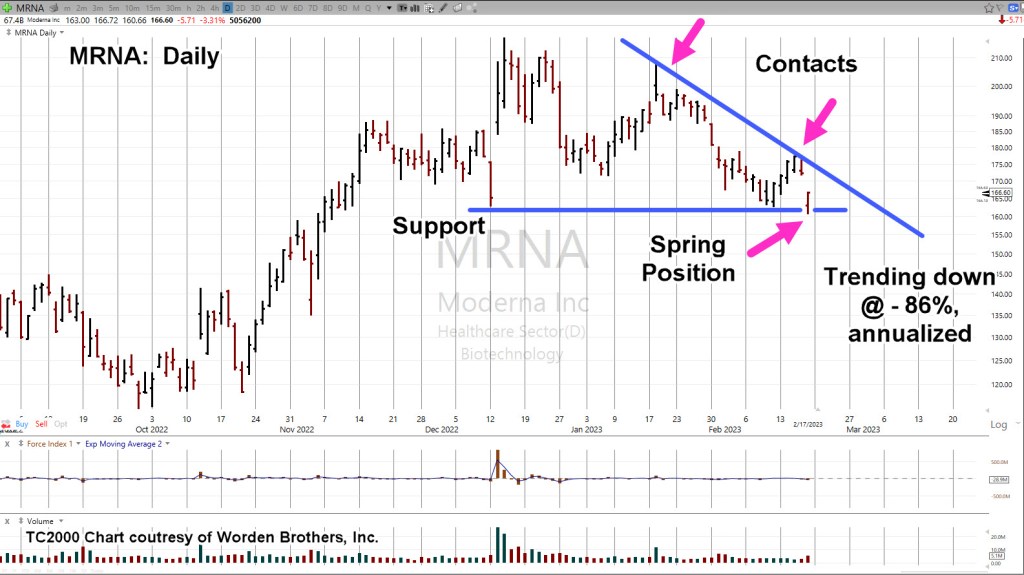
With a potential right-side trend (and channel) contact confirmed; shown below at – 86% annualized, odds are now favorable for a Put strategy.
In addition to the technical factors discussed, listed at the bottom of this post are no fewer than 22-links to the current fundamental state of biotech and their ‘handiwork’.
The weekly chart of MRNA, has a Wyckoff Up-Thrust and a test, confirmed by the downside pivot.
Moderna MRNA, Weekly
Notice the reversal action took place at a very weak Fibonacci 23.6% retrace.
The two blue lines on the daily chart (below) are exactly parallel.
The grey lines are parallel to the blue lines and intended to show MRNA, exhibits a repeating (downtrend) pattern.
Moderna MRNA, Daily
The expanded version on the daily has support being penetrated (horizontal blue line) and then ‘spring’ action last Friday as a result.
Of course, it’s ‘what happens next’, that’s the question.
In a prefect scenario, price action would thrust lower for a day or several days and then come back up to test the underside of resistance.
Elder Option Strategy
This strategy is taken from Elder’s book ‘Come Into My Trading Room’, and seeks to use as short-dated options as possible.
Doing so, requires the discipline to wait sufficient amount of time for price action to get into position and for option time value to bleed-off.
Potential Upside
Since we’re already in spring position and price action moved off the lows on Friday, MRNA could continue the upside right back to, or past the downtrend line.
However, with massive (undeniable) fundamentals building buy the day, and MRNA being mentioned specifically in at least one link below, probabilities favor the downside.
Supporting Links For The Bearish Stance
Florida Surgeon General Warns Life-Threatening VAERS Reports Up 4,400 Percent Since COVID-19 Vaccine Rollout
US Says Government, Not Moderna, Should Face COVID-19 Vaccine Lawsuit
New Medical Codes For COVID Vaccination Status Raise Concerns Among Experts
Watch: Rand Paul Grills School Of Nursing Head On Student COVID Vaccine Mandate
US Navy Lifts COVID Vaccine Mandate For Sailor Deployment
Mainstream Media Continues To Push False ‘COVID Heart’ Narrative To Explain Excess Deaths
NFL Players’ Association Urged To Screen for Heart Issues Over Vaccine Side Effects
WHO Suddenly Shelves Plans For Second Phase Investigation Into Origins Of COVID-19: Report
Watch: CDC Director Suggests It Will Never Change Child-Masking Policy
Rand Paul Introduces Bill To Halt Funding For Hospitals Denying Care To The Unvaxxed
Welfare State Weakens… 30 Million Americans Are About To Lose ‘COVID’ Food Stamp Handouts
IMF Says World Needs To Prepare For The “Unthinkable” After COVID, War In Ukraine
Note: Posts on this site are for education purposes only. They provide one firm’s insight on the markets. Not investment advice. See additional disclaimer here.
Intel’s a dog … and has been for a very long time.
How do we know that? The price action itself, tells us.
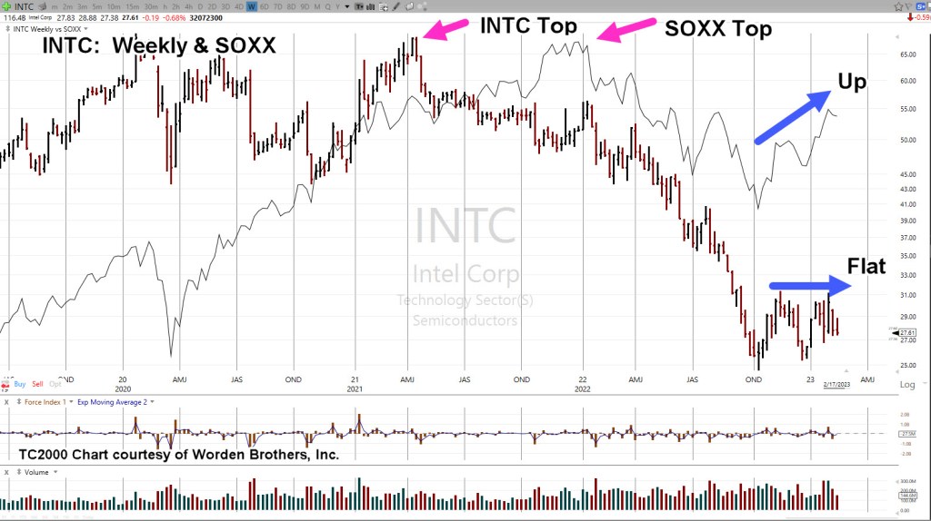
Looking at the weekly chart of INTC, overlaid with the SOXX (thin black line), it’s clear, things literally went south for INTC, right around April, of 2021.
Intel reversed while the sector, the SOXX continued higher.
It’s what happened next, that’s important.
Intel INTC, With SOXX, Weekly
Note how the SOXX has rebounded since mid-October last year while Intel has remained flat.
Even with all the market manipulation to keep the major indices trending higher, having the public thinking ‘the consumer is strong’, INTC has languished.
This lack of upward price action in a rising market, indicates significant weakness.
Has Intel reached a bottom? This is the ‘dip’, isn’t it?
As always, anything can happen and INTC, could launch higher from here. However, it’s not likely.
It’s a juggernaut and at the moment, heading lower.
All of which brings us to the set-up: Options trade to the short side.
Intel INTC, Daily
For a viable Put trade, at least two criteria need to be met (with downtrend already established) and those are: Option time bleed, and what’s called ‘price instability’ or a ‘test’.
The daily close of INTC, shows a prior set-up (‘Test’) and now, at the far right of the chart, forecasted action.
A possible time for the ‘test’ if it occurs would be this coming Wednesday as that makes it ‘Day 13’ from the high on February 3rd.
That day would also coincide with the Fed minutes being released at 2:00 p.m., EST.
Note: When Fibonacci time counts are involved, it was determined years ago (by my firm), when the U.S. market is closed for a holiday and the rest of the world markets are open, it can (and sometimes does) count as a Fibonacci trading day.
Therefore, with world markets open this Monday, and the U.S. closed, it may still count as a Fibonacci trading day.
That in turn, could make this Tuesday ‘Day 13’ (not advice, not a recommendation).
Note: Posts on this site are for education purposes only. They provide one firm’s insight on the markets. Not investment advice. See additional disclaimer here.
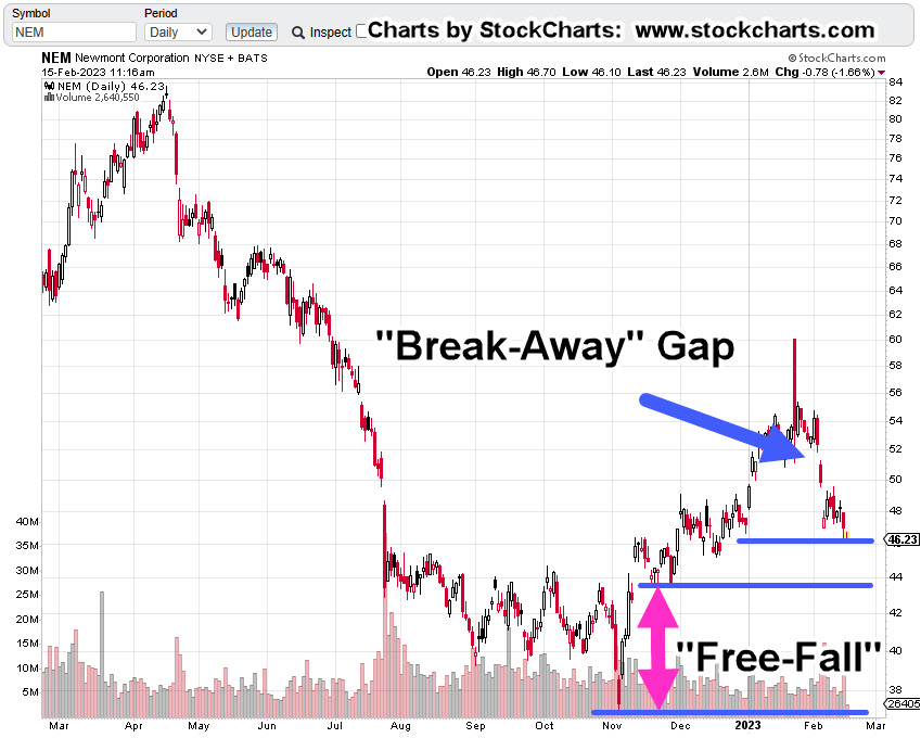
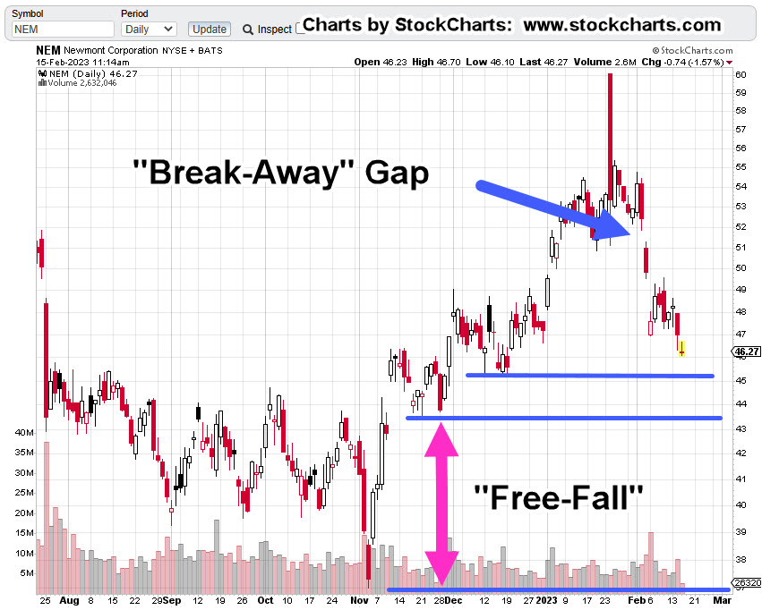
Newmont (NEM) price action’s working its way lower to a ‘free-fall’ area; shown below.
Depending on behavior if or when it gets to this area, there could be an acceptable set-up to execute an ‘Elder-type’ Put option (not advice, not a recommendation).
That Put strategy has already been discussed but for those who may be new, it’s basically a short-expiration, out-of-the-money Put for maximum (potential) gain.
A completely counter-intuitive approach to the standard method of long-dated entries, then ‘wait’ while the value burns down to nothing.
Newmont Mining NEM, Daily
The compressed chart has the big picture; Newmont’s all-time highs were reversed on April 18th, 2022.
It’s currently in the process of finding its long-term bottom which is possibly far away from current levels.
The next chart gets close in on the potential set-up.
If price action follows its current down-trend, NEM may reach the potential free-fall area late next week.
Note: Posts on this site are for education purposes only. They provide one firm’s insight on the markets. Not investment advice. See additional disclaimer here.
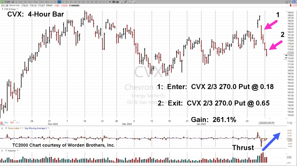
The Put entry on Chevron CVX, was admittedly, late to the party.
From a trading and strategy perspective, when CVX, announced its ‘buy-back‘ program, that was the appropriate time to go short (not advice, not a recommendation).
With that in mind, the Put option detailed in the above link was closed towards the end of yesterday’s session.
Chevron could still collapse from here and that may ultimately be the outcome.
However, before that happens, as shown below, the more probable event is to come back up for a test of underside resistance.
Chevron CVX, 4-Hour
Note how thrust energy (blue arrow) to the downside is dissipating.
The chart below shows a potential outcome, if (and it’s a big if) CVX, is still in a significant reversal.
Examples presented on this site are just that: Examples
They show one “old-timer’s” perspective on the market and current events.
The examples can be used (or not) to aid in understanding market behavior or to show a different perspective on how to approach the current environment.
To paraphrase Dr. Alexander Elder:
‘There are many ways to make money in the markets … and even more ways to lose it’.
It’s about 20-minutes before the open. Let’s see what happens next.
Note: Posts on this site are for education purposes only. They provide one firm’s insight on the markets. Not investment advice. See additional disclaimer here.
Events like this, tend to indicate the end of a move.
Then today, Chevron (CVX) cracks.
In keeping with Elder’s method of trading options, as was done with the Delta Airlines (DAL) trade, the chart is documented below.
Note: The Delta Put expired with no revenue on the trade. This is how the method is implemented. Many small losses that are peppered by a significant gain (not advice, not a recommendation).
Chevron CVX, Daily
Over the next week, CVX could get ahold if itself and stabilize … or it could completely fall apart (not advice, not a recommendation).
We can already see, it appears to have posted a double top with a swift reversal.
Note: Posts on this site are for education purposes only. They provide one firm’s insight on the markets. Not investment advice. See additional disclaimer here.
It’s a good thing we’re not listening to the financial press as the market’s ‘Call The Fed’s Bluff’; we would’ve missed the set-up.
Let’s bookmark this post (like the last one), come back in July or so, and see how the poker-hand with The Fed played out.
Three guesses on who’s going to win and the first two, don’t count. 🙂
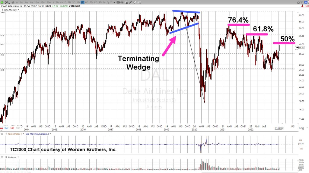
With Delta, it’s not the Fed they have to worry about. A series of events were set in motion (i.e., pilot ‘shortage’) that may not get fixed for years to come.
Moving on, let’s take a look at what the price action of Delta (DAL), is telling us.
For brevity, we’ll go straight to a marked-up (and time compressed) weekly chart of DAL.
Delta Airlines DAL, Weekly
DAL spent nearly a year building a ‘terminating wedge’ before breaking down during February of 2020.
Hmmm, February of 2020, what was happening back then?
That breakdown, coupled with the terminating wedge, and it’s almost as if someone knew something; time enough to position massively short or buy put options.
Subsequent retrace off the 2020 lows, were at lower and lower Fibonacci levels … with the current retrace at 50%.
The Options Trade
Dr. Alexander Elder describes (Come Into My Trading Room) one way to trade options that few attempt.
That is, instead of buying long dated options and then waiting for the slow burn down of capital, the lesser-known method is exactly the opposite.
In his book, he describes buying short-dated OEX (S&P 100) Put options for 3/8ths … back in the day when the market traded in fractions.
Two days later, he sells the options for 17, a 4,433% gain.
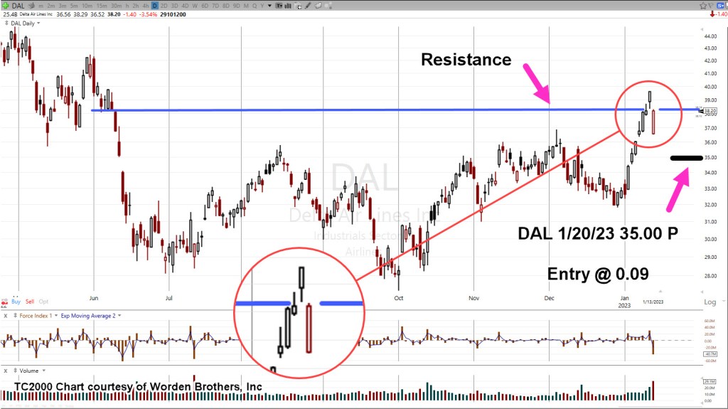
Taking that method and applying it to the daily chart, we have the following.
Delta Airlines DAL, Daily
On Friday, there was a huge gap-lower, open.
Price action spent the rest of the session attempting to close the gap. Volume increased substantially from Thursday’s session (up +46%)
Yet, price action was not even able to touch the lows of that session; Friday’s high of 38.29, vs. Thursday’s low of 38.32.
It’s a nuance that may have meaning or not.
The Short Trade
As shown on the chart, a position was opened with a Put; strike at 35, and priced (at entry) at 0.09 (not advice, not a recommendation).
Following Elder’s method, the price and short expiration, says there’s no hope for this trade.
Note: Posts on this site are for education purposes only. They provide one firm’s insight on the markets. Not investment advice. See additional disclaimer here.
Since the lows last November, to the close this past Friday, gold (GLD) has moved higher by a decent but modest 15.4%.
Naturally, the opportunists are out telling us ‘We’ve been warned’, ‘this is it’, ‘it’s going to the moon’ … yet again.
With that backdrop, we’re going to look at the precious metals facts, not the hype.
‘Precious metals’ because there are only four that have ‘currency code’ classifications, i.e., are classified as an asset with ‘currency like’ monetary characteristics.
Way back over a century ago, Wyckoff discovered the key to understanding the next likely move of the markets was the study the market itself (not fundamentals).
Wyckoff essentially ‘locked himself in a room with just a stock ticker and phone line’.
That’s not saying ‘money printing’ has no effect. There are a lot of moving parts. Intentional destruction of the food supply is just one of those parts.
Old School Analysis
Hypothetically, if you dropped an ‘old-timer’ into the markets at this juncture (without him knowing the ‘hype’), and showed him all four charts of gold, silver, palladium, platinum, and asked ‘what’s happening?’
What’s his response?
After a brief look at the charts, he would likely say:
‘Gold’s move higher is not being confirmed by the other precious metals’.
Note that all four metals peaked together during the inflation spike of 1980.
Ergo: At this juncture, something’s wrong.
Either the other metals are going to ‘catch up’ to meet gold or gold is going to come down to meet the others.
That is of course, unless this time is different … somehow.
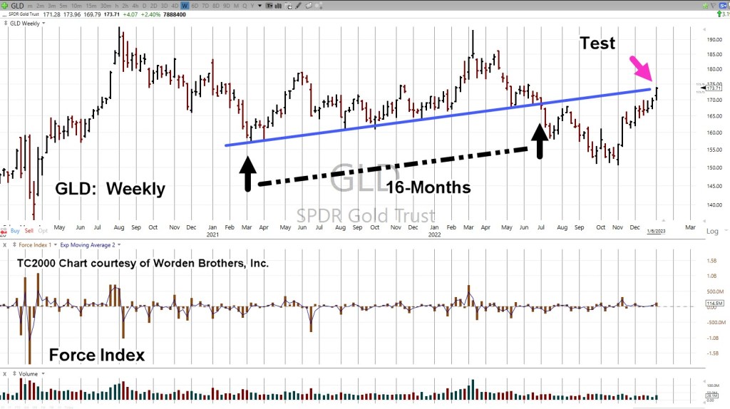
With that, we’ll look at the chart of gold to see what it’s saying about itself.
Gold GLD, Weekly
We’re starting with the unmarked chart.
Note: Elder’s Force Index scale is expanded to show the nuances of GLD, price action.
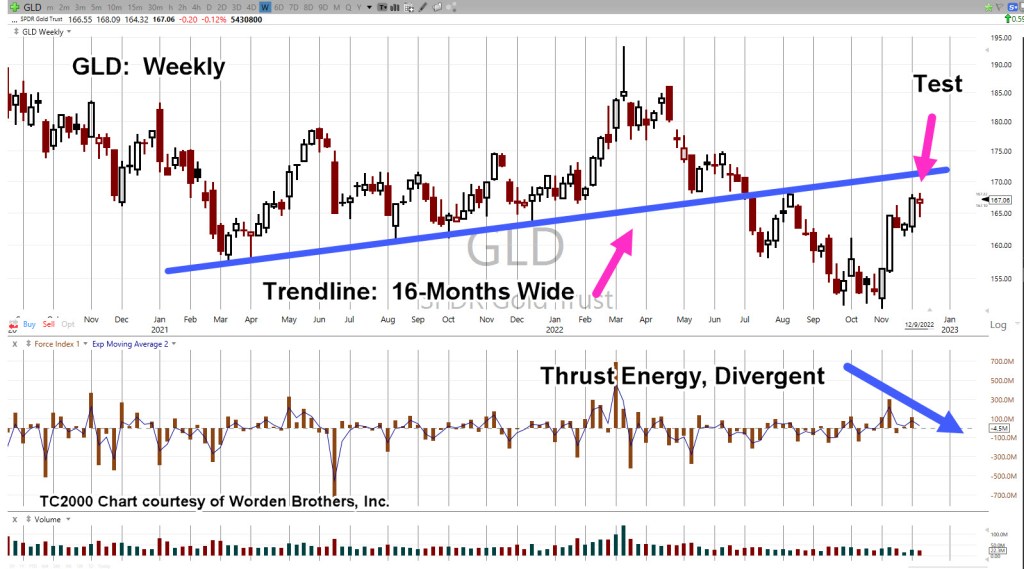
Next, we see we’re at a test of the trendline in place for 16-months before the downside breakout of July, last year.
Moving in closer, we have a wedge formation prior to the up-move last week.
Is this a breakout to the upside or a throw-over?
At this point, it’s unknown.
We can see that Force Index is below where price action entered the wedge during the week of November 11th.
Less force up into resistance (trendline), paints a slightly more bearish than bullish picture.
The ‘Why’ Comes Out
As if on cue and in classic Wyckoff style, we have a ‘why‘ for the move off the lows of last November.
Classic Wyckoff, because he said the ‘why’ of a move comes out after the fact.
There you have it; China buying gold last November and December.
During this move from the recent lows, it was certainly a trading opportunity for the bulls … but from a strategic standpoint, what happens next?
The Non-Confirmation
Non-confirmations can last a long time.
For example, the Oil & Gas sector XOP, declined for eight months, from April 2019 to January 2020, before the price of oil (USO) finally broke lower.
With the ZeroHedge article just released a few hours ago, we can expect at least a blip higher at the next GLD, open.
Note: Posts on this site are for education purposes only. They provide one firm’s insight on the markets. Not investment advice. See additional disclaimer here.
From the date of the second link above in April, this year, gold (GLD) is down about -8.5%.
Not exactly a crash but definitely not a ‘paradigm shift the world has yet to fully process’.
Just from a contrary standpoint, if ‘everybody’s doing it’, there must be something else going on.
Let’s take a look at the actual facts, the price action, and see what it’s telling us.
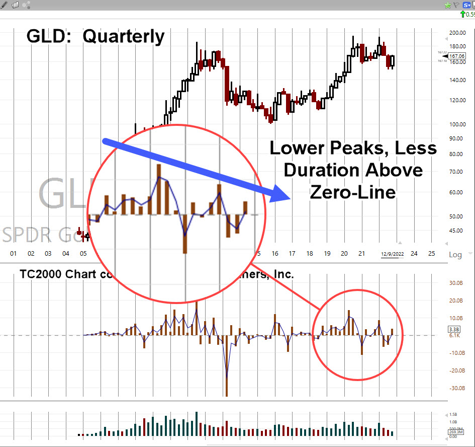
Gold (GLD), Quarterly
Looking at the big picture first; the quarterly chart.
Elder’s Force Index (shown in the middle section) has been expanded to detail the thrust energy behind the move(s).
It’s important to note, for at least the past 10-Quarters, two and a half years, the upward thrusts have been successively declining in energy.
That decline is highlighted below.
Next, we’ll drill down to the monthly chart.
It shows GLD, trended (slightly) higher for at least sixteen-months, before breaking down.
GLD, Monthly
Now, as the right-most magenta arrow shows, we’re at the test of underside resistance.
Tests may pass or fail; obviously, what happens next is important.
Also note, as with the quarterly, upward Force Index on the monthly, is declining.
We’ll take it one step further and go the weekly … it too, has declining and also diverging upward thrust.
GLD, Weekly
Ok, you talked me into it. 🙂
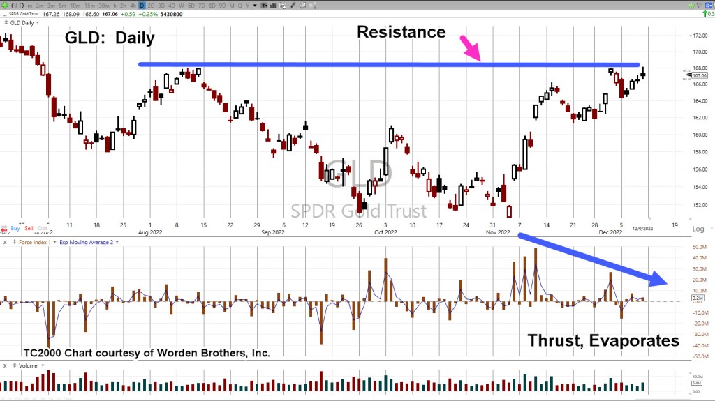
Let’s go to the daily and see the same thing.
GLD, Daily
Does all this mean gold will immediately go lower at the next open?
The short answer … it’s not known. However, from a probability standpoint, lower is more likely than higher.
No ‘Capitulation’
There’s nothing to indicate downside capitulation.
Nothing like the ‘changing of hands’ that took place this past March 8th, here and here.
It appears we’re still in the initial stages of a long-term downside reversal.
Downside? … How’s downside, even possible?
‘What kind of idiot comes up with that type of analysis?’
Moving Parts, A-Plenty
Every day, we see things going on in the background that could not be known or fathomed; like missing $80 Trillion?
All it takes, is for some kind of sovereign debt or derivatives blow-up, requiring that country to sell its assets like gold, silver, oil, grains and so on.
A huge dump on the gold market, would of course trigger stops and that in itself, could result in a contagion of selling.
If or when it happens, the downside might be temporary like the Flash Crash of 2010, or oil going negative, or it could be longer.
The ‘powers’ don’t seem to be too concerned with precious metals demand, prices, and low stock of physical at the commodities exchange(s).
Note: Posts on this site are for education purposes only. They provide one firm’s insight on the markets. Not investment advice. See additional disclaimer here.
An immense flood of data; research reports, lawsuits, expose articles and anecdotal evidence; every day, multiple times a day, something new.
Has the biotech technical (finally) lined up with the fundamental?
Those fundamentals are farther down but first, we’ll discuss the technical.
As a reminder, sometimes charts are inverted during analysis. This ‘trick’ was discovered years ago and is based on techniques used by Dr. Alexander Elder.
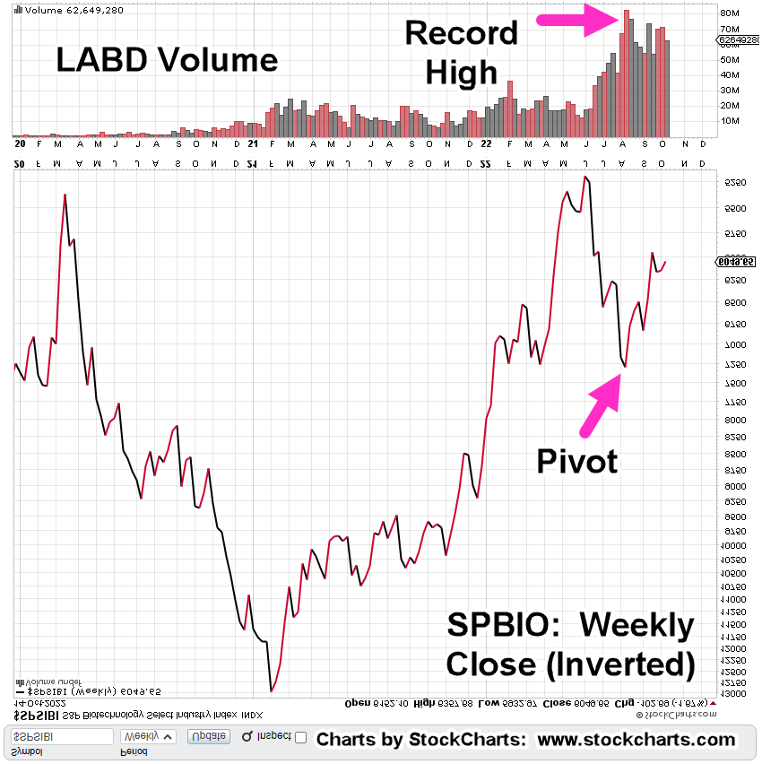
Biotech SPBIO, Weekly Close (Inverted)
We’ve taken the weekly closing chart of SPBIO ($SPSIBI, on StockCharts) and inverted it to mimic the action of inverse fund LABD.
The index has no volume; so LABD is used instead.
The magenta arrow shows the pivot point for the index, corresponds will all-time record volume on leveraged inverse LABD.
Next, we’ll get closer-in and look at the ‘pivot’ on the hourly chart (inverted).
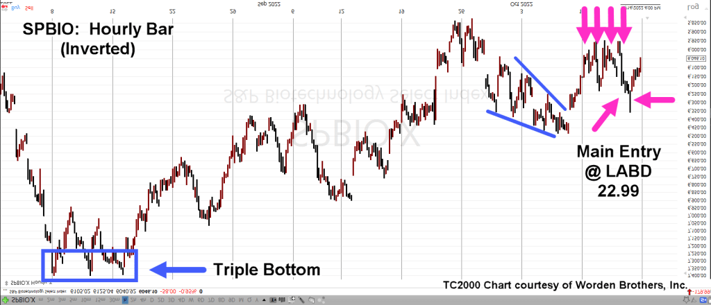
SPBIO, Hourly (Inverted).
The magenta arrows show successive positions (Livermore ‘probes’) entered (via LABD) before the main entry @ LABD 22.99, which was 90% of position size up to that point.
The next day (Friday) had a gap-lower open that was quickly reversed. Position size was increased by another 5%, at LABD 22.29 (not advice, not a recommendation).
Effective position equates to LABD 23.17
Price action pulled away steadily from the early morning levels, suggesting a sustainable reversal.
The Fundamentals
Some of this stuff, you just can’t make up.
Listed in somewhat chronological order, here they are (not an exhaustive list).
No. 1
Pfizer hires 600 to help document adverse events. Wasn’t it supposed to be ‘safe and effective’?
Note: Posts on this site are for education purposes only. They provide one firm’s insight on the markets. Not investment advice. See additional disclaimer here.