Gold Bulls … Go Berserk … Again

Testing The Trend

Since the lows last November, to the close this past Friday, gold (GLD) has moved higher by a decent but modest 15.4%.

Naturally, the opportunists are out telling us ‘We’ve been warned’, ‘this is it’, ‘it’s going to the moon’ … yet again.

With that backdrop, we’re going to look at the precious metals facts, not the hype.

‘Precious metals’ because there are only four that have ‘currency code’ classifications, i.e., are classified as an asset with ‘currency like’ monetary characteristics.

Currency Codes

Gold, Currency Code: XAU

Silver, Currency Code: XAG

Palladium, Currency Code: XPD

Platinum, Currency Code: XPT

The Market Itself

Way back over a century ago, Wyckoff discovered the key to understanding the next likely move of the markets was the study the market itself (not fundamentals).

Wyckoff essentially ‘locked himself in a room with just a stock ticker and phone line’.

Months later, when he emerged, ‘Studies in Tape Reading‘ was the result.

We’re going to use his insight from that text.

That is, what’s the market’s saying about itself? What’s the next likely direction?

Off The Highs

For some of the precious metals, they’re off their highs by a significant amount (percentages approximated).

Gold (GLD): Down -11%, from highs

Silver (SLV): Down -55%, from 2011, highs

Palladium (PAH23): Down -47%, from highs

Platinum (PLJ23): Down -53%, from highs

All of the precious metals are down nearly 50% or more, except gold.

In the case of Platinum, it’s near 1980s levels!

So, where’s the inflation?

Oh wait, here it is … one more time.

That’s not saying ‘money printing’ has no effect. There are a lot of moving parts. Intentional destruction of the food supply is just one of those parts.

Old School Analysis

Hypothetically, if you dropped an ‘old-timer’ into the markets at this juncture (without him knowing the ‘hype’), and showed him all four charts of gold, silver, palladium, platinum, and asked ‘what’s happening?’

What’s his response?

After a brief look at the charts, he would likely say:

‘Gold’s move higher is not being confirmed by the other precious metals’.

Note that all four metals peaked together during the inflation spike of 1980.

Ergo: At this juncture, something’s wrong.

Either the other metals are going to ‘catch up’ to meet gold or gold is going to come down to meet the others.

That is of course, unless this time is different … somehow.

With that, we’ll look at the chart of gold to see what it’s saying about itself.
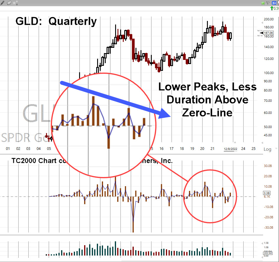
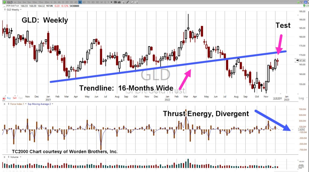
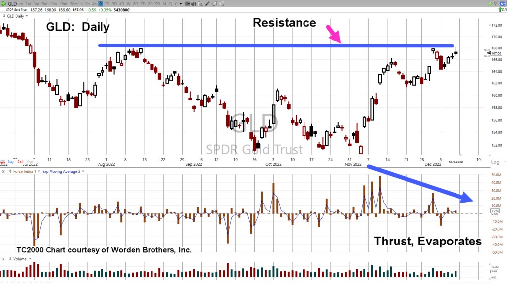
Gold GLD, Weekly

We’re starting with the unmarked chart.

Note: Elder’s Force Index scale is expanded to show the nuances of GLD, price action.

Next, we see we’re at a test of the trendline in place for 16-months before the downside breakout of July, last year.

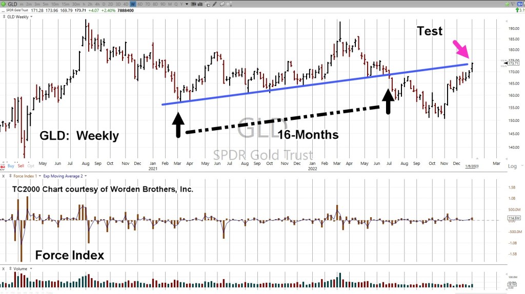
Moving in closer, we have a wedge formation prior to the up-move last week.

Is this a breakout to the upside or a throw-over?

At this point, it’s unknown.

We can see that Force Index is below where price action entered the wedge during the week of November 11th.

Less force up into resistance (trendline), paints a slightly more bearish than bullish picture.

The ‘Why’ Comes Out

As if on cue and in classic Wyckoff style, we have a ‘why‘ for the move off the lows of last November.

Classic Wyckoff, because he said the ‘why’ of a move comes out after the fact.

There you have it; China buying gold last November and December.

During this move from the recent lows, it was certainly a trading opportunity for the bulls … but from a strategic standpoint, what happens next?

The Non-Confirmation

Non-confirmations can last a long time.

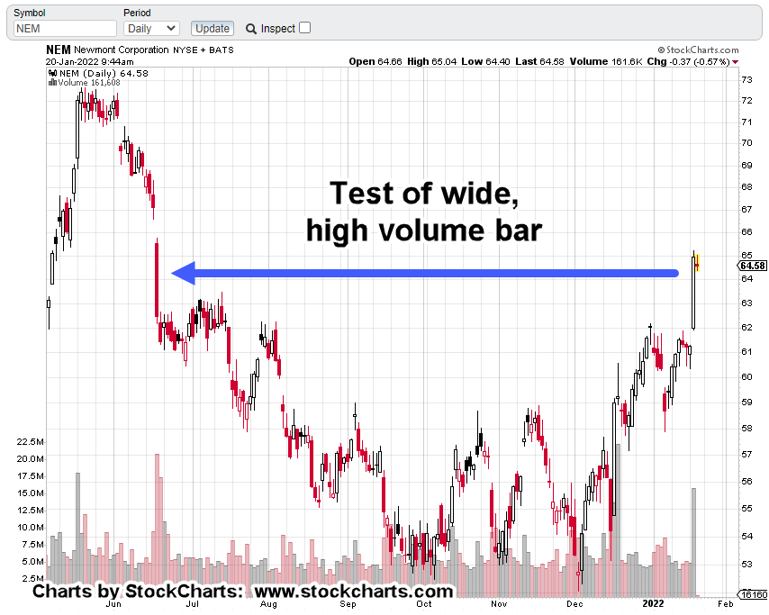
For example, the Oil & Gas sector XOP, declined for eight months, from April 2019 to January 2020, before the price of oil (USO) finally broke lower.

With the ZeroHedge article just released a few hours ago, we can expect at least a blip higher at the next GLD, open.

After that, we’ll see.

Stay Tuned

Charts by StockCharts

Note:  Posts on this site are for education purposes only.  They provide one firm’s insight on the markets.  Not investment advice.  See additional disclaimer here.

The Danger Point®, trade mark: No. 6,505,279

Gold … Set-Up & Strategy

Testing Underside Resistance

There’s no shortage of bullish prognostications for gold.

Said many times, as soon as there’s a blip higher, it’s near lunacy.

One of the latest installments is linked here and go figure … it’s the Russians, again!

Let’s get real.

Remember, the last time it was the Russians and the time before that?

From the date of the second link above in April, this year, gold (GLD) is down about -8.5%.

Not exactly a crash but definitely not a ‘paradigm shift the world has yet to fully process’.

Just from a contrary standpoint, if ‘everybody’s doing it’, there must be something else going on.

Let’s take a look at the actual facts, the price action, and see what it’s telling us.

Gold (GLD), Quarterly

Looking at the big picture first; the quarterly chart.

Elder’s Force Index (shown in the middle section) has been expanded to detail the thrust energy behind the move(s).

It’s important to note, for at least the past 10-Quarters, two and a half years, the upward thrusts have been successively declining in energy.

That decline is highlighted below.

Next, we’ll drill down to the monthly chart.

It shows GLD, trended (slightly) higher for at least sixteen-months, before breaking down.

GLD, Monthly

Now, as the right-most magenta arrow shows, we’re at the test of underside resistance.

Tests may pass or fail; obviously, what happens next is important.

Also note, as with the quarterly, upward Force Index on the monthly, is declining.

We’ll take it one step further and go the weekly … it too, has declining and also diverging upward thrust.

GLD, Weekly

Ok, you talked me into it. 🙂

Let’s go to the daily and see the same thing.

GLD, Daily

Does all this mean gold will immediately go lower at the next open?

The short answer … it’s not known. However, from a probability standpoint, lower is more likely than higher.

No ‘Capitulation’

There’s nothing to indicate downside capitulation.

Nothing like the ‘changing of hands’ that took place this past March 8th, here and here.

It appears we’re still in the initial stages of a long-term downside reversal.

Downside? … How’s downside, even possible?

‘What kind of idiot comes up with that type of analysis?’

Moving Parts, A-Plenty

Every day, we see things going on in the background that could not be known or fathomed; like missing $80 Trillion?

All it takes, is for some kind of sovereign debt or derivatives blow-up, requiring that country to sell its assets like gold, silver, oil, grains and so on.

A huge dump on the gold market, would of course trigger stops and that in itself, could result in a contagion of selling.

If or when it happens, the downside might be temporary like the Flash Crash of 2010, or oil going negative, or it could be longer.

The ‘powers’ don’t seem to be too concerned with precious metals demand, prices, and low stock of physical at the commodities exchange(s).

It’s as if they know, it will work itself out.

They’re on to something else more basic. Something ‘crude but effective‘ like destruction of the food supply.

Stay Tuned

Charts by StockCharts

Note:  Posts on this site are for education purposes only.  They provide one firm’s insight on the markets.  Not investment advice.  See additional disclaimer here.

The Danger Point®, trade mark: No. 6,505,279

The Usual Suspects

Special Biotech Edition

Bogart

An immense flood of data; research reports, lawsuits, expose articles and anecdotal evidence; every day, multiple times a day, something new.

Has the biotech technical (finally) lined up with the fundamental?

Those fundamentals are farther down but first, we’ll discuss the technical.

As a reminder, sometimes charts are inverted during analysis. This ‘trick’ was discovered years ago and is based on techniques used by Dr. Alexander Elder.

Biotech SPBIO, Weekly Close (Inverted)

We’ve taken the weekly closing chart of SPBIO ($SPSIBI, on StockCharts) and inverted it to mimic the action of inverse fund LABD.

The index has no volume; so LABD is used instead.

The magenta arrow shows the pivot point for the index, corresponds will all-time record volume on leveraged inverse LABD.

Next, we’ll get closer-in and look at the ‘pivot’ on the hourly chart (inverted).

SPBIO, Hourly (Inverted).

The magenta arrows show successive positions (Livermore ‘probes’) entered (via LABD) before the main entry @ LABD 22.99, which was 90% of position size up to that point.

The next day (Friday) had a gap-lower open that was quickly reversed. Position size was increased by another 5%, at LABD 22.29 (not advice, not a recommendation).

Effective position equates to LABD 23.17

Price action pulled away steadily from the early morning levels, suggesting a sustainable reversal.

The Fundamentals

Some of this stuff, you just can’t make up.

Listed in somewhat chronological order, here they are (not an exhaustive list).

No. 1

Pfizer hires 600 to help document adverse events. Wasn’t it supposed to be ‘safe and effective’?

No. 2

Pilot Shortage

Fired/quit because they refuse to get ‘protection’.

A possible corollary to what’s happened, via injection, we have this.

No. 3

Pfizer, nobody wants their product … after the rollout.

No. 4

Who could it be?

Previously unknown (or rare) problems and illness now starting to accelerate.

No. 5

We’re here to help.

No. 6

You mean, it was all a lie?

No. 7

The real reason for getting ‘tested’?

No. 8

What did the media know and when did they know it?

No. 9

It’s still a ‘suggestion‘ but the payouts to family members are real.

No. 10

It’s over … and then it’s not.

No. 11

We’ll keep it quiet, so no feelings get hurt.

No. 12

How bad is your batch? Let’s see.

No. 13

You mean, it was never tested? I’m shocked.

No. 14

After all that, maybe we can give it another shot.

No. 15

A potential infinite number of complications … nothing to see here.

No. 16

Getting away with it? Not so fast.

No. 17

Just had a heart attack? We can help.

No. 18

Limited Hangout? You decide.

No. 19

Lastly, this is what it’s really all about.

Recorded years ago. Did her ‘prophecy’ come true?

Stay Tuned

Charts by StockCharts

Note:  Posts on this site are for education purposes only.  They provide one firm’s insight on the markets.  Not investment advice.  See additional disclaimer here.

The Danger Point®, trade mark: No. 6,505,279

Eyes On China … FXI

Textbook (YANG) FXI, Short Entry

If the trade’s falling apart, get out.

That’s the admonition from Dr. Alexander Elder in his book ‘Come Into My Trading Room‘.

And so it was. Short position in real estate, closed out.

Even with all the analysis, real estate (IYR) has pushed higher. The short position via SRS (SRS-22-01) was exited just below the stop @ SRS 16.33.

Exiting a trade, frees the mind to look elsewhere for opportunity.

Typically, one would have to wait days or even a week or so for something else to be available.

However, despite appearances, the market is moving very fast at this juncture.

Looking around in those markets, we have a textbook entry signal (to go short) the FXI (not advice, not a recommendation).

David Weis & The Video

Many times, on this site (actually, for years), the Weis video has been recommended.

Next to Wyckoff’s treatise from 1910, Studies In Tape Reading, that video is probably the most important one could ever watch concerning the markets.

In it, he describes a ‘trick’ as he calls it, to get aboard a market that’s already underway. At the time, his discussion was using DE (if memory serves), as the trading vehicle.

That ‘trick’ is highlighted below on FXI

China Index FXI, Daily

This is how the chart looks early in today’s session.

Next, we’re going to invert the chart to mimic what’s seen on leveraged inverse fund YANG.

And now, the signal zoomed-in

The above price action is nearly exactly as presented in the Weis video; even though it was recorded fifteen-years ago.

The above signal is not a guarantee.

It is, however, a high probability low risk set-up (not advice, not a recommendation).

The entry signal was triggered at approximately YANG 11.75, with a stop at YANG 11.02, for a ‘risk’ of 0.73/share (not advice, not a recommendation).

Summary

As this post is being created, YANG is retracing and is currently trading near 11.67, narrowing the distance from any potential entry to the stop.

On a very long term (Monthly) basis, there are interesting things happening in FXI. We’ll be covering that soon in another update.

Stay Tuned

Charts by StockCharts

Note:  Posts on this site are for education purposes only.  They provide one firm’s insight on the markets.  Not investment advice.  See additional disclaimer here.

The Danger Point®, trade mark: No. 6,505,279

Active: YANG (YANG-22-02), entry @ 11.83, with stop @ 11.30

Biotech Strategy … Going Forward

SPBIO, Correction Complete

This morning’s action in biotech SPBIO, indicates we’re done with the upward corrective move.

The prior short position LABD-22-02, was reduced throughout the downward push over the past week and then exited completely in this morning’s pre-market session.

Within minutes after the open, as LABD pushed lower (SPBIO higher), it became obvious, a significant reversal was at hand.

It took LABD, just a little over two minutes to clear out stops and then begin an upside reversal.

Amateur vs. Professional

Dr. Alexander Elder covers the amateur/professional difference in his book Come Into My Trading Room.

That is, if an amateur gets stopped out or exits with a loss, they never come back.

Even if the trade reverses to go their direction, they refuse to re-position … having been ‘spanked’ by the market.

Breaking free of the (engineering) perfectionist mindset, is just one challenge during the journey to professional.

It must be overcome to achieve sucess in the markets.

Re-Positioned, Short

All of the above to say, the short in biotech has been re-established: LABD-22-03 (not advice, not a recommendation).

The difference at this point is, there’s a high level of expectation on what’s likely to happen next.

As Wyckoff put it a century ago, the reversal and re-position, enables us to be ‘in tune’ with price action.

Biotech SPBIO, Weekly

We’re going to invert the chart and mark it up.

First off, we can see the rule of alternation at work.

Next, we have at least two potential trading channels.

This one …

And this one …

We’ll let price action itself define which one (or none) is in-effect.

When we get a corrective move that resolves itself, at times, it creates a pivot point with a different rate of advance or decline.

That means, there’s more than a good possibility, the second (more aggressive) channel, is now dominant.

Summary

As this trade progresses, we’ll cover potential areas where the existing position can be increased with as low risk as possible.

As this juncture, LABD is trading in the area of 55.25.

The early (pre-market) loss has been more than recovered and we’re now well in the green for the day.

Stay Tuned

Charts by StockCharts

Note:  Posts on this site are for education purposes only.  They provide one firm’s insight on the markets.  Not investment advice.  See additional disclaimer here.

The Danger Point®, trade mark: No. 6,505,279

‘Now, We See The Violence …

… Inherent In the System’

It may as well be a Monty Python skit.

The number of opinions forecasts, pontifications and gesticulations have reached levels beyond the absurd.

Everybody’s important and has some intellectual and/or philosophical missive to promulgate.

We have great levels of insight like the selected items below. As promised, these comments were taken from the article linked in the last post.

“I don’t need to pay some 78 year old to hold 1/2 my money in cash”

“What a joke. We’re heading for multi-year blow-off top”

“78 year old fund manager loses his azz … markets going nowhere but up”

“Parabolic increase to nosebleed levels and an epic explosion 3 years from now.”

Seems our idiot/lazy Boomers, Gen-X-rs, Millennials, Gen-Z-rs, and just about everybody else, is the genius in the room; except for the 78-year-old.

He’s just a buffoon.

If someone has no real skill, experience or initiative, they resort to trash-talk like we see above.

Getting the right experience is the hard part.

Having experience in the markets involves many years of education (i.e. losses).

Just for documentation’s sake, let’s take a look at two examples of what experience looks like; each in their own respective industries.

Exhibit A:

Go ahead, check out this Bubba from Amarillo, Texas.

His customers drive from neighboring states, hundreds, if not thousands of miles away to have him rebuild their transmissions.

Within the first 5-minutes of the video above, there’s probably 30-years of experience on display.

I would suspect his rebuilds go for top-dollar; rightly so.

Then, we have this:

Exhibit B:

Yesterday’s market action, and today’s, has happened before.

That is:

A sharp multi percentage point, headline grabbing spike higher (within a down market), that’s immediately reversed the very next day.

Not only that, but the reversal also signified a bear market had started in earnest.

S&P 500, SPY, Daily Chart

Let’s set the stage.

In our example, the S&P had already topped and reversed.

It spent the next seven months heading lower and then retracing upward to an eventual downside reversal.

The next leg down continued, but then a few days later, there’s a massive, headline grabbing, upward spike.

Is the bear market over?

Is this the signal to buy the dip like our ‘experts’ above think for the current situation?

The next day, price action reversed the entire gain (like it has done today).

The chart shows the result.

From a personal standpoint, a 78-year old that’s still mentally sharp enough to provide his services and is not an obvious (globalist) sell-out the likes of which are on CNBC, then I’m very keen on what he would have to say.

His message: It’s the biggest bear market of his life.

Secondly, as Dr. Elder has said, ‘Trading is an old man’s game’. A good memory is critical to creating an edge.

In our example, I remember that upward spike well.

It was a Thursday.

The next day, price action reversed hard to the downside.

It never looked back for nine months.

Summary:

Is the S&P scenario described above, where we are now?

History never repeats itself exactly.

However, one can propose with some level of confidence, if today was the kickoff to the next leg, it has potential to be the fastest, farthest down price action in market history (not advice, not a recommendation).

Stay Tuned

Charts by StockCharts

Note:  Posts on this site are for education purposes only.  They provide one firm’s insight on the markets.  Not investment advice.  See additional disclaimer here.

The Danger Point®, trade mark: No. 6,505,279

China, FXI, YINN & YANG

Reposition The Short

‘Once stopped out, the amateur never comes back.’

That’s the assessment from Dr. Alexander Elder, years ago.

The amateur thinks he has special analysis powers and has to be correct on the trade immediately.

On the other, hand, the professional may attempt up to three entries (or more) to get the position they want.

So, it is with Emerging Markets (EEM) and the correlated trade, China (FXI).

Yesterday’s jump higher in both the EEM, and FXI, did not invalidate the work already done, linked here.

Instead, that move told us where to look.

As shown below, the FXI had the least net upward movement. The percentage gains have reduced substantially

FXI, Daily Chart

Using that information, FXI appears at, or near the end of its short squeeze move.

The Emerging Markets trade (once stopped out) was re-positioned to be short the FIX via YANG (not advice, not a recommendation).

YANG, Daily Chart

Upon initial glance, it appears to be a lot of (short) positioning activity. That may be true for now.

However, the objective is to identify a sustainable move (before it’s obvious) and then continue to build on the trade.

Summary

Note how there’s a huge downward slash in YANG, that corresponds to the sharp short squeeze move in FXI.

From a risk standpoint, one way to look at this event, it’s not likely to happen exactly this way again (rule of alternation).

We’re about 20-minutes before the open.

YANG, is trading higher in the pre-market by + 0.25-pts, or about + 1.61%.

Stay Tuned

Charts by StockCharts

Note:  Posts on this site are for education purposes only.  They provide one firm’s insight on the markets.  Not investment advice.  See additional disclaimer here.

The Danger Point®, trade mark: No. 6,505,279

‘Four Generations’

The Average Life Of A Fiat Currency

What if the ‘imminent collapse’ of the dollar is overblown by about 50 – years?

According to this just out, on private gold-filled currency, the article states average life of a fiat currency, is four generations. It goes on to say there are exceptions like the British Pound, continuing on even after hundreds of years.

The Black Swan

In Taleb’s book ‘The Black Swan’, he says it’s an event that nobody expects. It has long lasting repercussions and permanent change.

However, what most if not nearly everybody ignores or leaves out, is his alternate definition. That is:

A Black Swan can also be a future event that’s widely accepted as fact, that does not happen !!!

Is that where we are with the U.S. Dollar?

Even though the dollar has not collapsed and in fact, has rallied as we’ll see below, the ‘collapse’ talk continues unabated.

It’s easy to talk about dollar collapse.

It’s what gets the clicks. No matter that an actual collapse may be years if not decades away.

As of this post, how many ‘monopoly money’ YouTube videos can be found? Seems like it’s the same number or more than, ‘gold to skyrocket higher’.

Well, so far, gold has not skyrocketed higher.

On top of that, this site’s even provided an exclusive correlation that gold’s moving inversely to corn.

See ‘Insight Note at the end of this post.

Ever since the ‘Derecho‘, it’s never been the same.

Back to the dollar.

No doubt, the dollar was whacked over the past trading week. Let’s take a look at what the UUP, price action is saying about itself.

Dollar, UUP, Weekly Chart

The unmarked chart shows the dollar oscillating, testing support for six-months at the beginning of 2021.

Then, in mid-June ’21, UUP pivoted decisively higher (gold, GLD, pushed lower) and never came back to those levels.

Of course, this past week The Usual Suspects were out talking about the dollar and ‘monopoly money’.

Since the ‘gold skyrocketing higher’ forecast failed spectacularly, along with it being the investor’s fault, we then had the ‘clueless‘ and now, it’s ‘monopoly money’.

The chart below shows last week’s bloodbath has served to bring UUP, down to an established trend-line.

It’s important to note, with all that (down) volume, the most since early 2020, UUP was not able (thus far) to break through the trend (blue line).

That leaves the dollar at or near, the danger point.

Continued, sustained selling, risks breaking the uptrend.

If the opposite takes place and UUP starts to rally, last week may have been an inflection point (to the upside).

Gold (GLD) and the dollar appear to still be inversely correlated.

Summary:

Ever since removal of the link to gold in 1971, the dollar has the potential to collapse at any moment.

However, in this case, we at least have some historical precedent that on average, fiat currencies tend to last four generations before becoming worthless.

Wyckoff sates in his writings over and again, ‘somebody always knows something’.

If there’s a collapse afoot, he tells us to look at what the market is saying about itself (not advice, not a recommendation).

Stay Tuned

Charts by StockCharts

Note:  Posts on this site are for education purposes only.  They provide one firm’s insight on the markets.  Not investment advice.  See additional disclaimer here.

The Danger Point®, trade mark: No. 6,505,279

Insight Note:

It’s been a strange coincidence over the past year or so, ideas presented on this site make their way to certain YouTube sites either in the titles, or within their content.

The timing of this phenomenon, that within a day or two, ‘post it first here, see it on YouTube there’, has occurred more times than one would consider as just ‘coincidence’.

Admittedly, the insights (making their way to certain YouTubers) have not been exclusive … that is, until now.

Recognition of the Gold/Corn inverse correlation, first posted here, is unique to this site.

As far as is known, this correlation has not been presented on any other financial site or YouTube channel or any other medium.

It may be an important data-point and map into this site’s long-time premise; it’s the corn and the grain first, then gold and silver (not advice, not a recommendation).

For more detail, search for Genesis 41.

When ideas from others are incorporated into the analysis presented on this site, full acknowledgement of the source is cited.

As Dr. Elder said in his book ‘Come Into My Trading Room’:

“I have zero respect for thieves”

He’s talking about the theft of his book title: “Trading For A Living”. He goes on to say, (paraphrasing)

‘Do you really want to use market analysis or input from someone that can’t think for themselves?’

Authorization:

Therefore, this footnote is authorizing the further use of the Gold/Corn inverse correlation by others in the industry if they so choose with the following caveat:

If one of the sites monitored (or some other media) uses this exclusive insight, and does so without referencing the source, it puts this author in the unenviable (but not unfamiliar) position of calling out the thief by name … not unlike what Stew Peters is doing (to the hoax/genocide perpetrators) on his broadcasts.

This market environment’s providing a fantastic public service:

It’s separating out the hucksters, the shysters and the otherwise incompetent from those who are, or who are striving to provide a service or useful insight.

The general investing public may find out soon enough, they’re on their own. Maybe unbeknownst to them, they’ve always been on their own.

End

Volatility Event: Newmont Mining

Alignment Of The Bears

“Volatility Is Good”

Volatility cauterizes the emotions. It reveals the market extremes and shows each player’s hand; bulls and bears.

With the market just opened we’re going to look at gold’s last man standing: Newmont Mining.

‘Last man standing’ because, except for two equities far down in Senior Miner’s GDX, no one is anywhere near their mid-November highs.

The take on this: The gold market’s thinning out and ready to reverse.

A really big move

It’s easy to get lost and hypnotized with the day-to-day action. However, by pulling back, one sees the potential for a massive short (the market) opportunity (not advice, not a recommendation).

Implosion Effects: Broker Platforms Go Inoperative

Over and again, nearly each time there’s a big down move in the markets, where the Dow may lose 1,000 points or more, brokerage platforms seize up.

It happens so often; it’s probably best to incorporate it into one’s trading approach.

That’s one of the reasons, if not the main reason to work the short side (not advice, not a recommendation).

Newmont’s Short Clues

The volatility has exposed everybody’s hand on both side of the trade. That’s the good part.

We’ll touch on each technical event separately, starting with the unmarked daily chart:

First off, markets that have wide, high-volume bars, tend to come back and test that bar. We see it below:

Next, price action’s got itself into a terminating wedge; a potential bearish reversal pattern:

Then, we have today as Fibonacci Day 34, from the December 2nd, reversal low.

As this post is being created, NEM just made a new daily high; potentially culminating its wedge terminating move.

Big Fish, Little Hook

As Dr. Elder has said concerning stop placement, ‘You can’t catch a big fish with a little hook’.

So, we have GLD, GDX and GDXJ, in a November bull trap (up-thrust), with what looks like two-months of price action to come back and test.

If that assessment’s correct and it took two months just for a test, whatever happens next, may be on the order of years to resolve itself.

From a trade standpoint, it looks like today’s low in JDST, current open position, JDST-22-01, may be a good place for a stop (not advice, not a recommendation).

Newmont, Reversing

After Newmont posted a new daily high, it’s currently trading below yesterday’s close.

Deflation Pivot-Point

We have the usual hysteria in the gold market but this time, deflationary forces may be overtaking the manic gold bulls.

Case in point:

Existing home sales look like they’re rolling over. All kinds of excuses being made about lack of inventory and the imaginary ‘Speck’ with its new variant.

The one thing not imaginary about The Speck, is this report about what’s really going on.

Massive ‘depopulation’, is deflationary.

Stay Tuned

Charts by StockCharts

Note:  Posts on this site are for education purposes only.  They provide one firm’s insight on the markets.  Not investment advice.  See additional disclaimer here.

The Danger Point®, trade mark: No. 6,505,279

The Chart Speaks …

Massive Trading Channel In GDX

The past week has been a frustrating one being short the gold market.

Is the current trade, DUST-21-01, in a correction or an outright reversal?

It’s in the green (not advice, not a recommendation) but seems like it’s taking forever to get moving.

Paraphrasing Dr. Elder; He says ‘when in doubt, pull out (or farther out).’

So, we’re going to do just that.

Senior Miners, GDX

The un-marked daily chart is below. The second one is the same but inverted (to approximate inverse fund DUST).

Inverted

From the blank charts, it’s not immediately obvious.

However, the chart below shows GDX in a massive trading channel.

On top of that, today (Friday) may have been contact and verification of the right-side channel line. We won’t know for sure, until next week.

There’re about nine-months of trading action which also includes the two months to create the up-thrust set-up.

Sitting Back

If you sit back and take it all in, one begins to realize the enormity of what’s going on.

The up-thrust set-up was formed in two months. The channel itself, the bigger picture is nearly a year of price action.

From the inverted chart, the spike (downward) December 15th to now, is when the market thinned-out.

That’s when based on the data, funds flowed out of the senior miners and (some of it) into the last man standing; Newmont (NEM).

The stage is set.

Summary

Trades can fail. Anything can happen. That’s a given in the markets.

However, it looks like GDX is at another critical juncture.

Stay Tuned

Charts by StockCharts

Note:  Posts on this site are for education purposes only.  They provide one firm’s insight on the markets.  Not investment advice.  See additional disclaimer here.

The Danger Point®, trade mark: No. 6,505,279