Note: Posts on this site are for education purposes only. They provide one firm’s insight on the markets. Not investment advice. See additional disclaimer here.
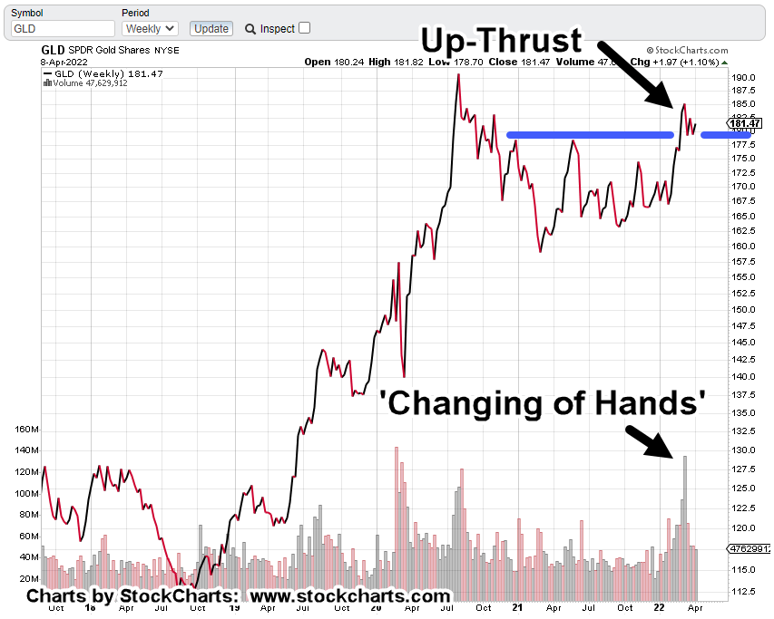
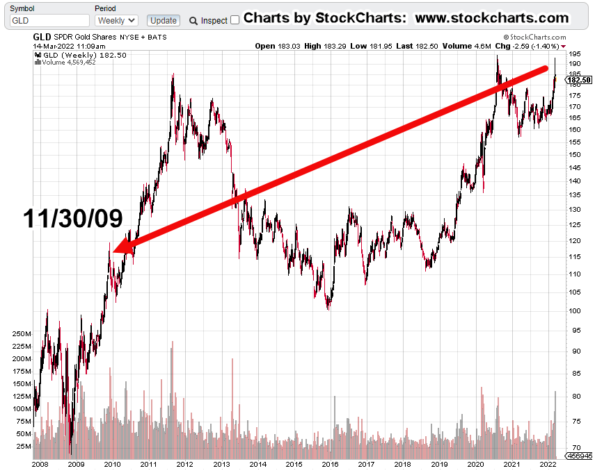
All the way back to late November 2009, to find a bar that’s remotely similar to the one just posted last week.
Even then, there are key differences.
The reversal during the week of November 30th, 2009 was after a breakout and run-up of about 20%; from the resistance/support area around GLD, @ 100.
Last week’s bar was within a trading range not outside it. Also, we had to wait until this morning’s open to get a new weekly low.
Volume (blow-off) characteristics were similar:
Week-ending 11/30/09, volume 93% higher than the week before; week-ending 3/11/22, volume 43% higher than the week before.
GLD, Weekly Chart
The chart gives us a feel for just how far back we have to go to find similar price action.
The prior update said at this juncture, longer term momentum indicators are pointing higher. Thus, suggesting there will be some kind of upward test either today or this week (Fed meeting?).
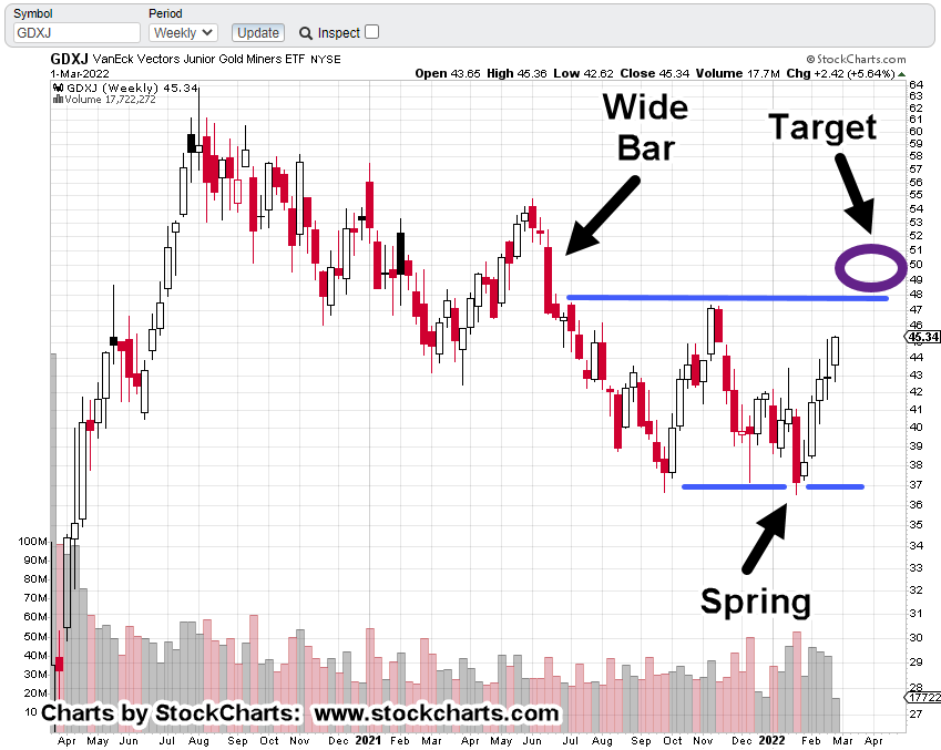
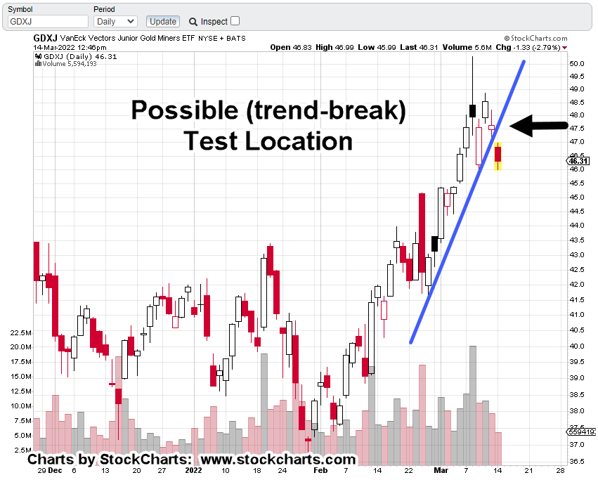
Junior Miners GDXJ, Weekly
Earlier this month, this post said to expect GDXJ, to up-thrust in the 48 – 50, area.
That does not guarantee a downside reversal. It just shows us price action repeats these behaviors; doing so for decades, if not hundreds of years.
What happens now?
Longer term momentum indicators point higher and give the bias to the upside.
However, something that can be done is to use that upward bias to position short at the lowest risk possible (not advice, not a recommendation).
Positioning via JDST
Junior Miners GDXJ, could come back to test the trendline break shown below starting today, through Wednesday.
If it does, the difference between being correct (about going short) and continued bull side action may be narrowed as much as possible (not advice, not a recommendation).
If that happens, the JDST stop will be very tight.
Note: Posts on this site are for education purposes only. They provide one firm’s insight on the markets. Not investment advice. See additional disclaimer here.
“The truth is incontrovertible. Malice may attack it, ignorance may deride it, but in the end, there it is.”
Winston Churchill
No matter what one may think about Churchill, the truth at this juncture for gold (GLD), is an island gap reversal:
‘There it is’
Longer term momentum indicators, MACD, are pointing higher on both the monthly and weekly.
So, there’s definitely some upward bias.
The ‘Next’ Catalyst
We’ve already had military attack, bombing of a nuclear power plant (so they say) including the actual threat of nuclear detonation … so what’s next?
The (fake) alien invasion?
What if aliens really do invade? My first thought of course will be, “I’m glad I have my stack of gold and silver to get me through. I feel much better.”
No, let’s get real.
We’re all going to wish we had a ‘Ma Deuce’, like this one.
If you’ve got one of those, you can have all the gold and silver you want … plus a few aliens to boot. 🙂
Hyperinflation, Here, Now?
Well, there’s at least one way to tell and that’s by the price action itself.
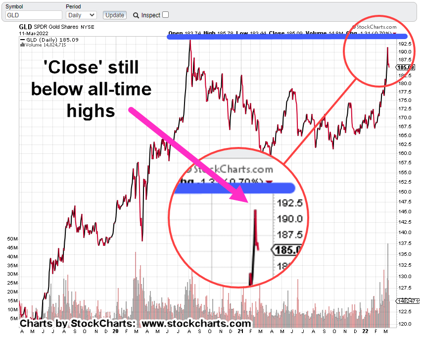
The daily chart of gold tracking fund GLD below, clearly shows the island gap.
Even with all the upward bias on longer-term momentum (MACD) indicators, if GLD can’t fill that gap, there’s something else at work.
On a closing basis, GLD is still below all-time highs, set back on August 6th, 2020.
With the climactic volume and price spike discussed previously, short term expectations are for some type of (continued) downward retrace.
Then, There’s This
It’s still about four hours to go before the Sunday futures open and anything can happen.
Note: Posts on this site are for education purposes only. They provide one firm’s insight on the markets. Not investment advice. See additional disclaimer here.
One hour, and fifteen minutes after this post was released, gold and the miners topped-out.
Depending on the close for today, gold futures prices may post a weekly reversal bar.
If it happens, that’s an important nuance.
The prior reversal from all-time highs … back in early August of 2020, did not happen on weekly reversal bar or even a daily bar.
What does that mean or what could it mean?
Unlike last time where gold (GLD), hovered around its all-time highs for a couple of weeks, this time, it looks like it can’t even do that.
We’re at the danger point.
For the gold tracking fund GLD, the price to watch is Monday’s open at 184.45. Closing below that level, indicates trouble for the bulls.
Gold (GLD), Daily Chart
Twelve months of daily price action shows the build-up, to the blow-off.
Below, we have a ‘measured move’ target completed.
Then, we have a volume climax.
Changing of hands from strong to weak.
Such volume spikes typically indicate the potential for a long-term, sustained reversal.
Contrary View
This analysis isn’t contrary just to be contrary.
We’re looking for market truth. Meaning, ‘what’s the market saying about itself?’
Once that truth is found or at least probabilities identified, then it’s incorporated into a strategic plan.
Go-Forward Strategy
At this point, it’s more than obvious, food and the food supply, is literally going to be the choke-point.
As nations world-wide, scramble to secure reliable food sources, anything can happen. They can even resort to selling-off their gold reserves en-masse, to pay for the insane commodity prices.
Don’t think that can happen?
Well, oil futures couldn’t go negative either, right? Nickel couldn’t surge to record highs on the largest single-day jump ever, right?
London Metal Exchange (LME) would never cancel trades and fudge their numbers, right?
What couldn’t happen then, is likely to happen now.
There’s a chance gold will not post a weekly reversal at the end of this session (currently, 12:53 p.m., EST). If so, it holds open the probability for an upward test or series of tests in the coming week.
Note: Posts on this site are for education purposes only. They provide one firm’s insight on the markets. Not investment advice. See additional disclaimer here.
Momentum indicators are pointing higher for both gold and the miners … that does not mean it’s a buy (not advice, not a recommendation).
For both GDX, and GDXJ, they’re entering up-thrust (potential reversal) territory as discussed in a previous post.
It’s time to monitor the sector for potential exhaustion and change of momentum.
That momentum could take a while to bleed-off … being patient is just one requirement for successful speculation.
Summary
From the panic, you would think no one’s ever seen a down market. On top of that, we’re potentially just getting underway.
This is the exact environment where Wycoff analysis comes to the fore: ‘What’s the market saying about itself?’
That analysis says, gold and the miners could still push a bit higher but there are huge disconnects under the surface; not the least of which, silver’s also not confirming the move.
Note: Posts on this site are for education purposes only. They provide one firm’s insight on the markets. Not investment advice. See additional disclaimer here.
A military invasion of Ukraine, nuclear power plant (supposedly) bombed, set on fire, power outages and potential food rationing, yet gold’s still below all-time highs?
Not only that as we’ll see below, the actual price has traced out what’s so far, a counter-trend (a-b-c) move; that is, the main trend is down … not up.
I like gold as much as the next guy but we’re seeing again and again, that’s not the crux of the immediate (world-wide) plan on a go forward basis.
Dollar & Gold: Game Of ‘Chicken’
Like a game of chicken, both the dollar and gold rallying strongly together; waiting to see who’s going to reverse first.
What do you think?
With as much control as certain entities have over both the dollar and gold … who’s likely to turn lower first?
If it’s gold, then at this juncture (below), it’s in a good position for reversal.
Weekly Gold (GLD) Close
The yellow vertical lines above, are of equal length.
GLD could push slightly higher and still maintain the ‘corrective’ a-b-c, structure.
As labeled, price action fits the ‘rule of alternation‘. The structure of the ‘a’ wave is brief and sharp. The structure of the ‘c’ wave is overlapping and longer duration.
The Danger Point:
Gold (GLD) is there now.
Continued upward pressure would change the ‘reversal’ assessment, to potential breakout … much higher prices ahead.
However, as J.B., points out in this latest video (time stamp 9:25) saying, he’s never seen so much traffic on the roads … as if gasoline’s at 99-cents.
One answer could be, this is the herd:
Completely unprepared and running around to find another herd as equally unprepared.
Panic buying of precious metals because everybody else is doing it, could be the reason behind gold’s current juncture.
Note: Posts on this site are for education purposes only. They provide one firm’s insight on the markets. Not investment advice. See additional disclaimer here.
With gold sector pundits bloviating, the ever-present challenge is to cut through the bilge and see what price action’s actually doing.
Stepping away for a few days, then taking another look at the charts, has yielded some potential insight into what’s really going on.
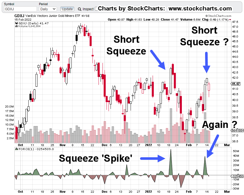
Junior Miners, GDXJ:
The first chart shows GDXJ, in the top panel with Force Index, in the lower.
Note the Force/Volume spikes … after the demand is satisfied, price collapses … at least on the first spike; we can’t say for sure the outcome of current action.
Price spikes and volume that subsequently collapse; the textbook definition of a short-squeeze.
There’s no real bullish demand or price would launch into a bull run.
The second chart highlights the areas in question.
The last chart gives one more clue that price may reverse from current levels.
Not only do we have a potential squeeze, but we’re also contacting an established trend line.
It looks like the squeeze is over. Volume has dropped significantly and price is up against established (trend) resistance.
Gold Higher, Miners Lower
Discussed many times, it (almost) doesn’t matter what gold is doing. It can go higher and yet the miners go lower.
We won’t know exactly why until it’s all over; one possible explanation’s that corporate collapse is already baked into the cake of the major equities …
Summary:
Remember their tagline, “We’re all in this together”.
So they are.
All major corporations implementing self-destruct (sustainability) policies … all of them doing it, ‘together’.
Note: Posts on this site are for education purposes only. They provide one firm’s insight on the markets. Not investment advice. See additional disclaimer here.
Even though technical conditions show we’re at least in a correction, if not outright reversal or collapse, record inflows for 2022, vs. 2021, present the herd-driven behavior of the public (and funds), to go long.
According to the link above, flows have been out of bonds and lesser performing equities, into equities that have gone down less.
In addition, you can see some of that flow (not addressed in the article) going into gold and the mining sector.
Stepping Back
Pulling away from charts and indicators for a moment, figuratively closing one’s eyes to get a ‘feel’ for what’s happening, it looks like the following:
We’re in a (potential) massive juggernaut reversal that’s been decades in the making; possibly having origins going all the way back to the ’87, crash, the ’95, bull market and then, repeated bubbles of 2000, ’07, and now.
At this point, it looks like the ‘average investor’ is doing the only thing they know how to do … that is, go long.
Those with at least some market knowledge, just got decisively whacked with their ‘put buying‘ strategy as the market has rallied strongly off the lows.
Pavlovian Panic
We’re witnessing the knee-jerk reactions of a public that’s been conditioned for decades, not to ‘think’, but only ‘do’.
Expect this type of behavior to go parabolic if the markets really do turn lower on a sustained, long-term basis.
Prechter has written extensively about crowds or the herd; especially in his text The Wave Principle of Human Social Behavior.
We can see this visceral behavior real-time, in other seemingly unrelated markets. Two examples below:
First, we had oil futures going negative for the first time in history; then we have LNG tanker rates going negative first time as well.
The model seems to be:
“Everybody wants it, and then, they don’t”.
The crowd runs to and fro, effectively leaderless.
With that said, one can make a case we’re just beginning, or already in an economic collapse; now being followed by the early stages of a market collapse.
Meanwhile, The Elephant Gets Bigger
Let’s not forget the massive elephant that’s just now getting so large, it can’t be ignored (time stamp 2:40).
Recall the example at this link … disparate crowds have a tendency to come to the same decision and modify behavior, all-at-once.
You have to wonder, when that crowd is going to simultaneously press the Sell, button.
Hit, In The SOXX
Unprecedented events are everywhere. That includes the massive, ‘never before seen‘, thrust lower in the SOXX.
The uptrend shown in the weekly chart of SOXX, has been decisively broken and with enormous volume.
The week ending Friday January 28th, saw 16.7-million shares traded … the most ever for the index (ETF).
More detail on trend break
Then, There’s Elliott Wave
Before the ‘Elliotticians’ get miffed by the previous (cookie cutter) comments, here’s this:
When this method works … it’s great.
It provides good projection areas and the useful ‘Fourth Wave of Lesser Degree’, targeting.
Note: A quick internet search for this Fourth Wave method (authored by Prechter) turns up nothing.
Logging onto ‘Club EWI‘, putting in ‘Fourth Wave’ has no items found.
One can try contacting Elliott Wave International, to request a copy of this targeting method. It may still be available (for a price).
The data used by this author to target the 4th wave retrace (shown below), is from a hard copy, dated, 1/8/2003. That information was excerpted from The Elliott Wave Theorist, July 9th, 2002.
First, the 2-Hour chart from Thursday’s update is repeated below with the ‘lesser degree’, added in magenta font:
Getting closer-in on the 4th-wave area below:
It’s subtle and difficult to spot. The price action congestion area is the ‘4th wave of lesser degree’.
Summary:
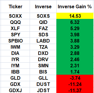
The previous update showed entry points for what is now SOXS-22-01 (not advice, not a recommendation).
Friday’s price action put this position well in the green; getting it to +24%, based on the close.
The table below are the ETFs being tracked along with the leveraged inverse fund tickers.
The percentage gain/loss, is for this past Friday’s action and shown for the inverse funds.
Obviously, the semiconductors were hit the hardest on Friday and so, SOXS, had the largest gain.
A good stop level for SOXS would naturally be Friday’s low (not advice not a recommendation). If we really are in an Elliott Wave 3, down … price action’s expected to continue its decline with haste.
Note: Posts on this site are for education purposes only. They provide one firm’s insight on the markets. Not investment advice. See additional disclaimer here.
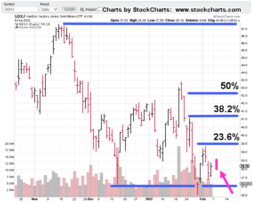
The magenta arrow and bar show pre-market action in Junior Miners GDXJ, about 25-minutes before the open.
Fibonacci retrace levels as noted.
The zoom chart shows a gap that action may be trying to fill and then? Is there something more?
Sated earlier, a 23.6%, retrace is rare and 38.2%, more common.
Summary:
The market looks to open higher.
If so, typical behavior is to come down for a test and then continue upward if that’s the overriding direction.
If the expected test fails, action may continue lower.
Once again, we’re at the danger point. The action itself defines the trading response.
Friday saw a partial exit of the short JDST-22-01, position in anticipation of higher prices (not advice not a recommendation)
Today may see the rest of the exit if the pivot higher is confirmed (typically within the first hour).
The fact pre-market trading is subdued with just (so far) a half-point or about 1.0% gain, still suggests weakness.
We can see price action penetrated support (bottom blue line) on the chart and so GDXJ, is in ‘spring position’. However, thus far that spring appears to be weak.
There’s a lot going on at this juncture.
JDST-22-01, Position Table to be updated and posted later.
Note: Posts on this site are for education purposes only. They provide one firm’s insight on the markets. Not investment advice. See additional disclaimer here.
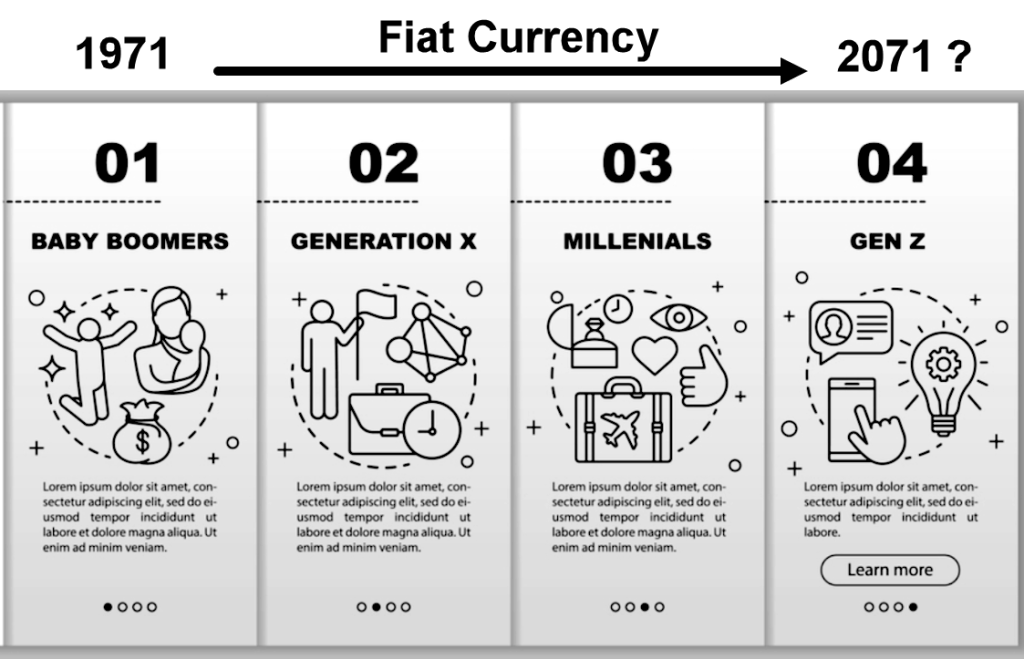
What if the ‘imminent collapse’ of the dollar is overblown by about 50 – years?
According to this just out, on private gold-filled currency, the article states average life of a fiat currency, is four generations. It goes on to say there are exceptions like the British Pound, continuing on even after hundreds of years.
The Black Swan
In Taleb’s book ‘The Black Swan’, he says it’s an event that nobody expects. It has long lasting repercussions and permanent change.
However, what most if not nearly everybody ignores or leaves out, is his alternate definition. That is:
A Black Swan can also be a future event that’s widely accepted as fact, that does not happen !!!
Is that where we are with the U.S. Dollar?
Even though the dollar has not collapsed and in fact, has rallied as we’ll see below, the ‘collapse’ talk continues unabated.
It’s easy to talk about dollar collapse.
It’s what gets the clicks. No matter that an actual collapse may be years if not decades away.
As of this post, how many ‘monopoly money’ YouTube videos can be found? Seems like it’s the same number or more than, ‘gold to skyrocket higher’.
Well, so far, gold has not skyrocketed higher.
On top of that, this site’s even provided an exclusive correlation that gold’s moving inversely to corn.
See ‘Insight Note‘ at the end of this post.
Ever since the ‘Derecho‘, it’s never been the same.
Back to the dollar.
No doubt, the dollar was whacked over the past trading week. Let’s take a look at what the UUP, price action is saying about itself.
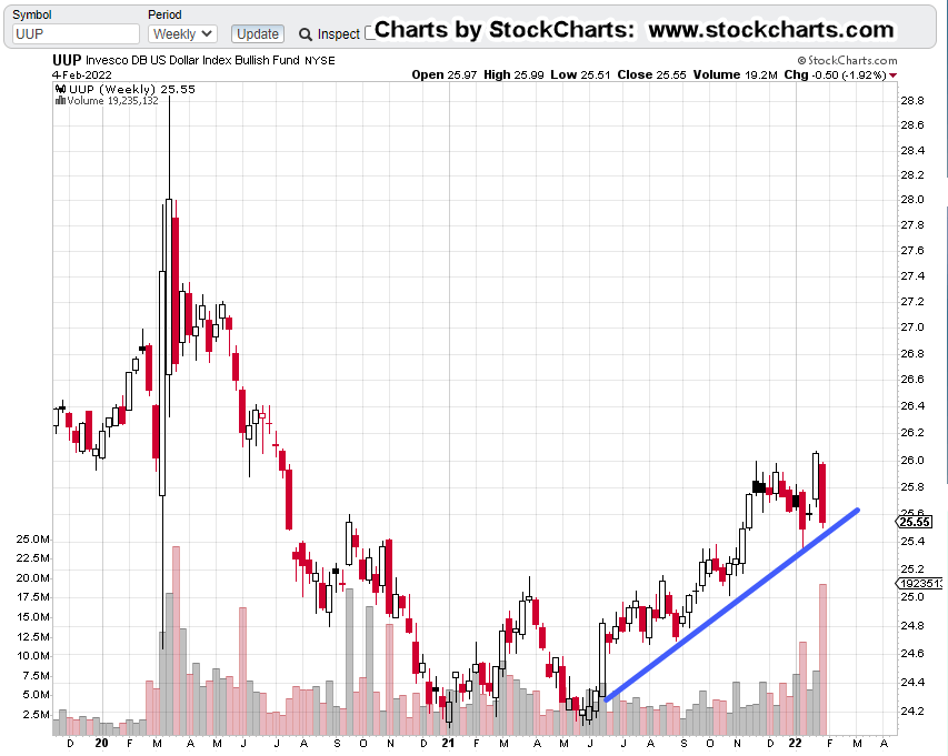
Dollar, UUP, Weekly Chart
The unmarked chart shows the dollar oscillating, testing support for six-months at the beginning of 2021.
Then, in mid-June ’21, UUP pivoted decisively higher (gold, GLD, pushed lower) and never came back to those levels.
Of course, this past week The Usual Suspects were out talking about the dollar and ‘monopoly money’.
The chart below shows last week’s bloodbath has served to bring UUP, down to an established trend-line.
It’s important to note, with all that (down) volume, the most since early 2020, UUP was not able (thus far) to break through the trend (blue line).
That leaves the dollar at or near, the danger point.
Continued, sustained selling, risks breaking the uptrend.
If the opposite takes place and UUP starts to rally, last week may have been an inflection point (to the upside).
Gold (GLD) and the dollar appear to still be inversely correlated.
Summary:
Ever since removal of the link to gold in 1971, the dollar has the potential to collapse at any moment.
However, in this case, we at least have some historical precedent that on average, fiat currencies tend to last four generations before becoming worthless.
Wyckoff sates in his writings over and again, ‘somebody always knows something’.
If there’s a collapse afoot, he tells us to look at what the market is saying about itself (not advice, not a recommendation).
Note: Posts on this site are for education purposes only. They provide one firm’s insight on the markets. Not investment advice. See additional disclaimer here.
The Danger Point®, trade mark: No. 6,505,279
Insight Note:
It’s been a strange coincidence over the past year or so, ideas presented on this site make their way to certain YouTube sites either in the titles, or within their content.
The timing of this phenomenon, that within a day or two, ‘post it first here, see it on YouTube there’, has occurred more times than one would consider as just ‘coincidence’.
Admittedly, the insights (making their way to certain YouTubers) have not been exclusive … that is, until now.
Recognition of the Gold/Corn inverse correlation, first posted here, is unique to this site.
As far as is known, this correlation has not been presented on any other financial site or YouTube channel or any other medium.
It may be an important data-point and map into this site’s long-time premise; it’s the corn and the grain first, then gold and silver (not advice, not a recommendation).
For more detail, search for Genesis 41.
When ideas from others are incorporated into the analysis presented on this site, full acknowledgement of the source is cited.
As Dr. Elder said in his book ‘Come Into My Trading Room’:
“I have zero respect for thieves”
He’s talking about the theft of his book title: “Trading For A Living”. He goes on to say, (paraphrasing)
‘Do you really want to use market analysis or input from someone that can’t think for themselves?’
Authorization:
Therefore, this footnote is authorizing the further use of the Gold/Corn inverse correlation by others in the industry if they so choose with the following caveat:
If one of the sites monitored (or some other media) uses this exclusive insight, and does so without referencing the source, it puts this author in the unenviable (but not unfamiliar) position of calling out the thief by name … not unlike what Stew Peters is doing (to the hoax/genocide perpetrators) on his broadcasts.
This market environment’s providing a fantastic public service:
It’s separating out the hucksters, the shysters and the otherwise incompetent from those who are, or who are striving to provide a service or useful insight.
The general investing public may find out soon enough, they’re on their own. Maybe unbeknownst to them, they’ve always been on their own.