Canary in The Coal Mine?
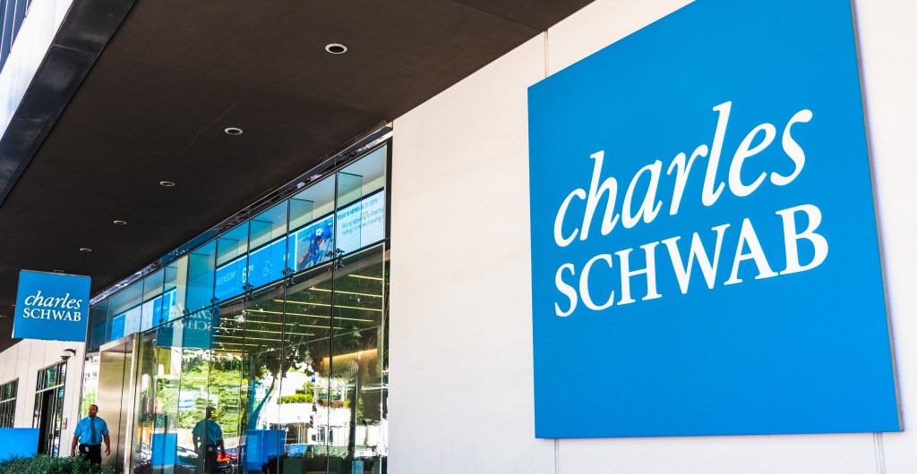
Friday’s downside action hit retail brokerages hard:
Schwab (SCHW) down -5.72%
Interactive Brokers (IBKR) down -6.41%
Interestingly, Robinhood, poster-boy for the novice ‘investor’, was whacked early in the session but recovered, closing lower by only -1.61%.
Adding to that, is the table below.
Financial Services, Capital Markets
This is part of the Finacial Services sector, showing major brokerage firm’s trading last Friday.

The upside in after-hours for HOOD, was the announcement it’s being included in the S&P 500.
If you have been in this game long enough, ‘last gasp’ indications like this, are typically contrary indicators (not advice, not a recommendation).
Note: The S&P reached its all-time high on Friday
Watch to see what happens next.
Does HOOD hold the upside (starting tonight), and move higher, or does it start slipping away.
Stay Tuned
Charts by StockCharts
Note: Posts on this site are for education purposes only. They provide one firm’s insight on the markets. Not investment advice. See additional disclaimer here.
The Danger Point®, trade mark: No. 6,505,279