That’s the training given by the late David Wies years ago concerning springs and up-thrusts.
His inference, if the volume contracts on the pull-back, the set-up has been tested; resumption of the reversal (up or down) is now expected to continue in earnest.
More analysis to follow but that’s where Newmont looks to be at this juncture.
Both gold (GLD), Newmont (NEM), and the miners (GDX), are at the danger point.
At this juncture, price action distance to trade failure or continued sucess is quite small (not advice, not a recommendation).
Note: Posts on this site are for education purposes only. They provide one firm’s insight on the markets. Not investment advice. See additional disclaimer here.
To date, there’ve been 232 transactions in the firm’s main trading account.
Each one has its own story.
The big one for now, is shorting the gold miners GDX, via DUST (not advice, not a recommendation).
We’re going to pull out the ‘card catalog’ on that one and take a brief look.
As a reminder, this post identified the breakout target for gold (GLD), months before it actually happened.
Also, in a prior post, it was discovered the miners had 3:1 downside response to recent down moves in gold.
Therefore, at this point in time, using leveraged inverse fund DUST, at -2X, the miners, gives an estimated, 6:1, market exposure.
Short entries were opened (shown below) once the gold market and miners broke to the upside.
Hysteria First
Those who’ve been here a while, already know part of the short set-up, was the necessary hysteria needed to get nearly everyone on the wrong (bullish) side.
Senior Miners, GDX
Just for reference, the daily chart of GDX, is below.
I suppose it must have been from behind enemy lines, with one of the gold updates warning us about archrival, Russia.
As we can see from the price collapse, the Russians must have found our gold bulls. 🙂
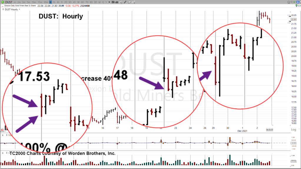
Meanwhile, Back At DUST
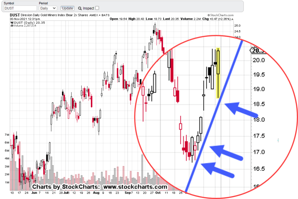
The daily chart of leveraged inverse DUST, shows trade entry locations to date (not advice, not a recommendation).
The hourly chart below, gives a closer look.
The next chart is a zoom-in of the entries.
Positioning in this market for now, is essentially complete.
At this point, it’s time to monitor and track for any potential trend reversal or trendline break.
Early Or Late
Years ago, sometime around late 2007, or early 2008, Robert Prechter Jr., said concerning his trades, he tends to be a little bit early.
That implicitly means he might suffer through adverse action including loss-exit, if action goes counter enough.
There’s no perfect entry. Early or late, take your pick.
Fixing Entry Errors
As can be seen on the hourly chart, every trade entry was on a red (declining price) bar.
The risk is, price action will just keep on going red.
The benefit is a big one; I’m not chasing the market.
If I’m chasing, it means I’m not on my game or I never had a game or worse, a coward that can’t pull the trigger on a trade without more ‘confirmation’.
David Weis covers in his video, how to properly get aboard a market that’s already underway.
After the initial entries, DUST banged around the bottom (GDX at the top) for eight trading days.
In retrospect and looking at the chart, the adverse action was not much lower but it did not feel like it at the time.
Because of the months of planning, there was an inference the size of this reversal would be significant.
So far, it is.
In the process of reversing, price action itself has fixed trade entries made a little too early.
Summary
Future updates will show potential trend and/or channel action as well as Fibonacci time correlation.
At this point, the DUST trade is well underway.
A reasonable stop area would be in the vicinity of DUST 19.37 (not advice not a recommendation).
Stay Tuned
Note: Posts on this site are for education purposes only. They provide one firm’s insight on the markets. Not investment advice. See additional disclaimer here.
Note: Posts on this site are for education purposes only. They provide one firm’s insight on the markets. Not investment advice. See additional disclaimer here.
That last one … is that like “The science is settled”?
To be fair, there is some truth in the articles. Prices are indeed rising. All types of costs are going up like food, gasoline and on.
Supply Restriction:
Here’s a strange bit of information from an unlikely source.
It turns out that copper (mining) supplies are being restricted in Minnesota. Go to time stamp 2:52, at this link and listen to the next 30-seconds.
Sure, it’s a data point of one but then again, what about all the talk of shutting down sources of oil production?
On it goes. This is supply restriction, not inflation.
It depends on what the definition of ‘inflation’ is.
Here we have one of the usual suspects parroting the now-accepted (but likely incorrect) definition of inflation. Go to time stamp 1:23.
I’m sticking with Robert Prechter Jr.’s definition of inflation and that is: Expansion of credit that causes increased spending that in turn causes demand to rise and then prices rise in turn.
Do we have expansion of credit now … or the destruction (or, soon to be) of credit? That’s called deflation.
Dollar … Still Not Dead
The dollar of course, is the wild-card.
Everybody’s expecting a collapse but darned if that’s just not happening. Actually, the opposite is taking place.
Now, all of a sudden it’s a “Contrarian Trade”. You can’t make this stuff up.
We’re coming up on the one-year anniversary of this post.
It postulated there was potential for a significant, medium-to-long term reversal in the dollar.
Getting The Picture
In a way, the dollar post and subsequent ZeroHedge one-year-later recognition of the obvious, define what this site’s all about.
As stated in the ‘About’ section, not every analysis works out. To borrow a quote from David Weis, ‘Sometimes I’m 100% wrong’.
Presented here are analysis, actions, course changes, attempting to maneuver through the largest economic and population collapse in world history.
The main focus is not to increase followership … although that is happening.
As the follower numbers increase, it’s a good sign that more are becoming aware of how manipulated and controlled is the entire narrative.
One way to separate from the effect of the falsehoods, is to become proficient at reading price action. As David Weis used to say, ‘What’s the market saying about itself?’
Which brings us to the current juncture. Gold
Gold, At A Crossroads ?
The current assessment of gold (i.e. bearish or reversal potential) is similar to the dollar from a year ago.
Different from the dollar, are the momentum (MACD, etc.) indicators … which are currently pointing higher.
In the dollar, there was a bullish weekly MACD divergence helping us along.
Not so with gold (GLD).
What we do have, and what the linked list above provides, is a look into a type of mass hysteria.
The ‘pegging the meter‘ article that came out late Friday caused only a blip higher in GLD and GDX.
If we’re at max persistent inflation already, is there any more upside left?
Stay Tuned
Note: Posts on this site are for education purposes only. They provide one firm’s insight on the markets. Not investment advice. See additional disclaimer here.
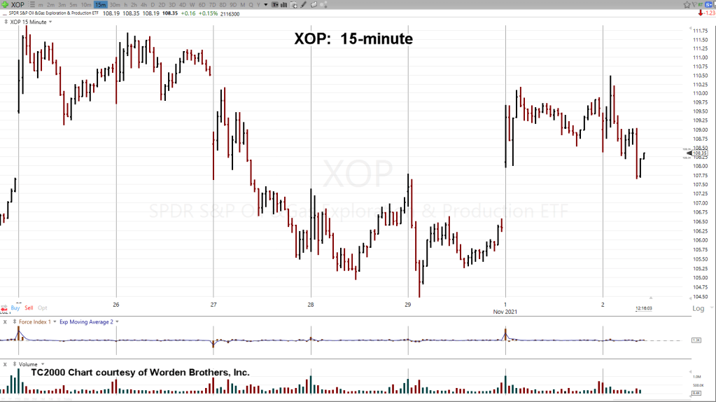
A higher XOP open would have probably been a short set-up (DUG) failure.
However, that’s not what happened.
The open was lower but then price action went on to post a new daily high above yesterday’s.
At this juncture, the short set-up is still valid (not advice, not a recommendation).
How can a new daily high be acceptable for a short position?
Repeating Set-Up:
Back in August this post was created to help document a market behavior that’s probably been repeating since the beginning.
My former mentor, David Weis used to call it ‘Spring to Up-thrust’, using Wyckoff’s terminology.
The fact the set-up’s been repeating for decades, if not a century or more, is definitive proof traditional valuations and fundamentals have nothing to do with actual price movement.
That’s a topic for another time.
XOP Analysis:
We’ll start with an un-marked XOP daily chart:
It doesn’t look like much is going on. So, let’s zoom into the far right side using the 15-minute, below:
Ok, what am I supposed to see?
Marking up the chart, we have the following:
Once we have the correct annotations, it’s obvious XOP just posted a ‘Spring to Up-thrust’.
True, it’s on a minor time frame like the 15-minute; however, it does give a clue XOP, could be in for a more significant and longer-term reversal (not advice, not a recommendation).
Positioning:
If XOP is somehow able to post another new daily high during this session or subsequent, most likely it would be time to exit our short position (via DUG, not advice, not a recommendation).
For now, the expectation’s for continued oscillation below today’s high … while XOP figures out if that’s all there is for the up-side.
Stay Tuned
Note: Posts on this site are for education purposes only. They provide one firm’s insight on the markets. Not investment advice. See additional disclaimer here.
Art & Science: Interpreting price action requires both.
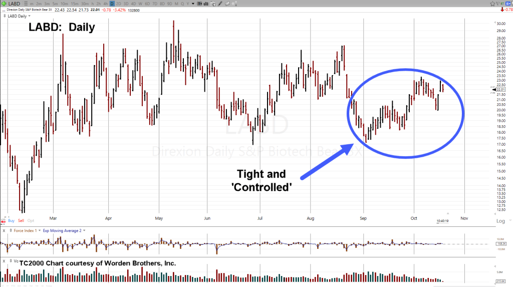
Since the September 2nd, high in biotech SPBIO and low for inverse LABD, the character of the market has changed.
Price action has become tight and orderly.
Typically, when that happens, someone (some entity) is gaining control. They are preparing the market for a directional move.
That’s the science part; the observation part.
Art is ephemeral. You don’t know if it matters to the subject at hand or not.
You won’t know until it becomes obvious.
In the markets, when it’s obvious, it’s too late.
News Of Note:
Within the past few days, there have been at least two news stories of note: Here and here.
It’s not really the stories themselves but what they represent.
Go to time stamp 8:10, at this link. That’s what it’s about.
The so-called controlling entities may be in the early stages of consuming each other.
What does that have to do the the markets and specifically biotech? Those thinking they were safe and getting fake ‘protection’ could be realizing, maybe they didn’t.
Maybe it was the real thing.
Mid Session:
SPBIO (Inverse, LABD):
The market’s had a change in character.
Whether or not the above links were the reason, just part of the reason or not at all, won’t be known until long after the market opportunity has passed.
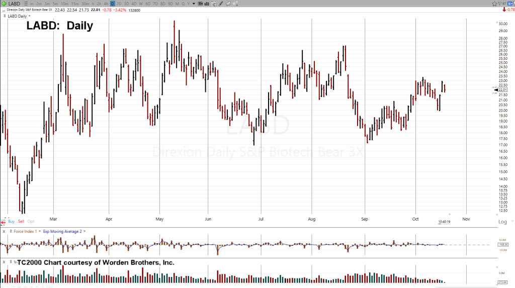
We’ll start with the un-marked daily chart of leveraged inverse fund LABD:
Tight price action identified:
Now, it gets interesting.
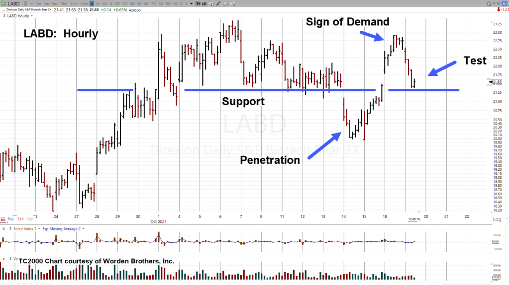
We’ll zoom in on part of the tight area using the hourly chart:
LABD has oscillated around support and then penetrated that support as shown.
Price action rose dramatically from there. We’ll label it as a sign of demand (Wyckoff term).
Next, we have the testing action. David Weis used to call it “The Gut Check”.
Tests can either pass or fail. That currently puts LABD at the danger point.
Positioning:
My firm’s position remains unchanged: Short biotech via LABD (not advice, not a recommendation).
Summary:
As this post is being created, LABD is moving up off the test lows. So far, overall price action has been well behaved.
Thus far, there has been no major (news generating) price break.
That type of controlled movement allows large positions to be built carefully and quietly (not advice not a recommendation).
Stay Tuned
Note: Posts on this site are for education purposes only. They provide one firm’s insight on the markets. Not investment advice. See additional disclaimer here.
Note: Posts on this site are for education purposes only. They provide one firm’s insight on the markets. Not investment advice. See additional disclaimer here.
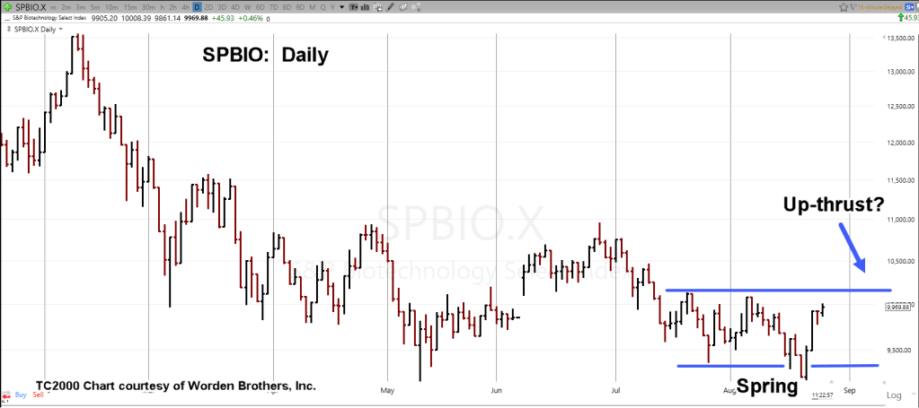
Biotech SPBIO, just went into a spring condition and is now in a rally.
From the sage observations of David Weis, we can expect … or at least start to look for, an Up-thrust.
The unmarked daily chart of SPBIO, is below. The charts that follow, show the potential up-thrust area. After that, we have a Fibonacci 23.6%, level added.
Just to add intrigue, September 7th, is 12-days from the August 20th low … well within acceptable range for a Fibonacci 13-Days.
Spring and Up-thrust notations:
Fibonacci retrace level:
Stay Tuned
Note: Posts on this site are for education purposes only. They provide one firm’s insight on the markets. Not investment advice. See additional disclaimer here.
Years ago, while reading one of David Weis’ daily updates, he made a comment to the effect:
‘I can’t count how many times I’ve seen a spring, go straight into an up-thrust’.
His observation stuck with me through the years. Being the engineering type, I naturally wanted to know why.
Why does that market observed phenomenon occur?
Pursuing the question from a data perspective, it became clear that finding an answer, would be a never-ending quest.
I abandoned the ‘data’ idea; but the question lingered.
During that time, observation of the markets proved Weis’ point. Some markets tend to go straight from ‘spring to up-thrust.’
One example that’s taking place now, is CAT:
Another example in the potential set-up phase is LOW:
The reason for the phenomenon remains open. Obviously, the market’s going to go where there are orders.
It’s likely, under the right price action and psychological conditions, when support is penetrated enough (amateur) participants sell and then sell short.
Those undisciplined traders continue to move their stops higher (against their trade) as the the market moves higher; ultimately taking them out at the up-thrust top.
How do I know this? Because that’s exactly what I used to do.
Note: Posts on this site are for education purposes only. They provide one firm’s insight on the markets. Not investment advice. See additional disclaimer here.
Looking over the updates of the past few weeks, you can see how the LABD channel (above) was formed.
The trend has repeated with successive moves higher and the right side channel line moved as a result of price action.
At this point, we may be there.
If LABD closes the day at its current location or higher, it’s a good sign of channel confirmation.
In addition, we have Moderna (MRNA) in the process of penetrating the trendline shown in yesterday’s update. If price action continues lower (as it’s doing in the early session), it could be on track to post a weekly reversal.
Separately, the IBB (ETF) index is already posting a weekly reversal. From a momentum standpoint, the new weekly high of IBB, has put that index in a potential bearish (MACD) divergence provided it closes lower from here for the week.
Positioning:
The bearish case has been building even back to David Stockman’s assessment of ‘2-Trillion Dollars of Bottled Air’, during the summer of 2015.
However, Stockman does not trade. So, to figure out if ‘this is it’, is not in his repertoire.
With current events as they are, one can intuitively conclude the fundamentals have not improved for the sector.
The backdrop is there for significant downside.
With that in mind my firm remains positioned max short (not advice, not a recommendation).
Any selling in LABD that’s occurred over the past month or so, was to adjust account(s) for maintenance (margin) requirements.
Once the index was finished with its adverse (SPBIO, higher, LABD lower) moves, we’re right back to establishing a full position.
This type of action has been going on for months.
It’s tedious and not exciting; exactly the opposite of what a typical YouTube viewer is looking for.
As a corollary, there’s no artificial (and profit limiting) requirement to show ‘Monthly’, Quarterly’ or whatever gains, to retail customers.
The financial press takes care of the retail side.
Some (very few) actually escape; finding themselves on sites like Van Metre’s, Weis’, and this one.
Stay Tuned
Note: Posts on this site are for education purposes only. They provide one firm’s insight on the markets. Not investment advice. See additional disclaimer here.