Beware … The Bond (Bull) Trap

… Almost There

The 40-year bull market in bonds, is over.

Until price action proves otherwise, each increase in bond price (decrease in rates) is going to be viewed on this site, from a bearish perspective.

That’s not to say bond prices won’t go higher. Counter-trend moves can be trading opportunities.

However, with market blow-ups, internet and broker outages the norm (think, SVB), taking a position against the overall main trend, is not something you’ll typically find presented on this site (not advice, not a recommendation).

With that said, let’s look at where the long-bond proxy TLT, is at this juncture.

Long Bond TLT, Daily

The chart may be hard to read but it shows the entire move lower from the all-time high posted on March 9th, of 2020.

The magenta arrow and bar is the Fibonacci 23.6%, retrace.

That’s where we’re focused on the chart below, an expanded version of the daily.

The potential set-up is obvious.

If price action breaks out of the (orange) wedge pattern into a measured move, it would retrace to the Fibonacci 23.6%, level, while at the same time, getting itself into Wyckoff Up-Thrust (reversal) position.

The up-thrust would be created if/when price action pushes above the known resistance area shown as the horizontal blue line.

The Danger Point®

If price action moves into the set-up area as shown, TLT would be at The Danger Point®

This is an area of instability.

At that point, it does not take much force to move the action in either direction, hence the name.

Strategy

As this post is being created, a quick check of ZeroHedge turns up this article, just released.

The article makes the statement as well, the bond bull market is over and uses the 10-yr Treasury to show the upside (yield) breakout.

The bottom line:

We’re in a highly dynamic environment where the typical money manager, financial advisor (as reported by Neil McCoy-Ward) finds themselves “clueless”.

If ever there was a point in time to focus exclusively on what price action is telling us using Wyckoff analysis, this is the time (not advice, not a recommendation).

The Sunday futures open in about six hours.

Stay Tuned

Charts by StockCharts

Note:  Posts on this site are for education purposes only.  They provide one firm’s insight on the markets.  Not investment advice.  See additional disclaimer here.

The Danger Point®, trade mark: No. 6,505,279

Gold’s ‘Maginot Line’

Strong Resistance, Built In

Unbeknownst to many, we’re witnessing a once-in-a-century opportunity and public service.

Those from the era of The Great Depression, are all gone now.

So, the same playbook can be run without anyone (alive) knowing we’ve been here before.

The public service presented to us, the massive on-going exposure of the financial charlatans and grifters.

You can be ‘certified’ and still be a certified (market) dolt.

Neil McCoy-Ward, points this out in his recent update linked here. Go to time stamp 8:40;

“Clueless” … “Completely Asleep”

Anyone who’s worked in the corporate world (in any sector), especially now, knows it’s near impossible to think or act independently.

So, it is with gold.

Gold & The Grifter Bandwagon

Where was everybody back in 2001, when gold was bottoming in the area of $270/oz., after a multi-decades long bear market (from 1980)?

The fact we have nothing but breathless panic from grifters and hangers-on, about rampant inflation should at least give one pause, we could be at a temporary or major reversal (not advice, not a recommendation).

At least with the analysis below, there’s a decision point that will let us know if we’re due for another leg higher, or if there’s a Sovereign debt crisis about to break that would kick-off massive selling of all assets including gold.

Gold GLD, Weekly

As the title says, we’ve got something akin to a ‘Maginot Line’ for gold. What looks like insurmountable resistance that could still be breached … but for now, is holding.

With each (manufactured) crisis, gold’s momentum in the form of price and volume, is declining.

From a Wyckoff analysis standpoint, the bulls (for now) are running out of steam.

The ‘terminating wedge’ in gold’s price action has already been discussed, link here.

Looking at the action in another light, we see a Wyckoff Up-Thrust in the works. Price action has penetrated a previous high and is currently struggling.

If gold (GLD) is able to significantly penetrate the resistance and hold, then we’re likely on to the hysterical predictions of the masses.

If not, and we get a reversal, it’s going to be big surprise for many. They’ll be stunned, unable to move and eventually provide more fuel for the downside as they sell in panic.

Downside Drivers

What could possibly be a downside driver for gold?

One has already been mentioned, a Sovereign debt crisis. It’s a likely event considering the record-pace rise for interest rates and subsequent bank failures.

Another is an ‘executive’ decision that gold ownership is outlawed. It’s happened in the past and those who got through that event are no longer with us.

Moving on, we’ve already been told there will be a ‘cyber-attack’.

What’s going to happen to gold, when there’s no electricity, fuel or food shipments?

As survivalist author Ron Foster says, in this interview, (time stamp 27:20), during a grid-down situation, he’s not giving up his food. He says, during such an event, precious metals are “meaningless”.

Stay Tuned

Charts by StockCharts

Note:  Posts on this site are for education purposes only.  They provide one firm’s insight on the markets.  Not investment advice.  See additional disclaimer here.

The Danger Point®, trade mark: No. 6,505,279

Biotech (Short) Trade Nets + 37%

Just Part of The Story

I once had an Uncle tell me:

“Percentages are for liars”

There may be doubters, haters, even money managers reading this and thinking that as well.

So, we’re going to get into it.

We’ll address the ‘liar’ claim, present the current state of biotech along with partial exit of the short position (not advice, not a recommendation).

Fundamentals: The Rats Scramble

Anyone with two-boosters rubbing together can see the rats scrambling; attempting to ‘normalize’ the abnormal.

For example, it’s now ‘standard procedure‘, after a Pilot’s ‘incapacitated’ (i.e., potentially drops dead) in the cockpit to roam about the cabin and ask if there’s anyone else available to fly the plane.

You can’t make this up. Nothing to see here.

Now, on to the charts.

First: Let’s Review

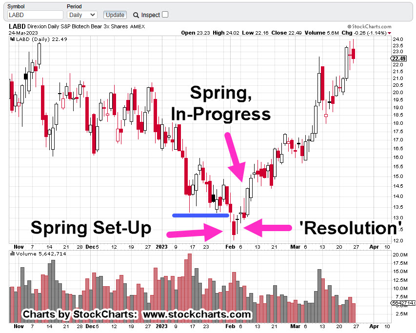
The chart re-printed below, is how it looked this past February 9th, as presented in this post. Recall, the actual reversal was identified to-the-day, in this post.

To go even a bit further, the Wyckoff penetration set-up was identified a day earlier, in this post.

SPBIO Leveraged Inverse LABD, Daily

Re-printed from February 9th.

Fast forward to now. This is how it looked on Friday.

From the chart above, the reversal is well underway.

Momentum has slowed a bit, hence the reason for the position to be reduced by about 13%.

If the decision to partial-exit was wrong and LABD heads immediately higher, there’s still a sizable position open.

If LABD spends the next several days contracting lower (as anticipated), there may be an opportunity to re-acquire the exited position at a lower level (not advice, not a recommendation).

The next chart shows the current trading channel.

It won’t take much sideways to down action to contact the right side. If or when that happens, we’ll see how price action behaves.

Where’s The Lie?

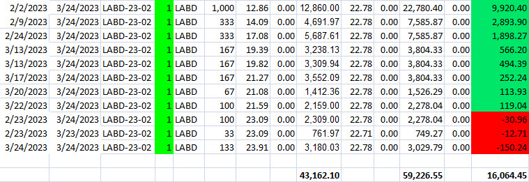
The spreadsheet below, is a modified version of what’s used by my firm. Note, it’s not the actual shares traded but a representation of that action.

The chart has been simplified with the initial entry (of this series) adjusted to 1,000 shares. Subsequent entries are adjusted by the same factor as the initial entry.

For the engineers, the data has been ‘normalized‘.

Working the numbers; we have $43,162.10 initial cost, $59,226.55 at the exit, yielding $16,064.45, which is just over a +37%, gain.

If there’s a lie in all of the above data, the analysis identifying the set-up, the reversal and subsequent trading actions with partial exit, I’m not sure where it is. 🙂

Note: The two left-most rows of ‘zeros’ in the chart are for commission charges. The spreadsheet was developed way back in the day when we had such things.

The right-most row of ‘zeros’ is open profit/loss.

Stay Tuned

Charts by StockCharts

Note:  Posts on this site are for education purposes only.  They provide one firm’s insight on the markets.  Not investment advice.  See additional disclaimer here.

The Danger Point®, trade mark: No. 6,505,279

Gold … The ‘Bubble’ Wins

At Least, For Now

The rabid gold bulls … foiled again.

From the last update (emphasis added):

“Gold (GLD) either reverses from here or moves slightly higher to the 187.50-area before reversing.”

Immediate reversal is exactly what happened.

Actually, gold did go higher to the targeted (GLD 187.50) area in the overnight session; then reversed before the regular session open.

So, it did both of the forecasted moves. 🙂

The ‘Real’ Unemployment

By now, anyone with two pension-plans rubbing together, knows the numbers … that is, any ‘official’ numbers are complete propaganda (not advice, not a recommendation).

For example, the ‘real’ unemployment here, is likely closer to 25%, rather than the ‘official’ level below 4%.

Keep that in mind, as we continue on.

Gold GLD, Weekly

The GLD, weekly has the three major tops with the current (potential) one included.

The second chart (the daily) focuses on the reversal; in technical terms a ‘Wyckoff Up-Thrust‘.

Gold GLD, Daily

Right now, we’re at the test or The Danger Point®; it won’t take much force to move price action either way.

Pointing probabilities to the downside, we have a repeating pattern of ‘Spring to Up-Thrust’.

It’s an observed empirical phenomenon, markets tend to go from a Wyckoff ‘spring’, straight into an ‘up-thrust’.

The New ‘Paradigm’

Well, we probably to have a new paradigm but it’s not in gold (not advice, not a recommendation).

That new paradigm is what no one will discuss.

In the opinion of this author and contrary to what is presented here and here (remember our ‘unemployment’ numbers) we’re in a full-scale demand and population collapse.

The ‘inflation’ for possibly a large part, has been manufactured.

You can’t have over one-hundred food processing plants mysteriously burn down (bug, insect factories not affected) with millions upon millions of egg laying hens destroyed, cattle herd at 1962, lows and not affect the price.

For whatever reason, the mainstream has decided to reveal to the masses what’s been known for years to those who are awake.

Of special interest, Tucker Carlson interview, linked here.

Going Forward

Gold’s at The Danger Point®.

If it can’t make it higher from here on so much apparent and ‘rampant’ inflation, there’s a real risk of it being affected by some kind of Sovereign default … somewhere.

A default would potentially lead to a massive asset sell-off; including everything that’s not nailed down … i.e., gold.

Stay Tuned

Charts by StockCharts

Note:  Posts on this site are for education purposes only.  They provide one firm’s insight on the markets.  Not investment advice.  See additional disclaimer here.

The Danger Point®, trade mark: No. 6,505,279
Gold … Bubble or Breakout ?

We’re About To Find Out

As this post is being created the Credit Suisse battle, rages on.

Recent updates are here and here.

Of course, it’s all planned chaos … but that’s a discussion for another time.

The apparent response from gold (GLD) over the past week, was to move sharply higher.

As expected, the gold bulls are in their brain-stem mania.

Once again. It’s a ‘new paradigm‘.

With that, let’s not forget the last time we had a ‘new paradigm’. Gold has not been higher, since.

Trading opportunity? … Maybe.

New ‘Paradigm’? … Probably, not.

Different, This Time?

As we’ll see below, there are potentially two outcomes for the price of gold (not advice, not a recommendation).

First: Gold (GLD) either reverses from here or moves slightly higher to the 187.50-area before reversing.

… OR …

Second: GLD, pushes higher, just shy of the 200.00, mark, while getting itself into a Wyckoff up-thrust condition.

The first chart shows the extremes as of Friday’s close (Sunday futures, yet to open).

Gold GLD, Weekly

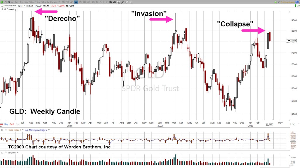
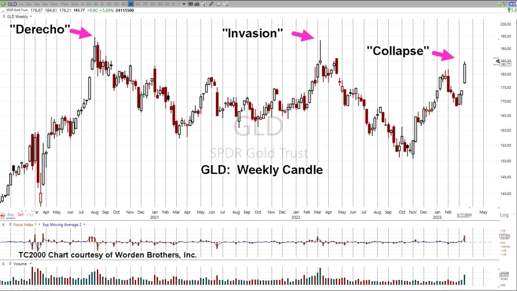
Concerted effort to destroy (or pollute) the food supply began with the Derecho. That effort continues to this day.

Secondly, we have the ‘invasion’ of Ukraine. Note the GLD spike is lower than the Derecho.

Now, we have the banking ‘collapse’. Once again (so far), the upward spike is lower than previous.

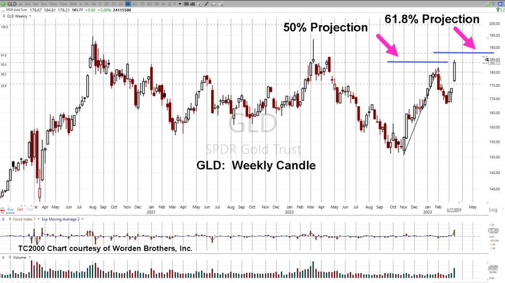
Looking at the second chart, we see a Fibonacci projection to 50%, the GLD 183.77-level; exactly where GLD, closed on Friday.

Empirical observation over many years has revealed, if price action gets to a 50% projected level, it’s typically on its way to higher levels.

A Lower Peak

Even if GLD moves up to the 61.8% projection as shown, the GLD 187.50-area, it’s still below the prior ‘Invasion’ peak set at GLD 193.30.

If GLD, moves significantly past these levels, then it’s likely on to new, all-time-highs and a potential Wyckoff Up-Thrust (reversal) condition.

If it happens, we’ll address it at that time.

Stay Tuned

Charts by StockCharts

Note:  Posts on this site are for education purposes only.  They provide one firm’s insight on the markets.  Not investment advice.  See additional disclaimer here.

The Danger Point®, trade mark: No. 6,505,279

Alcoa: Another ‘Chief Cook’

Yet, One More ‘ESG’ Opportunity

Like Carvana, Alcoa has no P/E

However, before we get started, this just out concerning Biotech:

From the German Health Minister, no less:

“Permanent Disabilities”

In a way, it does tie into the Alcoa analysis.

As a reminder, the economic (and population) collapse created by protection from ‘The Speck’, will last the lifetime of anyone reading this post (not advice, not a recommendation).

To support that statement and expand on the enormity of what’s happening, we have this link.

‘Over the next 10 years, ‘Speck’ lawsuits are projected to experience tremendous growth.’

With that, let’s move on.

Alcoa & ESG

Just looking at the website, it’s an ESG cornucopia.

When looking at the chart, it’s (almost) a no-brainer.

First, the very long-term view (Quarterly)

Alcoa AA, Quarterly

On the long-term, we have the repeating market characteristic; ‘Spring-to-Up-Thrust.

A ‘test’ of that up-thrust has been occurring over the most recent quarter.

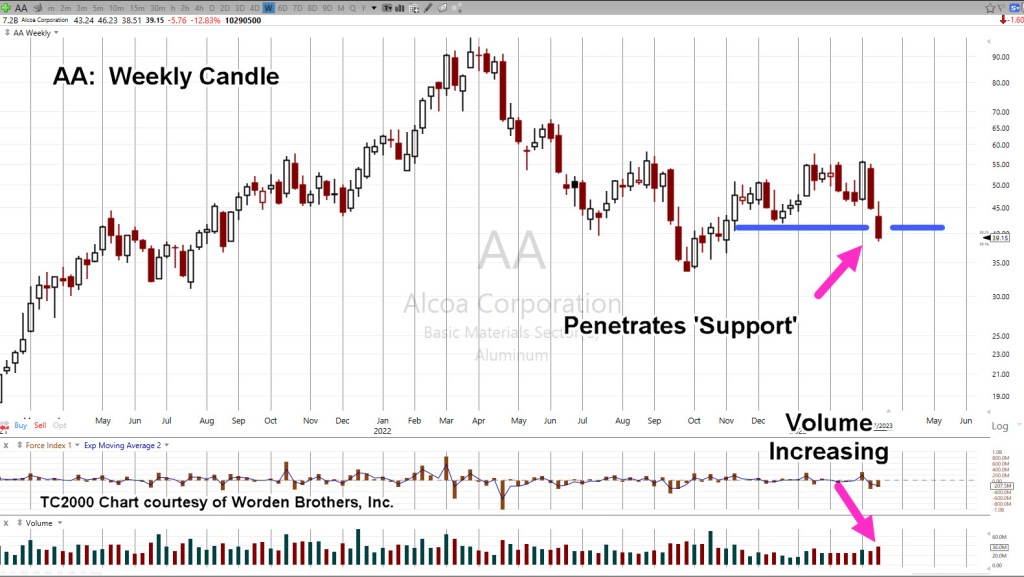
On the weekly chart, we see price action penetrated support with volume increasing.

Alcoa AA, Weekly

Technically, it’s a Wyckoff ‘Spring’ set-up. Some form of upward action next week is to be expected.

However, with the increased volume to the downside, probabilities are low at this point we’ll see any significant upside (not advice, not a recommendation).

Long Way To The ‘Open’

As said in the prior update, events are accelerating. The latest from ZeroHedge proves that to be true.

UBS Seeks Government Backstop As It Rushes To Finalize Credit Suisse Takeover Deal As Soon As Tonight

Another Nail in the Coffin

Looks like the Swedes have put another nail in the coffin for ESG. How long is it going to take for their pension system to fully collapse and then result in social unrest a la Paris?

Stay Tuned

Charts by StockCharts

Note:  Posts on this site are for education purposes only.  They provide one firm’s insight on the markets.  Not investment advice.  See additional disclaimer here.

The Danger Point®, trade mark: No. 6,505,279
Biotech … Bear Flag Breakout

A Long Way Down

On February 3rd, also represented as; 2/3/23, it all changed.

That was the day the ‘toxic train‘ derailed in East Palestine, Ohio.

It was also the day biotech sector SPBIO, reversed to the downside.

The biotech reversal was identified to the day with the following quote:

” … today’s action is consistent with resolution of the five-months of congestion …”

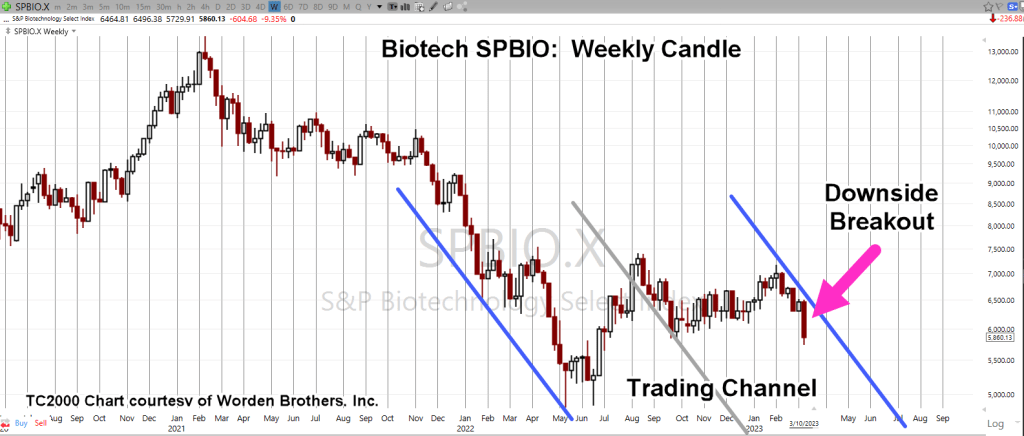
Biotech had been in a congestion zone, a bear flag, for an incredible five-months. There’s no other pattern like on the chart of SPBIO (ticker, $SPSIBI, on StockCharts).

The analysis stated that if or when this sector breaks to the downside, the extended period of congestion suggests a long, sustained, move lower (not advice, not a recommendation).

So, here we are.

Now, the downside reversal is obvious. Then again, it’s likely we’re still very early in the move as we’ll see below.

Projection Methods

We’re going to use two projection methods:

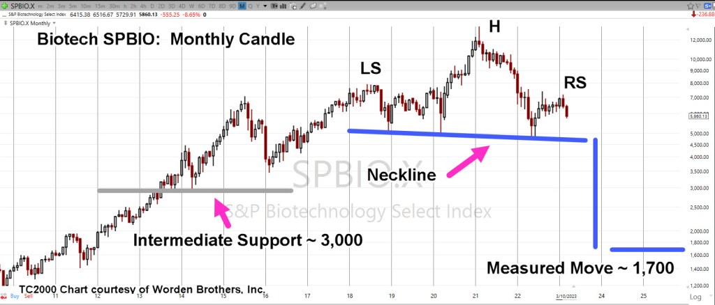
First: The standard classical chart which identifies a potential Head & Shoulders pattern.

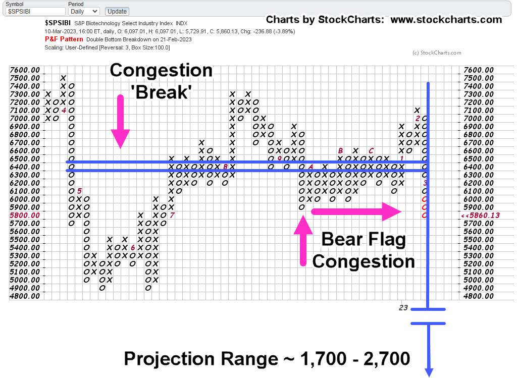
Second: The century old technique of ‘counting’ via Point & Figure (P&F).

Biotech SPBIO, Weekly (Classical)

Two charts are in classical format. The first shows the trading channel that spans 39-weeks from week 5/13/22, to week 2/3/23.

Note: Let’s not miss the symbolism (also, here and here): May 13th, 2022, was Friday. Then we have 2/3/23.

“For we wrestle not … “

The second chart is a compressed view.

Note the “3,000-level”, discussed in the P&F section.

Biotech SPBIO, Monthly

If the H&S pattern is in-effect and the neckline is broken, we have a measured move projection to the vicinity of SPBIO ~ 1,700 (not advice, not a recommendation).

Now, on to the P&F.

The ‘P&F’ chart has been used as a forecast tool for over one-hundred years.

The idea is to ‘count’ the number of congestion points and then project that congestion either higher or lower.

In our case of a breakdown, the projection is lower.

Biotech SPBIO ($SPSIBI), Daily P&F

The P&F chart comes up with roughly the same lower projection; approximately 1,700 (not advice, not a recommendation).

Looking at the P&F, we can see a steady amount of congestion with few breaks, that is, until we get to the left-most area.

There, we have a break of twelve boxes.

In classical P&F terms, that break of 12, indicates the SPBIO may ultimately reach the 1,700 level, but price action could be choppy after the initial count.

That initial count equates to around 3,000 for SPBIO, which just so happens to be an intermediate support level as shown on the Monthly chart.

Stay Tuned

Charts by StockCharts

Note:  Posts on this site are for education purposes only.  They provide one firm’s insight on the markets.  Not investment advice.  See additional disclaimer here.

The Danger Point®, trade mark: No. 6,505,279

Intel … ‘Penny Stock’ by Year End ?

Trading Channel

Beginning next week, we’re about to find out if Intel (INTC) is on track to be a ‘penny stock’, by year-end.

Stocks trading below $5/share, are technically called ‘Penny Stocks‘, and mostly ignored by institutional money.

Dystopian Hell: The Stage Is Set

INTC, has already cut the dividend by 66% (note the symbolism) and is ‘conserving cash’.

A large part of their operation with 18,600 employees, is just outside Portland, Oregon.

Here’s a recent look at Portland, uploaded two months ago.

‘Gee honey. Let’s take the kids and move to Portland … Not.’

Incredible, that ‘Speck Protection’ is STILL being pushed (time stamp 2:11). How would you like to work at a location at this late date, where it’s normal to wear a mask?

So, it goes.

All of this brings us to the chart. The price action itself defines the next likely course (Wyckoff).

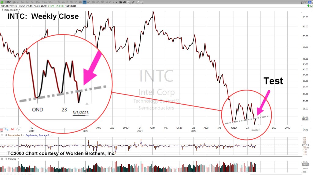
Intel INTC, Weekly Close

Last week closed testing underside resistance and potential right-side trend line contact (second chart).

Compressing the chart and expanding the downside scale, gives us the following.

Just in case anyone’s skeptical about ‘channels’ not being a real potential, here’s the latest look at Carvana (CVNA).

Carvana CVNA, Weekly Close

It’s important to note, not only the channel but the location of “No P/E”, which was the release of this post.

Carvana never closed higher after December 11th, 2021.

Intel, What’s Next?

Will it be the same for Intel?

Of course, that’s not known. Price action itself is the final arbiter; at this juncture, it’s at The Danger Point®

This is where the risk is least (not advice, not a recommendation).

If price action moves significantly higher from here, let’s say 5%, then we’ve likely bottomed and are heading into a rebound.

If not, and Monday, opens and closes lower, it may be a confirmation of the right-side trend line and potential trading channel (not advice, not a recommendation).

Let’s see what happens next.

Stay Tuned

Charts by StockCharts

Note:  Posts on this site are for education purposes only.  They provide one firm’s insight on the markets.  Not investment advice.  See additional disclaimer here.

The Danger Point®, trade mark: No. 6,505,279
Biotech … Breakdown, Breakout

‘The Court Jester’

Court jesters reveal truths like no other.

How appropriate then, that someone who typically plays the ‘village idiot’ comes out with the truth.

Whether the ‘false narrative’ is finally crumbling or not, is not directly related to analyzing price action.

It does, however, provide the backdrop.

The ‘Big Reveal’

The last update in biotech had this to say (emphasis added):

“If this is the big reversal and biotech is the downside leader, unfortunately, that could mean a planned ‘reveal’ by the mainstream media.“

What wasn’t known, was just exactly how the truth would come out. Now, we know.

All of which, brings us to the topic at hand: Biotech SPBIO.

It turns out, SPBIO, is trading most consistently, on a three-day pattern.

Biotech SPBIO, 3-Day

In Wyckoff terms, the market itself defines what timeframes and what support/resistance levels are important.

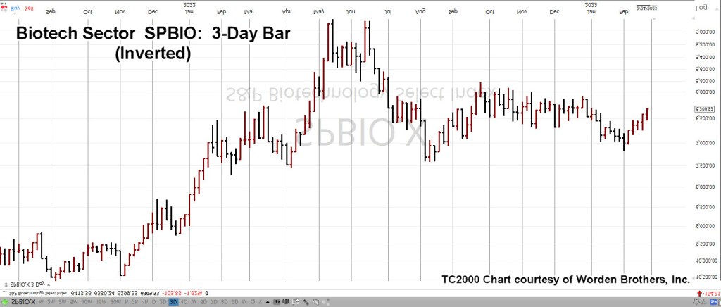
Next up, we’re going to invert the chart to mimic the price action observed on the leveraged inverse fund LABD.

Biotech SPBIO, 3-Day, Inverted

And now, the characteristics of this sector the market itself, has revealed.

At this juncture, SPBIO, trades in a sequence of 3-Days after which, if there’s a directional move, continues on for nine consecutive bars.

After nine-bars, price action typically enters a correction for an undetermined amount of time.

After the correction’s compete the market has (in the past) continued on a directional move for another nine-bars.

Then & Now

We’re currently in a directional move that’s five ‘3-Day Bars’ in thus far.

If the market adheres to its prior behavior(s), we have at least four more ‘three-days’ to go (not advice, not a recommendation).

Note, the current reversal was identified to the day, with this update:

“However, today’s action is consistent with resolution of the five-months of congestion (not advice, not a recommendation).”

The fact the congestion period for SPBIO has taken so long to (apparently) resolve itself, has produced the potential for price action to go farther, last longer than anyone would normally expect.

That move if it happens, connects well with the introduction at the top of this post; a large part of the public has been informed in no uncertain terms, it was all a lie.

The needle, and the damage done.

Stay Tuned

Charts by StockCharts

Note:  Posts on this site are for education purposes only.  They provide one firm’s insight on the markets.  Not investment advice.  See additional disclaimer here.

The Danger Point®, trade mark: No. 6,505,279

NVDA & SOXX … Risk Reduced ?

At The Danger Point®, Where Risk Is Least

It does not get much better than this.

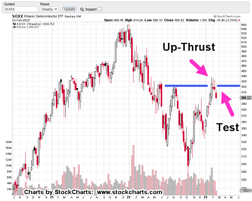
The weekly chart of semiconductor index SOXX (below), shows we’ve already had the Wyckoff up-thrust, the reversal.

All that was missing was the test. That is, until today.

The reportedly ‘good news‘ from Nvidia has given the SOXX the excuse to test its reversal.

Pre-market action has Nvidia itself is up +10.61%, and the SOXX currently up +2.42% (8:32 a.m., EST).

Conversely leveraged inverse fund SOXS is down – 7.15%. This is the opportunity (not advice not a recommendation).

Semiconductor Index SOXX, Weekly

With the SOXX open set for higher, risk on a short position (via 3X Leveraged Inverse SOXS) may be reduced as much as the market is going to allow.

Less risk is NOT, no risk.

The market is going through its natural tendencies, and this is an area where there could be a short opportunity (not advice, not a recommendation).

Stay Tuned

Charts by StockCharts

Note:  Posts on this site are for education purposes only.  They provide one firm’s insight on the markets.  Not investment advice.  See additional disclaimer here.

The Danger Point®, trade mark: No. 6,505,279