Was It August 1st?

Was yesterday, the day?
The day the SOXX, closed higher but failed to print a new high.
It’s now early in the session (9:55 a.m., EST) and we have a new daily low.
There have been sell signals before but this one has a different ‘feel’ (not advice, not a recommendation).
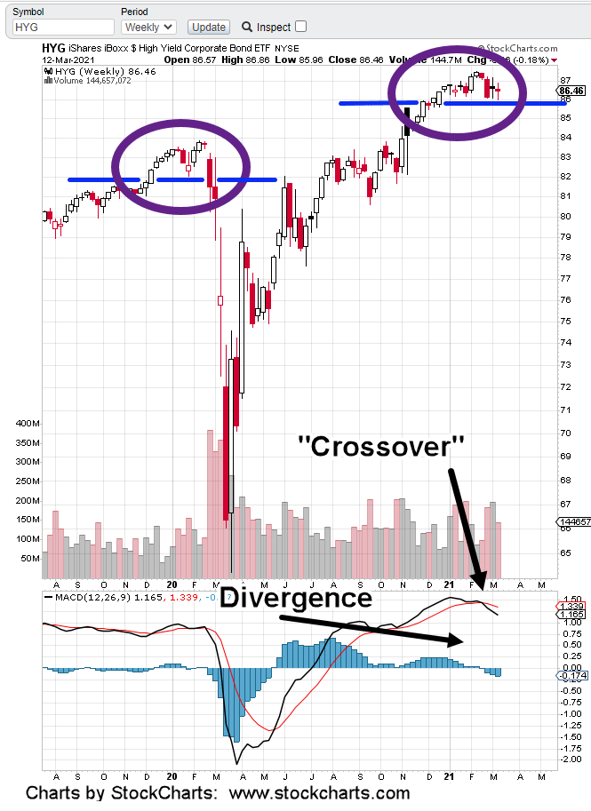
Yesterday, bonds (TLT) gapped open lower and broke below support; rates are rising … again.
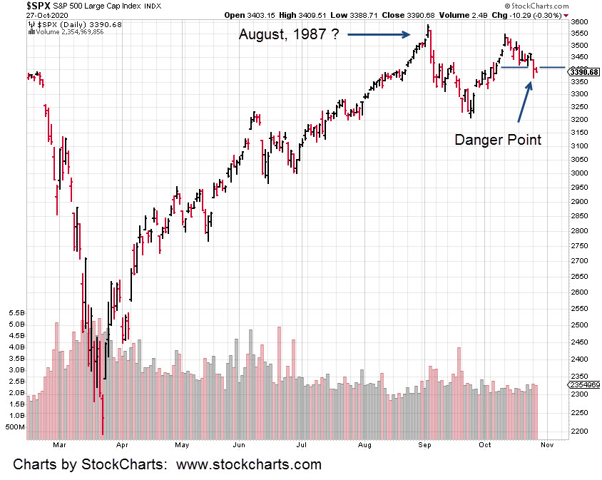
The 1987 Set-Up
Those old enough, remember the set-up. Rates up (bonds down) and market rising to all-time highs at the same time.
A chart of the ’87 crash is here. Note, the high was in August, that year.
Now, a video from Robert Prechter, about the current historic extremes.
‘Not since the South Sea Bubble of the 1700s’
Couple all of that with bonds (TLT) breaking down and we could have that ‘inflection point’, saying we’ve reached the top (not advice, not a recommendation).
The Mania Goes ‘Manic’

Going back to this post, it said to expect the AI proaganda to increase as we reach the top and reverse down.
If yesterday was that day, then we’ve got more articles coming about the downside being a ‘buying opportunity’.
It’s been the same throughout history
From a positioning standpoint and Wyckoff analysis perspective, under such conditions, one is to pick the weakest market to short and not the strongest (not advice, not a recommendation).
Junior Gold Miners, GDXJ, Bear Market
The last update showed how positions can be de-risked.
There’s always uncertainty but working long enough in the markets and eventually an understanding is formed on how the game is played.
Fake, fabricated or ‘serendipitous’ news articles getting the public on the wrong side, are just part of the game.
In the early session, the GDXJ, is continuing its move lower.
Stay Tuned
Charts by StockCharts
Note: Posts on this site are for education purposes only. They provide one firm’s insight on the markets. Not investment advice. See additional disclaimer here.
The Danger Point®, trade mark: No. 6,505,279