What To Watch … Bonds, Gold, Real Estate, Tesla

Bonds:
Last Friday, the bond reversal posted a shallow retrace.
We’re looking for upside follow-through at the next session.
Gold:
If gold (GLD) closes below 154.67, on Monday, it will be seven consecutive down months.
Momentum has slowed to a potential inflection point.
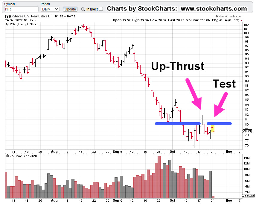
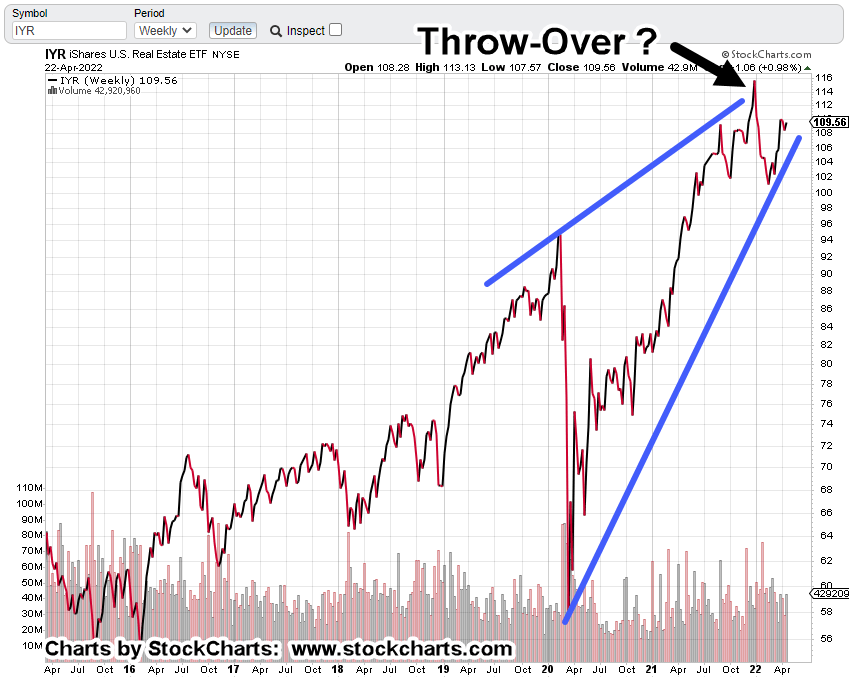
Real Estate:
If bonds move higher, real estate may follow. We have potential targets and Fibonacci timeframes.
Tesla:
This update, said to watch if/when TLSA, broke below support.
It did just that during the following week but now, it’s hesitating.
As a result, we have a Wyckoff ‘spring’ set-up.
Now, on to the charts.
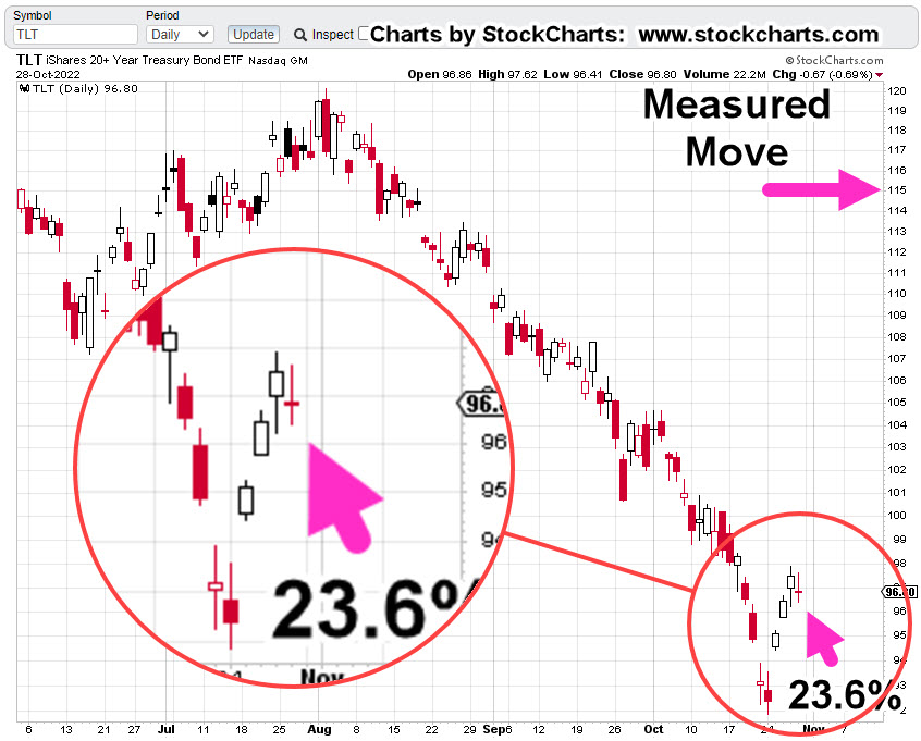
Long Bond TLT, 30-minute
We’re drilling down to the 30-minute.
The blue line is Fibonacci 23.6%. Price action (at this point) shows the beginning of a move higher from that level.

Moving decisively higher at the next session, puts the terminating wedge into play, shown here.
If we get a wedge breakout, then we have a measured move target in the vicinity of TLT, 115.00.
Gold (GLD) Weekly Chart
A close below 154.67, on Monday, would put GLD, at seven consecutive down months.
GLD, has never closed lower seven consecutive months; not since inception, on 11/18/04.
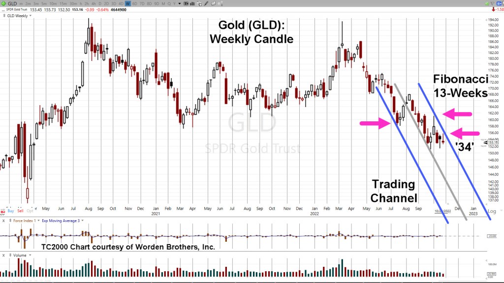
Gold remains in a down-channel that’s a Fibonacci 13-Weeks wide.
Last week’s move helped to re-confirm the channel.
That action is itself, a Fibonacci 34-Weeks from the ‘changing of hands‘ high, during week-ending, 3/11/22.
However, momentum of price action has slowed.
If there’s going to be a break to the upside, this would be the place; otherwise, watch for continued GLD downside.
Real Estate IYR, Weekly
If bonds continue their upside reversal with rates lower, we can expect real estate IYR, to have some type of ‘dead cat’ bounce.
If so, how long and how high.
An infinite number of scenarios are possible. However, the chart of IYR, shows what to expect for two of those possibilities.
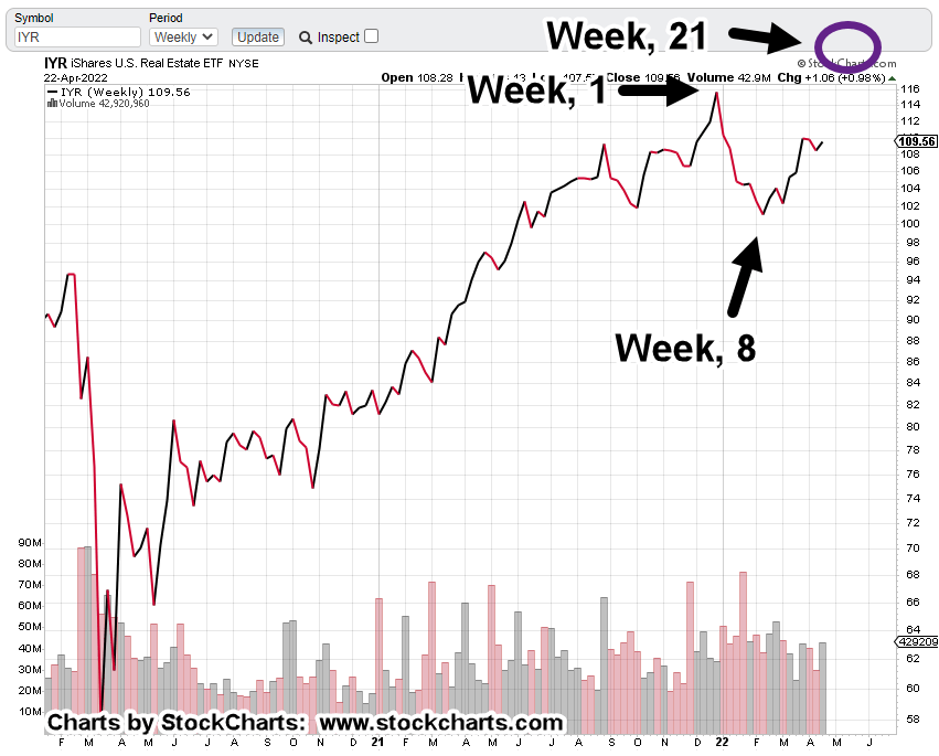
Real Estate IYR, Weekly

The uptrend (blue line) has been decisively broken. What has not yet happened, is a ‘test’ of that break.
Shown are potential tests; Week 8 (from 10/14/22, lows), at Fibonacci 38%, and Week 13, at 50%.
Between ‘Week 8’ and ‘Week 13’, is the December Fed meeting … a possible catalyst.
Tesla (TSLA) Weekly
This one seems a bit far-fetched but here it is, anyway.
If bonds rally, the rest of the market may also rally; that could include our chief cook and bottle washer, Tesla.
Price action bounced at support and penetrated it several times before printing outside-up on the weekly (twice).
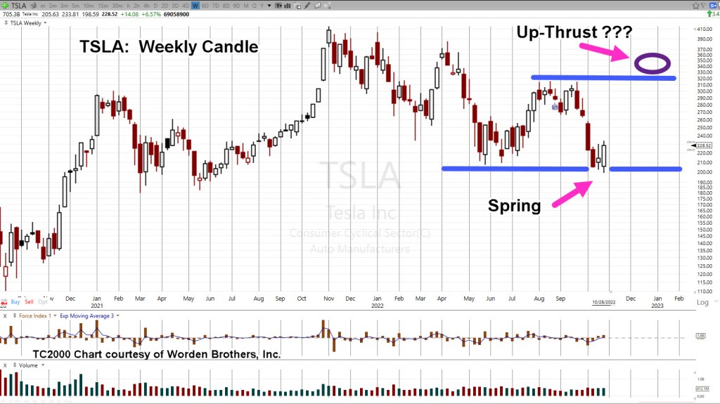
By definition, it’s a Wyckoff spring set-up.
A spring tends to go straight into an up-thrust; a repeating pattern, shown on the chart at around TSLA, 315.
Set-ups can also fail … so, we’ll be watching this one closely.
Stay Tuned
Charts by StockCharts
Note: Posts on this site are for education purposes only. They provide one firm’s insight on the markets. Not investment advice. See additional disclaimer here.
The Danger Point®, trade mark: No. 6,505,279