‘…. and reminds you, she was only in it, for the money ….’ Steve Goodman
Seems like any time gold or silver blips higher, the shills come out; a new book to sell, more metals to peddle.
Obviously, what’s presented on this site, is neither; we’re searching for the truth, market truth, nothing else.
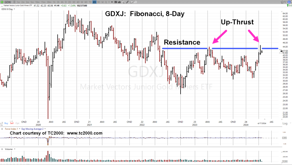
When looking at Junior Mining (ETF) Index, GDXJ, once again, it’s at The Danger Point®.
Junior Miners, GDXJ, Fibonacci 8-Day
The 8-Day chart gives us a clear view of the action.
There was an up-thrust during the week of April 14th, 2023.
Now, a Fibonacci 55 (-2) weeks later, another one during the week of April 12th.
Last Time, Is Not, This Time
The up-thrust in April ’23, resulted in a steady but choppy downside action until the bottom, February, this year.
Using Prechter’s ‘rule of alternation’, whatever happens from here, it’s not likely to be what happened last time.
So, essentially, we have two potential outcomes; strengthening with continued upside, or a swift decline back to support levels (not advice, not a recommendation).
Note: Posts on this site are for education purposes only. They provide one firm’s insight on the markets. Not investment advice. See additional disclaimer here.
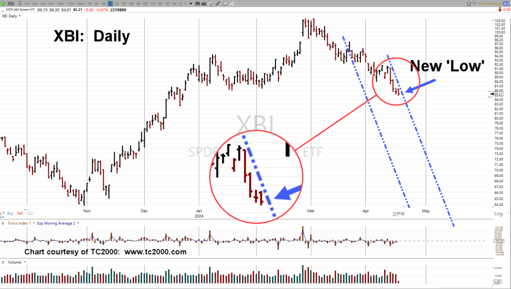
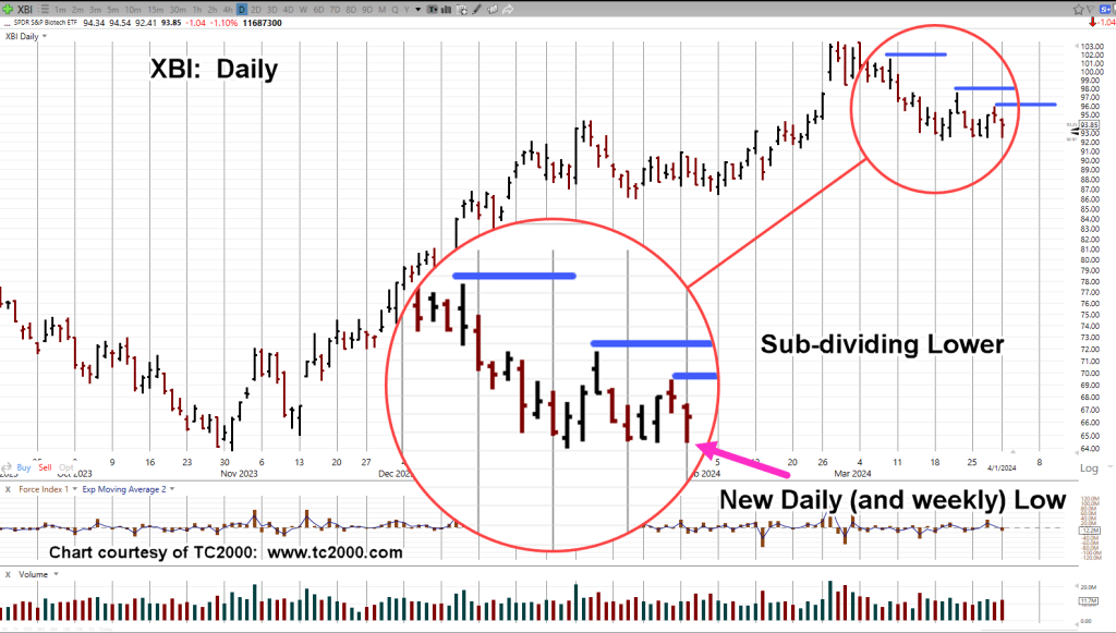
If this morning’s upside ‘attempt‘ was all there is for biotech XBI, then it’s just a blip on the RADAR screen.
If so, the sector could be entering a very dynamic phase (not advice, not a recommendation).
There’s always the chance, price action is slowing to mount another try at the upside.
However, if the trading channel with its trendlines remains in-effect (shown below), lower prices are the higher probability.
Biotech XBI, Daily
At this point in the session (11:42 a.m., EST), XBI has made a new daily low but more importantly, has not made a new daily high.
The ‘blip’ higher at the open, may have been the best chance for a Wyckoff spring to develop; so far, it’s not happening.
The Fibonacci channel previously discussed (here) remains in-effect. This morning’s action appears to be confirming the right side trendline (not advice, not a recommendation).
Note: Posts on this site are for education purposes only. They provide one firm’s insight on the markets. Not investment advice. See additional disclaimer here.
Note: Posts on this site are for education purposes only. They provide one firm’s insight on the markets. Not investment advice. See additional disclaimer here.
Storage facilities in Texas are paying to have someone take excess Nat-gas.
As this link says, the ‘reason’ for negative Nat-gas, is high oil prices prompt drillers to increase oil production, along with (by-product) Nat-gas, driving down the price.
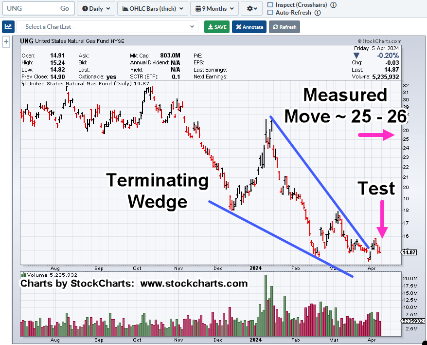
We’ll cover Nat-gas (UNG) in a separate update which by the way, on Friday, posted another Wyckoff spring set-up.
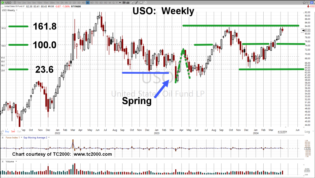
The question du jour is, ‘does oil go higher from here?‘
If oil is going higher (or likely to go), then Nat-gas may be pressured downward for longer.
International Chaos
The amount of ‘pontificating’ from the media on what oil is, or is not going to do, is mind-numbing.
Wyckoff himself said, we’re attempting to find out ‘the next probable direction’ for the market, which of course, can never be known for sure.
With that, let’s go to the truth of the matter, the chart.
Oil Tracking Fund, USO, Weekly
Shown on the chart, is a Fibonacci projection from the lows of March 2023, to the first wave high of April ’23, then back down to the wave low, in May ’23.
It might be hard to see, so the first waves are highlighted with green dashed lines.
At this point, instead of asking the question ‘where’s oil going?’, a better question may be, ‘is the chart of USO “respecting” the Fibonacci projections?’
Looking at the chart, it’s an obvious, yes.
Right now, we’re at the 161.8%, projection and USO is hesitating; at the same time, Nat-gas, UNG, appears to be forming a long-term bottom (not advice, not a recommendation).
Note: Posts on this site are for education purposes only. They provide one firm’s insight on the markets. Not investment advice. See additional disclaimer here.
Way back in 2001, it was all bearish on the gold front as well; lows were around $254/oz. – $255/oz.
How did that work out?
No, Nat-gas is not gold but at this point, it’s possibly just as ignored as gold was, then.
The strategy or potential reasons for a rally in Nat-gas, have already been addressed here and here.
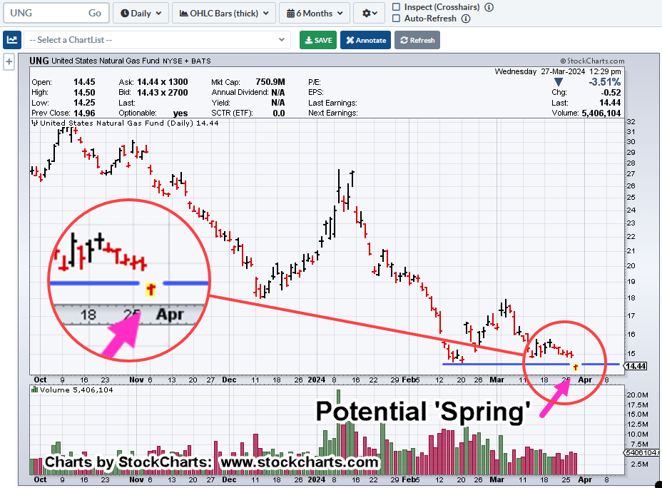
So, we’ll cut to the chase, looking at the proxy, UNG.
Natural Gas, UNG, Daily
It’s possible, the March 27th, penetration of support (covered here) and subsequent recovery, is a Wyckoff spring set-up (not advice, not a recommendation).
If we’re in a spring with the wedge in-effect, meaning, the market’s not going to morph into another structure, then it’s likely, Friday’s action was a test of both the spring and the wedge (breakout).
Supporting the ‘test’ scenario, we have Friday’s action pulling back to the lows; volume contracts by over 37%, when compared to the day prior, Thursday.
Of course, this is all very nuanced action and can be blown away at the next session.
However, as with our gold example, no one was looking for a major, long-term reversal at the time.
Note: Posts on this site are for education purposes only. They provide one firm’s insight on the markets. Not investment advice. See additional disclaimer here.
There’s been something wrong with the precious metal’s, gold and silver, for years.
Gold and silver used to move essentially in tandem, over the long term; not anymore.
This link shows there’s a huge divergence in the correlation between the two metals. Gold has launched higher, while silver has lagged.
Right around June of 2020, the correlation began to break down. What else was going on (or being ‘rolled out’) around June of 2020?
Recall, silver’s primarily an industrial metal; affected much more (than gold) by manufacturing demand.
Strategy First
Shown by the market itself, direct correlation between silver and gold no longer applies (or has somehow changed into a new construct), silver’s not confirming the ‘inflation’ shtick, possibly influenced more by industrial demand.
Thus, we have the following.
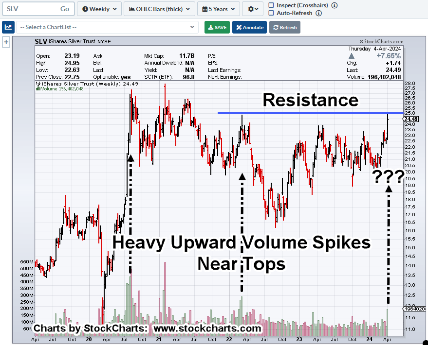
Silver SLV, Weekly
Just listening to what the market’s telling us, it says, when SLV, reaches a top and inflection point (to reverse lower), it tends to print heavy upside volume bar(s).
Looking at the chart, price action’s all over the place. Wide bars, volume spikes, the gamut.
Markets like this are unstable and usually can’t mount a sustained move in either direction.
Typically, if there’s going to be a breakout (or breakdown), price action tends to get tight, or get itself into a ‘coil’.
Even so, we need to account for the market itself.
Having traded silver futures contracts during the last run up and meltdown from 2011 – 2014, the silver market is thin and likes to ‘spike’.
That (spike) behavior is confirmed by Ed Seykota in Market Wizards and David Wies in his (formerly) daily market updates.
We may be at the beginning of a set-up for a Wyckoff up-thrust (above resistance) and then reversal.
A possible measured move for SLV (to be covered in another update), puts the tracking ETF, right around 25.60, about 2-pts. from where we are now (not advice, not a recommendation).
Note: Posts on this site are for education purposes only. They provide one firm’s insight on the markets. Not investment advice. See additional disclaimer here.
Note: Posts on this site are for education purposes only. They provide one firm’s insight on the markets. Not investment advice. See additional disclaimer here.
“What we’re looking for here, is some kind of Jimmy Carter type stunt where corn exports are halted in the name of ‘national security’ or some such thing.”
Corn Tracking Fund CORN, Weekly
Two Fibonacci projections are overlaid on the chart.
First, a simple retrace starting near ‘Derecho’ lows, to highs set during the week of April 29th, 2022.
Second, a counter-trend projection from those highs to the intermediate lows set during week of May 19th, 2023 and highs of June 23rd, week, the same year.
CORN has retraced 61.8%, which is also the 1:1 counter-trend projection. In addition, it’s the measured move from the wedge break.
The market has effectively confirmed the support area.
Oil Goes Negative … And Corn?
Remember that ‘anything can happen’. Oil futures made history by going negative.
We’re in a new construct, a new paradigm, our strategy should match accordingly.
Everyone has their own perspective and plan for the markets; fair enough.
From here, CORN could continue to new, all-time highs.
However, for my accounts, I’ll wait until such time it appears the downside risk is removed as much as possible.
One potential area for that ‘removal’ is the 76.4%, retrace in the vicinity of CORN @ 16 (not advice, not a recommendation).
Note: Posts on this site are for education purposes only. They provide one firm’s insight on the markets. Not investment advice. See additional disclaimer here.
Note: Posts on this site are for education purposes only. They provide one firm’s insight on the markets. Not investment advice. See additional disclaimer here.
Right along with the current narrative, ‘The Fed’s going to cut rates’, is another narrative, ‘The Fed’s in charge, a leader, and sets rates’.
Is either one, actually true?
Years ago, Robert Prechter Jr. pointed out very convincingly, the Fed’s a follower, not a leader.
His research showed, over many years, the Fed consistently follows the market.
Along with that, was his premise, ‘The market leads the news, not the other way around’.
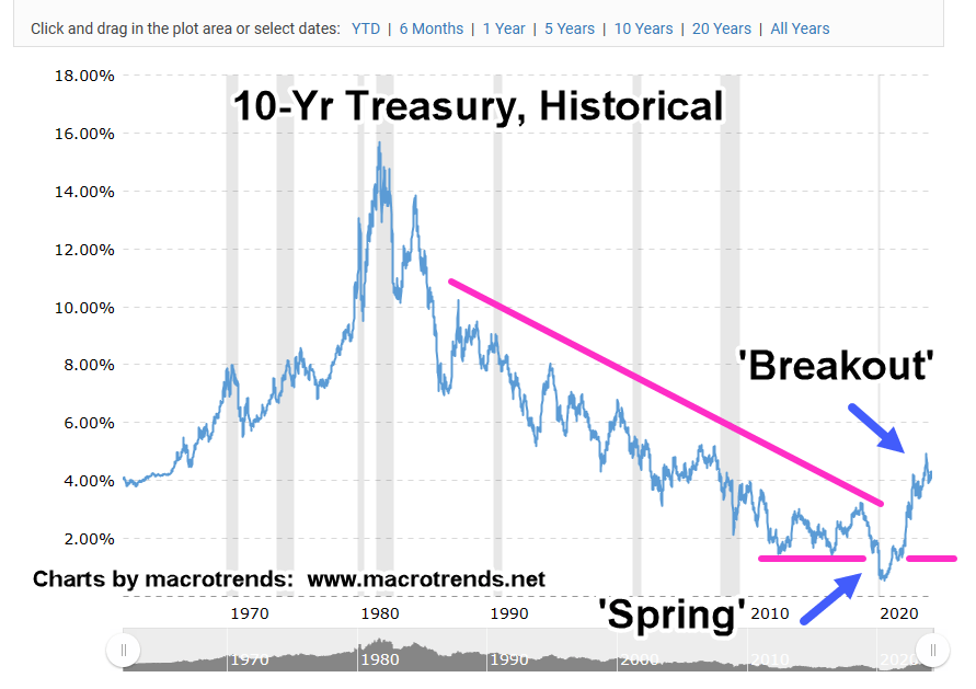
Using that, we’ll look at what the Fed’s likely to do next; let’s use the long-term view, the 10-Year Treasury.
What’s it telling us?
Macrotrends Historical Chart: Ten Year Treasury
As posted in the prior update, the 40-yr bond bull market, i.e., lower rates, is over (not advice, not a recommendation).
We see the upside reversal in rates (downside for bonds) took over 10-years to set up.
Rates pushed below established support into a Wyckoff spring condition, then reversed higher, then into an outright breakout.
Currently, we’re hovering around in ‘no-man’s land’.
Could rates dip lower (bonds higher) and we get a token rate cut in response from the Fed?
Well, as David Weis used to say, ‘Anything can happen’.
Strategy First
However, from a strategic standpoint and for the long-term, higher rates are more probable.
The market has already responded with interest rate sensitive sectors and stocks (IYR, KMX, CVNA, etc.), having peaked long ago, in 2021.
A Dangerous Game
Depending on one’s perspective, what’s going on here with interest rates, is a dangerous game of ‘chicken’.
As Uneducated Economist puts it, the Fed’s a ‘credible threat’; all they have to do is ‘talk’ and propose (i.e., threaten) to move rates and the market responds without the Fed actually doing anything.
It’s working, for now.
The Emperor Has No Clothes
The problem is, as Prechter has already shown with research done years ago, ‘the emperor has no clothes’.
The Fed does not control rates at all; it’s a follower, only doing what the bond market’s telling it to do.
For some reading this, it’s old news.
For others, it’s a shock to find out, yet another institution is not what you thought it was.
Note: Posts on this site are for education purposes only. They provide one firm’s insight on the markets. Not investment advice. See additional disclaimer here.