Three Months of Down

For the next three-months, until the end of October, the (net) seasonality of the markets is down.
That’s not all.
According to this link, we have a bevy of technical and fundamentals suggesting the overall direction of the markets is to lower levels (not advice, not a recommendation).
Lower is good … at least if one is positioned short.
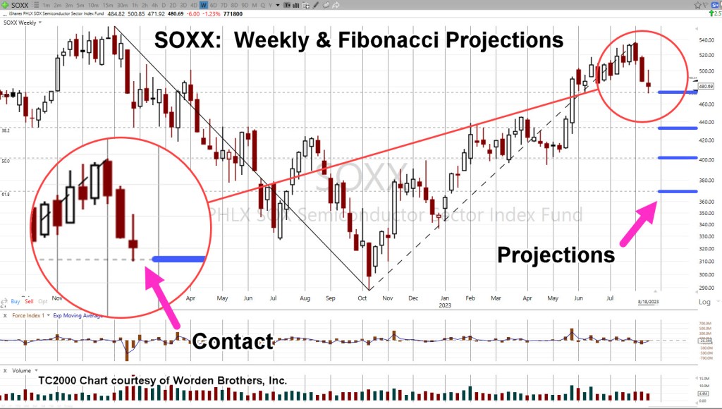
With that, we’ll look at the semiconductors, SOXX, to see how seasonality might help on a (potential) short position.
Semiconductors SOXX, Daily
If the channel remains intact, we’re still at the beginning.

Of course, the very next session can completely blow this analysis apart. That’s the way of the markets.
For now, however, we do have a channel, we do have the above-mentioned seasonality; probability and pressure is to the downside (not advice, not a recommendation).
Turkey & Position
For those familiar with ‘Reminiscences‘, and ‘Turkey’, a.k.a. Mr. Partridge, we should all know the importance of maintaining position.
The objective, therefore, is to attempt to maintain a short position (via SOXS, or other short) as long as possible, given the trading channel and bearish bias (not advice, not a recommendation).
Simple But Not Easy
One of the very first things the Online Trading Academy (Dallas) told their class back in the day, working the markets with a profitable plan of action should be ‘simple’.
They also said, the problem is, it’s not easy.
Here’s just one unrelated example of a simple job (i.e. ‘protection’) that’s obviously, not easy.
Stay Tuned
Charts by StockCharts
Note: Posts on this site are for education purposes only. They provide one firm’s insight on the markets. Not investment advice. See additional disclaimer here.
The Danger Point®, trade mark: No. 6,505,279