Note: Posts on this site are for education purposes only. They provide one firm’s insight on the markets. Not investment advice. See additional disclaimer here.
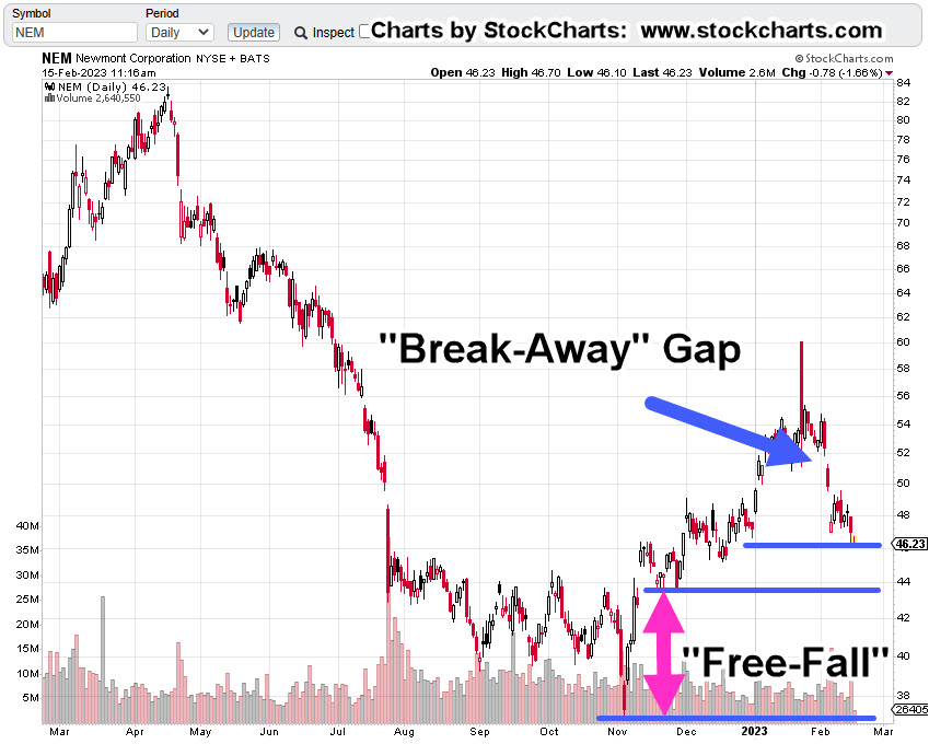
Newmont (NEM) price action’s working its way lower to a ‘free-fall’ area; shown below.
Depending on behavior if or when it gets to this area, there could be an acceptable set-up to execute an ‘Elder-type’ Put option (not advice, not a recommendation).
That Put strategy has already been discussed but for those who may be new, it’s basically a short-expiration, out-of-the-money Put for maximum (potential) gain.
A completely counter-intuitive approach to the standard method of long-dated entries, then ‘wait’ while the value burns down to nothing.
Newmont Mining NEM, Daily
The compressed chart has the big picture; Newmont’s all-time highs were reversed on April 18th, 2022.
It’s currently in the process of finding its long-term bottom which is possibly far away from current levels.
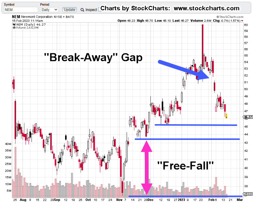
The next chart gets close in on the potential set-up.
If price action follows its current down-trend, NEM may reach the potential free-fall area late next week.
Note: Posts on this site are for education purposes only. They provide one firm’s insight on the markets. Not investment advice. See additional disclaimer here.
Monday was Fibonacci ‘Day 13’ from the January 4th, XOP, lows.
With about fifteen-minutes before the open, pre-market action in the XOP leveraged inverse fund DRIP, is trading slightly higher at 12.67.
So, was yesterday the day? Has XOP topped-out and now in the process of reversal?
As always with the markets, the price action itself, will show us the truth.
However, what can be stated with some confidence, is that we’re at a low-risk point for going short (not advice, not a recommendation).
‘Low-risk’, does NOT mean ‘no-risk’
XOP, New Low or New High
It’s somewhat straightforward at this point.
If XOP, posts a new daily low, it increases the probability of reversal. If it posts a new daily high, then price action is possibly on to new all-time highs.
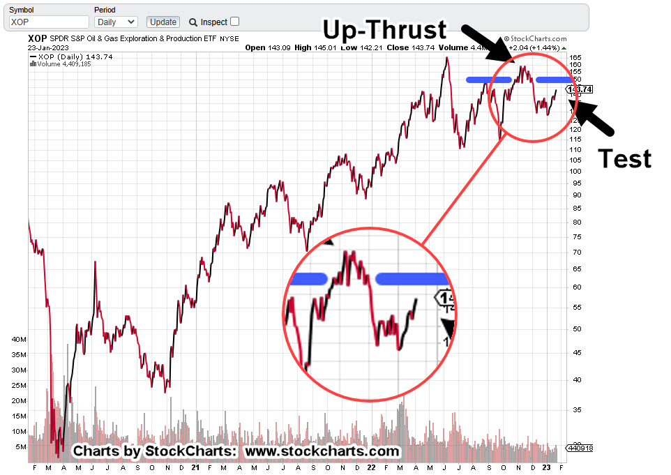
Oil & Gas XOP, Daily Close
The daily chart shows the labored six weeks of rounded top that’s identified as ‘Up-Thrust’.
At present, XOP is testing the underside of that Up-Thrust.
The zoom version of the chart shows the amount of upside effort expended during the rounded top.
Price action spent over a month attempting to move higher, only to collapse into a downside reversal.
Now, we can see that wide price action area is being tested; not unlike the Newmont test as described here.
Note: Posts on this site are for education purposes only. They provide one firm’s insight on the markets. Not investment advice. See additional disclaimer here.
Nemont Mining (NEM), Gold, and the Oil & Gas Sector are at a critical juncture.
The rest of the major indices, Dow, S&P, QQQs, real estate (IYR), and so on, are in a similar position.
For this update, we’ll focus on Newmont (NEM), as it’s the largest cap in the Senior Mining Sector GDX, and a general representative of the commodities markets.
Financial collapse is a process, not an event.
Newmont topped-out in April, of last year. Exxon, the proxy for the Oil & Gas sector, may have reached its highs this past November.
Where’s The Inflation?
As Michael Cowan has just reported, banks are absconding with depositor’s money under the guise of ‘bail-in’.
If the fiat cash is so worthless, why are banks seizing it?
As Robert Prechter Jr., said years ago, ‘all fiat cash ultimately goes to zero’; the end game (most likely) for the dollar. However, it could be months, years, or even a decade before that happens.
For right now, today, this minute, the data is showing us, the banks want the money; ‘Show me the money‘.
With that, let’s look at the non-existent ‘inflation’ in the mining sector.
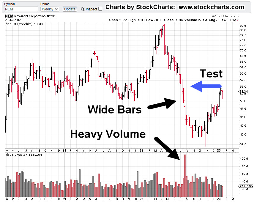
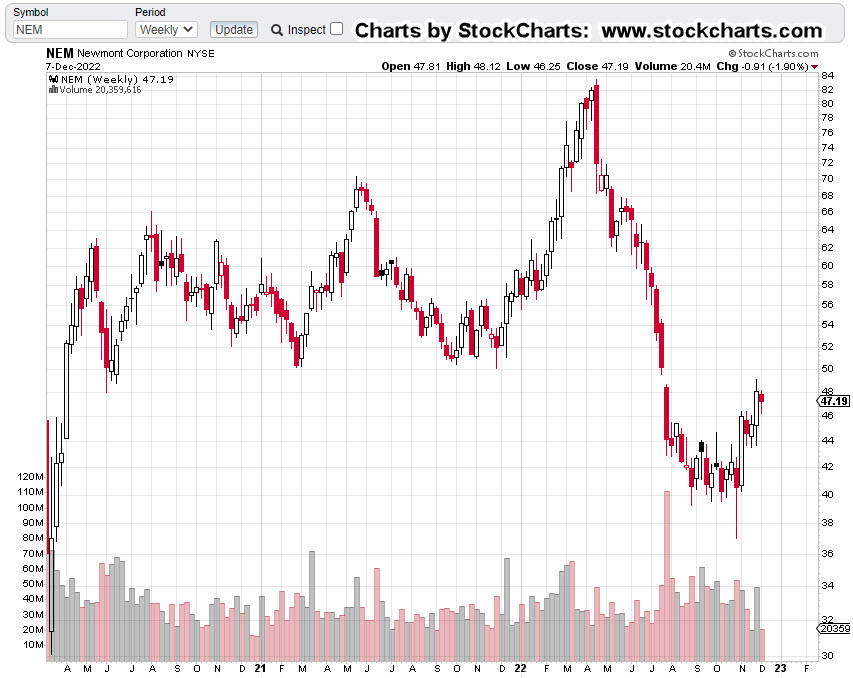
Newmont Mining NEM, Weekly
The first chart identifies the heavy volume and then test of wide price bars. This behavior is common in the markets; they tend to come back and test wide high-volume areas.
Next, we see there’s a terminating wedge developing as volume declines; the inference, is lack of significant commitment at these price levels.
We’ll get close-in on the wedge; last week printed a lower weekly low and closed lower for the week.
There’s no breakdown of the wedge … yet.
At this juncture, it’s up to the bulls to show they’re still in control.
Inflation vs. Scarcity
We have without a doubt, the effects of the event from the past three years gaining momentum. Whether or not those effects reach a peak this year, is unknown.
A lot of the mainstream and YouTuber’s alike talk about the upward move in gold as the result of ‘inflation’.
Here’s a little bit of insight you’ll not find anywhere else; how about gold rising because the above mentioned ‘effects‘ are causing production volumes to decline?
Maybe it’s because of scarcity (along with nearly everything else) that’s causing the increase in price.
Just to drive that idea home, the latest total gold production numbers, listed here.
Gold production for 2020 dropped -8.2%, from the year prior. Year 2021 was down -1%, from 2020.
From 2010 to 1019, gold production increased or was flat year over year … that is, until 2020.
Note: Posts on this site are for education purposes only. They provide one firm’s insight on the markets. Not investment advice. See additional disclaimer here.
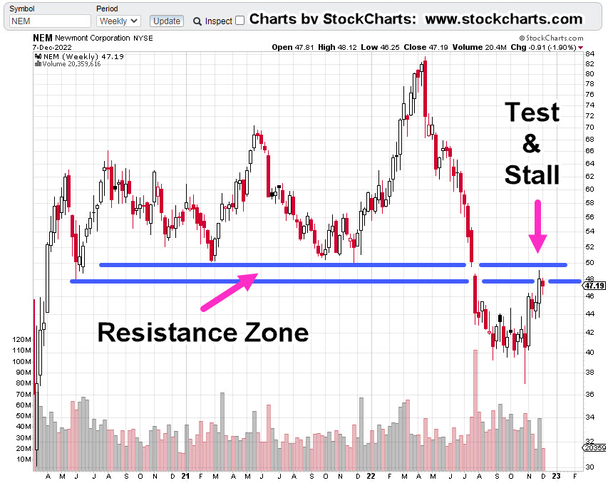
So, let’s take a look at a the largest cap in the mining sector, Newmont and see what the price action is telling us.
Newmont Mining NEM, Weekly
First, we have the un-marked chart and right off the bat, it does not look good; down -45.4%, from all-time highs.
It looks even worse, when the resistance zone is added.
So far, price action has already stalled and not been able to hold within the resistance zone.
It’s important to note, this resistance area is over two years wide. it’s not likely that anything’s going to happen to the upside without numerous attempts.
No ‘Clicks’, In A Gold Bear Market
If buying gold was the answer to getting through the financial, economic and societal collapse, then one would think the price would be moving relentlessly higher.
Note: Posts on this site are for education purposes only. They provide one firm’s insight on the markets. Not investment advice. See additional disclaimer here.
As if on cue to support the prior post highlighting silver’s ‘mysterious’ decline, we have this just out, on Newmont Mining.
Newmont’s in free-fall.
For long-time visitors to this site, today’s events should be no surprise.
These reports, here and here, posted back in April, identified reversals in gold miners GDXJ, and implicitly GDX, to the day.
We’ll include a quote from the first linked report below:
“It’s a fairly safe assessment, nobody expects a downside reversal … nobody”.
And yet, here we are.
As the administration and the financial press, becomes ever more confused and bipolar; even now, re-defining the long-held definition of ‘recession’, we have Wyckoff analysis time and again, cutting through the media trash to determine the highest probability for the market.
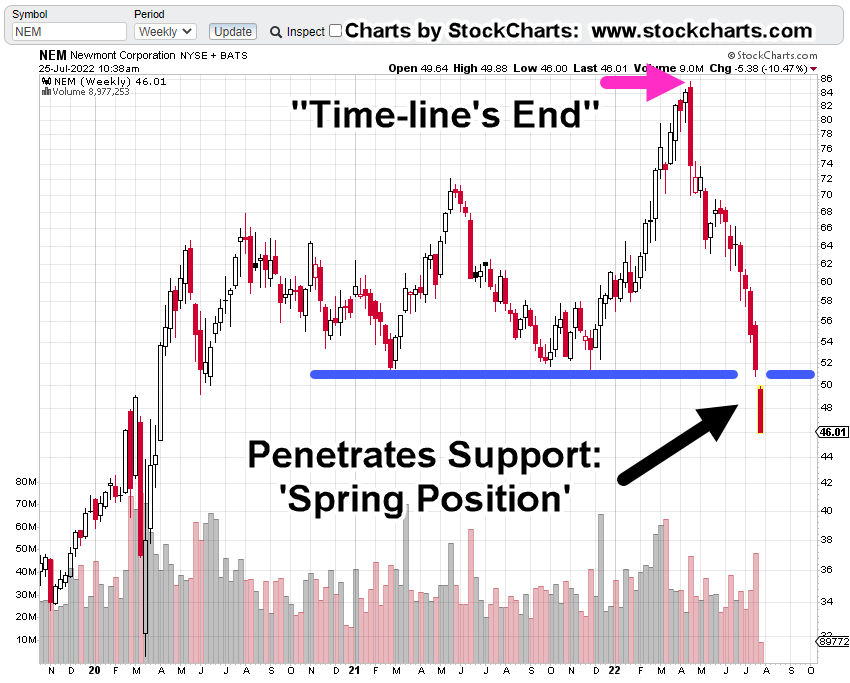
Newmont Mining (NEM) Weekly
The chart below has current conditions for Newmont.
Also shown is the location of the first post linked above, released before Newmont began its decline.
At this juncture, NEM has penetrated long established support; technically it’s in ‘spring position’.
The expectation is for some kind of (weak) rally attempt. We’ll see if it’s able to get back above support.
Note: Posts on this site are for education purposes only. They provide one firm’s insight on the markets. Not investment advice. See additional disclaimer here.
It’s a significant, if not major event, when one market participant (collectively) hands off the trading vehicle to another.
In a decline, that usually means the ‘average investor’, the least disciplined, least knowledgeable, gives up and hands off to the professionals; the ‘strong hands’.
In a blow-off top, the reverse is true.
The professionals lead the ignorant along with whatever narrative is necessary so that enough volume is created to successfully exit positions.
The changing of hands for gold and gold miners, was identified on this site, here, here, here, here, here, here, and here, starting over two-and-a-half months ago.
The analysis was consistent throughout; we are not in a long-term, sustainable, bull market. That stance applied most specifically to gold miners GDX, and GDXJ.
For that assessment to change, price action itself would have to change character; not the lagging momentum indicators, moving averages, price oscillators and so on that are themselves, defined by price action.
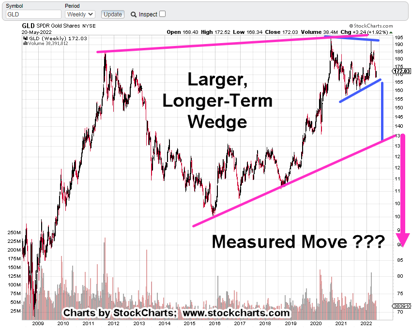
So, let’s take a look at what gold (GLD) is saying about itself.
Gold (GLD), Weekly Chart
First, the un-marked chart.
Next, we see a medium to long term trendline that’s been decisively broken and tested.
Getting closer-in, we can see the oscillation about the line, the break and subsequent test (with reversal).
What’s Next?
Well, that brings us to Harry Dent.
Love him or hate him. Here he is, offering up a perspective that’s not going to be popular.
How can gold (GLD) decline from here?
Let’s take a look.
If the wedge above is in-effect, if it’s the dominant factor at this point, then a break depending on location would take GLD down to about 130-ish.
If that happens, it will be a big event … down to approximately $1,300/oz.
However, it’s what may come next, that will be totally unexpected.
It’s interesting, the wedge in blue has a measured move target right to the bottom of the larger wedge in magenta.
To get below $900/oz, will be a very different place.
With that in mind, this site has presented time and again, we’re in an unprecedented world-event.
‘Normal’ is not coming back … ever.
Awake, or Not
Jerimiah Babe, in one of his latest videos hints there’s a strange vibe to what’s happening: Time stamp 5:20,
‘There’s something going on here …’
The Fed may actually be telling us the truth … just not in the way we expect.
You have to be awake to read between the lines.
Inflation may indeed be ‘transitory’ as they say because consumer demand is going to evaporate.
Evaporate not because the consumer can’t afford it, but because there are, or will be, no consumers.
Note: Posts on this site are for education purposes only. They provide one firm’s insight on the markets. Not investment advice. See additional disclaimer here.
As with Newmont Mining in the Senor Miners Index GDX, ProLogis is the largest market cap in the Real Estate Index, IYR.
When markets ‘thin-out’, when they reach the end of a long sustained bull move, capital exits the lower caps, the lesser performers, and is thrown into the last man standing; the largest cap(s) in the sector.
In can be argued, that’s where we are now with IYR.
Friday’s Wipe-Out
As expected, because of the near thousand point drop in the Dow, YouTube’s abuzz with everyone attempting to figure out what’s going to happen this coming Monday.
The Maverick does an excellent job (linked here) of posing the question, ‘Where are we’?
He doesn’t even bother with are we in a market collapse; that’s pretty much a no-brainer. It’s the ‘where’ in the collapse, that’s the question.
Real Estate … What’s Next?
From this site’s perspective, we’ll let the market itself tell us what’s likely to happen next.
Since the focus over the past week has been real estate (IYR), let’s look at the largest cap ProLogis PLD, to get clues on the next potential action.
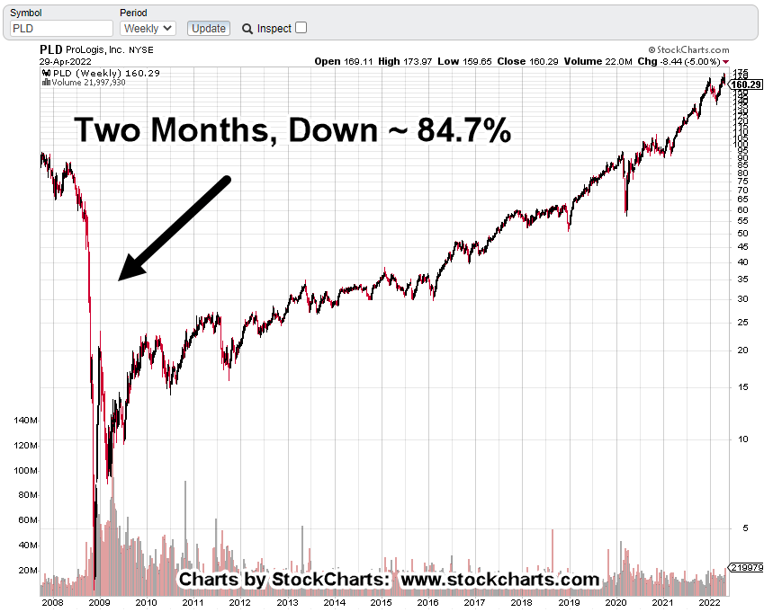
ProLogis PLD, Weekly Chart
First, we’ll look at the big picture.
PLD was vaporized in the last market collapse.
We should also note, it took about 12-years to get back to pre-crash levels; good ‘ol ‘buy and hold’ 🙂
Of course, a multi-year covered call strategy could have been implemented if maintaining long. With that approach, PLD could have potentially become a cash-cow.
Crash Clues
Note on the chart above, PLD didn’t just up and crash; it gave clues well beforehand.
We’ll go into those clues in a later update.
For now, let’s look at next week’s probable action.
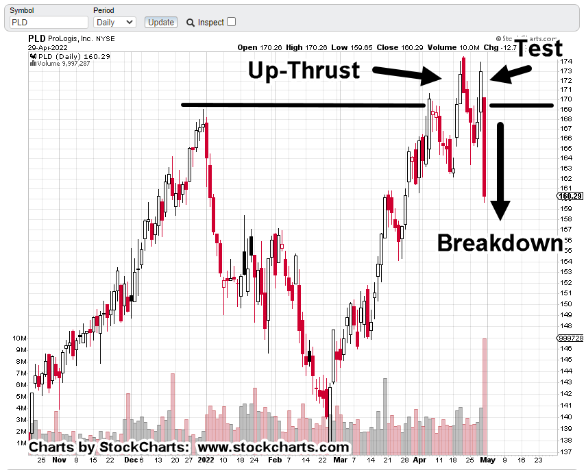
ProLogis PLD, Daily Chart
First, the un-marked chart to show where action finished up on Friday.
Next, we see an upthrust, test and sharp reversal.
Price action finished at support and just below the lows set on Monday, the 18th and Monday the 25th.
Wide, high-volume bars tend to get tested.
So, we’re below the lows with a wide high-volume bar. That puts PLD, in spring position.
Summary
Because PLD and IYR (and the rest of the indices) finished at or near their lows, there may be some downside follow-through this coming Monday.
Price action’s the final arbiter but there’s potential for some kind of upside test in the coming week(s).
As a courtesy, the DRV chart below shows the entry location for DRV-22-02 (not advice, not a recommendation) and the current stop.
Note how liquidity has picked up over the last two weeks.
Friday’s volume of 309,800 shares, was the largest ever for the inverse fund.
Note: Posts on this site are for education purposes only. They provide one firm’s insight on the markets. Not investment advice. See additional disclaimer here.
That’s how one YouTuber described the Wyckoff method.
Well, judge for yourself.
The analysis in question is linked here and the video is here.
If you look at the video closely, the area called out as the ‘secondary test’ can also be identified as a ‘spring’ set-up.
Note how that spring goes straight into an up-thrust; the one being discussed at time stamp: 0:34.
Wyckoff analysis is both science and intuition.
The good part is discernment, the ability to intuitively perceive events, is a God-given gift.
By definition, no amount of Artificial Intelligence can fully replicate that ability.
Of course, that doesn’t mean the people J.P. Sears refers to at time stamp 3:26, won’t try.
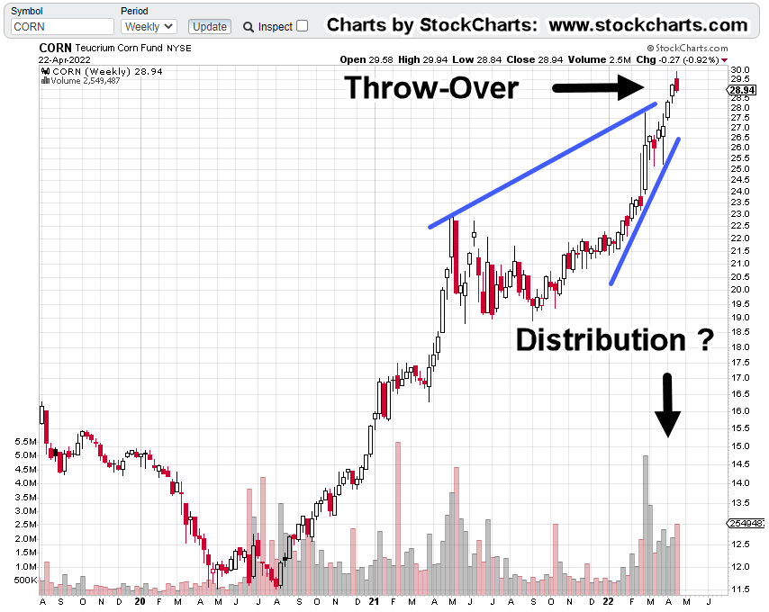
So, let’s move on to the market at hand; corn and more specifically, Teucrium tracking fund CORN.
CORN, Weekly
From the week of the Derecho breakout to this past Friday’s close, is a Fibonacci 89-Weeks.
Friday’s weekly bar was also a reversal.
The week closed with the highest net negative volume since the week of October 15th, 2021.
Looking closer at the volume, we see the large spike during the week ended March 4th, followed by successive weeks of elevated volume.
There’s also a terminating wedge with a potential throw-over; similar to what’s happening in Newmont Mining (NEM).
This market appears to be ripe for chaos.
Hitting The Mainstream
Adding to the probability for some kind of ‘event’, the price of corn is hitting the mainstream.
Throw in some real or fake news on food processing plants and the pressure for government to ‘do something’ continues to build.
Summary
The opportunity to go long CORN was way back at the Derecho.
At this point, prices are elevated to the point where risk appears to be increasing … potentially leading to a momentary price spike downward (not advice, not a recommendation).
If that happens, there’s likely to be chaos for several days as clearing firms either slow their payments, halt/cancel trades, or go bankrupt altogether … similar to what happened during the London Metal Exchange melt-down.
Note: Posts on this site are for education purposes only. They provide one firm’s insight on the markets. Not investment advice. See additional disclaimer here.
Momentum indicators are pointing higher for both gold and the miners … that does not mean it’s a buy (not advice, not a recommendation).
For both GDX, and GDXJ, they’re entering up-thrust (potential reversal) territory as discussed in a previous post.
It’s time to monitor the sector for potential exhaustion and change of momentum.
That momentum could take a while to bleed-off … being patient is just one requirement for successful speculation.
Summary
From the panic, you would think no one’s ever seen a down market. On top of that, we’re potentially just getting underway.
This is the exact environment where Wycoff analysis comes to the fore: ‘What’s the market saying about itself?’
That analysis says, gold and the miners could still push a bit higher but there are huge disconnects under the surface; not the least of which, silver’s also not confirming the move.
Note: Posts on this site are for education purposes only. They provide one firm’s insight on the markets. Not investment advice. See additional disclaimer here.