Precious Metals … Silver & Gold

The ‘Non-Confirmation’

Something’s not right in the precious metals sector.

Gold’s just off -8%, from its highs while other monetary metals (Palladium, Platinum, Silver) are far below their highs; silver’s off a whopping -51.75%, from its 2011, highs.

In addition, as we’ll see below, silver (SLV) is just now contacting the right side of a trend line and potential downward channel structure that goes all the way back to the lows of 2015.

The ‘Squeeze’ of 2021

Below on the weekly chart of SLV, is a point labeled “1”.

That’s the location of what turned out to be a right-side trend line contact. Back then, an update on the ‘squeeze’ was posted, linked here.

Taken from that update was the following (emphasis added):

Those attempting garner forces (the little guy) to move the markets, such as silver, will find out soon enough who’s in control … and it’s not them.

It’s unlikely silver is going higher any time soon. There could be some upward spasms as the crowded trade exhausts itself; it’s likely we’ve seen the SLV highs for quite some time.

So, here we are nearly two years later; SLV never posted higher than the February 2nd, squeeze of 2021.

So, what’s next? Is there something else going on?

We’ll look at that question after the charts.

Silver SLV, Weekly

First, is the un-marked chart.

Next, we see a pattern that’s not so clear without mark-up.
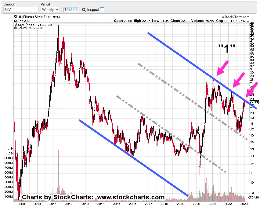
For SLV, to break out, there needs to be an absence of motivated sellers (prices drift higher) or sufficient buying demand to overcome the downward trend.

Inflection Point

For an idea of what’s likely to happen next, we’re going to go to an unlikely source; Daniela Cambone and Gregory Mannarino.

It’s not about ‘controlling’ inflation and it never was, going all the way back to 1913. It’s about the ‘end game’, as discussed by Mannarino.

“Eliminate The Middle Class” (time stamp 11:40)

The sticky wicket is the ‘debt bubble’ and the ‘elephant’.

The Elephant Grows

The chart of silver (and other precious metals) and its non-confirmation with gold, could be an indicator of debt collapse and demand collapse first, before hyperinflation.

Multiple times a day now we have reports like the following flooding into the marketplace:

COVID Vaccines Are “Obviously Dangerous” And Should Be Halted Immediately, Say Senior Swedish Doctors

‘Normalization’ Of Emergency Use Authorizations Concerns Health Experts

CDC Says Stroke Concerns Over Pfizer Jab Warrant Investigation

They Promised “Safe And Effective”; We Got “Sudden And Unexpected”

Pentagon “Exploring” Back-Pay For Troops Kicked Out Over COVID Vaccine Mandate

Multiple Young Athletes And Former Athletes Died Suddenly This Past Month

Doctor Calls For Withdrawal Of Pfizer, Moderna COVID-19 Vaccines Following New Research

The above list is just since yesterday and it’s only 2:00 p.m., Central Time, today!!!

Monetary & Manufacturing

Silver is unique more so than gold, in that it’s an industrial metal as well as monetary.

The collapse in manufacturing demand could be the reason silver’s not confirming gold’s move.

It may also be telling us, as the effects of the elephant take hold, a huge liquidation of all assets could be coming; paradoxically as the need for fiat cash (not precious metals) to pay off debt, increases.

Stay Tuned

Charts by StockCharts

Note:  Posts on this site are for education purposes only.  They provide one firm’s insight on the markets.  Not investment advice.  See additional disclaimer here.

The Danger Point®, trade mark: No. 6,505,279

Gold Bulls … Go Berserk … Again

Testing The Trend

Since the lows last November, to the close this past Friday, gold (GLD) has moved higher by a decent but modest 15.4%.

Naturally, the opportunists are out telling us ‘We’ve been warned’, ‘this is it’, ‘it’s going to the moon’ … yet again.

With that backdrop, we’re going to look at the precious metals facts, not the hype.

‘Precious metals’ because there are only four that have ‘currency code’ classifications, i.e., are classified as an asset with ‘currency like’ monetary characteristics.

Currency Codes

Gold, Currency Code: XAU

Silver, Currency Code: XAG

Palladium, Currency Code: XPD

Platinum, Currency Code: XPT

The Market Itself

Way back over a century ago, Wyckoff discovered the key to understanding the next likely move of the markets was the study the market itself (not fundamentals).

Wyckoff essentially ‘locked himself in a room with just a stock ticker and phone line’.

Months later, when he emerged, ‘Studies in Tape Reading‘ was the result.

We’re going to use his insight from that text.

That is, what’s the market’s saying about itself? What’s the next likely direction?

Off The Highs

For some of the precious metals, they’re off their highs by a significant amount (percentages approximated).

Gold (GLD): Down -11%, from highs

Silver (SLV): Down -55%, from 2011, highs

Palladium (PAH23): Down -47%, from highs

Platinum (PLJ23): Down -53%, from highs

All of the precious metals are down nearly 50% or more, except gold.

In the case of Platinum, it’s near 1980s levels!

So, where’s the inflation?

Oh wait, here it is … one more time.

That’s not saying ‘money printing’ has no effect. There are a lot of moving parts. Intentional destruction of the food supply is just one of those parts.

Old School Analysis

Hypothetically, if you dropped an ‘old-timer’ into the markets at this juncture (without him knowing the ‘hype’), and showed him all four charts of gold, silver, palladium, platinum, and asked ‘what’s happening?’

What’s his response?

After a brief look at the charts, he would likely say:

‘Gold’s move higher is not being confirmed by the other precious metals’.

Note that all four metals peaked together during the inflation spike of 1980.

Ergo: At this juncture, something’s wrong.

Either the other metals are going to ‘catch up’ to meet gold or gold is going to come down to meet the others.

That is of course, unless this time is different … somehow.

With that, we’ll look at the chart of gold to see what it’s saying about itself.

Gold GLD, Weekly

We’re starting with the unmarked chart.

Note: Elder’s Force Index scale is expanded to show the nuances of GLD, price action.

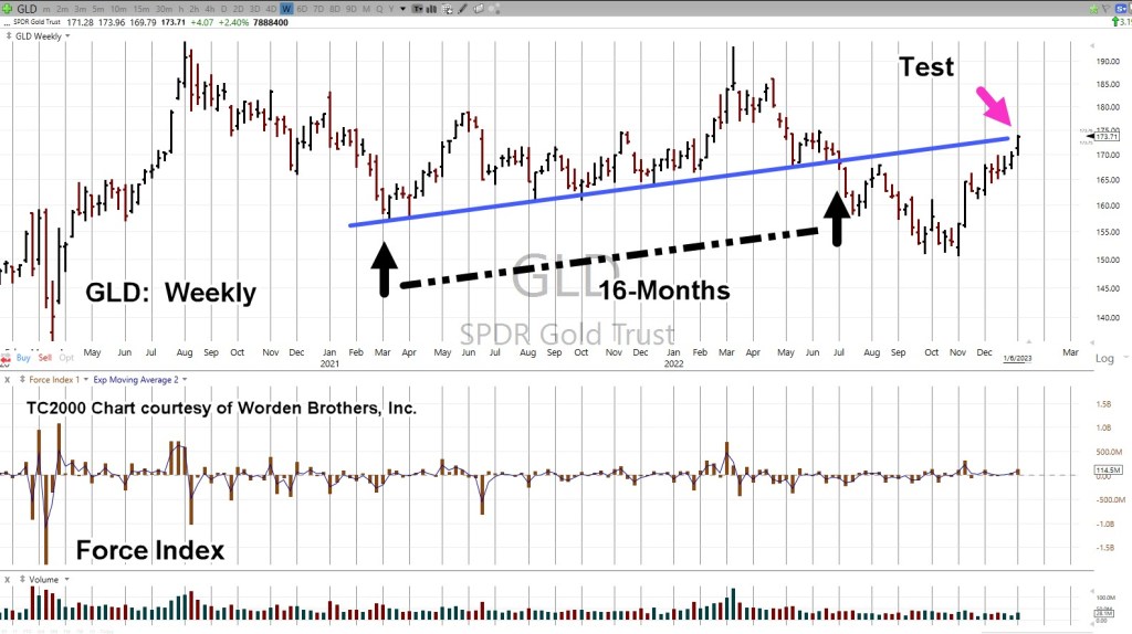
Next, we see we’re at a test of the trendline in place for 16-months before the downside breakout of July, last year.

Moving in closer, we have a wedge formation prior to the up-move last week.

Is this a breakout to the upside or a throw-over?

At this point, it’s unknown.

We can see that Force Index is below where price action entered the wedge during the week of November 11th.

Less force up into resistance (trendline), paints a slightly more bearish than bullish picture.

The ‘Why’ Comes Out

As if on cue and in classic Wyckoff style, we have a ‘why‘ for the move off the lows of last November.

Classic Wyckoff, because he said the ‘why’ of a move comes out after the fact.

There you have it; China buying gold last November and December.

During this move from the recent lows, it was certainly a trading opportunity for the bulls … but from a strategic standpoint, what happens next?

The Non-Confirmation

Non-confirmations can last a long time.

For example, the Oil & Gas sector XOP, declined for eight months, from April 2019 to January 2020, before the price of oil (USO) finally broke lower.

With the ZeroHedge article just released a few hours ago, we can expect at least a blip higher at the next GLD, open.

After that, we’ll see.

Stay Tuned

Charts by StockCharts

Note:  Posts on this site are for education purposes only.  They provide one firm’s insight on the markets.  Not investment advice.  See additional disclaimer here.

The Danger Point®, trade mark: No. 6,505,279

The Market Set-Up … This Week

What To Watch … Gold, Bonds, & Real Estate

First off, ‘Goldman‘ says melt-up.

Not to be outdone, we have this ‘me too’ melt-up article as well.

Let’s not forget, all the ‘Fed must do something’ rumors and feigned concern by its members.

If anyone really wants to know the big picture, the overall plan (a wide majority do not), this interview may be the best explanation to-date.

With all of that, we certainly could get some kind of rally in the coming week. We’ll let the price action speak for itself.

As a reminder, Wyckoff analysis does not concern itself with press releases, rumors or ‘fundamentals’; Wyckoff himself, determined based on price action alone, they have no material effect on market movement.

In his words, ‘other forces are at work’, and it’s those forces that interest us.

Gold & Silver

As said in this update, gold (GLD) was just ‘ticks’ away from posting a new monthly low. In fact, it got just 0.24-pts, from a new low before rebounding.

Of course, each time we get any kind of rally in the metals, there’s the usual hysteria. Even though for the past seven months and counting, those rallies occur at lower and lower levels … i.e., a bear market.

Shown below, it’s in a trading channel with price action at the right-side channel line.

Gold (GLD) Weekly

The chart below gets closer-in.

From left-most contact point on the channel to the initial contact on the right side is a Fibonacci 13-weeks.

Also note, the weekly high posted at the center line is a Fibonacci 5-weeks from the left-most contact.

Highly emotional markets tend to adhere to Fibonacci until either the emotion wears off or ‘everybody’ recognizes the structure.

Obviously, to keep the channel intact, a lower open (and lower action) at the next session is needed.

Silver (SLV) has already been discussed in this update and this one.

Bond (TLT) Capitulation ?

Was this past Friday the day?

Gap-down trading on huge volume.

Looking at the daily chart of TLT below, Friday’s level of (down) volume has occurred only three times in the past three years.

Each time, there was a near immediate rebound or in the case of March 2021, the rebound came several weeks later.

Bonds (TLT) Daily

Moving in closer, we see the possibility of an ‘island-gap’ at the next open.

What could drive capital into the bond market?

Well, how about a ‘shock’ or continued market melt-down (not advice, not a recommendation).

A quick check of the local newsfeed (as of 12:45 p.m., EST) shows nothing on the horizon other than usual nuclear attack threats, power outages, child mutilation protests, marauding bears and the disarmament of Canadians.

Nothing to see here …

Real Estate

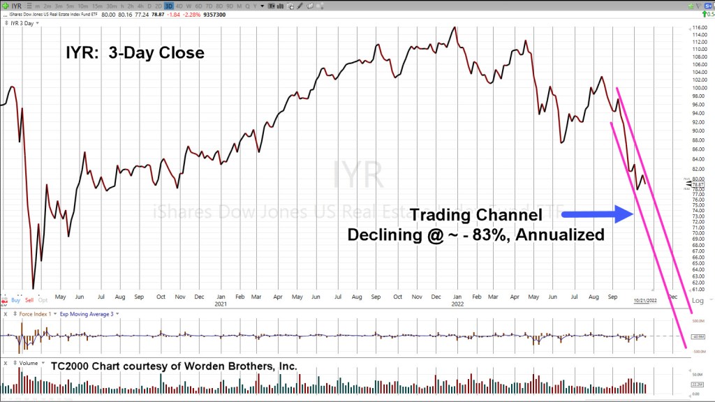
There is no mistake, events in real estate are happening at the fastest pace in recorded history.

As Scott Walters put it, over 10-million people bought into the ‘work from home’ hype and got themselves instantly (nearly) upside down in their transaction.

Now, the layoffs start.

Real Estate IYR, 3-Day Close

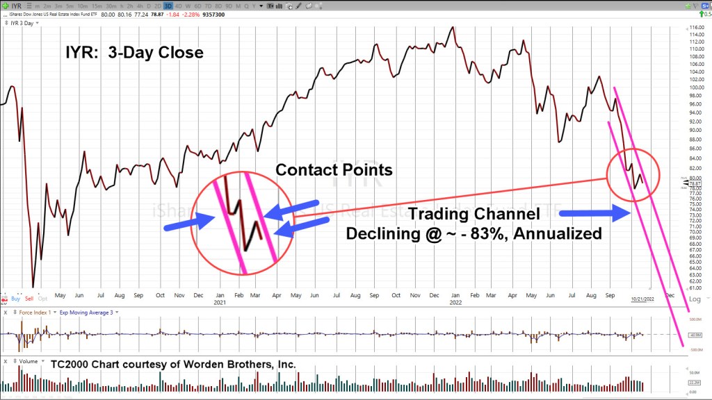
Zoom-in, on the channel

As the last update said, we’ll know soon enough if there is more upside or if last Friday was it, and the downdraft continues.

Stay Tuned

Charts by StockCharts

Note:  Posts on this site are for education purposes only.  They provide one firm’s insight on the markets.  Not investment advice.  See additional disclaimer here.

The Danger Point®, trade mark: No. 6,505,279
Set-Up Details … Real Estate

At A ‘Confluence’

The last update, posted late in the session, said with the upward bias provided by the sizable Op-Ex event, we can look for the weakest (or one of the weakest) sectors.

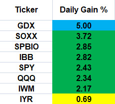
The chart below summarizes yesterday’s action:

Friday 10/21/22, Single Day Gains

Gold miners GDX, is the outlier at the top and real estate IYR, the outlier at the bottom.

Before anybody gets excited about ‘hyperinflation’, just a reminder; silver SLV’s, action has retraced to a weak 38.2% (chart not shown), as it was forecasted to do from last week’s update:

“Silver (SLV) is currently at support levels; therefore, some upward action (staying below SLV: 18.5) is normal behavior.”

Price action is the final arbiter; we’ll see what happens next.

Back to real estate.

Professional Wisdom: ‘The Crash’

We’re going to use the experience and insight provided by Scott Walters concerning the potential for real estate; that is, we’re in a world-wide event the scale of which, no one alive (and possibly, ever) has seen before.

The Economic Ninja has just seconded that opinion (time stamp 3:45) with his quote:

“Right now, we are in the greatest collapse since The Great Depression; and I believe it will be as severe, if not worse, sharper, faster, than what people experienced in 1929”.

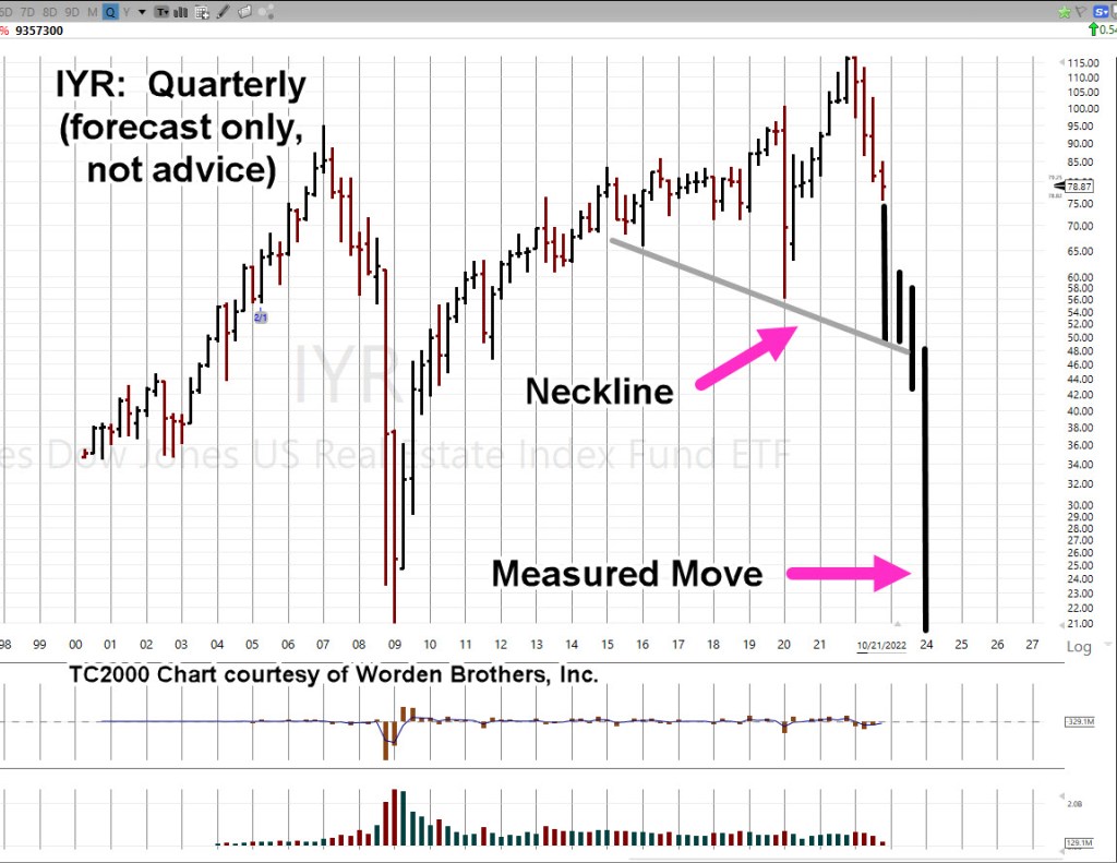
So, what would that ‘collapse’ look like on a chart of real estate, IYR?

Ah, yes. That’s the hard part.

To take useful wisdom like that above, and somehow map it into potential market behavior.

For that, we’re going to use the Quarterly chart of IYR.

Real Estate IYR, Quarterly

There are still two months and one week left to go in the 4th, Quarter.

We’re at a confluence of price action as we’ll cover in the Hourly chart farther down; first, what’s the potential?

Here is one artist’s rendition (not advice, not a recommendation).

That puts it into perspective.

We may know at the very next open, if we’re pivoting higher or continuing the decline.

Butterfly In The Amazon

Of course, the market’s not going to tell anyone its next move. We have to decipher that (read the tape) ourselves.

Sometimes, as Wyckoff said a century ago … ‘It’s as if the weight of a feather is all that’s needed, to push the market further or to reverse.’

So, let’s look at that feather (the butterfly) on the hourly chart.

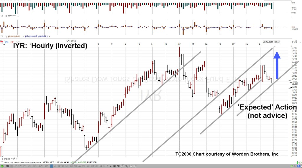
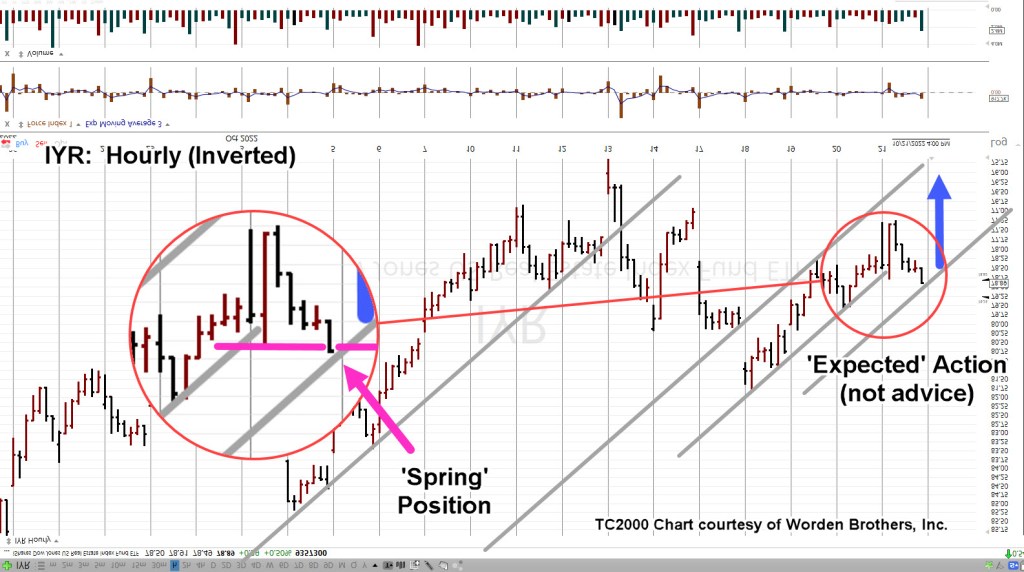
Since we’re positioned short (DRV-22-05), the chart’s inverted to mimic leveraged inverse fund DRV.

Real Estate IYR, Hourly (Inverted)

The important part is we see a repeating pattern of trendlines.

Moving in closer, we have this. The blue arrow is ‘expected’ action based on the analysis up to this point (not advice, not a recommendation).

Moving even closer, the zoom shows IYR, finished the day in Wyckoff spring position; having pushed past minor support (resistance on non-inverted).

Summary

If IYR opens lower or gap-lower, we’ll have to wait and see if it posts a new daily low (below IYR ,77.24).

If that happens, we have some confirmation lower prices are ahead and can then set a definitive stop for DRV-22-05.

Obviously, a higher open (pushing past IYR 78.91), negates the trade.

Stay Tuned

Charts by StockCharts

Note:  Posts on this site are for education purposes only.  They provide one firm’s insight on the markets.  Not investment advice.  See additional disclaimer here.

The Danger Point®, trade mark: No. 6,505,279

The Market Set-Up … This Week

What To Watch

First off, it’s nice to know, traders at J.P. Morgan, don’t have clue as what to do.

They say it themselves; Not One Person

On top of that, I’m supposed to pay money reading about how clueless they are. 🙂

No thanks. Let’s see if we can do better than the average ‘investment firm’.

Before we get started, a reminder; as Michael Cowen says:

‘It’s the bear market that reveals those who really understand’, not the bull market ‘geniuses‘.

With that, let’s get into it; first up, is silver.

Silver: Wyckoff Analysis Results

The downside reversal was identified to the day.

Adding to that post, Europeans could not only be freezing or starving this winter, but also subject to radiation poisoning.

Surely, they’re all thinking that ‘stack’ of silver is going to save them.

Silver (along with gold) remain trending lower.

Silver (SLV) is currently at support levels; therefore, some upward action (staying below SLV: 18.5) is normal behavior.

Bonds: Are They Ready?

Hold your nose … bonds could be setting up for a rally.

As Steven Van Metre reports here, the Fed ‘shenanigan’ meter is pegged.

Bonds, TLT Weekly

Note, the bullish TLT, set-up is not confirmed until MACD ticks higher (not advice, not a recommendation).

Also note the repeating pattern of ‘spring to up-thrust‘.

Last up, biotech

Biotech SPBIO, Hourly (Inverted)

We’re going to use the chart from yesterday’s post to set the stage for getting closer-in.

This past Friday’s early morning ‘spike’ is barely visible; the 30-minute (inverted) chart below, has more detail.

SPBIO, 30-minute (Inverted)

Price action rejected the lower levels (higher on SPBIO) and pulled away throughout the session. That ‘pulling away’ continued on, all the way into the close.

That’s a clue there may be follow-through at the next session.

If the early session opens ‘gap-higher’ (SPBIO, lower), into the resistance area (four magenta arrows, hourly chart), it would be the fourth time pressuring at this area; markets rarely hold a fourth attempt.

Summary

Of course, other markets are being watched like real estate (IYR), Tesla (TSLA), and even Basic Materials (DJUSBM), a potential sleeper for significant downside.

Updates are planned if/when low risk shows up.

Positions: Current Stance (courtesy only, not advice).

The following is the positioning of my firm’s main (largest) account.

LABD-22-08:

LABD Entry @ 25.1278, 24.735, 26.025, 22.99, 22.29***, Stop is @ LABD 21.23***

***, Indicates change

Note: Positions may be increased, decreased, entered, or exited at any time.

Stay Tuned

Charts by StockCharts

Note:  Posts on this site are for education purposes only.  They provide one firm’s insight on the markets.  Not investment advice.  See additional disclaimer here.

The Danger Point®, trade mark: No. 6,505,279

Real Estate Crash … Exit Targets

The DRV, Exit(s)

Well-calculated stops, (mostly) take care of trade implosion. So, where’s the exit?

The answer is there’s no set answer.

We’ll explain that by using the current plan for DRV-22-04 (not advice, not a recommendation).

Questions

First question to determine an exit in this case, is to ask:

“What are the media pundits, and/or ‘experts’ talking about right now?”

Well, that’s easy.

Just like the ‘silver squeeze’ idea that won’t go away (even as SLV continues downward), the ‘Fed pivot‘ is another delusion that keeps holding on.

As parts of the market (like IYR) continue their free-fall, all eyes are on the next Fed meeting; waiting for them to pivot and ‘save us’.

Right around November 1st, or 2nd, seems like it can’t help but be some kind of emotional cathartic set-up.

Unless stopped out ahead of time, the plan, is to plan an exit within that window.

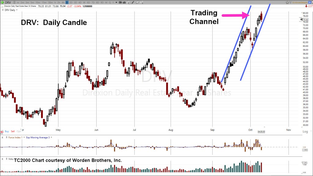
Let’s go to the IYR, 3X Leveraged Inverse fund DRV.

IYR, 3X Inverse, DRV, Daily

At the end of today’s session DRV has posted a downside reversal candle.

The next session will be important.

We either have follow-through to the downside, thus validating the reversal (and exit of the position) or we have some variation of an inside day or new daily high.

If the trading channel remains valid, the compressed chart below shows a potential exit range: DRV 140 – 200.

During the next session(s), if DRV, posts a new daily high (unless stopped), the DRV-22-04, stop will be moved to this session’s low @ 73.86

Positions & Current Stance (courtesy only, not advice).

The following is the positioning of my firm’s main (largest) account.

DRV-22-04:

Entry @ 66.463, Stop @ 63.98

ZSL-22-01:

Entry @ 28.08, Stop @ 28.53:

Discretionary exit (today) @ 31.5513***

Trade Closed

LABD-22-08***:

Entry @ 25.1278 (yesterday) and 24.735 (today), Stop @ 22.59

***, Indicates change

Note: Positions may be increased, decreased, entered, or exited at any time.

Stay Tuned

Charts by StockCharts

Note:  Posts on this site are for education purposes only.  They provide one firm’s insight on the markets.  Not investment advice.  See additional disclaimer here.

The Danger Point®, trade mark: No. 6,505,279

Silver … Sold Out !

… And The Bulls Are Trapped

How is it possible to have silver stocks sold out here and here, yet silver bears have trapped the bulls.

As we’ll show below, this morning’s action in SLV, has confirmed the reversal; a Wyckoff up-thrust, pointing silver’s probability to lower levels.

For starters, let’s recap on how this (trading) game is played.

That is, the public i.e., the masses, need to be led to and fro so they are continuously on the wrong side of the trade.

That’s it.

So it is with precious metals and specifically silver.

The media came out recently, effectively telling everyone ‘Now is the time to buy gold’.

Where were these guys in 2001, when gold bottomed around $271/oz.

No, they show up at the end of the move … not the start.

Public Buys Hype, Not Facts

So the public has bought into the hype and run the silver coffers dry. Everyone excepts an immediate currency collapse and certainly anything can happen.

However, as Undedicated Economist points out, the dollar strength (first identified in this post) can last for years.

The original (bullish reversal) analysis is now supported by the facts; it’s been nearly two-years since that post and the dollar (UUP) is still headed higher.

So, let’s find out where silver is likely to go. For that, we go to the weekly chart.

Silver SLV, Weekly

The set-up, already posted; Spring-to-Up-Thrust.

It’s a repeating pattern found across the markets.

Price action gets itself into a spring condition by penetrating support which subsequently sets up the reversal; the up-thrust.

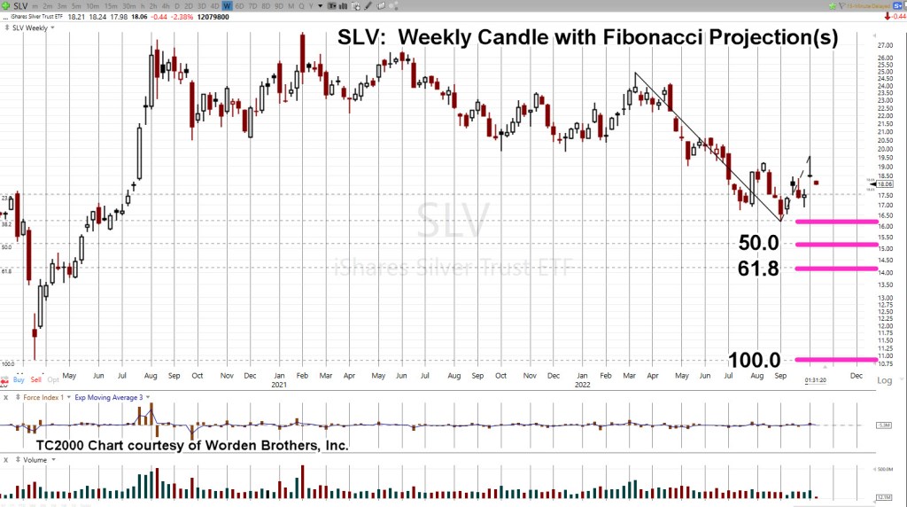
Next, we’ll use the Fibonacci Projection Tool, showing likely areas for downside destination.

A full 1 : 1 projection gets us right back to where we started the whole ‘short-squeeze’.

If SLV, gets back down to the 10.50 – 11.0, level, one can only imagine what type of hype will be in vogue.

However, at those levels, it’s reasonable to expect the local bullion dealer will be begging for sales … they might even offer their product at, or near, spot. 🙂

Stay Tuned

Charts by StockCharts

Note:  Posts on this site are for education purposes only.  They provide one firm’s insight on the markets.  Not investment advice.  See additional disclaimer here.

The Danger Point®, trade mark: No. 6,505,279

The Silver Set-Up

Repeating: Spring-To-Up-Thrust

Which comes first: Freezing and starving to death, or currency collapse?

Is that a hyperbolic statement?

Short answer, is no.

Here are at least two boots-on-the-ground sources that paint an incredibly bleak picture of what is to come in just weeks for Europe.

Links are here and here.

As with the Texas Freeze, the last thing on anybody’s mind was their “stack” of silver.

The humanitarian crisis is happening now, if not soon. Currency collapse may be months if not years away.

Which brings us to the precious metals and specifically silver, SLV.

The past few trading sessions have formed a repeating set-up: Spring-To-Up-Thrust.

Silver SLV, Daily

Note, the Pre-Market activity is far below yesterday’s high; the bulls may be trapped.

Typically the first order of business is an attempt to close the gap. If that happens, price action is then narrowing the risk on a short entry (not advice, not a recommendation).

One typical trading vehicle for shorting silver (other than the futures market) is 2X Inverse Fund ZSL.

Summary

The bulls think it’s finally the launch they have been waiting for … all these years.

It could be … anything can happen.

However, that does not take away from the fact we’ve got a trade set-up that may offer a low-risk short entry (not advice, not a recommendation).

Stay Tuned

Charts by StockCharts

Note:  Posts on this site are for education purposes only.  They provide one firm’s insight on the markets.  Not investment advice.  See additional disclaimer here.

The Danger Point®, trade mark: No. 6,505,279

Trading A Silver Collapse: Part 3

No One Expects A Long Term Siege

This time is different.

This is not 1987, or 1998, or 2000, or 2008.

In those cases, once the market reached bottom, the recovery was sharp (’98, ’09) and if not, was steady as in ’87 and ’03 – ’04.

In each case, interest rates were high enough to allow ‘fiddling’ that would in turn, result in the desired (i.e., up) market response.

Ammo Is Spent

This time, we’re in another melt-down and there’s no ammunition left to save the market.

That all got spent in ’08.

Back then, those witnessing firsthand, efforts like TARP, could feel in their gut, ‘there won’t be a (save) next time’.

So, here we are.

Always Fighting The Last Battle

It’s been said, Generals are always fighting the last battle; that is, what happened last time.

In line with that thinking is the (YouTube) idea, once we get a ‘collapse’, it will be time to rush in and scoop up ‘assets’ at fire sale prices.

That idea would have worked quite well in ’08 – ’09, which was last time.

On The Brink

Last time, there was no threat of nuclear war.

There was no infrastructure collapse or crop failures and looming world-wide famine (just to name a few).

There was no ‘elephant’ either.

This article, just out, has California front running the elephant with ‘composting’ signed into law a few days ago.

Silver, The Collapse of Demand

It’s not the metal itself that’s the problem. Having some is always a good idea.

It’s the idea of trusting in these ‘things‘ to be one’s savior.

There are larger forces at work that will likely overshadow owning something you can’t eat.

Once again, this just out: World’s largest produce market (Paris) goes up in flames.

At some point, there will be a collective world-wide realization … it’s the food supply.

When that happens, the expectation is, all ‘assets’ will be heavily sold off, including precious metals.

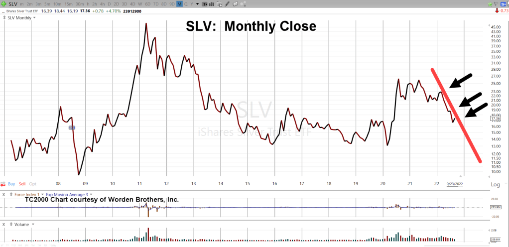
Silver (SLV), Monthly Close

The monthly chart shows the line to watch; the downtrend that started in late March of this year.

If SLV maintains its current rate of decline, it will be April of next year before we get to the support level shown below.

Pushing (and closing) below well-established multi-year support (orange line), is no easy task.

We would likely need to have some sort of catalyst to help price action get to those levels.

Once below support (‘Target Area’), SLV would then be in Wyckoff spring position.

Summary

As always, anything can happen; precious metals could rally starting at the futures open in a couple hours.

Price action itself, is the final arbiter.

Most ‘investors’ are not prepared for a long-sustained siege-grinding rachet lower, possibly to single digits.

If that happens, then will be the time to assess the potential for a significant long-term rally.

Stay Tuned

Charts by StockCharts

Note:  Posts on this site are for education purposes only.  They provide one firm’s insight on the markets.  Not investment advice.  See additional disclaimer here.

The Danger Point®, trade mark: No. 6,505,279

‘Tipping Point’ For Gold ?

“Sentiment Is Negative” … So What?

No sooner had the bearish report on silver been released, than we have a bullish report on gold at ZeroHedge; linked here.

We’re going to address the bullish view briefly but succinctly, with the weekly chart of gold (GLD) below … but first.

When ‘Sentiment’ Works

One little trading nugget that took about 25-years to find out (your mileage may vary), was that in a sustained up or downtrend, sentiment is largely, irrelevant.

In the ZeroHedge report linked above, the ‘little guy’ (i.e. sentiment) is bearish or negative. We all know the little guy is nearly always wrong.

Not to worry.

If gold and silver move decidedly lower from here, our ‘little guy’ will think he’s a genius.

He’ll begin (or continue) to post all kinds of philosophical memes on twitter and Facebook; then set himself up for the big whammy farther down the road. 🙂

The pros will get their money no doubt; they’re patient.

Now, on to the weekly chart for gold (GLD).

Gold (GLD), Weekly Close

We’ve already discussed how penetrating support will put gold (GLD) in Wyckoff spring position.

It’s clear we are there now.

As it says in the chart, support penetration was preceded by a very weak bounce.

The difference between Wyckoff analysis and others is that Wyckoff focuses on what the market’s saying about itself.

At this juncture, price action to the upside (the bounce) is weak; suggesting that momentum remains to lower levels.

The following chart is a zoom of that bounce area.

Summary

This update’s several hours before the 2:00 p.m., EST, Fed announcement … likely to be a non-event, anyway.

Nonetheless, if there’s a significant change in price action, we’ll review it at that time.

Stay Tuned

Charts by StockCharts

Note:  Posts on this site are for education purposes only.  They provide one firm’s insight on the markets.  Not investment advice.  See additional disclaimer here.

The Danger Point®, trade mark: No. 6,505,279