Note: Posts on this site are for education purposes only. They provide one firm’s insight on the markets. Not investment advice. See additional disclaimer here.
The last time we had a major (sustained) economic melt-down, was 2007 – 2008.
The market (S&P) bottomed on March 9th, 2009, posting a low at 666.79.
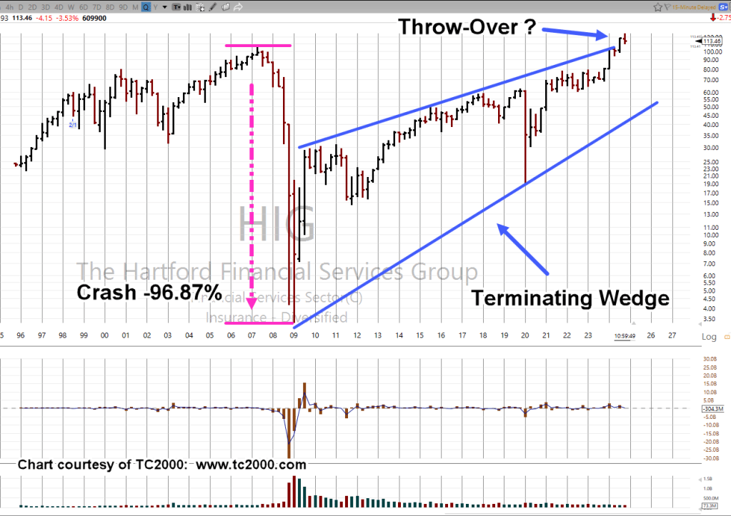
During that collapse, Hartford Financial was one of the hardest hit.
It imploded, crashed, by -96.87%.
It’s important to note, HIG bottomed at 3.33, during the week-ending, 3/6/09; you can’t make this stuff up. 🙂
So, let’s take a look at what HIG, is doing now and if it’s at risk, yet again (not advice, not a recommendation).
We’re looking at the long-term, the Quarterly Chart
Hartford Financial, HIG, Quarterly
With just a few weeks left in the Quarter, HIG is positing a reversal.
From a classical analysis standpoint, a reversal back into the wedge (and then upside test) would be a potential sell-signal (not advice, not a recommendation).
Note: Posts on this site are for education purposes only. They provide one firm’s insight on the markets. Not investment advice. See additional disclaimer here.
From a price action standpoint, we have an outside down weekly bar as well as (potential) monthly reversal.
Despite fever-pitch, ‘the world’s ending’ talk on gold and (supposed) silver breakouts, we’re reminded here (time stamp 3:10) to expect a downward spike in gold should there be (serious) international trouble (not advice, not a recommendation).
Newmont’s the largest cap in the GDX; let’s take a look at the sector.
Senior Miners, GDX, Weekly
GDX, in the same vein as IWM, NVDA, SOXX, SPY, and TLT (to name a few), posting its own terminating wedge.
Noted in the chart, GDX has entered back into the wedge formation after a ‘throw-over’; typically, a bearish sign (not advice, not a recommendation).
Note: Posts on this site are for education purposes only. They provide one firm’s insight on the markets. Not investment advice. See additional disclaimer here.
For the mining sector we’re about to find out if it’s bulls or bears.
With today’s overall (S&P, Dow, QQQ, etc.) down market and the press screaming in hysterical panic at the start of the day, you’d think the market had collapsed 50% or more.
The last update (over the weekend) had this to say about the S&P (emphasis added):
“So, here we are: The market (SPY) has rallied over the past week, giving the illusion that all is well.
However, it too is now in up-thrust (reversal) position.“
So, the SPY declines by just over 1%, everyone loses their head and starts talking about CBDC.
Moving on to the ‘knee-jerk’ sector for the day, let’s look at the miners and specifically GDXJ.
Junior Miners GDXJ, Daily Close
Admittedly, the prior update was unsure whether or not this sector had its up-thrust reversal ‘test’.
Note: Posts on this site are for education purposes only. They provide one firm’s insight on the markets. Not investment advice. See additional disclaimer here.
One report covering the historic narrowing of the market is here.
Never before seen narrow breadth: What does it mean?
It means the market’s ‘keeping up appearances’ while the foundation’s been removed.
That way, the professionals can get out the door; sell or sell-short, funnel capital to the only three tickers left (AAPL, AMZN, MSFT), while the public looks at the SPY, and says ‘Where’s the collapse?’
Let the crowd focus on the S&P … probably the most computer controlled, AI driven, Machiavellian manipulated market in the world … but hey, I’ve got my i-phone trading app and I’m going to ‘Put it to the man’.
Meanwhile, downside leader biotech, inches lower.
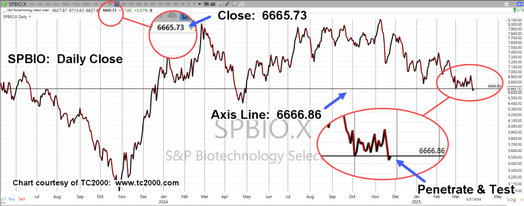
Biotech SPBIO, Daily
Let’s review where we are with SPBIO, with the full understanding that anything can happen.
For now, we’re heading lower (not advice, not a recommendation).
It’s obvious. Biotech’s following a Fibonacci time sequence.
Let’s pull out to the larger weekly chart and see something really scary.
Biotech SPBIO, Weekly Close
If we really are at the right side of the trading channel, it’s not looking good for the bulls.
Of course, it all makes sense.
The market’s at record breadth divergence. Banks are collapsing, Ukraine (fabricated, or not) coupled with trade wars, the consumer’s tapped-out (credit at maximum) and on it goes.
Positioning
Early this session, the short position in biotech (via LABD) was increased (not advice, not a recommendation).
The table below shows the trading (entry) activity during the on-going reversal (not advice, not a recommendation).
Hard Stop: 16.79
The notation ‘LABD-23-05’, indicates this is the fifth trading campaign (or trade series) in LABD for the year.
Note: Posts on this site are for education purposes only. They provide one firm’s insight on the markets. Not investment advice. See additional disclaimer here.
Nemont Mining (NEM), Gold, and the Oil & Gas Sector are at a critical juncture.
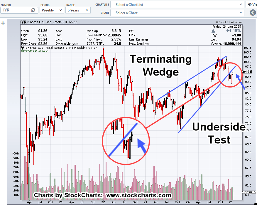
The rest of the major indices, Dow, S&P, QQQs, real estate (IYR), and so on, are in a similar position.
For this update, we’ll focus on Newmont (NEM), as it’s the largest cap in the Senior Mining Sector GDX, and a general representative of the commodities markets.
Financial collapse is a process, not an event.
Newmont topped-out in April, of last year. Exxon, the proxy for the Oil & Gas sector, may have reached its highs this past November.
Where’s The Inflation?
As Michael Cowan has just reported, banks are absconding with depositor’s money under the guise of ‘bail-in’.
If the fiat cash is so worthless, why are banks seizing it?
As Robert Prechter Jr., said years ago, ‘all fiat cash ultimately goes to zero’; the end game (most likely) for the dollar. However, it could be months, years, or even a decade before that happens.
For right now, today, this minute, the data is showing us, the banks want the money; ‘Show me the money‘.
With that, let’s look at the non-existent ‘inflation’ in the mining sector.
Newmont Mining NEM, Weekly
The first chart identifies the heavy volume and then test of wide price bars. This behavior is common in the markets; they tend to come back and test wide high-volume areas.
Next, we see there’s a terminating wedge developing as volume declines; the inference, is lack of significant commitment at these price levels.
We’ll get close-in on the wedge; last week printed a lower weekly low and closed lower for the week.
There’s no breakdown of the wedge … yet.
At this juncture, it’s up to the bulls to show they’re still in control.
Inflation vs. Scarcity
We have without a doubt, the effects of the event from the past three years gaining momentum. Whether or not those effects reach a peak this year, is unknown.
A lot of the mainstream and YouTuber’s alike talk about the upward move in gold as the result of ‘inflation’.
Here’s a little bit of insight you’ll not find anywhere else; how about gold rising because the above mentioned ‘effects‘ are causing production volumes to decline?
Maybe it’s because of scarcity (along with nearly everything else) that’s causing the increase in price.
Just to drive that idea home, the latest total gold production numbers, listed here.
Gold production for 2020 dropped -8.2%, from the year prior. Year 2021 was down -1%, from 2020.
From 2010 to 1019, gold production increased or was flat year over year … that is, until 2020.
Note: Posts on this site are for education purposes only. They provide one firm’s insight on the markets. Not investment advice. See additional disclaimer here.
If we use the S&P as the proxy, it hardly even lasted that long.
Going back to just four days ago, we had this (emphasis added):
“It’s well known, stocks tend to rise in the first weeks of January. Tax loss selling is over and there’s typically some type of ‘relief’.
Don’t count on it this time (not advice, not a recommendation).”
Market Meets Expectations
It was expected on the first trading day of the year, the market would continue its downtrend.
After this morning’s 15-minute blip, that’s exactly what’s happening.
We’ve already discussed real estate IYR, (here, here and here) as well as the Q’s (here).
Now, there appears to be another sign of impending price collapse … the oil sector; specifically, Oil & Gas Index XOP.
As is typical, we’ll begin the analysis with the longer time frame, the weekly.
Oil & Gas Sector XOP, Weekly
There’s no secret to the chart below other than Livermore’s admonition for going short; that is, he finds a market that ‘goes down and stays down’ (not advice, not a recommendation).
The prior two down-drafts were quickly retraced; one in mid-July last year and one in September.
Not so, this time.
If we go to the daily, we have an ominous look where a downtrend could be validated.
Oil & Gas Sector XOP, Daily
The right-side trend is drawn as a dashed line, revealing the attempted breakout on the last two sessions in December.
Attempted trend line and channel breakouts are normal market behavior.
It’s clear in the case above, price action has quickly got itself back into the trading channel.
Summary
Of course, oil prices are not supposed to go down, right?
At this juncture, look at all the conflict and potential supply disruptions that are possible.
However, the price of oil and the price of the exploration/production equities are two separate things.
The price of oil could skyrocket further, and yet, the equites still collapse. Bear markets are all about price, wealth, and credit destruction.
Typical short positioning trade vehicles for this sector are DRIP (-2X) and DUG (-2X), or to short the XOP directly (not advice, not a recommendation).
Note: Posts on this site are for education purposes only. They provide one firm’s insight on the markets. Not investment advice. See additional disclaimer here.