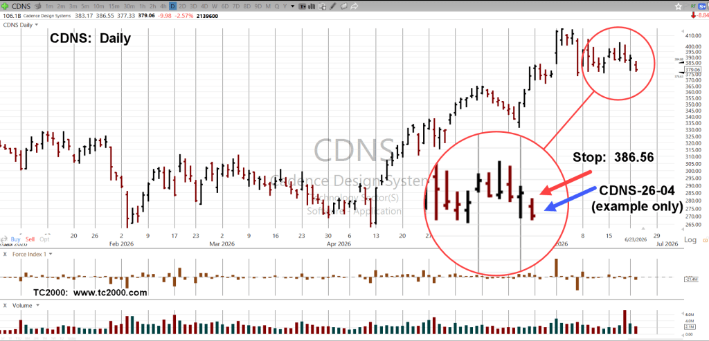
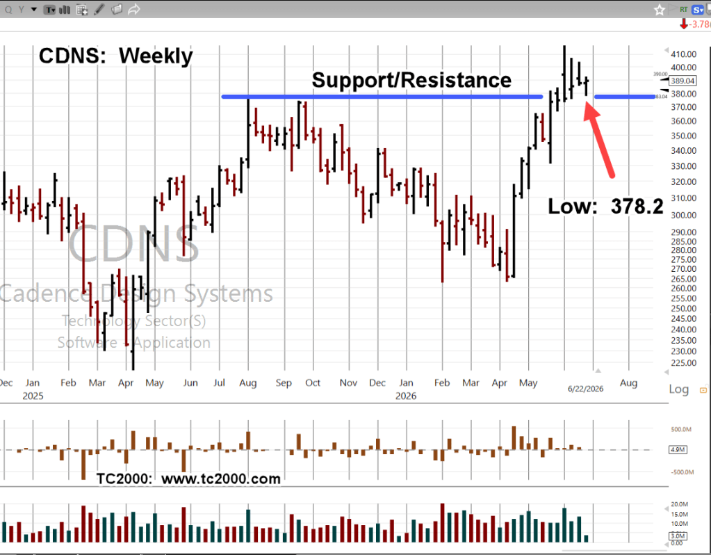
Barely Closing Higher
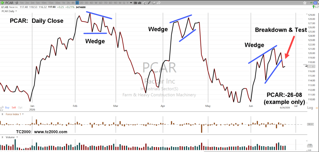
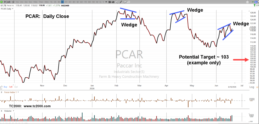
The PCAR trade plan, already posted with this update.
From that:
“If we get a breakdown from this point and using that bit of insight, a measured move target is within the vicinity of 103 (not advice, not a recommendation).”
Yesterday, the breakdown and today, a potential test.
The expectation is for continued downside (not advice, not a recommendation).
Stay Tuned
Charts by StockCharts
Note: Posts on this site are for education purposes only. They provide one firm’s insight on the markets. Not investment advice. See additional disclaimer here.
The Danger Point®, trade mark: No. 6,505,279