Unprecedented … Again

Nefarious forces operate in distraction and darkness.
“And this is the condemnation, that light is come into the world, and men loved darkness rather than light, because their deeds were evil.”
The year 2021, was the year everyone (except children) showed their true colors; they made their decision, knowingly or not, for darkness or light.
This year, 2022, is where the effects (or ‘side effects’) of that decision began to take hold.
Now, as 2023 approaches, we’re likely to move into the realm of unprecedented chaos and collapse.
As if on cue, under the cloak of this week’s holiday distraction, we have what’s possibly the next wave.
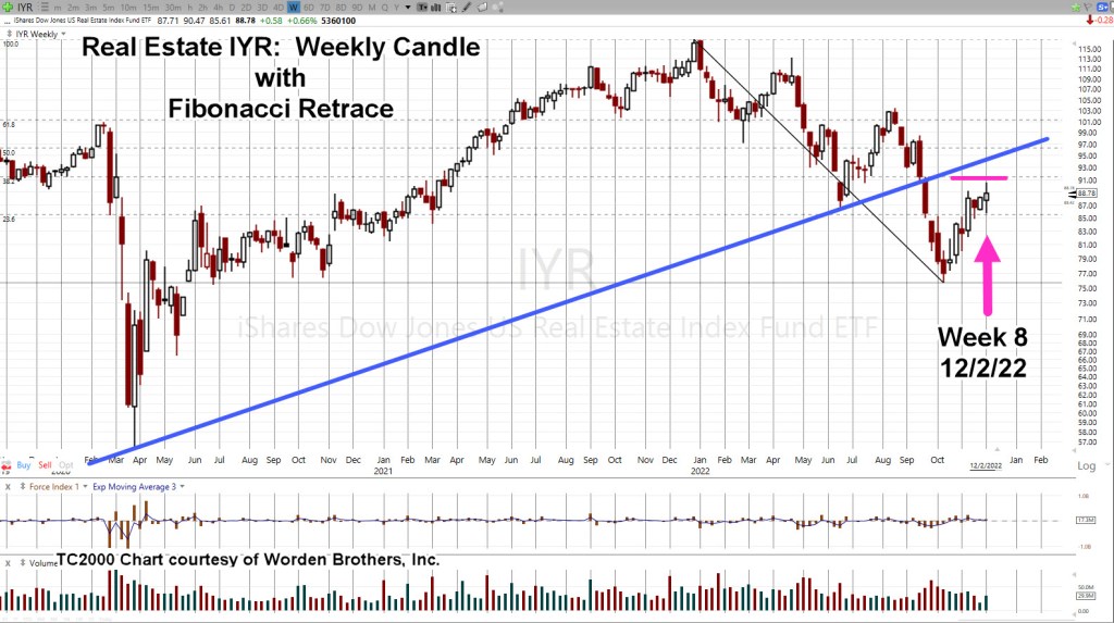
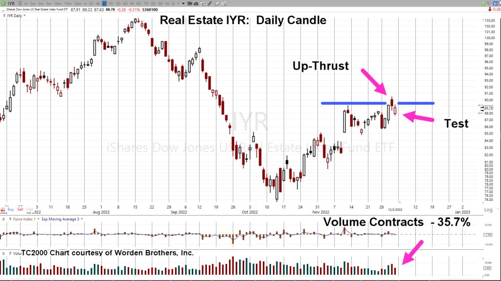
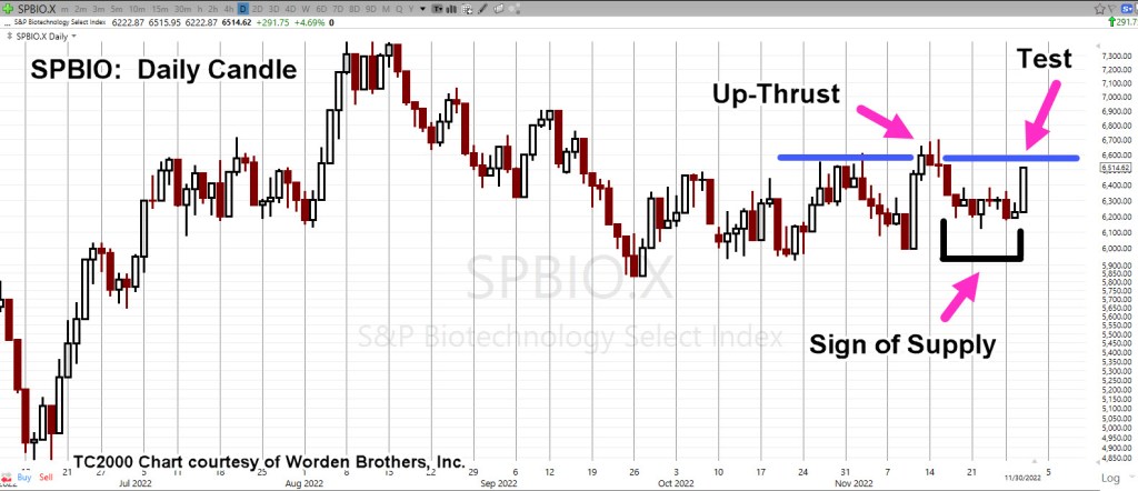
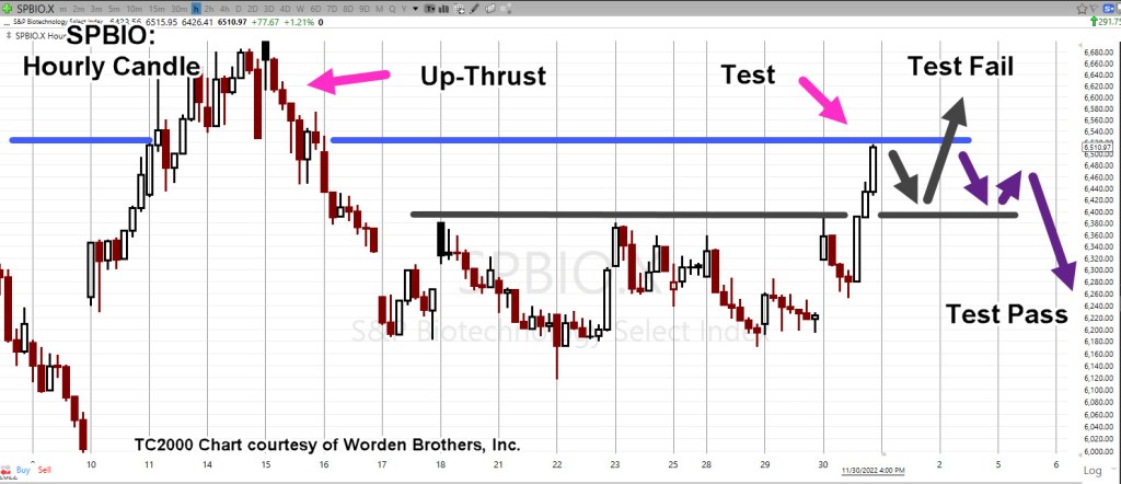
This could be the reason as presented in the last update, why biotech appears to be in the early stages of disconnecting from the overall market.
That separation may continue or not; price action is always the final arbiter.
The ‘Woke’ Go Broke
The useful idiots that comprise the ‘woke’ business crowd may be in for the biggest surprise in the coming year.
If there is one overriding theme to keep in mind for 2023, this could be it.
Separate enclaves are now forming of those who have not, will not, and are not going to go along with the ever more unbelievable narratives.
Here is a link to just one of those enclaves.
As a digression; in Texas, we’re just now coming out of yet another record-breaking cold spell.
That’s two, never before seen record breaking low temp events within the past three years!
How does that fit with the global warming narrative?
Anyone awake knows full well what’s going on … and it’s not global warming.
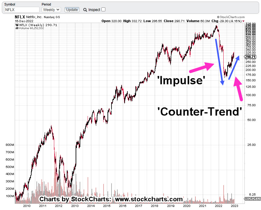
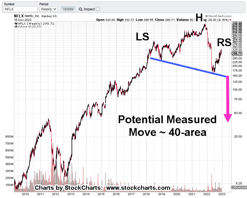
Who’s On First: NFLX or TGT?
Now that vending machine Carvana (CVNA), is out of the way, who’s next?
Partly as a result of economic decline and partly from the decision to take consumer spending elsewhere, Netflix and Target now appear ready to continue their implosion.
More on their technical chart conditions in the next update.
Stay Tuned
Charts by StockCharts
Note: Posts on this site are for education purposes only. They provide one firm’s insight on the markets. Not investment advice. See additional disclaimer here.
The Danger Point®, trade mark: No. 6,505,279