Note: Posts on this site are for education purposes only. They provide one firm’s insight on the markets. Not investment advice. See additional disclaimer here.
As former floor trader Richie Naso says, ‘You have to think like a criminal’ (time stamp 10:50).
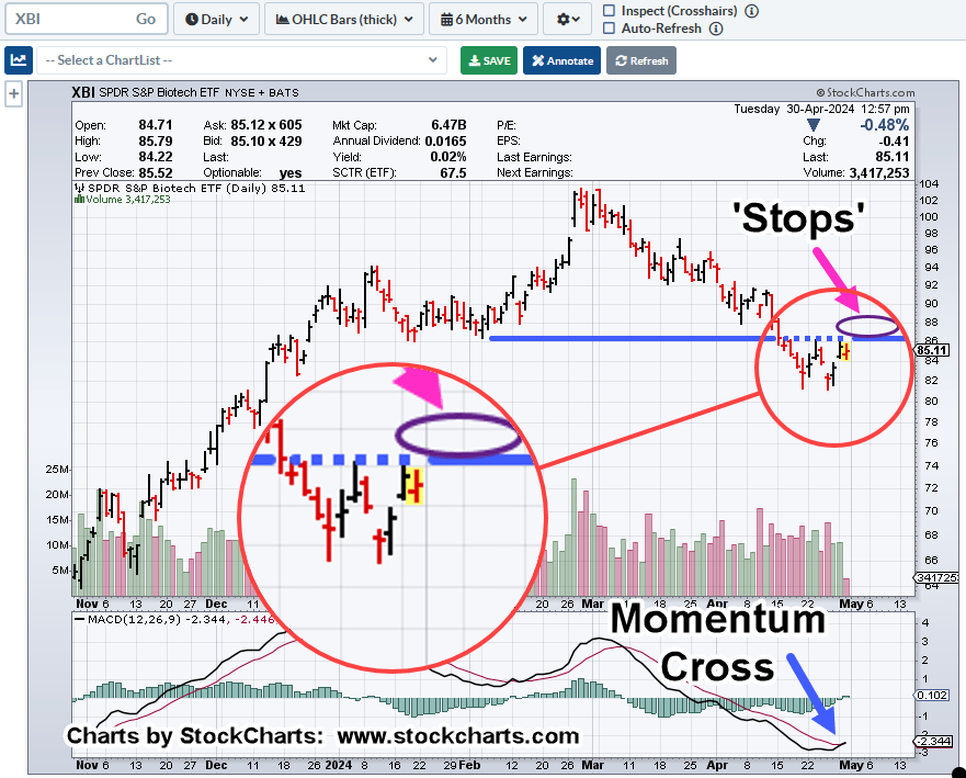
Using his example, a market-maker executes orders ‘to create liquidity’; where on the chart of biotech XBI (below), would that bundle of ‘order’ liquidity exist?
Biotech XBI, Daily
The purple oval shows where there’s a potential of congregated ‘stops’.
Also note, the MACD cross.
This trigger signal is on the Daily MACD, only as the weekly shows longer term momentum continues lower (not advice, not a recommendation).
At this juncture, XBI has broken out of previous trend channels and so, we have a new construct.
Positioning
Presently, I have no open positions in biotech (not advice, not a recommendation).
Back in the day, I would likely be holding short, placing my stops exactly at the location of the purple oval.
Let’s see if the market searches out my old stop location that if hit, would have taken me out of position (via LABD) right in time for a potential reversal to the downside. 🙂
Note: Posts on this site are for education purposes only. They provide one firm’s insight on the markets. Not investment advice. See additional disclaimer here.
If there’s one market attracting huge numbers of grifters, carpetbaggers, peddlers, and all-around crazies, it’s precious metals.
I’ve been hearing from this crowd, ‘the government’s going to collapse, the dollar’s going to collapse’, since the early 1980s.
As said many times before, I like precious metals as much as the next guy.
However, from a strategy standpoint, with each passing day, we see it’s the food supply (here, and here) that comes first (not advice, not a recommendation).
What’s currently taking place is so much more complicated (in my opinion) than just ‘stacking’.
Let’s not forget the flood of ‘fake’ or ‘diluted‘ precious metals and other chicanery; like having your coin-shop bank account closed for no apparent reason.
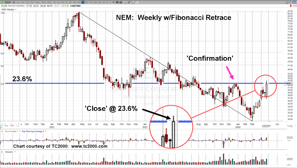
Well, we have to keep the loonies on the path which brings us to our case in point, Newmont Mining, NEM.
Newmont, Good News is Bad News
Gold price has moved higher over the past four to five months and expectedly, that’s been noted in Newmont’s latest Quarterly release, link here.
NEM, stock price at ‘nine-month highs’, what’s not to like?
It’s when we look at the chart, we see a different story.
Newmont Mining, NEM, Weekly
After all the ‘good news’, NEM has only retraced an anemic 23.6%, of its overall downside move.
Note the close on Friday was right at the 23.6% level, giving it even more significance.
This level has also become an ‘axis line’ as exhibited by price action going back to August of 2022.
By The Numbers
When looking through the major sectors, retrace (and reversal) from 23.6%, is becoming more frequent.
Two other indices posting and reversing from that level (measured from recent highs), are biotech XBI, and real estate, IYR.
NEM, What’s Next?
Thursday, 4/25, was a wide bar with heavy volume.
We’ve stopped at the retrace, which is also resistance, confirmed by price action in late December. ’23.
A reasonable expectation is NEM, retraces, testing the wide bar and volume before continuing to the downside or moving back higher to a breakout (not advice, not a recommendation).
Note: Posts on this site are for education purposes only. They provide one firm’s insight on the markets. Not investment advice. See additional disclaimer here.
Note: Posts on this site are for education purposes only. They provide one firm’s insight on the markets. Not investment advice. See additional disclaimer here.
How do you know if it’s a countertrend move, or an outright reversal?
Do you stay with the trade or, as Dr. Elder said, ‘do you just take the money and run?’
For biotech XBI, it’s been a nasty two days of upside for any short positions, but the real question is, are we there yet?
Looking at the charts below, you’ll have to decide for yourself.
However, from my perspective, it’s possible that ‘today is the day’; meaning, we may be at the top of the correction (not advice, not a recommendation).
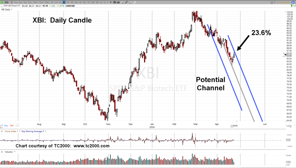
Biotech XBI, Daily
The chart is self-explanatory.
From the day a ‘change of character’ was identified to last Friday’s low, is a Fibonacci 21 days.
From that low to today, is a Fibonacci 3 Days.
We’ll compress the chart scale for a bigger picture view of the current action.
Also included is the grey centerline, showing the channel has a symmetrical ‘look’.
Also note, we’re at a 23.6%, retrace at the day’s high (thus far) and price action appears to be eroding downward.
Note: Posts on this site are for education purposes only. They provide one firm’s insight on the markets. Not investment advice. See additional disclaimer here.
When’s the last time you saw a P&F chart on any (other) website or YouTube, channel?
My guess … probably a long time ago, or never.
Even StockCharts, recently revamped their site, removing the landing page option for P&F. It’s still there, but you have to search to find it under ‘more tools’.
If we’re going to be using Wyckoff analysis to determine the most probable direction for the market (and how far it could go), then P&F analysis is part of that effort.
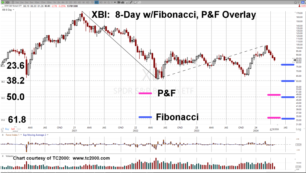
For our biotech example, XBI, we’ve used two projection methods to see where price action is likely to go if we have a sustainable downturn in progress.
Biotech XBI, 3-Point P&F
As a reminder, ‘3-Point’ means before an ‘X’ or ‘O’ is charted (for reversal), the index must move at least 3-points.
Based on the P&F action itself, we have a projection range (not advice, not a recommendation).
Now, comes the interesting part, Fibonacci projections.
Biotech XBI, 8-Day, w/Fibonacci
The Fibonacci projections are shown as the blue lines.
The P&F projections from the chart above, are overlaid as the magenta lines.
Of course, projections do not guarantee anything.
At the next open, XBI could launch itself into a upside reversal; not likely, but it could happen.
Wyckoff Cause & Effect
What we’re doing here, is adhering to Wyckoff discipline from his stock market course material (still available here).
No position, long or short is entered unless there is sufficient cause i.e., P&F count for a sustained move.
Note: I have no affiliation with the Stock Market Insitute and do not receive any compensation from them.
In the case of biotech XBI, above, it literally has spent years generating a P&F count; the ’cause’.
The ‘effect’, is the actual move; now potentially in progress.
Note: Posts on this site are for education purposes only. They provide one firm’s insight on the markets. Not investment advice. See additional disclaimer here.
Before we get started, recognize there’s a huge public service available with the (media, YouTubers, et al.) discussion on potential gold, silver, rally ‘to the moon’.
Now that Nvidia (NVDA) has posted a reversal, it’s likely the bull market, if not completely over, is seriously damaged.
As Ed Dowd, former BlackRock fund manager suggested, (link here), when the market turns lower, everything’s likely to head down … everything; at least, initially.
The public service: We get to see (in real time) which analysis method is best suited to determine the truth of what’s really happening.
With that, let’s move on to the chart.
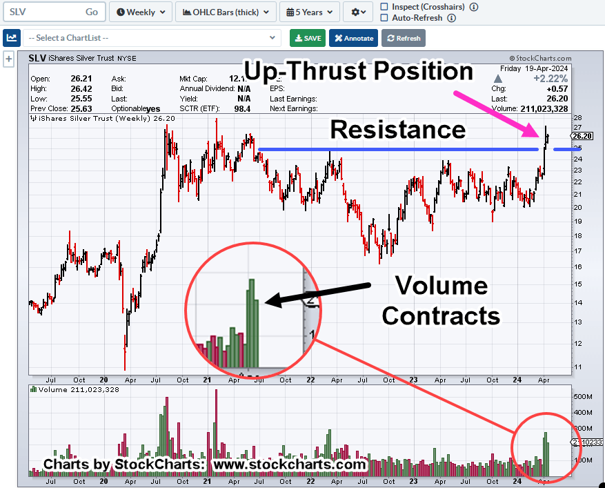
Silver SLV, Tracking ETF, Weekly
If this is an initial thrust to move higher, it’s losing energy; narrow range (weekly) bar with volume contracting.
If we’re in an up-thrust about, to reverse lower or consolidate, this is the type of market behavior to expect (not advice, not a recommendation).
Delusional In … Delusional Out
Like the Artificial Intelligence (AI) delusion, hyped-up beyond all conceivable expectations, it takes a while to deflate.
This past Friday may have been the start.
So too, it could be with precious metals.
If indeed, this time is different, and were in a sustained, long term (years-long) rally for silver (SLV), then look for the character of the price action to change.
One potential example of that would be, successive gaps higher of $5/oz., $10/oz., or more.
A real bull market breakout (like the S&P in 1995), does not let you get aboard comfortably.
Note: That breakout in ’95, was a complete shock to the typical market watcher.
The S&P had oscillated in a trading range for a year before launching decidedly higher in early ’95. In that sense, the breakout is/was the complete opposite of the ‘long awaited’ (potential) bull run in precious metals.
The Mood Has Shifted
Anecdotally, the mood appears to have shifted.
If we’ve just past the top in the market (S&P, Dow, SOXX), then expect the social construct to become unhinged.
Note: Posts on this site are for education purposes only. They provide one firm’s insight on the markets. Not investment advice. See additional disclaimer here.
In the case of biotech XBI, it may have started the ‘dynamic phase’, suggested two days ago, in this update.
Then, there’s Elliott Wave.
Back in the day, while being mentored by the late David Weis, he revealed his ‘love/hate’ relationship with the method.
His quote to me was “Intermittent reinforcement, is a hook”; meaning, it works just well enough (but not profitably enough) to keep you coming back to ‘get it right’ next time … which never comes.
For me, I’m not going to use the approach for trading decisions, but highlight in the case of XBI, we just might have an Elliott Wave structure (not advice not a recommendation).
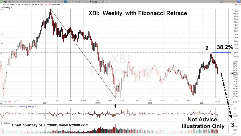
Biotech XBI, Weekly
If this structure’s correct, a lot can happen on the way to the end of ‘Wave 3’.
Note the XBI, topped-out right at the 38.2%, retrace in March (labeled, as ‘Wave 2’), before reversing lower.
Big In, Big Out
The chart above is a massive structure; years of action to form the top, reversal, counter trend wave, then reversal again, which is where we are now.
Note: Posts on this site are for education purposes only. They provide one firm’s insight on the markets. Not investment advice. See additional disclaimer here.
‘…. and reminds you, she was only in it, for the money ….’ Steve Goodman
Seems like any time gold or silver blips higher, the shills come out; a new book to sell, more metals to peddle.
Obviously, what’s presented on this site, is neither; we’re searching for the truth, market truth, nothing else.
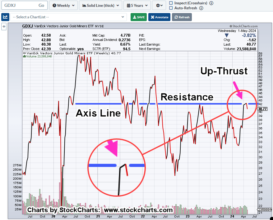
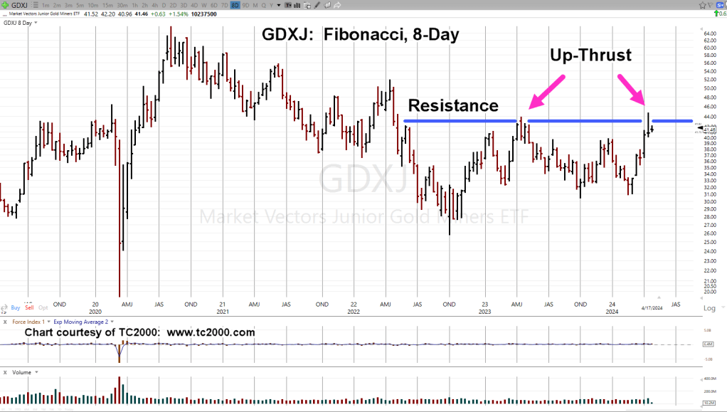
When looking at Junior Mining (ETF) Index, GDXJ, once again, it’s at The Danger Point®.
Junior Miners, GDXJ, Fibonacci 8-Day
The 8-Day chart gives us a clear view of the action.
There was an up-thrust during the week of April 14th, 2023.
Now, a Fibonacci 55 (-2) weeks later, another one during the week of April 12th.
Last Time, Is Not, This Time
The up-thrust in April ’23, resulted in a steady but choppy downside action until the bottom, February, this year.
Using Prechter’s ‘rule of alternation’, whatever happens from here, it’s not likely to be what happened last time.
So, essentially, we have two potential outcomes; strengthening with continued upside, or a swift decline back to support levels (not advice, not a recommendation).
Note: Posts on this site are for education purposes only. They provide one firm’s insight on the markets. Not investment advice. See additional disclaimer here.
‘ … we’re at the 161.8%, projection and USO is hesitating; at the same time, Nat-gas, UNG, appears to be forming a long-term bottom’
The implication was: We’re at a Fibonacci level in USO, while the ‘herd’ has positioned themselves (massively) long and Nat-Gas appears to be reaching a (potential) long-term low.
Three trading days later, we have this:
Oil Tracking Fund USO, Weekly
If you look closely, the grey dashed line, the Fibonacci 161.8% projection, is just visible and extends out of the green line, highlighting that level.
A possible, nascent reversal.
Way back in 1902, after studying the markets intently, Wyckoff, discovered the following (paraphrasing):
‘Forces were at work, moving prices around, independent of any fundamentals, not connected to any valuations.’
Nearly, a century later, Prechter says this as well in one of his many interviews (paraphrasing, again).
‘If somehow, I was able to give you the newspaper headlines for tomorrow, you would not be able to tell me if the market was going to go up or down’.
The media is presenting oil (gasoline) and Nat-Gas prices as inversely correlated. Looking at the topping chart of USO and the bottoming chart of UNG, it’s believable … for now.
Downward thrust in Nat-Gas UNG, appears to be exhausting itself after a 20-month, bear market.
Risk is never zero, but currently appears to be at a low for UNG (not advice, not a recommendation).
Note: Posts on this site are for education purposes only. They provide one firm’s insight on the markets. Not investment advice. See additional disclaimer here.