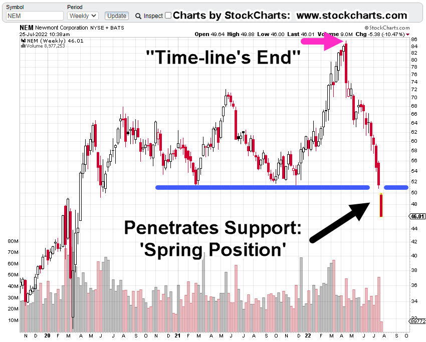
Gold Miners … The Reversal

Each Peak Is Lower

Gold’s reversal or potential for reversal, has already been covered here, here and here.

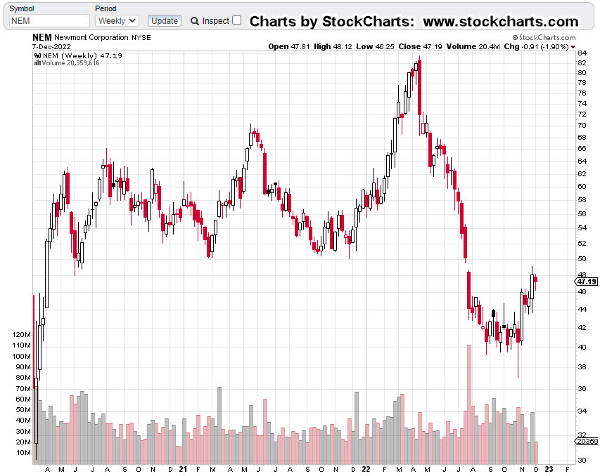
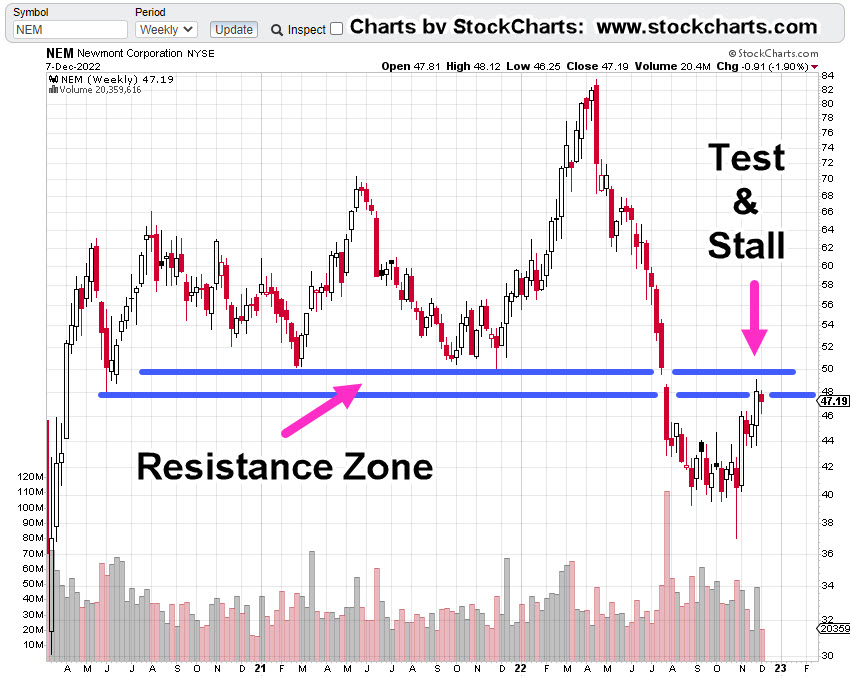
We’re going to focus on the Junior Miners GDXJ but start first, with an updated chart of gold (GLD).

Gold GLD, Weekly Close

This is how it looked back on April 15th.

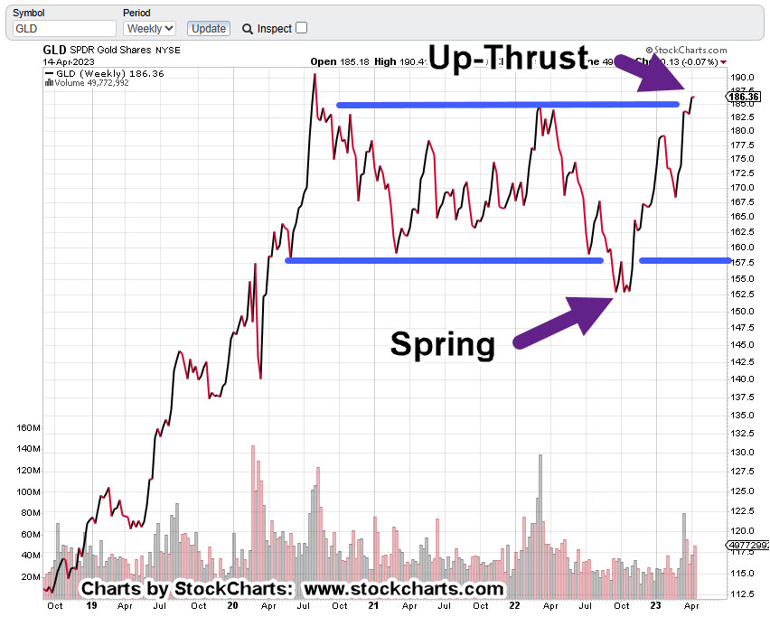
As of the close yesterday, we have this:

It’s arguable GLD, is now below the resistance line (completing the Spring-to-Up-Thrust) but that’s not the most important part from a trading standpoint.

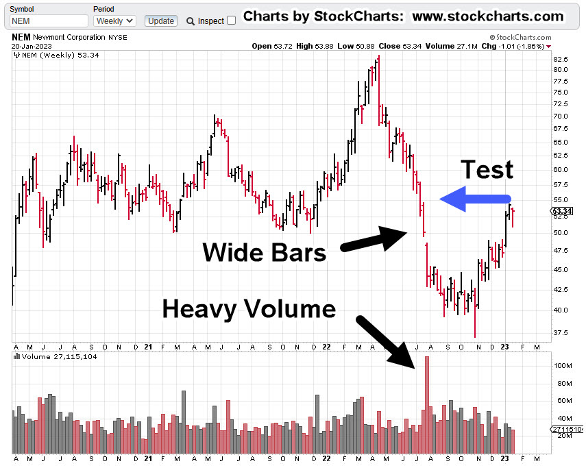
When looking at the Junior Mining Index GDXJ, there’s an ominous pattern.

Junior Miners GDXJ, Weekly Close

Each extreme peak over the last three-years has been labeled; the Derecho of 2020, the so-called Ukraine ‘invasion’, and now, the banking crisis.

Note: The SVB bank failure was on March 10th. There was a ‘knee-jerk’ reaction by the public into gold and related components … that peak appears to have stalled at the location shown.

What’s going on is obvious; it’s a bear market.

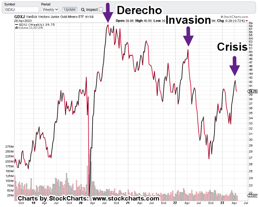
Each major peak, lower than the last.

Now, the interesting part.

The Junior Miners are in Wycoff Up-Thrust condition.

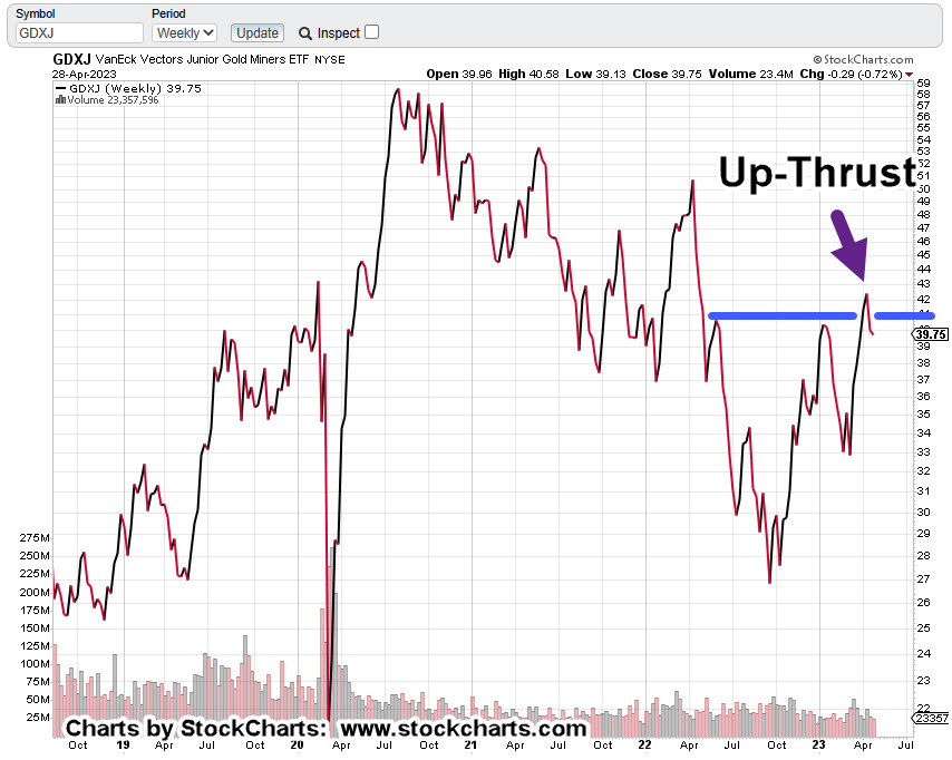
In this case, price action’s solidly below the resistance line.

Looking at the daily (not shown), there may have been a ‘test’ of resistance this past week for a move higher; if so, it failed and GDXJ closed slightly lower.

Summary & Positioning

So, here we are: The market (SPY) has rallied over the past week, giving the illusion that all is well.

However, it too is now in up-thrust (reversal) position.

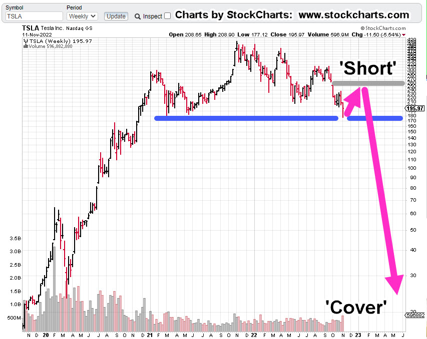
For my business accounts, it looks like being short the miners at this juncture is lower risk than being short biotech (not advice, not a recommendation).

Typical short vehicles that could be used (not a recommendation) are DUST and JDST.

As always, anything can happen. If the markets ‘implode’, they might be closed for any number of days or weeks.

Stay Tuned

Charts by StockCharts

Note:  Posts on this site are for education purposes only.  They provide one firm’s insight on the markets.  Not investment advice.  See additional disclaimer here.

The Danger Point®, trade mark: No. 6,505,279

‘Panic’ Into Gold … Reversal Risk

Gold Bulls Exhausted

With Friday’s downside reversal we’re now between Euphoria and Anxiety for gold.

This past week was inundated with stories of panic at the bullion dealers.

YouTube ‘content creators’ were going berserk with hyper-inflationist rants; other ‘influencers’ telling us the dollar’s about to collapse; they say the Fed’s the only reason the dollar’s not at zero right now.

Then, rumors warning of gold to $5,000/oz. and higher.

The result as you would expect, is a highly emotional, manipulated public.

Different This Time?

At this point, whether or not the dollar will collapse is probably irrelevant.

Long time visitors to this site already know, battle lines (like here and here) are being drawn and it’s not in precious metals (not advice, not a recommendation).

As always, anything can happen and gold could go higher but with Friday’s reversal, probabilities have now shifted to the downside.

With that, we now have an ominous chart of gold below.

It shows the set-up to a repeating market characteristic:

Wyckoff ‘Spring to Up-Thrust’.

Gold (GLD) Weekly Close

Gold’s momentum wanes just as it’s pushing up through resistance.

Obviously, what happens next is the important part.

Strategy

Looking at the economic calendar for the coming week, there’s a Fed speaker every single day. If we’re really at a significant reversal, next week’s likely to put the panic into unsustainable overdrive and mark the top.

For the bulls, we’re looking for the GLD, highs to be maintained. If it can’t hold, there’s reversal trouble ahead.

A Reversal?

If this is the ‘big one’ and gold reverses, a likely (medium-term) target is in the area of $1,300/oz., – $1,350/oz. (not advice, not a recommendation).

If that happens, gold’s still expensive but it’s the mining sector GDX, GDXJ, that would potentially be devastated.

Both the Seniors and Juniors are already printing an MACD bearish divergence (not yet confirmed) when looking at the weekly charts.

Stay Tuned

Charts by StockCharts

Note:  Posts on this site are for education purposes only.  They provide one firm’s insight on the markets.  Not investment advice.  See additional disclaimer here.

The Danger Point®, trade mark: No. 6,505,279

Oil … Gas … Gold & Newmont

Markets, At Critical Juncture

Nemont Mining (NEM), Gold, and the Oil & Gas Sector are at a critical juncture.

The rest of the major indices, Dow, S&P, QQQs, real estate (IYR), and so on, are in a similar position.

For this update, we’ll focus on Newmont (NEM), as it’s the largest cap in the Senior Mining Sector GDX, and a general representative of the commodities markets.

Financial collapse is a process, not an event.

Newmont topped-out in April, of last year. Exxon, the proxy for the Oil & Gas sector, may have reached its highs this past November.

Where’s The Inflation?

As Michael Cowan has just reported, banks are absconding with depositor’s money under the guise of ‘bail-in’.

If the fiat cash is so worthless, why are banks seizing it?

As Robert Prechter Jr., said years ago, ‘all fiat cash ultimately goes to zero’; the end game (most likely) for the dollar. However, it could be months, years, or even a decade before that happens.

For right now, today, this minute, the data is showing us, the banks want the money; ‘Show me the money‘.

With that, let’s look at the non-existent ‘inflation’ in the mining sector.

Newmont Mining NEM, Weekly

The first chart identifies the heavy volume and then test of wide price bars. This behavior is common in the markets; they tend to come back and test wide high-volume areas.

Next, we see there’s a terminating wedge developing as volume declines; the inference, is lack of significant commitment at these price levels.

We’ll get close-in on the wedge; last week printed a lower weekly low and closed lower for the week.

There’s no breakdown of the wedge … yet.

At this juncture, it’s up to the bulls to show they’re still in control.

Inflation vs. Scarcity

We have without a doubt, the effects of the event from the past three years gaining momentum. Whether or not those effects reach a peak this year, is unknown.

A lot of the mainstream and YouTuber’s alike talk about the upward move in gold as the result of ‘inflation’.

Here’s a little bit of insight you’ll not find anywhere else; how about gold rising because the above mentioned ‘effects‘ are causing production volumes to decline?

Maybe it’s because of scarcity (along with nearly everything else) that’s causing the increase in price.

Just to drive that idea home, the latest total gold production numbers, listed here.

Gold production for 2020 dropped -8.2%, from the year prior. Year 2021 was down -1%, from 2020.

From 2010 to 1019, gold production increased or was flat year over year … that is, until 2020.

Stay Tuned

Charts by StockCharts

Note:  Posts on this site are for education purposes only.  They provide one firm’s insight on the markets.  Not investment advice.  See additional disclaimer here.

The Danger Point®, trade mark: No. 6,505,279

Gold … Repeating (Short) Set-Up

At The Extreme

Gold is at the extreme … again.

It’s also posting a repeating pattern; indicating a short set-up (not advice, not a recommendation).

As presented over a year ago, that set-up is defined as what’s called (in Wyckoff terms), a spring-to-up-thrust.

Meaning, price action has a repeating tendency to go from one trade set-up to another.

We’ll go to the daily chart.

Gold GLD, Daily

The Changing of Hands, is included because as of yet, that (downside) reversal has not been decisively negated.

There’s no downside capitulation volume; indicating we’re on the other side (bullish side) of the current downtrend.

Now gold is at The Danger Point®. The ephemeral place where risk is least; price action can (easily) go either way.

So The Question Is, Which Way?

Here’s one perspective that’s reasonably balanced.

The theory is all about Central Banks … ok, if it works.

From a personal (trading) standpoint, the fundamental approach was abandoned years, if not decades ago.

Moving closer-in on the daily, we have the following.

Price action is struggling at resistance (upper blue line).

As stated in a prior update, if GLD, can’t hold and move above this level, it’s an indicator of potential serious trouble to the downside.

Of course, it goes without saying, the miners, GDX, GDXJ, are at similar danger points.

Stay Tuned

Charts by StockCharts

Note:  Posts on this site are for education purposes only.  They provide one firm’s insight on the markets.  Not investment advice.  See additional disclaimer here.

The Danger Point®, trade mark: No. 6,505,279

There’s No … ‘Santa Rally’

Forecasted Months Ago … Now, Playing Out

Let’s start with the post from way back in September, linked here.

Back then, it said (emphasis added):

It’s going to be a very different place come December.

This won’t be like ’08 -’09, where all the stops are being pulled to ‘rescue’ the market.

No, this time really is different.

We can all see by now; the plan is controlled demolition.

That was then. Fast forward to now.

ZeroHedge has come out with the obvious. If there’s going to be a Santa Rally, it needs to start soon.

Good luck with that.

Instead of looking for a rally, we’ve moved on from that (unlikely) potential to something different, linked here.

That link is not a forecast. It’s there to remind us, the potential for what can happen.

One group that just won’t let go of the (sustainable) rally scenario are the gold bugs.

Seems like with every ‘blip’ higher we have articles like this one, this one, and this one.

So, let’s take a look at a the largest cap in the mining sector, Newmont and see what the price action is telling us.

Newmont Mining NEM, Weekly

First, we have the un-marked chart and right off the bat, it does not look good; down -45.4%, from all-time highs.

It looks even worse, when the resistance zone is added.

So far, price action has already stalled and not been able to hold within the resistance zone.

It’s important to note, this resistance area is over two years wide. it’s not likely that anything’s going to happen to the upside without numerous attempts.

No ‘Clicks’, In A Gold Bear Market

If buying gold was the answer to getting through the financial, economic and societal collapse, then one would think the price would be moving relentlessly higher.

That’s not happening … not by a long shot.

What is happening, is this: Demand destruction on a colossal scale.

This destruction is on the birth side and the death side.

These events are affecting everything, going forward.

Nailing The Reversals

Using Wyckoff analysis, this site has been able to identify reversals in gold and the miners at times, to the day.

Important pivot points are here, here, here, and here,

Once again, at this juncture, we’re at a potential reversal in silver, gold, and the miners.

It’s about 15-minutes before the open. NEM is trading slightly higher by about 1.00%.

Let’s see what happens next.

Stay Tuned

Charts by StockCharts

Note:  Posts on this site are for education purposes only.  They provide one firm’s insight on the markets.  Not investment advice.  See additional disclaimer here.

The Danger Point®, trade mark: No. 6,505,279

The Market Set-Up … This Week

What To Watch … Crypto Collapse, Biotech, Gold, Telsa

JPMorgan … says sell

Goldman … says buy.

Wyckoff says … Don’t listen to either.

In fact, Wyckoff’s stock market training course, first published in 1934, (still available), says that until you can ignore the financial press completely, ‘You will never be successful in the markets’.

Price action itself, properly interpreted, will tell you where to look for the opportunity.

The Ponzi Implosion, Cometh

The market is littered with Ponzi schemes. Some have already imploded, CVNA, HOOD, Crypto; some have not.

Concerning Crypto, here’s an excellent update from Michael Cowan. Buried in that update, at time stamp 4:58, looks like HOOD, may be in even more trouble.

Biotech is in a class of its own and was discussed in yesterday’s update.

For gold, we’re going to look at the Junior Miners GDXJ, and last week’s action.

Junior Miners GDXJ, Daily Close

The Junior’s are the weakest in the sector; therefore, that’s where we look for a short opportunity (not advice, not a recommendation).

To move higher, above resistance, normal market behavior, is to come back to the lower blue line (i.e., support) to gain enough energy to move higher for a breakout.

To move lower, normal market behavior, is to come down to the lower blue line as a test which subsequently fails; the move continues lower.

Either way, normal behavior at this juncture, is to move lower. We’ll see.

Now on to the chief cook and bottle washer … Tesla.

Tesla (TSLA), At The Edge

For starters, let’s recognize there’re a lot of moving parts; U.S. ‘parts’ and China ‘parts’.

If one’s going short, another task is to forecast under what conditions a short would have enough risk removed.

For that answer, oddly enough, we go to gold, GLD.

Gold GLD, Weekly: 2015 – 2017

GLD posted a massive upthrust above the blue line lasting over fourteen weeks before breaking decisively lower.

Then, it labored four weeks to come back up for a test.

After that, collapse; lower weekly closes for seven consecutive weeks.

In the chart above, the area identified as ‘Short’, has as much upside risk removed as possible, right at resistance.

Now on to Tesla.

Tesla TLSA, Weekly

Two scenarios are presented where risk may be reduced.

Chart 1

Chart 2

One of these may happen or neither of them.

Either way, for risk to be reduced, a short entry is needed to be at a known resistance level (not advice, not a recommendation).

Let’s move on to the current positioning.

Positions: (courtesy only, not advice).

One of three events will happen at the next session.

1: Both positions stopped out

2: One position stopped out

3: No positions stopped out

Each outcome will provide a data-point where to focus (or not) in the current environment.

LABD-22-10:

Entry @ 18.1398: Stop @ 16.83

JDST-22-05

Entry @ 9.1666: Stop @ 8.79

Note: Positions may be increased, decreased, entered, or exited at any time.

***, Indicates change

Stay Tuned

Charts by StockCharts

Note:  Posts on this site are for education purposes only.  They provide one firm’s insight on the markets.  Not investment advice.  See additional disclaimer here.

The Danger Point®, trade mark: No. 6,505,279

The Largest ‘Squeeze’, Ever

A Market Of Extremes

So, this is how it’s going to be.

The market itself is telling us it’s not going to be ‘well behaved’, possibly for years to come.

According to Goldman, link here, we’ve just had the largest short squeeze on record.

Friday, must have pushed it over the edge from the previously reported, ‘third largest‘.

The ‘Pontificators’

Everybody think’s they’ve got it figured out; We’re going to have stagflation, no wait, hyperinflation, no wait, inflation/deflation simultaneously, no wait, dollar collapse, no wait, gold to the moon, no wait, and on it goes.

What we really have, which is obvious to those ‘awake‘, is something that’s never happened before.

That ‘something‘ is here every day, multiple times a day.

Flash Crash, 2010

Every so often just as a reminder, this event is posted as an example; until that day, it never happened before either.

“Paper comes in, a big seller!!!”

 ‘Paper’ is essentially anyone (banks, hedge-funds, institutions, and/or retail) outside the pit.  Those in the pit are called ‘locals’.

Positioned At The Extreme

The largest short squeeze in history has actually performed a public service; the markets are at extremes.

With that, the short position in Junior Miners GDXJ, has already been discussed, link here.

We’re going to move on and talk about the elephant; more specifically, biotech SPBIO.

Biotech SPBIO

The table shows last week’s action when compared to the week prior. All major sectors had solid gains but it’s the right-most column that’s of interest.

The right-side column shows how far price action closed above the prior week’s high.

Once again, biotech shows overall weakness. It gets more interesting when looking at the weekly chart.

Biotech SPBIO, Weekly

It’s been three successive weeks of apparent up-thrust reversals that were negated each time.

Looking at the weekly below, what we have, is a huge bear flag that just so happens to be, Fibonacci 8-Weeks wide.

It’s possible, this congestion area is the mid-point of the overall move from the highs set during the week of February, 2021.

Compressing the chart and putting in a measured move target gives us the following.

If we have an actual Head & Shoulders top, that target is shown as well.

Either way, the downside potential is enormous; thus, requiring intense focus from a Wyckoff standpoint, i.e., during a bear market, identify the weakest sector for short opportunities (not advice, not a recommendation).

All of which brings us to positioning.

Positioning

On Friday, a discretionary exit was made from the entire LABD-22-09 position as (LABD) price action continued to decline with no end in sight.

Loss on the LABD-22-09, series was a drubbing of -12.2%

Then again, last week was the largest squeeze in history; taking that into account, the loss wasn’t -30% or -50%.

As the trading day progressed, LABD price action continued lower until low-and-behold, it reversed.

Once again, a position was entered (not advice, not a recommendation) but this time was different. Frist off, initial position size is smaller; about 60% smaller.

Secondly, the stop is an actual order that’s in the market (shown below).

Sounds obvious but we’re dealing with unprecedented times and market disruptions. Recall during the Flash-Crash of 2010, Kimberly Clark, or Colgate (if memory serves) went ‘no-bid’ and printed i.e., sold for 0.01.

That low print remained on the charts for years until it was ultimately removed.

If it can happen on the downside (i.e. when long), it can happen on the upside as well (when short).

Positions: (courtesy only, not advice).

LABD-22-10***:

Entry @ 18.1398***: Stop @ 16.83***

JDST-22-05***

Entry @ 9.1666***: Stop @ 8.79***

Note: Positions may be increased, decreased, entered, or exited at any time.

***, Indicates change

Stay Tuned

Charts by StockCharts

Note:  Posts on this site are for education purposes only.  They provide one firm’s insight on the markets.  Not investment advice.  See additional disclaimer here.

The Danger Point®, trade mark: No. 6,505,279

GDX, Down 5-Months, & Counting

Way Back, To 2012

We have to go all the way back nearly ten-years, to find five consecutive down-months.

The bear market in the miners GDX, and GDXJ, is not any news to those accessing (or following) this site over the long-haul.

Nearly two years ago, this report pegged the bear market before it was even a blip in anyone else’s pineal gland. 🙂

That fact’s proven-out by the listing of no fewer than ten links to other analyst’s super-bullish posts on gold and gold miners.

It’s safe to say at that time, everybody else was pointed in one (bullish) direction.

So, what’s happened to GDX (and GDXJ) since that October 25th, 2020, report?

GDX, is down approximately – 38.2%, and GDXJ, has declined – 47.6%.

Not exactly a bull market.

Senior Miners, GDX, Monthly Bar

Looking at the chart, it’s obvious; the prior ‘five-months’, distance traveled, was much less than our current situation.

Add to that, there’s no real support until lower levels. The decline’s free to continue, unabated.

Summary

This site’s primary focus is strategy. The longer term, the better.

Including the October 25th, 2020, report on the gold miners, we’re coming up on several other significant two-year anniversaries:

Bitcoin to Replace Gold?

Dollar Reversal; Ready

Corn Goes Vertical

Let’s not forget, ‘The Speck’, as we call it, was identified as a hoax well over two years ago; documented with this post.

The intuitive assessment of only partial data (at best) was, and probably will remain, the most important post of all.

Stay Tuned

Charts by StockCharts

Note:  Posts on this site are for education purposes only.  They provide one firm’s insight on the markets.  Not investment advice.  See additional disclaimer here.

The Danger Point®, trade mark: No. 6,505,279

Newmont Mining’s Collapse

Where’s The ‘Inflation’?

As if on cue to support the prior post highlighting silver’s ‘mysterious’ decline, we have this just out, on Newmont Mining.

Newmont’s in free-fall.

For long-time visitors to this site, today’s events should be no surprise.

These reports, here and here, posted back in April, identified reversals in gold miners GDXJ, and implicitly GDX, to the day.

We’ll include a quote from the first linked report below:

“It’s a fairly safe assessment, nobody expects a downside reversal … nobody”.

And yet, here we are.

As the administration and the financial press, becomes ever more confused and bipolar; even now, re-defining the long-held definition of ‘recession’, we have Wyckoff analysis time and again, cutting through the media trash to determine the highest probability for the market.

Newmont Mining (NEM) Weekly

The chart below has current conditions for Newmont.

Also shown is the location of the first post linked above, released before Newmont began its decline.

At this juncture, NEM has penetrated long established support; technically it’s in ‘spring position’.

The expectation is for some kind of (weak) rally attempt. We’ll see if it’s able to get back above support.

Stay Tuned

Charts by StockCharts

Note:  Posts on this site are for education purposes only.  They provide one firm’s insight on the markets.  Not investment advice.  See additional disclaimer here.

The Danger Point®, trade mark: No. 6,505,279

Seabridge Gold … Strategy Update

Lying In Wait … For Opportunity

As the ‘About‘ section says, this site provides one leader’s view on the market; what can best be termed as ‘Strategic Leadership’.

So, just what is that, exactly.

A good example is the current biotech analysis and action.

Biotech strategy, thus far.

No. 1:

Recognize biotech (SPBIO), as bear market leader.

No. 2:

Wait for opportunity to position short via LABD, on an upside reversal; A Wyckoff, up-thrust.

No. 3:

Monitor and increase the short position as the market allows. Continue until targets are met or stopped out (not advice, not a recommendation).

As can be seen, hereherehere, and here, the trade LABD-22-03, is progressing well.

It should be noted, this trade could be over in minutes, or go on for months. The price action itself, will decide when it’s complete (not advice, not a recommendation).

Now, on to gold in general and Seabridge, specifically.

The Gold Reversal

We’ve had several updates that show gold (GLD) has changed hands; from strong to weak.

Quite obviously, this assessment is completely opposite the narrative and the crowd consensus.

However, price action itself, has told us there’s been a reversal.

Recent posts here, here, here, here and here, successively build on themselves showing at this juncture, the gold direction, is down.

Leading Edge Chaos

Evidence continues to build, we’re just on the leading edge of chaos; likely to last for years, if not decades.

Go to time stamp 1:12 at this link and observe one of many efforts already in place to take down the current system.

Chaos, Opportunity, and Seabridge

All of the above brings us to Seabridge Gold (SA).

Going way back, 20-months, to the first post on SA, and taking the following from that report:

“If and when the markets (S&P, Dow, NASDAQ) reverse in earnest, there’s likely to be widespread panic. Just like last time [2007 – 2008] and probably worse.

As a side note: If and when we get there (panic selling), and if SA pushes below well-established support (6-area), the initial plan is to open a major long position … but with a significant caveat.

That caveat is:  We’ll take possession of the actual physical shares (not advice, not a recommendation).  The broker could put up a fuss and charge a fee.  So be it.”

Now, that’s a strategy.

Back then, nearly two years ago, it was not so obvious why having the physical shares was important. I think the reasons for doing so now, are clear.

Let’s move on to the actual chart of SA and look at probabilities.

Seabridge Gold (SA), Quarterly Chart

One thing is obvious just looking at the un-marked chart:

The bull market for SA, ended years ago; October of 2007, to be exact.

The actual price of gold (GLD) went on higher for over three-more years. Yet, SA languished.

Now, gold (GLD) has potentially reversed and there’s possibility for significant downside.

How significant? Well, somewhere in the range of $1,300/oz, or even lower.

Which brings us to the same chart of SA but adding Fibonacci projections.

SA, Quarterly Chart, Fibonacci Projection(s)

Getting closer-in with the zoom, we see the market itself has already validated those projections; especially the 38.2, level.

The 50% projection is near 5.00, and the 61.8%, is all the way down to 0.49 – 0.51.

Seabridge down to 50-cents, is that possible?

The Great Depression, 2.0

Those attempting to equate current events with the Great Depression, are at least doing the good work of recognizing the similarities and possibilities.

In the case of Neil McCoy-Ward, (linked above), he recognizes this time, is a whole other animal.

So, the answer is yes … SA could go to 50-cents. If and when it does, nobody will want to buy.

Stay Tuned

Charts by StockCharts

Note:  Posts on this site are for education purposes only.  They provide one firm’s insight on the markets.  Not investment advice.  See additional disclaimer here.

The Danger Point®, trade mark: No. 6,505,279