Real Estate & The Wrecking Ball

When The Short Squeeze Is Over …

Question:

How do you know it’s a short-squeeze?

Answer:

When it’s over, prices collapse.

That’s exactly what happened yesterday and today.

Yesterday was the squeeze; today, prices collapsed.

We’re about mid-way through today’s session and there could be a late-day test of the down draft. Even so, the action tells us, up moves at this time, can’t be sustained.

For the first hour of today’s session, price action went straight down. Not even a hint of an upward test.

Real Estate IYR, Weekly Chart

This is how the weekly looks currently.

The 105.50 – 106.00, is an area of support.

Price action may hesitate and use that support for an attempt to move higher.

However, there may be something else at work that’s not obvious without a mark-up.

That is, IYR could be in a downward trading channel; having confirmed the right-side yesterday and today.

As Dan from i-Allegedly, has repeated time and again:

‘We’ve had warning after warning … after warning’.

He even uses that phrase in his recent video, linked here.

In his view, along with access to other real estate professionals, the set-up is worse than 2007 – 2009.

The trading channel area is zoomed-in below.

Four channel hits on the left side and two on the right.

The lowest contact spike on the left channel line to the highest spike contact on the right, is a Fibonacci 13-Weeks.

Positioning

For the most part during yesterday’s session, the short position in SRS was maintained (SRS-22-01).

However, late in the session as price action spiked higher, that position was closed and a new one opened with the 3X-Inverse fund DRV; identified as DRV-22-02 (not advice, not a recommendation).

The downward bias on a triple leveraged fund(s) is significantly higher than a two-times fund (even counting for the additional leverage).

Now that significant countertrend moves may be complete for a while, I’m taking advantage of the additional 3X leverage (not advice, not a recommendation).

There was a slight loss on the SRS-22-01, position; somewhere around -0.21 %, … not significant.

Summary

Both Dan (i-Allegedly) and Jerimiah Babe keep getting asked “When’s the collapse?”

Their responses are near identical; “You’re in it, now”.

What do they (asking the question) expect?

Do they want to have the societal, financial and we now know for sure, genocidal collapse, live streamed through their Netflix?

Stay Tuned

Charts by StockCharts

Note:  Posts on this site are for education purposes only.  They provide one firm’s insight on the markets.  Not investment advice.  See additional disclaimer here.

The Danger Point®, trade mark: No. 6,505,279

SOXX, Ready To Drop

All The Good News Is Out

Liquidity Risk?

It’s been long enough; most have forgotten the ‘Flash Crash‘ of 2010.

That crash happened in May of that year.

May of this year, would make it 12-years and interestingly, a Fibonacci 144, months.

Normalcy Bias:

As Nissam Taleb said in his book, ‘The Black Swan’, every day is like every other day on the farm, for Mr. Turkey … that is, until Thanksgiving Day.

Let’s take a look at the historical chart of Semiconductor ETF SOXX, and see the effect of a Flash Crash.

Easy to spot … prices did recover by the end of the day.

What about the next time?

This report just out on ZeroHedge, shows liquidity is drying up in the bond market. Actually, liquidity has been drying up ever since Dodd-Frank of 2010.

All of this is working (to increase risk) in the background.

Let’s take a look at another unprecedented event … the downthrust and apparent recovery in the semiconductor index, SOXX.

SOXX, ETF, Daily Chart

First up, is the unmarked chart of the index.

Next, we’ll show the recovery higher is on diminishing volume.

There’s no real commitment to the higher prices …. they are just drifting upward.

We’ve already shown the Elliott Wave assessment of the current structure. Now, let’s look at it from a Wyckoff standpoint; Up-Thrust and Test.

Price action posted an Up-Thrust, declined and now has come back for an apparent test.

Confirmation Bias

At this juncture, both Elliott Wave and Wyckoff Analysis present a price action structure that’s set for downside reversal.

In a way, we’re at the danger point for both methods.

Summary

From a personal and corporate standpoint, going long in this market and all markets for that matter, was abandoned long ago (not advice, not a recommendation).

To borrow a phrase from Dan at i-Allegedly, he repeats over and over in his videos, ‘We’ve had warning, after warning’.

So, we have.

The SOXX, is telling us, it’s ready to resume action to the downside. After-hours, already has the index trading lower.

Stay Tuned

Charts by StockCharts

Note:  Posts on this site are for education purposes only.  They provide one firm’s insight on the markets.  Not investment advice.  See additional disclaimer here.

The Danger Point®, trade mark: No. 6,505,279

p.s. The insight of 2010 Flash Crash, anniversary of Fibonacci 144 months in May of this year, is exclusive to this site.

‘Unbelievable’ Numbers

Good News Is Bad News. Bad News Is Good News

For all of us serfs in the banana republic proletariat, it’s near if not impossible, to keep up with the lies.

The latest ‘employment‘ report is just one example.

This video from Jerimiah Babe, posted a few days ago has a different story. Check out the intro and then farther on at time stamp: 9:00.

For a second opinion, we can go to Dan, at i-Allegedly.

On his latest post, fast-forward to time stamp 7:00, where he walks through an outdoor restaurant area that’s completely vacant.

The ’employment’ report is vapor. Judging from the comments (at ZeroHedge) most everyone seems to be aware of the fakery.

Naturally, with all of this uncertainty and rampant inflation, the logical place to go would be the gold market.

Junior Miners, GDXJ

As this post is being created (mid-session), the Junior Miners are at the danger point. Price action’s at a location where it’s decision time.

So far, it’s an ‘inside day’. We don’t have a new daily high or low from the previous session.

The Fib retrace of 23.6%, discussed previously is holding for now. That weights action to the downside.

Posting a new daily high would begin to erode the set-up; potentially indicating GDXJ, is going to attempt a retrace to the Fib 38%, level.

If that higher retrace becomes a more favorable probability, the JDST-22-01, trade will likely be closed out (not advice not a recommendation).

The chart below shows the inside action thus far.

The table below has the current positioning JDST-22-01, via inverse fund JDST (not advice, not a recommendation).

As always, the sell finger is on the trigger. Description of color coding and table layout is in this post.

Summary:

Trade decisions posted on this site are defined by the price action itself (not advice, not a recommendation). Wyckoff analysis does not concern itself with what’s obviously fake.

Wyckoff focuses strictly on what the market is saying about itself.

At this juncture, price action’s saying that both bulls and bears, are at the danger point.

Stay Tuned

Charts by StockCharts

Note:  Posts on this site are for education purposes only.  They provide one firm’s insight on the markets.  Not investment advice.  See additional disclaimer here.

The Danger Point®, trade mark: No. 6,505,279

Junior Miners, Stall-Out

First To Reverse

For the evening/overnight session, both gold and the S&P futures have opened lower.

The S&P is down 50-pts, nearly 1.10% (at about 8:15 p.m. Eastern) and already penetrating the last session’s low.

The number of technical factors concerning gold, the miners and especially the Junior Miners GDXJ, is significant.

We’ll cover just a few in this update.

Junior Miners, GDXJ: Daily

The un-marked daily chart shows GDXJ oscillating but in a general downward trend:

The next chart shows price action posted a reversal bar right at Fibonacci 23.6%, for the entire move; from the breakout highs in mid-November ’21, to the lows on January 28th, this year.

A ‘Fib’ retrace of 23.6%, is rare and if it holds, indicates significant weakness.

The next two charts present a case for why this shallow retrace may indeed hold and thus, indicate the start of the next leg lower.

On a print basis, it’s been a Fibonacci 55 (+1) days from the GDXJ print high on November 12th, 2021, to the high posted today (2/2/22).

The next chart shows that November 12th, 2021 was also the closing high of the breakout set-up.

The Important Part:

Yesterday, was the closing high of GDXJ (so far) and that makes it a perfect Fibonacci 55-Days, from peak-to-peak.

The last update on the miners showed significant down-pressure at support levels, unlike previous visits to the area.

Looks like we’ve had the rally that was forecast; that rally may now be fading.

“It’s reasonable to expect an attempt to rally in the coming week … but with this much down force, a successful rally is not the high-probability outcome.”

Gold Could Hold

Already discussed, is the idea, the actual price of gold may hold steady or even go higher and yet the mining sector collapses.

As Dan from i-Allegedly posts in this report, Italian wine makers are having a hard time getting corks for their bottles. That’s right, corks !!!

Does anyone really think a massive mining outfit is going to be able to source all they need to continue operations without interruption?

Let’s not even get started with the ‘sustainability’ corporate failure already baked into the cake 🙂

‘Stackers’ … We’ve Got You Covered

That’s right, if the last report was not enough, we now have this: Fertilizer plant on fire … imagine that.

Right in time for spring planting.

But wait, there’s more; look at the fire chief’s comments. How many “33s” can you count?

For we wrestle not

“For we wrestle not against flesh and blood, but against principalities, against powers, against the rulers of the darkness of this world, against spiritual wickedness in high places.”

Sorry for those who think it’s all a ‘myth‘. I’m with Good Patriot on this one (time stamp 17:09); that we’re in a battle surpassing all that’s come, since 33 AD.

Gold & Silver

Hard assets: Good to have for sure (ammunition, seeds and egg-laying hens may be better) … but if we’re really in a similar event to Genesis 41, that means the corn and grain come first, then gold and silver.

Summary:

This post started with the S&P down about -0.80% and it’s now down -1.10%, posting a new daily low.

Gold is down slightly, holding steady but that’s already been discussed above.

Remaining short the sector via JDST-22-01 (not advice not a recommendation).

Position size on JDST-22-01, has been increased. More on that in the next report.

Stay Tuned

Charts by StockCharts

Note:  Posts on this site are for education purposes only.  They provide one firm’s insight on the markets.  Not investment advice.  See additional disclaimer here.

The Danger Point®, trade mark: No. 6,505,279

Corn … The Famine Set-Up

Waiting For Mr. Potato

It’s hitting the mainstream.

Famine ahead; more specifically, a crisis in corn.

This article just out from ZeroHedge, has the upcoming crop in an almost guaranteed rout before it even gets planted.

Ever since the ‘Derecho‘, corn has been thought (on this site) to be the potential catalyst for market and economic collapse.

The first time that idea was presented was on August 20th, 2020, in this post.

It’s important to note that way back, 17-months ago, it was already understood to be a ‘controlled demolition’.

Crazy conspiracy back then. Looks like a fact, now.

Which brings us to the charts.

CORN: Weekly Chart

As usual, we’ll start with the unmarked chart: Teucrium tracking fund CORN:

It looks like price action is about to break to the upside.

The chart below is marked with some key levels: Support and 38%, and 50% retrace:

For long-time visitors to this site, you can almost write the script for what comes next.

What can make corn drop far enough to get itself below established support and into the ‘spring set-up’ area?

Doing so, may present a medium, to long-term, trade opportunity.

Enter, The Potato

It’s probably not “if”, but “when”.

What we’re looking for here, is some kind of Jimmy Carter type stunt where corn exports are halted in the name of ‘national security’ or some such thing.

More detail on the Carter grain embargo at this link … scroll down to No. 12

Of course, if that happens, corn is likely to crash (like it did last time) if only temporarily.

More Is Less

A corn embargo means more corn for us, right?

Probably, wrong.

Remember, fertilizer prices are sky-high.

Elevated corn prices (like now) might just cover the cost for the farmers … maybe.

A corn crash in the commodities would likely mean even less corn gets planted … maybe none at all.

Enter, The ‘Bought And Paid For’

It may be that easy (as above), or get complicated because a major consumer of U.S. exported corn, is China.

Exports to China over the last year have literally gone off the scale. Add to that, China is the number two holder of U.S. Debt.

So, one can already see where this may be going.

After the initial fake panic where the politicians realize there’s a crisis (that part being real), which they themselves created, they’ll likely pontificate about halting exports for just long enough, to have farmers throw in the towel with no spring planting.

After all of that, and let’s not forget special investigative news coverage about ‘how all this happened’; blame it on climate change and then keep everything the same.

Exports continue (to China) as much as possible and the U.S. citizens starve … literally.

By the way, go to time stamp 24:04, at this link and look at the clouds in the upper right. For those awake, it’s clear; right angle, cross-hatch pattern.

Right angles are not a natural phenomenon. Whatever climate change there is, is the one being created.

When Corn Takes The Dive

If or when corn takes a hit, price action itself will define the correct trade action.

So, let’s be ready and not surprised, if we see corn in chaos.

Stay Tuned

Charts by StockCharts

Note:  Posts on this site are for education purposes only.  They provide one firm’s insight on the markets.  Not investment advice.  See additional disclaimer here.

The Danger Point®, trade mark: No. 6,505,279

Depopulation, is Deflationary

‘Safe And Effective’

Independent sources confirming, Americans are now dying at unprecedented rates.

This article just out from Activist Post, contains two (possibly three) sources, each confirming the numbers.

One of the earliest posts that discussed mass depopulation, is linked here. Line-item No. 1, starts it off.

Murder For Hire

This post from September last year, discussed the ‘Elephant in the room’.

That elephant is, we’re at the front end of a potential mass genocide event (that’s already underway).”

Now, here is verifiable proof of just one avenue for ‘deflation’; i.e. demand is literally going to die-off.

This on-going tragedy or ‘plan’ depending on the source is not going to end anytime soon. In fact, we’re still at the front end of what will last for decades.

The medical establishments in the ‘proof’ link above, know exactly what they’re doing; their actions affect millions, if not billions, world-wide.

Fundamentals Of The Matter

This time, the fundamentals do matter.

By now, we all know the backdrop for the entire population world-wide, is ‘shortage’.

Shortage of almost everything.

However, one thing’s not short; stupidity.

We seem to be full up on that. Anecdotal evidence from a trip to the local Target had people still getting in line, apparently of their own free will, for injections.

At this juncture the results are starting to pile up.

One local school is so short-staffed from ‘illness’ (i.e. potential adverse effects), it closed this week; planned to re-open this coming Monday.

Dead Paradigm: ‘Money Management’

Schools are a microcosm of the entire population.

If schools are closing, what’s going on in the other industries? Just for argument, we’ll keep our focus on the ‘wealth management’ sector.

A quick check of a randomly selected ‘partnered research firm’ that has $1-Trillion in assets, 19,000 financial professionals, partnered with 800 institutions, shows in their market commentary, it’s nothing but, ‘blue skies ahead’.

With stats like that, one can surmise: This Is The Herd

The herd sees nothing but blue skies. All is well.

The Netflix implosion could be used to paint market potential as a whole (not advice, not a recommendation): Down over 20%, instantly.

Dan, from i-Allegedly, with his thousands of contacts, has repeatedly stated, the old way of doing business is not coming back: It’s over.

If you’re running a juggernaut of 19,000 ‘professionals’, how fast are you going to be able to change course if/when the market implodes?

New Paradigm: ‘Centralized Management’

You can almost feel it.

That may be the likely outcome of the potential wealth management implosion (not advice, not a recommendation).

That’s if the markets can even survive.

At time stamp 20:49, in this link, Dan may have given us the model for the entire commercial structure, post apocalypse.

After the small and medium businesses have been destroyed, it’s time for a centralized approach.

After it’s all over, if you’re ‘certified’, the centralized method may be all that’s left (not advice, not a recommendation).

Throw in the requirement to be fully ‘injected’ to be part of a centralized firm and voila!, It will become even more centralized as the management population naturally decreases (rapidly).

Taking that to its logical conclusion, as the ranks of certified managers decreases, the only ‘managers’ left will be those who are exempt; the government employees, i.e., the final solution.

There’s more than one way to confiscate an IRA (not advice, not a recommendation).

The War Room

As the ‘About‘ page has stated, we’re in a war; a financial war.

The rules of the game have changed.

The old way of gathering assets, making sure you don’t lose too much money or posting small gains, intentionally keeping clients blissfully ignorant (by spouting garbage like ‘due diligence’), is over.

What’s needed now, at least for starters, is straight talk and the truth; or as much of it that’s currently known.

So far, what is known is this:

Results of mass-injections are starting to show. The largest die-off in recorded (by insurance firm’s) history.

Shortages of everything and especially the food supply (search on this site for keyword, Genesis 41).

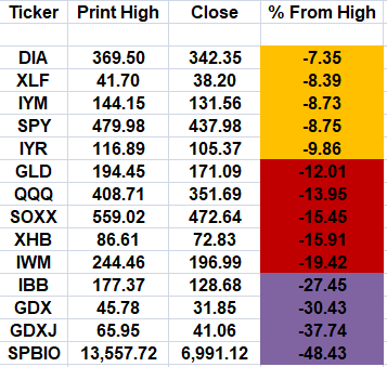
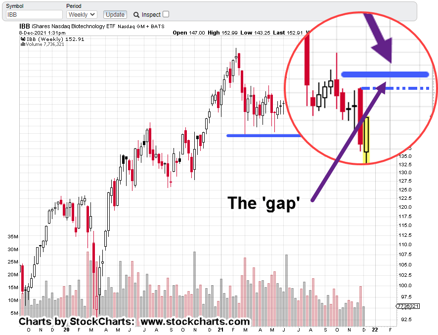
All market bubbles appear to be deflating simultaneously; gold miners and biotech leading the way.

The typical money management firm, if they’re nimble enough will begin to ‘minimize losses on the way down’.

They only know, or can only work in one direction: Up

After meeting with a reputable manager ($100s of millions under management) and asking him if he works the downside, the response was: ‘The clientele can’t handle the volatility’.

So, the answer is no.

The fastest, potentially most profitable direction, the direction that trading professionals prefer, i.e., ‘down’, is not worked by a typical firm. They wait for the upside.

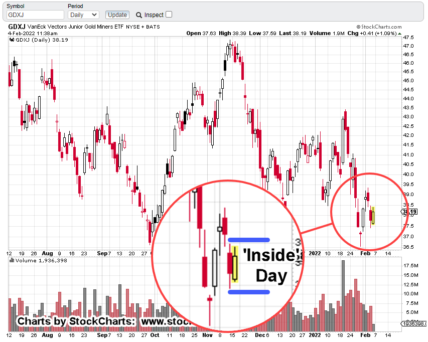
What’s The Market Saying?

Wyckoff analysis focuses strictly on what the market’s saying about itself.

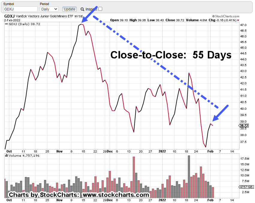
Looking at the table above, that market clearly shows, gold miners and biotech leading the way down; potentially going much lower and each for their own reasons.

On deck for tomorrow, a technical look at gold and the miners; what may be in store for continued downside action.

We’ll discuss Newmont’s apparent reversal; Juniors as the weakest sector, along with P&F and Fibonacci projections.

Stay Tuned

Note:  Posts on this site are for education purposes only.  They provide one firm’s insight on the markets.  Not investment advice.  See additional disclaimer here.

The Danger Point®, trade mark: No. 6,505,279

Carvana Has No P/E

No P/E

No Grade-Point

Another Animal House ?

Delta

‘All courses, … incomplete

If your biggest claim to fame is that you ‘invented’ a vending machine … you’ve got real problems.

No haggle pricing, thin margins and high volume, have already been pioneered by CarMax.

So, what’s left … you get to select your car with a token and vending machine?

Based on available data, in the past three years, CVNA had one profitable quarter. Those results were released in August, this year.

About a week after that, CVNA breaks its uptrend, goes sideways and now, is heading lower.

CVNA Trend Break

The daily chart has the arrow showing the only profitable quarter in three years.

On the other side of business, we have CarMax … where every quarter for the past ten-years has been profitable.

Double The Bubble

During the melt-down in 2007 – 2008, new cars on retail lots had window stickers that said ‘$10,000 Off List Price’.

We’re probably double the bubble of then. With that in mind, even CarMax looks poised to have a hard time.

As the economy (if you can call it that) falls off the cliff, one of these two (KMX, CVNA), is not likely to survive.

So, we can expect even deeper discounts.

However, this time, it’s likely to be a choice between buying food or buying the SUV at 70% – 80%, off retail.

On the positive side, that SUV can be put to work hauling fertilizer (if it can be found) for raised bed gardens. 🙂

Stay Tuned

Charts by StockCharts

Note:  Posts on this site are for education purposes only.  They provide one firm’s insight on the markets.  Not investment advice.  See additional disclaimer here.

The Danger Point®, trade mark: No. 6,505,279

‘Heart Failure’ … The New Normal

… What It Could Mean For Biotech

So, now it starts.

This just out from ZeroHedge, linked here, shows the ‘elephant’ has begun to go mainstream.

Another chess-move.

At least one previous post (No.1, linked here), has shown the phenomenon is not a one-off event.

Now, according to the link above, there’s an estimated 300,000 affected … and we’re just getting started.

Insiders Sell … Retail Buys

Do those at the highest levels know their customer base is about to evaporate on a world-wide basis?

While they may not know every detail, they at least know something’s up. Steven Van Metre discusses the insider selling in his latest update, linked here.

Front End Phenomenon

We’re still at the beginning stages of an event that in the opinion of this author, is going to last the lifetime of those reading this post.

‘Hyperbolic statement’ one might say.

To that, I would counter with this; when it was posted, the ‘elephant’ was hyperbolic as well.

Now? Not so much.

Keeping that long range thinking in mind also keeps one from choosing the ‘insane’ human behaviors discussed by Dan (I Allegedly) in his latest post.

So, let’s take a look at what type of insanity we have going on in the markets today.

Of course, that points us to our chief cook and bottle washer, biotech (IBB).

Biotech, IBB

When we last left our hero, savior, and protector of all that is natural immunity, the biotech discussion was on Moderna (MRNA).

The thrust higher, detailed in this post was thought to be too fast for a sustained reversal. Well, it was right and wrong at the same time.

Moderna wound up reversing … sort of.

At the same time, the biotech sector headed lower to support and is now moving higher.

The weekly IBB, chart has the support (lower blue line) and potential up-thrust location (also 50%, retrace) identified.

The zoom shows the narrow gap between the weekly bars and 50% retrace.

If price action makes it past the resistance bars and into the gap, IBB would then be in up-thrust position (not advice, not a recommendation).

Stay Tuned

Charts by StockCharts

Note:  Posts on this site are for education purposes only.  They provide one firm’s insight on the markets.  Not investment advice.  See additional disclaimer here.

The Danger Point®, trade mark: No. 6,505,279


Silver: Leading The Way, Lower

Already Below Resistance

While gold (GLD) is just above its resistance breakout, silver’s not waiting around.

It’s already below its breakout; apparently leading to the downside.

Using ‘boots on the ground’ type reporting from sources like Jerimiah Babe and Dan (I Allegedly), the financial collapse is accelerating.

The metals look like they’re not exempt from financial conditions (deflation); they’re at the cusp of reversal.

Silver (SLV) Daily Chart:

The next chart zooms in on the reversal area.

It’s clear; SLV is now below resistance … a bearish indication.

At some point and if you live long enough (and have a working brain) you realize it’s all about manipulation.

Everything is manipulated.

Separating from that trap is akin to mental bravery; setting you apart from the mindless herd and at times, in opposition to that herd.

Silver (SLV) is down a whopping -53% from its high set over a decade ago in April of 2011. How can we be in inflation or hyperinflation?

That’s to come … maybe.

Right now, silver’s giving us a signal; lower prices ahead.

Stay Tuned

Charts by StockCharts

Note:  Posts on this site are for education purposes only.  They provide one firm’s insight on the markets.  Not investment advice.  See additional disclaimer here.

The Danger Point®, trade mark: No. 6,505,279

Gold Gets Whacked !

Mid Session

… But, That’s Not The Real Story

First, this morning’s action in gold (GLD) tells us, it’s not a bull market.

The asylum escapees (gold bulls) from yesterday, might paint today’s action as a buying opportunity.

Well, it could be a buying opportunity for short term trades (not advice, not a recommendation) but that’s not what this site is about.

Bull markets do not let you get aboard comfortably.

Case in point:

For those old enough to remember, harken back to the bull market launch of 1995.

Remember that?

It seemed like every day was up into new highs with nary a retracement until a year and a half later.

No, there’s something else going on with gold.

It may indeed continue to move lower from here. However, there’s a price action feel that’s not right.

GLD:

Potential Coup D’état Set-Up ?

Those who own the gold market(s) know full well, there’s a bunch of rabid ‘collapse’ types who believe the metal’s their salvation ticket out of events to come.

Those in control, need to get as many as possible on the wrong side of the trade before there can be a sustained long-term (or fast and sharp) down move.

Such a move, if it goes low enough and fast enough, would likely take out the majority of the ‘stacking’ community.

Looking at the un-marked chart of gold (GLD), just where would that location be … where everyone, except the few, are positioned incorrectly?

As discussed previously, the area shown below would be a good location for an up-thrust (reversal) condition.

In addition, that location’s between the 38% and 50%, retrace level(s) from August 2020, to March 2021.

One can speculate on just what would cause or enable a last-gasp push higher above the GLD 171, level.

Well, for starters, how about a massive volcanic eruption that results in long-term destruction on both sides of the Atlantic.

As Dan (I Allegedly) says with his post just out, ‘the economy is in a perfect storm’.

Anything can happen.

Stay Tuned

Charts by StockCharts

Note:  Posts on this site are for education purposes only.  They provide one firm’s insight on the markets.  Not investment advice.  See additional disclaimer here.

The Danger Point®, trade mark: No. 6,505,279