When Oil & Gas Sector XOP, pushed above last week’s high, it negated the breakdown scenario.
At the same time, it opened another potential opportunity that may set-up this coming Friday … The 13th.
We’ve shown over and again, markets tend to exhibit repeating patterns. Things like trading ranges, terminating wedges, breakouts and breakdowns, are not new.
However, there’s a lesser-known characteristic; the tendency for a market to go straight from a Wyckoff ‘spring’, into an ‘up-thrust’.
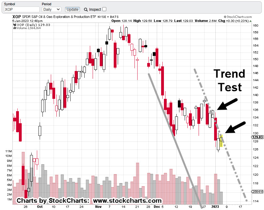
Currently, we’re about mid-way into the set-up as shown on the daily chart of XOP.
Oil & Gas XOP, Daily
Price action pushed below support (the spring set-up) and is now mid-way into that spring; potentially going straight into an up-thrust.
There was a reversal pivot on Fibonacci Day 5 (yesterday), which opens up the possibility of another time correlation at Fibonacci Day 8 … this coming Friday.
Before The Open
It’s about twenty-minutes before the regular open and XOP, is trading higher … further confirming we’re headed for a potential set-up and reversal (not advice, not a recommendation).
Note: Posts on this site are for education purposes only. They provide one firm’s insight on the markets. Not investment advice. See additional disclaimer here.
Was that the day where irrefutable evidence like this is going to stick?
Price action of Biotech Sector IBB, has posted a long awaited and anticipated reversal signal (not advice, not a recommendation).
We’ll look at that below.
The IBB, Up-Thrust & Reversal
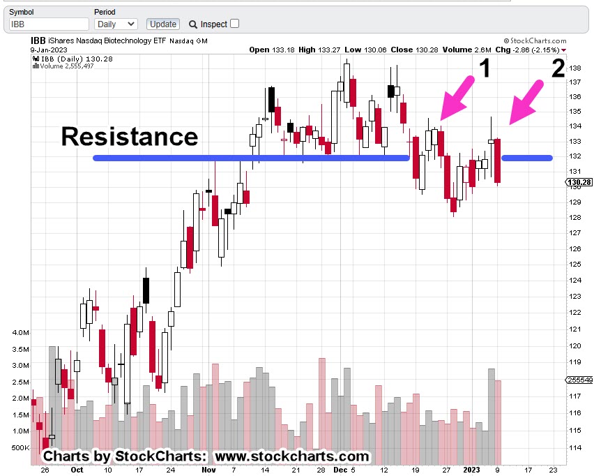
As a reminder, in Wyckoff terms, an ‘up-thrust’ is where price action struggles above known resistance for some period of time and then reverses to the downside.
In the case of IBB, that ‘struggle’ lasted an incredible seven-weeks.
Biotech IBB, Weekly
Price action attempted to break above resistance for nearly two-months, before reversing lower.
Then we had an initial test during the week of 12/23/22 (on the daily for three days), and a secondary test last week.
Biotech IBB, Daily
The daily shows more detail on the struggle.
Point No. 1, was the initial test. Point No. 2, was the secondary test which appears to have decisively failed.
Pre-market action shows IBB, set to open slightly lower.
If it does, then expectation is for some (brief) attempt to rally as a test of the breakdown.
The Driving Force
For years, this site has not wavered in the assessment, what’s happening in this sector, will be the driving force for the entire market on a go-forward basis (not advice, not a recommendation).
Anything can happen.
It’s unknown if yesterday was ‘the day’.
What is known however, evidence is building on a massive scale. Every day, sometimes multiple times a day, we see the effects.
Positioning
This site presents the data, the insight and price action nuances. It does not give recommendations.
With that said, going short this sector is not as straightforward as the other major indices.
IBB, may be shorted directly but will likely result in a maintenance fee from the broker.
Of course, that puts one on the hook for the sector’s dividend payment (currently yielding 0.31%).
The other option is 2X leveraged inverse fund BIS.
However, this fund’s volume is thin … meaning it’s not nearly as liquid as the other inverse funds such as SDS, DXD, QID, SOXS and so on.
It’s up to the trader/speculator to participate or not.
We’re about fifteen-minutes before the open. Let’s see what happens next.
Note: Posts on this site are for education purposes only. They provide one firm’s insight on the markets. Not investment advice. See additional disclaimer here.
Since the lows last November, to the close this past Friday, gold (GLD) has moved higher by a decent but modest 15.4%.
Naturally, the opportunists are out telling us ‘We’ve been warned’, ‘this is it’, ‘it’s going to the moon’ … yet again.
With that backdrop, we’re going to look at the precious metals facts, not the hype.
‘Precious metals’ because there are only four that have ‘currency code’ classifications, i.e., are classified as an asset with ‘currency like’ monetary characteristics.
Way back over a century ago, Wyckoff discovered the key to understanding the next likely move of the markets was the study the market itself (not fundamentals).
Wyckoff essentially ‘locked himself in a room with just a stock ticker and phone line’.
That’s not saying ‘money printing’ has no effect. There are a lot of moving parts. Intentional destruction of the food supply is just one of those parts.
Old School Analysis
Hypothetically, if you dropped an ‘old-timer’ into the markets at this juncture (without him knowing the ‘hype’), and showed him all four charts of gold, silver, palladium, platinum, and asked ‘what’s happening?’
What’s his response?
After a brief look at the charts, he would likely say:
‘Gold’s move higher is not being confirmed by the other precious metals’.
Note that all four metals peaked together during the inflation spike of 1980.
Ergo: At this juncture, something’s wrong.
Either the other metals are going to ‘catch up’ to meet gold or gold is going to come down to meet the others.
That is of course, unless this time is different … somehow.
With that, we’ll look at the chart of gold to see what it’s saying about itself.
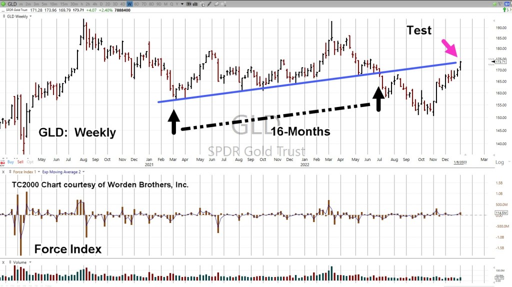
Gold GLD, Weekly
We’re starting with the unmarked chart.
Note: Elder’s Force Index scale is expanded to show the nuances of GLD, price action.
Next, we see we’re at a test of the trendline in place for 16-months before the downside breakout of July, last year.
Moving in closer, we have a wedge formation prior to the up-move last week.
Is this a breakout to the upside or a throw-over?
At this point, it’s unknown.
We can see that Force Index is below where price action entered the wedge during the week of November 11th.
Less force up into resistance (trendline), paints a slightly more bearish than bullish picture.
The ‘Why’ Comes Out
As if on cue and in classic Wyckoff style, we have a ‘why‘ for the move off the lows of last November.
Classic Wyckoff, because he said the ‘why’ of a move comes out after the fact.
There you have it; China buying gold last November and December.
During this move from the recent lows, it was certainly a trading opportunity for the bulls … but from a strategic standpoint, what happens next?
The Non-Confirmation
Non-confirmations can last a long time.
For example, the Oil & Gas sector XOP, declined for eight months, from April 2019 to January 2020, before the price of oil (USO) finally broke lower.
With the ZeroHedge article just released a few hours ago, we can expect at least a blip higher at the next GLD, open.
Note: Posts on this site are for education purposes only. They provide one firm’s insight on the markets. Not investment advice. See additional disclaimer here.
First, we’ll review oil; tomorrow, we’ll look at gold.
From an intuitive standpoint, you can almost feel it.
The oil and gas sector has launched to unsustainable highs.
Behemoths like Exxon (XOM) with its 63,000 employees have gone from below $30/share to above $110/share, an increase over 280%, in just two years.
In the history of the equity, going all the way back to 1984, that’s never happened.
Even in 1987, before the crash, XOM was up for the two-year period, a paltry 108%, by comparison.
Now, data is coming in nearly by the day about collapsing demand, layoffs accelerating, and inventories piling up.
The latest from Steven Van Metre, at time stamp 4:25, discusses just how fast the downdraft is, and will be.
Important Note:
Before we leave the Van Metre link above, at time stamp 8:50, the assertion is made of what the Fed will do when slower growth data comes in. i.e., interest rates will be halted or lowered.
Nassim Talib called this kind of thinking “Normalcy Bias”.
The opinion of this site is, it’s a trap. Thinking what happened last time, will happen this time.
Let’s mentally bookmark this post and come back six-months from now to see what happened.
We’re in uncharted territory and other agendas are at work.
Like ‘bread and circuses’, the ‘pivot’ discussion is a distraction … keeping the proletariat placated.
Demand Collapse
We’ve got demand collapsing on a daily basis right in front of our faces and yet, it’s a big mystery (to some).
What’s not known, is how the general population will react to undeniable truth when it finally hits, en masse.
We have a good hint of what’s in store as reported by Jerimiah Babe during the first minute of this report.
Moving on to the Oil & Gas Sector.
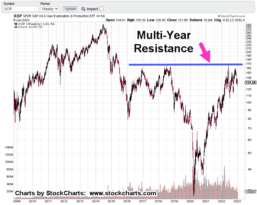
Oil & Gas XOP, Weekly
The weekly chart shows the multi-year resistance area that was tested (and rejected) back in mid-June, last year.
The next chart shows we also have a terminating wedge.
Price action has come back to the lower boundary; suggesting a breakdown is a probability.
If we get a breakdown, measured move support is identified at approximately -47%, below current levels.
Strategy & Trading
Obviously, the charts paint a bearish picture.
Over the past week, XOP was covered here and here.
The first link discussed how price action was very close to making a new daily high. That happened the next session (Friday) and indeed, it had Wyckoff ‘spring’ characteristics.
Price action moved higher and closed higher for the day, but it did not post a new weekly high … keeping the bearish case on the table.
A popular leveraged inverse fund is DRIP (not advice, not a recommendation).
At The Close
As this post comes to a close, a quick check on ZeroHedge turns up this: ‘Tipping Point‘
We’ve jumped over ‘recession’ and have gone straight into crisis and depression.
Note: Posts on this site are for education purposes only. They provide one firm’s insight on the markets. Not investment advice. See additional disclaimer here.
That was Jesse Livermore’s assessment of the market just before The Panic of 1907.
That Was, Then
Back then, it was money spent on The Boer War, tight financial conditions and extreme overvaluations.
Looks more and more, like today
It’s been this site’s opinion for about a year (now supported by data), that we’ve gone straight past recession, into economic collapse and depression.
And Now, This
Another data point confirming the ‘depression’ scenario is this, just out from ZeroHedge: The Baltic Dry Index had its largest one-day collapse on record.
As if to drive it home; demand is in free-fall as Amazon, just announced plans to fire 18,000 workers.
From a strategic standpoint, collapsing shipping demand means collapsing fuel demand.
Which brings us to the sector of the day, Oil & Gas
Oil & Gas Sector XOP, Weekly
The last update, showed the weekly chart has reversed down and stayed down.
XOP is penetrating support, now at The Danger Point®.
The daily chart has more detail; we’re hovering at support, testing the right side trendline (again).
Providing some (minor) upward bias for the day is this report on WTI (West Texas Intermediate).
Oil & Gas Sector XOP, Daily
It’s 1:31 p.m., EST and XOP, has not posted a new daily high (it’s very close).
Doing so, would weaken the downtrend case and point probabilities to a Wyckoff spring move higher.
Summary
Demand is rapidly collapsing on many fronts and the WTI report linked above uses the word ‘tepid’.
That may be completely inaccurate or misleading when considering the demand for shipping has seen its worst down-day, on record.
Note: Posts on this site are for education purposes only. They provide one firm’s insight on the markets. Not investment advice. See additional disclaimer here.
Note: Posts on this site are for education purposes only. They provide one firm’s insight on the markets. Not investment advice. See additional disclaimer here.
Note: Posts on this site are for education purposes only. They provide one firm’s insight on the markets. Not investment advice. See additional disclaimer here.
Note: Posts on this site are for education purposes only. They provide one firm’s insight on the markets. Not investment advice. See additional disclaimer here.
Within the mirage of fake data, one thing’s not fake, the price.
The latest revelation about fake data, comes at this link, telling us something we already knew; the jobs data is a complete mirage.
What must be over a year ago, Neil McCoy–Ward, presented a series whereby he reviewed several individual, personal diaries, from The Great Depression.
From that series, no-one (in the public) seemed to know the extent of unemployment until much later.
The numbers were ‘hidden’ back then, just like now; what a coincidence.
The search, and need for the ‘truth’, becomes more clear by the day. In the markets, truth is the price and price only.
Apparently driving it home, revelation that chief cook and (woke) bottle washer Netflix, drank the Kool-Aid and overestimated advertising demand.
The last update on NFLX, stated there may be a rally to test the breakdown. So far, it hasn’t happened.
Last Thursday’s – 8.6%, ‘air-pocket’, may have been the kick-off to much lower prices (not advice, not a recommendation).
Let’s take another look at the big picture on Netflix.
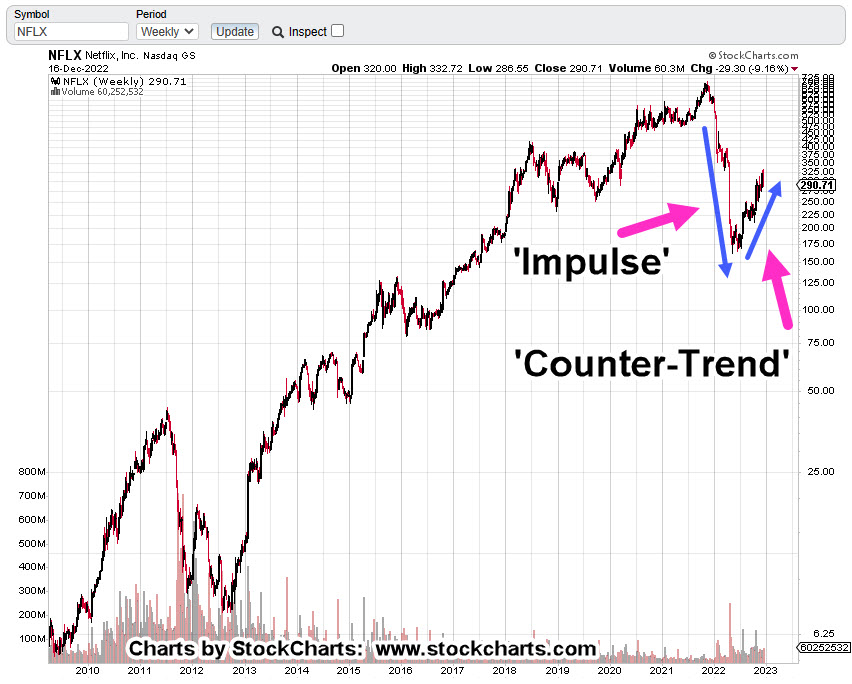
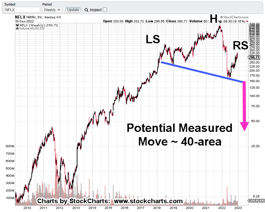
Netflix NFLX, Weekly
Very quickly we see the overall (impulsive) direction of the market is down.
In Wyckoff terms, there’s what he called ‘ease-of-movement’, to the downside.
Next, we have a possible Head & Shoulders, top.
If NFLX, reverses from here all the way down to the neckline (blue line), and if it breaks that line, then we target the 40-area; that’s a lot of ‘ifs’.
Moving in closer on the daily chart, is the following:
Netflix NFLX, Daily
The wedge breakdown is clear.
There was an attempt to rally, if you can call it that, on Friday. So far, no significant upside action.
The zoom area shows price action still below the lower wedge boundry.
Netflix is different from our other potential implosion, short candidate (which proved correct), Carvana, CVNA.
That difference, Carvana sold a product for which there was an actual need, i.e., transportation.
Summary
It’s been just over a year since the CVNA, ‘No P/E’, report.
Carvana’s a slow-motion train-wreck; down over -98%, as of Friday’s close.
Note: Posts on this site are for education purposes only. They provide one firm’s insight on the markets. Not investment advice. See additional disclaimer here.
So, let’s take a look at a the largest cap in the mining sector, Newmont and see what the price action is telling us.
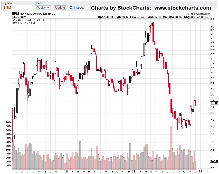
Newmont Mining NEM, Weekly
First, we have the un-marked chart and right off the bat, it does not look good; down -45.4%, from all-time highs.
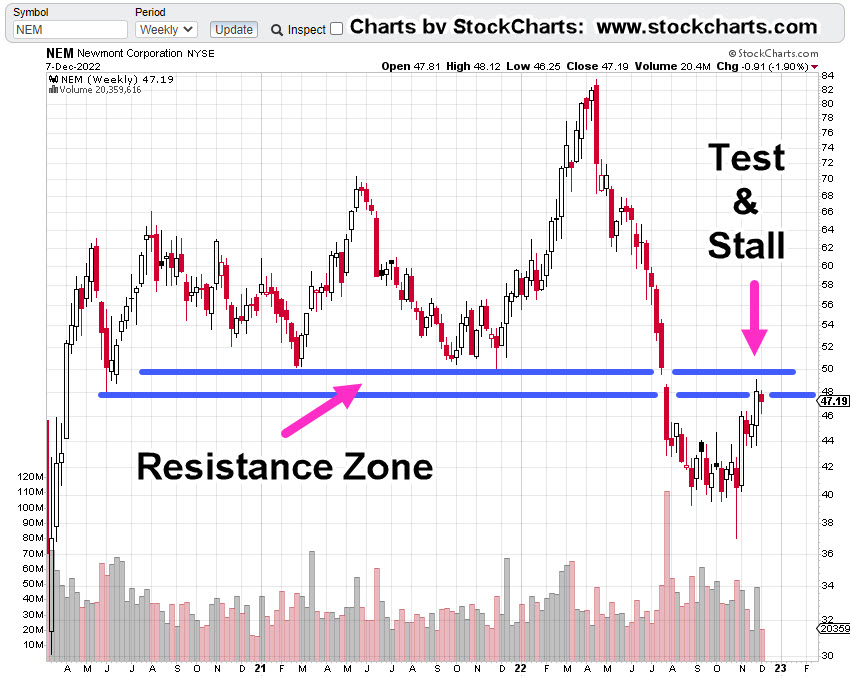
It looks even worse, when the resistance zone is added.
So far, price action has already stalled and not been able to hold within the resistance zone.
It’s important to note, this resistance area is over two years wide. it’s not likely that anything’s going to happen to the upside without numerous attempts.
No ‘Clicks’, In A Gold Bear Market
If buying gold was the answer to getting through the financial, economic and societal collapse, then one would think the price would be moving relentlessly higher.
Note: Posts on this site are for education purposes only. They provide one firm’s insight on the markets. Not investment advice. See additional disclaimer here.