Biotech … Breakout or Breakdown

The Usual Suspects

During the past three months, biotech index SPBIO, has been oscillating, coiling like a spring; preparing for a dramatic move.

Then yesterday (Thursday), there’s an upside launch.

We now have price action instability; either the bulls or the bears are in control.

At this point, we don’t know who has the upper hand.

However, based on the list of recent news items below, it does not look good for the bulls.

Biotech’s Frankenstein

Within the past few days, we have this:

Deadline Passes For Pfizer To Submit Results Of Post-Vaccination Heart Inflammation Study To US Regulators

FDA Deviated From Normal Process In Pfizer Vaccine Approval, Documents Show

Former Employees Sue ESPN After Being Fired For COVID Vaccine Refusal

Lead Author Of Research On Pfizer And Moderna Trials Warns COVID Vaccinations Must Be Stopped

Pentagon Drops COVID-19 Vaccine Mandate For Troops

Let’s see if the market’s ready to hand it to this sector. What’s the price action telling us.

Biotech SPBIO, Weekly

The weekly chart shows the potetial breakout.

However, since we’re looking at this from a ‘going short’ perspective (not advice, not a recommendation), the chart following this one is inverted.

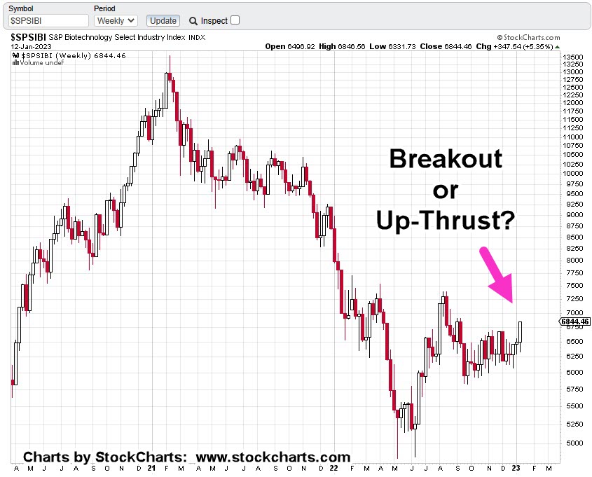
When we invert the chart, it takes on a whole different look.

Biotech SPBIO, Weekly (Inverted)

If price action’s spent over three months getting where support has been penetrated only to have it fail into a reversal, the ensuing move has massive potential.

In Wyckoff terms, it’s cause and effect.

The ’cause’ has been three months of congestion. The ‘effect’ is a potential long duration, or wide volatility move.

Before The Open

It’s twenty minutes before the open and 3X leveraged inverse fund LABD, is trading higher by about +3.5%.

This is normal behavior whether we have a reversal or not.

One last check of ZeroHedge, before releasing this post turns up this:

Senator Questions CDC On Why It Claimed No ‘Unexpected Safety Signals’ For COVID Vaccines

The ‘monster’ continues to grow.

Stay Tuned

Charts by StockCharts

Note:  Posts on this site are for education purposes only.  They provide one firm’s insight on the markets.  Not investment advice.  See additional disclaimer here.

The Danger Point®, trade mark: No. 6,505,279

Biotech … Behind The Scenes

The Big Reveal

Was yesterday, the infection point?

Was that the day where irrefutable evidence like this is going to stick?

Price action of Biotech Sector IBB, has posted a long awaited and anticipated reversal signal (not advice, not a recommendation).

We’ll look at that below.

The IBB, Up-Thrust & Reversal

As a reminder, in Wyckoff terms, an ‘up-thrust’ is where price action struggles above known resistance for some period of time and then reverses to the downside.

In the case of IBB, that ‘struggle’ lasted an incredible seven-weeks.

Biotech IBB, Weekly

Price action attempted to break above resistance for nearly two-months, before reversing lower.

Then we had an initial test during the week of 12/23/22 (on the daily for three days), and a secondary test last week.

Biotech IBB, Daily

The daily shows more detail on the struggle.

Point No. 1, was the initial test. Point No. 2, was the secondary test which appears to have decisively failed.

Pre-market action shows IBB, set to open slightly lower.

If it does, then expectation is for some (brief) attempt to rally as a test of the breakdown.

The Driving Force

For years, this site has not wavered in the assessment, what’s happening in this sector, will be the driving force for the entire market on a go-forward basis (not advice, not a recommendation).

Anything can happen.

It’s unknown if yesterday was ‘the day’.

What is known however, evidence is building on a massive scale. Every day, sometimes multiple times a day, we see the effects.

Positioning

This site presents the data, the insight and price action nuances. It does not give recommendations.

With that said, going short this sector is not as straightforward as the other major indices.

IBB, may be shorted directly but will likely result in a maintenance fee from the broker.

Of course, that puts one on the hook for the sector’s dividend payment (currently yielding 0.31%).

The other option is 2X leveraged inverse fund BIS.

However, this fund’s volume is thin … meaning it’s not nearly as liquid as the other inverse funds such as SDS, DXD, QID, SOXS and so on.

It’s up to the trader/speculator to participate or not.

We’re about fifteen-minutes before the open. Let’s see what happens next.

Stay Tuned

Charts by StockCharts

Note:  Posts on this site are for education purposes only.  They provide one firm’s insight on the markets.  Not investment advice.  See additional disclaimer here.

The Danger Point®, trade mark: No. 6,505,279

Gold Bulls … Go Berserk … Again

Testing The Trend

Since the lows last November, to the close this past Friday, gold (GLD) has moved higher by a decent but modest 15.4%.

Naturally, the opportunists are out telling us ‘We’ve been warned’, ‘this is it’, ‘it’s going to the moon’ … yet again.

With that backdrop, we’re going to look at the precious metals facts, not the hype.

‘Precious metals’ because there are only four that have ‘currency code’ classifications, i.e., are classified as an asset with ‘currency like’ monetary characteristics.

Currency Codes

Gold, Currency Code: XAU

Silver, Currency Code: XAG

Palladium, Currency Code: XPD

Platinum, Currency Code: XPT

The Market Itself

Way back over a century ago, Wyckoff discovered the key to understanding the next likely move of the markets was the study the market itself (not fundamentals).

Wyckoff essentially ‘locked himself in a room with just a stock ticker and phone line’.

Months later, when he emerged, ‘Studies in Tape Reading‘ was the result.

We’re going to use his insight from that text.

That is, what’s the market’s saying about itself? What’s the next likely direction?

Off The Highs

For some of the precious metals, they’re off their highs by a significant amount (percentages approximated).

Gold (GLD): Down -11%, from highs

Silver (SLV): Down -55%, from 2011, highs

Palladium (PAH23): Down -47%, from highs

Platinum (PLJ23): Down -53%, from highs

All of the precious metals are down nearly 50% or more, except gold.

In the case of Platinum, it’s near 1980s levels!

So, where’s the inflation?

Oh wait, here it is … one more time.

That’s not saying ‘money printing’ has no effect. There are a lot of moving parts. Intentional destruction of the food supply is just one of those parts.

Old School Analysis

Hypothetically, if you dropped an ‘old-timer’ into the markets at this juncture (without him knowing the ‘hype’), and showed him all four charts of gold, silver, palladium, platinum, and asked ‘what’s happening?’

What’s his response?

After a brief look at the charts, he would likely say:

‘Gold’s move higher is not being confirmed by the other precious metals’.

Note that all four metals peaked together during the inflation spike of 1980.

Ergo: At this juncture, something’s wrong.

Either the other metals are going to ‘catch up’ to meet gold or gold is going to come down to meet the others.

That is of course, unless this time is different … somehow.

With that, we’ll look at the chart of gold to see what it’s saying about itself.

Gold GLD, Weekly

We’re starting with the unmarked chart.

Note: Elder’s Force Index scale is expanded to show the nuances of GLD, price action.

Next, we see we’re at a test of the trendline in place for 16-months before the downside breakout of July, last year.

Moving in closer, we have a wedge formation prior to the up-move last week.

Is this a breakout to the upside or a throw-over?

At this point, it’s unknown.

We can see that Force Index is below where price action entered the wedge during the week of November 11th.

Less force up into resistance (trendline), paints a slightly more bearish than bullish picture.

The ‘Why’ Comes Out

As if on cue and in classic Wyckoff style, we have a ‘why‘ for the move off the lows of last November.

Classic Wyckoff, because he said the ‘why’ of a move comes out after the fact.

There you have it; China buying gold last November and December.

During this move from the recent lows, it was certainly a trading opportunity for the bulls … but from a strategic standpoint, what happens next?

The Non-Confirmation

Non-confirmations can last a long time.

For example, the Oil & Gas sector XOP, declined for eight months, from April 2019 to January 2020, before the price of oil (USO) finally broke lower.

With the ZeroHedge article just released a few hours ago, we can expect at least a blip higher at the next GLD, open.

After that, we’ll see.

Stay Tuned

Charts by StockCharts

Note:  Posts on this site are for education purposes only.  They provide one firm’s insight on the markets.  Not investment advice.  See additional disclaimer here.

The Danger Point®, trade mark: No. 6,505,279

Oil Today … Gold Tomorrow

Commodities, Have Peaked

First, we’ll review oil; tomorrow, we’ll look at gold.

From an intuitive standpoint, you can almost feel it.

The oil and gas sector has launched to unsustainable highs.

Behemoths like Exxon (XOM) with its 63,000 employees have gone from below $30/share to above $110/share, an increase over 280%, in just two years.

In the history of the equity, going all the way back to 1984, that’s never happened.

Even in 1987, before the crash, XOM was up for the two-year period, a paltry 108%, by comparison.

Now, data is coming in nearly by the day about collapsing demand, layoffs accelerating, and inventories piling up.

The latest from Steven Van Metre, at time stamp 4:25, discusses just how fast the downdraft is, and will be.

Important Note:

Before we leave the Van Metre link above, at time stamp 8:50, the assertion is made of what the Fed will do when slower growth data comes in. i.e., interest rates will be halted or lowered.

Nassim Talib called this kind of thinking “Normalcy Bias”.

The opinion of this site is, it’s a trap. Thinking what happened last time, will happen this time.

Let’s mentally bookmark this post and come back six-months from now to see what happened.

We’re in uncharted territory and other agendas are at work.

Like ‘bread and circuses’, the ‘pivot’ discussion is a distraction … keeping the proletariat placated.

Demand Collapse

We’ve got demand collapsing on a daily basis right in front of our faces and yet, it’s a big mystery (to some).

What’s not known, is how the general population will react to undeniable truth when it finally hits, en masse.

We have a good hint of what’s in store as reported by Jerimiah Babe during the first minute of this report.

Moving on to the Oil & Gas Sector.

Oil & Gas XOP, Weekly

The weekly chart shows the multi-year resistance area that was tested (and rejected) back in mid-June, last year.

The next chart shows we also have a terminating wedge.

Price action has come back to the lower boundary; suggesting a breakdown is a probability.

If we get a breakdown, measured move support is identified at approximately -47%, below current levels.

Strategy & Trading

Obviously, the charts paint a bearish picture.

Over the past week, XOP was covered here and here.

The first link discussed how price action was very close to making a new daily high. That happened the next session (Friday) and indeed, it had Wyckoff ‘spring’ characteristics.

Price action moved higher and closed higher for the day, but it did not post a new weekly high … keeping the bearish case on the table.

A popular leveraged inverse fund is DRIP (not advice, not a recommendation).

At The Close

As this post comes to a close, a quick check on ZeroHedge turns up this: ‘Tipping Point

We’ve jumped over ‘recession’ and have gone straight into crisis and depression.

Stay Tuned

Charts by StockCharts

Note:  Posts on this site are for education purposes only.  They provide one firm’s insight on the markets.  Not investment advice.  See additional disclaimer here.

The Danger Point®, trade mark: No. 6,505,279

Another ‘Data Point’, Collapse

Baltic Dry Index

‘The longer the delay, the bigger the break.’

That was Jesse Livermore’s assessment of the market just before The Panic of 1907.

That Was, Then

Back then, it was money spent on The Boer War, tight financial conditions and extreme overvaluations.

Looks more and more, like today

It’s been this site’s opinion for about a year (now supported by data), that we’ve gone straight past recession, into economic collapse and depression.

And Now, This

Another data point confirming the ‘depression’ scenario is this, just out from ZeroHedge: The Baltic Dry Index had its largest one-day collapse on record.

As if to drive it home; demand is in free-fall as Amazon, just announced plans to fire 18,000 workers.

From a strategic standpoint, collapsing shipping demand means collapsing fuel demand.

Which brings us to the sector of the day, Oil & Gas

Oil & Gas Sector XOP, Weekly

The last update, showed the weekly chart has reversed down and stayed down.

XOP is penetrating support, now at The Danger Point®.

The daily chart has more detail; we’re hovering at support, testing the right side trendline (again).

Providing some (minor) upward bias for the day is this report on WTI (West Texas Intermediate).

Oil & Gas Sector XOP, Daily

It’s 1:31 p.m., EST and XOP, has not posted a new daily high (it’s very close).

Doing so, would weaken the downtrend case and point probabilities to a Wyckoff spring move higher.

Summary

Demand is rapidly collapsing on many fronts and the WTI report linked above uses the word ‘tepid’.

That may be completely inaccurate or misleading when considering the demand for shipping has seen its worst down-day, on record.

Stay Tuned

Charts by StockCharts

Note:  Posts on this site are for education purposes only.  They provide one firm’s insight on the markets.  Not investment advice.  See additional disclaimer here.

The Danger Point®, trade mark: No. 6,505,279

Asset Confiscation, Gaining Speed

Higher Taxes, Starting Today

But wait, it’s not just taxes.

According to this link, it’s not only higher taxes, but retirement accounts being hi-jacked through rule changes.

‘The bulk of the wealth of the American people.’

Not to be outdone, the IRS will increase penalties for under and overpayment of taxes as reported by Fox Business via Jerimiah Babe (time stamp 22:16).

At least it’s nice to know, implementation of the ‘$600’ rule will be saved until next year. 🙂

So, we have the context for the year 2023; i.e., wealth destruction, asset confiscation, fines and fees.

It’s a straightforward plan on ‘their’ part.

What’s also straightforward as reported by Babe, a large number of Americans don’t even know what’s going on let alone be willing to take action.

Then, The Elephant

Let’s not forget the ‘elephant’ that’s likely to be the biggest driver for 2023.

We see that elephant every day now and sometimes multiple times a day. It’s starting to reach the fringes of the mainstream with articles like this one.

Scroll down to The List … It’s No. 2

That elephant and its subsequent lack of demand (less population, fewer buyers) as a result, will likely affect real estate in a big way … for decades to come (not advice, not a recommendation).

The last update showed the weekly trading channels in IYR. The next chart goes further out to the monthly and identifies a Fibonacci sequence.

Real Estate IYR, Monthly

So far, we’ve had IYR on the daily (link here), the weekly (link here), and now the monthly, below.

Major inflection points on the monthly have occurred at Fibonacci timeframes.

Original Forecast, October

The analysis of the current set-up started way back in late October. Using a weekly chart, a potential Fibonacci sequence was identified that ultimately proved correct.

Real estate IYR, had its print high during Fibonacci Week 8, as shown below in the original forecast.

The next chart shows where we are now, again on the weekly timeframe.

Real Estate IYR, Weekly

Original Analysis & Forecast

The updated chart shows the subsequent price action.

Real estate IYR, has pivoted lower and posted tight price action over the past two weeks. Tight action typically precedes a breakout or directional move.

Summary

Anything can happen in the markets.

Even though a good analysis has been presented to indicate further downside for IYR, this Tuesday’s action will let us know for sure.

Typical vehicles to go short the sector are leveraged inverse funds DRV (-3X) and SRS (-2X) or to short the IYR directly (not advice, not a recommendation).

Stay Tuned

Charts by StockCharts

Note:  Posts on this site are for education purposes only.  They provide one firm’s insight on the markets.  Not investment advice.  See additional disclaimer here.

The Danger Point®, trade mark: No. 6,505,279

Trend & Channel

Get In … Get Out

There tends to be a period of consolidation and organized chaos, before price action enters and exhibits channel behavior.

Of course, the problem from a trading perspective, be able to wait through the chaos getting to the set-up and that’s no small feat.

Several of the major indices are in a channel right now. Those are (ETF symbol) SPY, QQQ, IYR and IWM.

We’ll discuss the Q’s farther down but first, this just out, on ZeroHedge, concerning the overall economic conditions.

That is, we’re already in full scale economic collapse and they have the data to prove it.

As incredible as it may be, there are still sectors of the population that believe, ‘the consumer is strong’.

A big wake-up call is coming for them. Oh wait, is that a telephone ringing off in the distance 🙂

The media lies appear to be crumbling at an exponential rate; there’s no guarantee it’ll all hold together into late January, or mid-February as presented only yesterday.

From a Nasdaq (QQQ), technology sector perspective, we have the following.

NASDAQ QQQ, Weekly

The Q’s began the week with a lower open and within the range of the prior week.

It’s a subtle clue the direction remains down and the market’s not volatile … just yet.

Next up, is the channel

It has the right ‘look’.

Moving in closer; the right-side trend line verification (hits).

There are no fewer than four weekly hits (including today) that verify the right side. The attempted push out of the channel is identified as the ‘Throw-Over’.

Attempted breakouts (and failures) are common market behaviors. We see that price action quickly got itself back into the channel.

Get In … Get Out

At this juncture, price action remains in the channel.

A short position (via QID, or equivalent) is a viable choice for the trader/speculator (not advice, not a recommendation).

For the reasons described above (the collapse), we appear to still be in the early stages of the down channel.

Obvious discretionary exit points for a short trade would be left side contact of the channel i.e., the ‘demand’ side or a decisive right-side breakout i.e., the ‘supply’ side (not advice, not a recommendation).

Summary

In a separate market, Netflix (NFLX), may have hit the right side of its own tend line as well.

It seems to be all happening very quietly.

Stay Tuned

Charts by StockCharts

Note:  Posts on this site are for education purposes only.  They provide one firm’s insight on the markets.  Not investment advice.  See additional disclaimer here.

The Danger Point®, trade mark: No. 6,505,279

Discretionary Destruction … 2023

The Cash Squeeze

During 2022, we’ve had one short squeeze after another.

For 2023, it could be forced liquidation in the relentless squeeze for cash.

One corporate example of the squeeze is the announcement from CarMax; they’ve suspended their stock buybacks.

This ‘buy-back halt’, theme, needs to be added to the market strategy for the coming year.

We can put that on the list right along with skipped dividends, power outages, market outages, internet cyber-attack and supply chain disruptions.

A comment below, posted in yesterday’s update from Jerrimiah Babe, opines the typical consumer’s going to carry on unabated, until the very last minute.

“I don’t believe most people will stop spending until all access to credit is exhausted. Whether it be cards, after-pay, family, theft most will continue to keep up appearances. I honestly think most could be 2 months behind on their mortgage or rent and still be spending on crap. There’s no financial responsibility or discipline anymore.”

How that may translate to the mainstream is, they continue to report ‘the consumer is strong’ until instantly, overnight, they’re not.

Possible timing for that event may be late January, or mid-February (not advice, not a recommendation).

With all that in mind, the last post identified Netflix and Target, as potential candidates for significant downside opportunity.

‘Significant’, meaning a 50% to 90% decline from current levels (not advice, not a recommendation).

Target TGT, Yearly

The year is just about over so let’s start with a very long-term view.

Two things have happened over the past three-years.

Price action has met a measured move out of the wedge as shown; then, a massive downward thrust.

It’s important to note, this year’s down-thrust, dwarfs the previous one during the -64.7%, decline of ’07 – ’09.

There’s a band of support that’s at least nine-years wide, in the vicinity of 50 – 75.

We’ll discuss that in another update.

Netflix NFLX, Yearly

Technically, Netflix is worse than target. That is, it has the potential to decline farther and faster.

NFLX, has support as well but comparatively minor in the area of 50.

It does not become significant until the wedge (blue lines) in the vicinity of 5 – 10.

With Netflix’s ‘product’ being completely discretionary, it’s ultimate downside potential, from a fundamental standpoint, surpasses that of Target.

Summary

Time permitting, shorter timeframes will be presented.

However, since the primary focus of this site, is first on ‘strategy’ (think dollar rally), we’re interested in the larger timeframes.

That in turn, provides background to drill down further for any trade decisions (not advice, not a recommendation).

Stay Tuned

Charts by StockCharts

Note:  Posts on this site are for education purposes only.  They provide one firm’s insight on the markets.  Not investment advice.  See additional disclaimer here.

The Danger Point®, trade mark: No. 6,505,279

Claus & Effect, The Next Wave

Unprecedented … Again

Nefarious forces operate in distraction and darkness.

“And this is the condemnation, that light is come into the world, and men loved darkness rather than light, because their deeds were evil.”

The year 2021, was the year everyone (except children) showed their true colors; they made their decision, knowingly or not, for darkness or light.

This year, 2022, is where the effects (or ‘side effects’) of that decision began to take hold.

Now, as 2023 approaches, we’re likely to move into the realm of unprecedented chaos and collapse.

As if on cue, under the cloak of this week’s holiday distraction, we have what’s possibly the next wave.

This could be the reason as presented in the last update, why biotech appears to be in the early stages of disconnecting from the overall market.

That separation may continue or not; price action is always the final arbiter.

The ‘Woke’ Go Broke

The useful idiots that comprise the ‘woke’ business crowd may be in for the biggest surprise in the coming year.

If there is one overriding theme to keep in mind for 2023, this could be it.

Separate enclaves are now forming of those who have not, will not, and are not going to go along with the ever more unbelievable narratives.

Here is a link to just one of those enclaves.

As a digression; in Texas, we’re just now coming out of yet another record-breaking cold spell.

That’s two, never before seen record breaking low temp events within the past three years!

How does that fit with the global warming narrative?

Anyone awake knows full well what’s going on … and it’s not global warming.

Who’s On First: NFLX or TGT?

Now that vending machine Carvana (CVNA), is out of the way, who’s next?

Partly as a result of economic decline and partly from the decision to take consumer spending elsewhere, Netflix and Target now appear ready to continue their implosion.

More on their technical chart conditions in the next update.

Stay Tuned

Charts by StockCharts

Note:  Posts on this site are for education purposes only.  They provide one firm’s insight on the markets.  Not investment advice.  See additional disclaimer here.

The Danger Point®, trade mark: No. 6,505,279

Biotech Disconnects & The Claus

Naughty or Nice ?

Biotech price action’s disconnecting from the rest of the market.

Around the last Fed meeting, biotech separated from the major indices, heading the opposite direction, i.e., sideways to higher.

We’ll see that as we get into the snapshots of the hourly charts (below), but first several clues on why biotech (so far) isn’t going along.

The Next Plan Rolls Out

First up is this, just out on ZeroHedge.

It appears the next push is on … and the target is the kids. Another wave of ‘protection’ is certain to boost profits.

Note: Those commenting on ZH have been ‘awake’ from the start; an invaluable resource.

Next up is this, just out on BrandNewTube; another clear thinker that helps ‘tie it all together’.

Is this the explanation for biotech’s current behavior?

Strictly speaking and from a Wyckoff perspective, we won’t know the real reason for a move until it’s nearing the end.

What we can see, is that character of price action has changed (again).

With that, we’ll look at the 3X, leveraged inverse funds of two indices, Russell 2000 (TZA) and SPBIO (LABD).

TZA & LABD, Hourly

The disconnect has been a recent observation.

We’ll drill right down to the hourly and put the charts one on top of the other.

We can see that while inverse TZA, is now back up to the pre-squeeze high, inverse LABD, is far below that level.

That’s not to say things can’t change quickly.

For now, however, there may be something else going on that’s keeping the sector buoyant and suppressing the LABD, inverse fund.

Stay Tuned

Charts by StockCharts

Note:  Posts on this site are for education purposes only.  They provide one firm’s insight on the markets.  Not investment advice.  See additional disclaimer here.

The Danger Point®, trade mark: No. 6,505,279