Salt … or … Gold

‘Stacking’, The Right Thing?

“One ounce of gold for half kg of salt”

That’s what it cost for salt during the reign of the Khmer Rouge, as reported by a Cambodian in the comment section at this link.

One-half kilogram, is roughly 1.1 lbs., or 17.6 oz.

One ounce of gold for about 18-oz. of salt … sounds about right … if you’re starving.

Salt is essential for life; gold, not so much.

Strategy, First

This site’s primary focus is strategy.

It has adhered to the premise (for years), we’re in a situation that mimics Genesis 41

That means, it’s the corn and the grain, i.e., food, first, then gold and silver (not advice, not a recommendation).

A brief list for further review is, here, here, here, and here.

The ‘Price’ of Salt

For the ‘stackers’, consider this:

In our example above, the commentor said their family survived in part, because they had “100kg of salt”.

That amount equates to about 220 lbs.

Converting 1oz gold for (roughly) 18-oz. salt, at today’s gold prices, is about $392,000 ‘worth’ of salt.

When they came out other side, the salt may have been gone, but they had the gold. 🙂

Now, moving on to the chart.

Gold (GLD), Weekly

Gold is at a critical juncture.

We’re either in a potential ‘throw-over’ on the wedge formation (with reversal) or about to pressure higher into all-time highs (not advice, not a recommendation).

We see a rising (terminating) wedge, along with a decline in volume (thrust).

We’re at The Danger Point®

Gold’s price action does not need much of a push to go either way.

Then, The Dollar

Recall, from the dollar update (link here), there’s a possibility for it to decline from current levels; potentially setting up a Wyckoff spring condition.

A dollar decline would naturally provide a likely correlation for gold rising into new all-time highs.

If either one happens, there’s probably going to be panic.

Stay Tuned

Charts by StockCharts

Note:  Posts on this site are for education purposes only.  They provide one firm’s insight on the markets.  Not investment advice.  See additional disclaimer here.

The Danger Point®, trade mark: No. 6,505,279

Gold’s ‘Maginot Line’

Strong Resistance, Built In

Unbeknownst to many, we’re witnessing a once-in-a-century opportunity and public service.

Those from the era of The Great Depression, are all gone now.

So, the same playbook can be run without anyone (alive) knowing we’ve been here before.

The public service presented to us, the massive on-going exposure of the financial charlatans and grifters.

You can be ‘certified’ and still be a certified (market) dolt.

Neil McCoy-Ward, points this out in his recent update linked here. Go to time stamp 8:40;

“Clueless” … “Completely Asleep”

Anyone who’s worked in the corporate world (in any sector), especially now, knows it’s near impossible to think or act independently.

So, it is with gold.

Gold & The Grifter Bandwagon

Where was everybody back in 2001, when gold was bottoming in the area of $270/oz., after a multi-decades long bear market (from 1980)?

The fact we have nothing but breathless panic from grifters and hangers-on, about rampant inflation should at least give one pause, we could be at a temporary or major reversal (not advice, not a recommendation).

At least with the analysis below, there’s a decision point that will let us know if we’re due for another leg higher, or if there’s a Sovereign debt crisis about to break that would kick-off massive selling of all assets including gold.

Gold GLD, Weekly

As the title says, we’ve got something akin to a ‘Maginot Line’ for gold. What looks like insurmountable resistance that could still be breached … but for now, is holding.

With each (manufactured) crisis, gold’s momentum in the form of price and volume, is declining.

From a Wyckoff analysis standpoint, the bulls (for now) are running out of steam.

The ‘terminating wedge’ in gold’s price action has already been discussed, link here.

Looking at the action in another light, we see a Wyckoff Up-Thrust in the works. Price action has penetrated a previous high and is currently struggling.

If gold (GLD) is able to significantly penetrate the resistance and hold, then we’re likely on to the hysterical predictions of the masses.

If not, and we get a reversal, it’s going to be big surprise for many. They’ll be stunned, unable to move and eventually provide more fuel for the downside as they sell in panic.

Downside Drivers

What could possibly be a downside driver for gold?

One has already been mentioned, a Sovereign debt crisis. It’s a likely event considering the record-pace rise for interest rates and subsequent bank failures.

Another is an ‘executive’ decision that gold ownership is outlawed. It’s happened in the past and those who got through that event are no longer with us.

Moving on, we’ve already been told there will be a ‘cyber-attack’.

What’s going to happen to gold, when there’s no electricity, fuel or food shipments?

As survivalist author Ron Foster says, in this interview, (time stamp 27:20), during a grid-down situation, he’s not giving up his food. He says, during such an event, precious metals are “meaningless”.

Stay Tuned

Charts by StockCharts

Note:  Posts on this site are for education purposes only.  They provide one firm’s insight on the markets.  Not investment advice.  See additional disclaimer here.

The Danger Point®, trade mark: No. 6,505,279

Oil … Gas … Gold & Newmont

Markets, At Critical Juncture

Nemont Mining (NEM), Gold, and the Oil & Gas Sector are at a critical juncture.

The rest of the major indices, Dow, S&P, QQQs, real estate (IYR), and so on, are in a similar position.

For this update, we’ll focus on Newmont (NEM), as it’s the largest cap in the Senior Mining Sector GDX, and a general representative of the commodities markets.

Financial collapse is a process, not an event.

Newmont topped-out in April, of last year. Exxon, the proxy for the Oil & Gas sector, may have reached its highs this past November.

Where’s The Inflation?

As Michael Cowan has just reported, banks are absconding with depositor’s money under the guise of ‘bail-in’.

If the fiat cash is so worthless, why are banks seizing it?

As Robert Prechter Jr., said years ago, ‘all fiat cash ultimately goes to zero’; the end game (most likely) for the dollar. However, it could be months, years, or even a decade before that happens.

For right now, today, this minute, the data is showing us, the banks want the money; ‘Show me the money‘.

With that, let’s look at the non-existent ‘inflation’ in the mining sector.

Newmont Mining NEM, Weekly

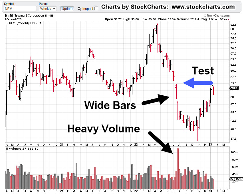
The first chart identifies the heavy volume and then test of wide price bars. This behavior is common in the markets; they tend to come back and test wide high-volume areas.

Next, we see there’s a terminating wedge developing as volume declines; the inference, is lack of significant commitment at these price levels.

We’ll get close-in on the wedge; last week printed a lower weekly low and closed lower for the week.

There’s no breakdown of the wedge … yet.

At this juncture, it’s up to the bulls to show they’re still in control.

Inflation vs. Scarcity

We have without a doubt, the effects of the event from the past three years gaining momentum. Whether or not those effects reach a peak this year, is unknown.

A lot of the mainstream and YouTuber’s alike talk about the upward move in gold as the result of ‘inflation’.

Here’s a little bit of insight you’ll not find anywhere else; how about gold rising because the above mentioned ‘effects‘ are causing production volumes to decline?

Maybe it’s because of scarcity (along with nearly everything else) that’s causing the increase in price.

Just to drive that idea home, the latest total gold production numbers, listed here.

Gold production for 2020 dropped -8.2%, from the year prior. Year 2021 was down -1%, from 2020.

From 2010 to 1019, gold production increased or was flat year over year … that is, until 2020.

Stay Tuned

Charts by StockCharts

Note:  Posts on this site are for education purposes only.  They provide one firm’s insight on the markets.  Not investment advice.  See additional disclaimer here.

The Danger Point®, trade mark: No. 6,505,279

Gold Bulls … Go Berserk … Again

Testing The Trend

Since the lows last November, to the close this past Friday, gold (GLD) has moved higher by a decent but modest 15.4%.

Naturally, the opportunists are out telling us ‘We’ve been warned’, ‘this is it’, ‘it’s going to the moon’ … yet again.

With that backdrop, we’re going to look at the precious metals facts, not the hype.

‘Precious metals’ because there are only four that have ‘currency code’ classifications, i.e., are classified as an asset with ‘currency like’ monetary characteristics.

Currency Codes

Gold, Currency Code: XAU

Silver, Currency Code: XAG

Palladium, Currency Code: XPD

Platinum, Currency Code: XPT

The Market Itself

Way back over a century ago, Wyckoff discovered the key to understanding the next likely move of the markets was the study the market itself (not fundamentals).

Wyckoff essentially ‘locked himself in a room with just a stock ticker and phone line’.

Months later, when he emerged, ‘Studies in Tape Reading‘ was the result.

We’re going to use his insight from that text.

That is, what’s the market’s saying about itself? What’s the next likely direction?

Off The Highs

For some of the precious metals, they’re off their highs by a significant amount (percentages approximated).

Gold (GLD): Down -11%, from highs

Silver (SLV): Down -55%, from 2011, highs

Palladium (PAH23): Down -47%, from highs

Platinum (PLJ23): Down -53%, from highs

All of the precious metals are down nearly 50% or more, except gold.

In the case of Platinum, it’s near 1980s levels!

So, where’s the inflation?

Oh wait, here it is … one more time.

That’s not saying ‘money printing’ has no effect. There are a lot of moving parts. Intentional destruction of the food supply is just one of those parts.

Old School Analysis

Hypothetically, if you dropped an ‘old-timer’ into the markets at this juncture (without him knowing the ‘hype’), and showed him all four charts of gold, silver, palladium, platinum, and asked ‘what’s happening?’

What’s his response?

After a brief look at the charts, he would likely say:

‘Gold’s move higher is not being confirmed by the other precious metals’.

Note that all four metals peaked together during the inflation spike of 1980.

Ergo: At this juncture, something’s wrong.

Either the other metals are going to ‘catch up’ to meet gold or gold is going to come down to meet the others.

That is of course, unless this time is different … somehow.

With that, we’ll look at the chart of gold to see what it’s saying about itself.

Gold GLD, Weekly

We’re starting with the unmarked chart.

Note: Elder’s Force Index scale is expanded to show the nuances of GLD, price action.

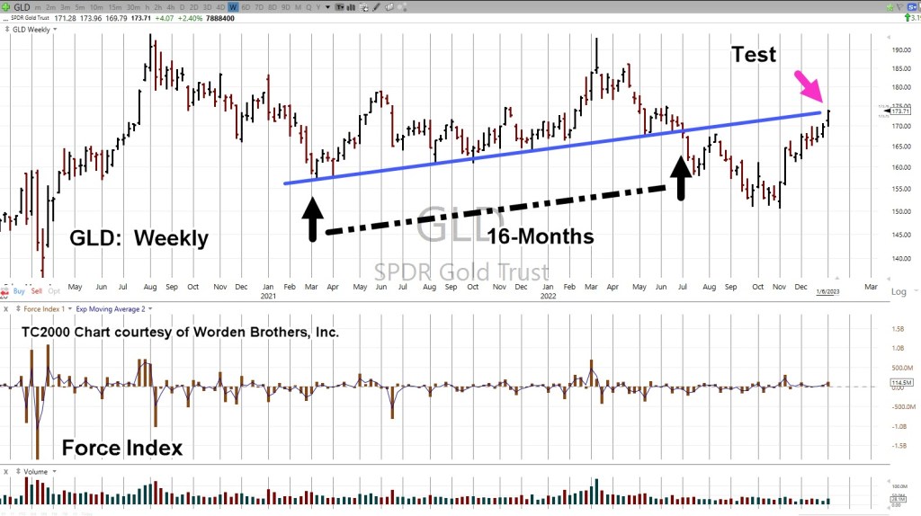
Next, we see we’re at a test of the trendline in place for 16-months before the downside breakout of July, last year.

Moving in closer, we have a wedge formation prior to the up-move last week.

Is this a breakout to the upside or a throw-over?

At this point, it’s unknown.

We can see that Force Index is below where price action entered the wedge during the week of November 11th.

Less force up into resistance (trendline), paints a slightly more bearish than bullish picture.

The ‘Why’ Comes Out

As if on cue and in classic Wyckoff style, we have a ‘why‘ for the move off the lows of last November.

Classic Wyckoff, because he said the ‘why’ of a move comes out after the fact.

There you have it; China buying gold last November and December.

During this move from the recent lows, it was certainly a trading opportunity for the bulls … but from a strategic standpoint, what happens next?

The Non-Confirmation

Non-confirmations can last a long time.

For example, the Oil & Gas sector XOP, declined for eight months, from April 2019 to January 2020, before the price of oil (USO) finally broke lower.

With the ZeroHedge article just released a few hours ago, we can expect at least a blip higher at the next GLD, open.

After that, we’ll see.

Stay Tuned

Charts by StockCharts

Note:  Posts on this site are for education purposes only.  They provide one firm’s insight on the markets.  Not investment advice.  See additional disclaimer here.

The Danger Point®, trade mark: No. 6,505,279

Gold … Repeating (Short) Set-Up

At The Extreme

Gold is at the extreme … again.

It’s also posting a repeating pattern; indicating a short set-up (not advice, not a recommendation).

As presented over a year ago, that set-up is defined as what’s called (in Wyckoff terms), a spring-to-up-thrust.

Meaning, price action has a repeating tendency to go from one trade set-up to another.

We’ll go to the daily chart.

Gold GLD, Daily

The Changing of Hands, is included because as of yet, that (downside) reversal has not been decisively negated.

There’s no downside capitulation volume; indicating we’re on the other side (bullish side) of the current downtrend.

Now gold is at The Danger Point®. The ephemeral place where risk is least; price action can (easily) go either way.

So The Question Is, Which Way?

Here’s one perspective that’s reasonably balanced.

The theory is all about Central Banks … ok, if it works.

From a personal (trading) standpoint, the fundamental approach was abandoned years, if not decades ago.

Moving closer-in on the daily, we have the following.

Price action is struggling at resistance (upper blue line).

As stated in a prior update, if GLD, can’t hold and move above this level, it’s an indicator of potential serious trouble to the downside.

Of course, it goes without saying, the miners, GDX, GDXJ, are at similar danger points.

Stay Tuned

Charts by StockCharts

Note:  Posts on this site are for education purposes only.  They provide one firm’s insight on the markets.  Not investment advice.  See additional disclaimer here.

The Danger Point®, trade mark: No. 6,505,279
There’s No … ‘Santa Rally’

Forecasted Months Ago … Now, Playing Out

Let’s start with the post from way back in September, linked here.

Back then, it said (emphasis added):

It’s going to be a very different place come December.

This won’t be like ’08 -’09, where all the stops are being pulled to ‘rescue’ the market.

No, this time really is different.

We can all see by now; the plan is controlled demolition.

That was then. Fast forward to now.

ZeroHedge has come out with the obvious. If there’s going to be a Santa Rally, it needs to start soon.

Good luck with that.

Instead of looking for a rally, we’ve moved on from that (unlikely) potential to something different, linked here.

That link is not a forecast. It’s there to remind us, the potential for what can happen.

One group that just won’t let go of the (sustainable) rally scenario are the gold bugs.

Seems like with every ‘blip’ higher we have articles like this one, this one, and this one.

So, let’s take a look at a the largest cap in the mining sector, Newmont and see what the price action is telling us.

Newmont Mining NEM, Weekly

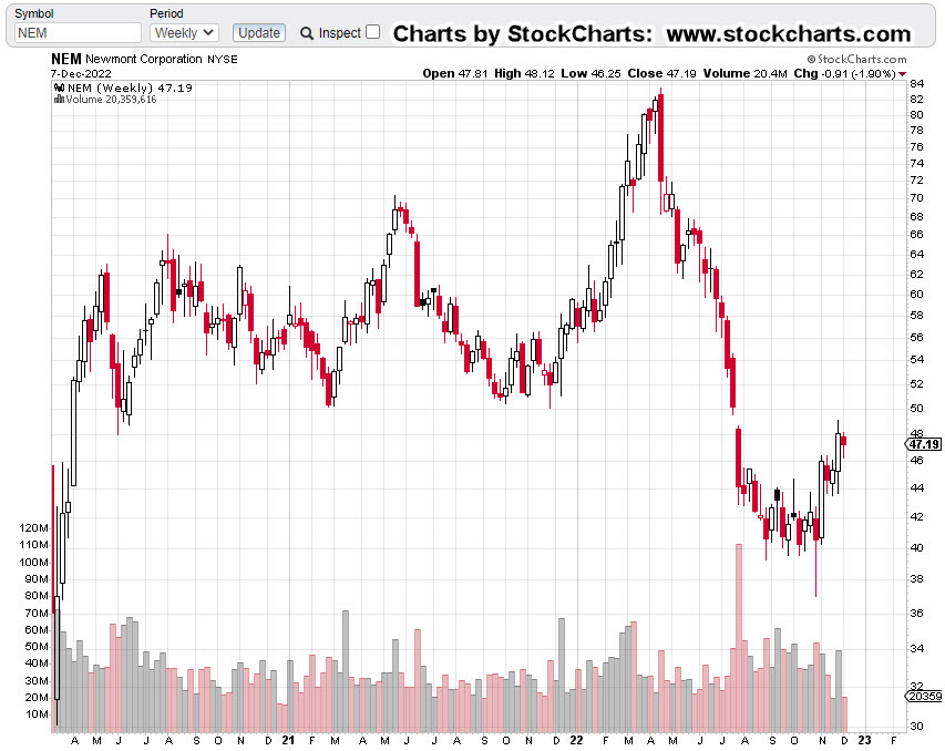
First, we have the un-marked chart and right off the bat, it does not look good; down -45.4%, from all-time highs.

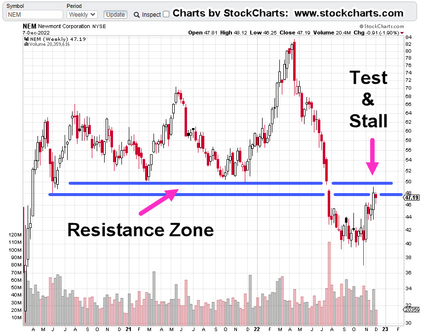
It looks even worse, when the resistance zone is added.

So far, price action has already stalled and not been able to hold within the resistance zone.

It’s important to note, this resistance area is over two years wide. it’s not likely that anything’s going to happen to the upside without numerous attempts.

No ‘Clicks’, In A Gold Bear Market

If buying gold was the answer to getting through the financial, economic and societal collapse, then one would think the price would be moving relentlessly higher.

That’s not happening … not by a long shot.

What is happening, is this: Demand destruction on a colossal scale.

This destruction is on the birth side and the death side.

These events are affecting everything, going forward.

Nailing The Reversals

Using Wyckoff analysis, this site has been able to identify reversals in gold and the miners at times, to the day.

Important pivot points are here, here, here, and here,

Once again, at this juncture, we’re at a potential reversal in silver, gold, and the miners.

It’s about 15-minutes before the open. NEM is trading slightly higher by about 1.00%.

Let’s see what happens next.

Stay Tuned

Charts by StockCharts

Note:  Posts on this site are for education purposes only.  They provide one firm’s insight on the markets.  Not investment advice.  See additional disclaimer here.

The Danger Point®, trade mark: No. 6,505,279

The Largest ‘Squeeze’, Ever

A Market Of Extremes

So, this is how it’s going to be.

The market itself is telling us it’s not going to be ‘well behaved’, possibly for years to come.

According to Goldman, link here, we’ve just had the largest short squeeze on record.

Friday, must have pushed it over the edge from the previously reported, ‘third largest‘.

The ‘Pontificators’

Everybody think’s they’ve got it figured out; We’re going to have stagflation, no wait, hyperinflation, no wait, inflation/deflation simultaneously, no wait, dollar collapse, no wait, gold to the moon, no wait, and on it goes.

What we really have, which is obvious to those ‘awake‘, is something that’s never happened before.

That ‘something‘ is here every day, multiple times a day.

Flash Crash, 2010

Every so often just as a reminder, this event is posted as an example; until that day, it never happened before either.

“Paper comes in, a big seller!!!”

 ‘Paper’ is essentially anyone (banks, hedge-funds, institutions, and/or retail) outside the pit.  Those in the pit are called ‘locals’.

Positioned At The Extreme

The largest short squeeze in history has actually performed a public service; the markets are at extremes.

With that, the short position in Junior Miners GDXJ, has already been discussed, link here.

We’re going to move on and talk about the elephant; more specifically, biotech SPBIO.

Biotech SPBIO

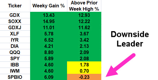
The table shows last week’s action when compared to the week prior. All major sectors had solid gains but it’s the right-most column that’s of interest.

The right-side column shows how far price action closed above the prior week’s high.

Once again, biotech shows overall weakness. It gets more interesting when looking at the weekly chart.

Biotech SPBIO, Weekly

It’s been three successive weeks of apparent up-thrust reversals that were negated each time.

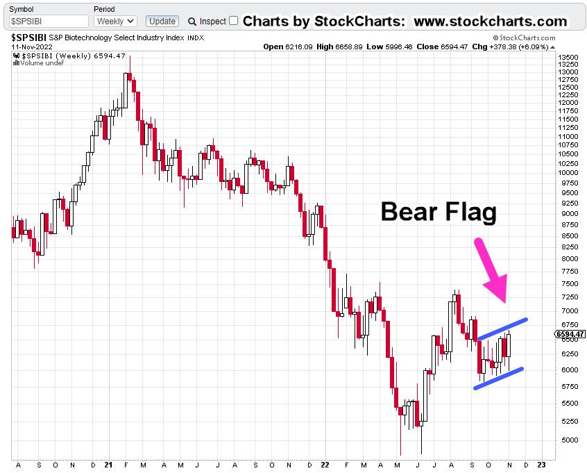
Looking at the weekly below, what we have, is a huge bear flag that just so happens to be, Fibonacci 8-Weeks wide.

It’s possible, this congestion area is the mid-point of the overall move from the highs set during the week of February, 2021.

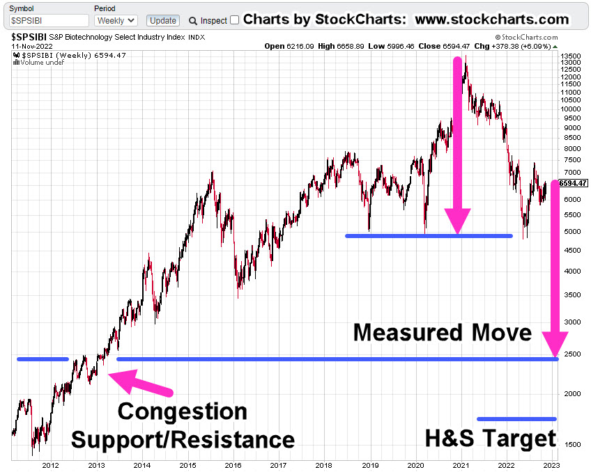
Compressing the chart and putting in a measured move target gives us the following.

If we have an actual Head & Shoulders top, that target is shown as well.

Either way, the downside potential is enormous; thus, requiring intense focus from a Wyckoff standpoint, i.e., during a bear market, identify the weakest sector for short opportunities (not advice, not a recommendation).

All of which brings us to positioning.

Positioning

On Friday, a discretionary exit was made from the entire LABD-22-09 position as (LABD) price action continued to decline with no end in sight.

Loss on the LABD-22-09, series was a drubbing of -12.2%

Then again, last week was the largest squeeze in history; taking that into account, the loss wasn’t -30% or -50%.

As the trading day progressed, LABD price action continued lower until low-and-behold, it reversed.

Once again, a position was entered (not advice, not a recommendation) but this time was different. Frist off, initial position size is smaller; about 60% smaller.

Secondly, the stop is an actual order that’s in the market (shown below).

Sounds obvious but we’re dealing with unprecedented times and market disruptions. Recall during the Flash-Crash of 2010, Kimberly Clark, or Colgate (if memory serves) went ‘no-bid’ and printed i.e., sold for 0.01.

That low print remained on the charts for years until it was ultimately removed.

If it can happen on the downside (i.e. when long), it can happen on the upside as well (when short).

Positions: (courtesy only, not advice).

LABD-22-10***:

Entry @ 18.1398***: Stop @ 16.83***

JDST-22-05***

Entry @ 9.1666***: Stop @ 8.79***

Note: Positions may be increased, decreased, entered, or exited at any time.

***, Indicates change

Stay Tuned

Charts by StockCharts

Note:  Posts on this site are for education purposes only.  They provide one firm’s insight on the markets.  Not investment advice.  See additional disclaimer here.

The Danger Point®, trade mark: No. 6,505,279

The Capitulation ‘Model’

Using The Gold Market Example

First up is the (downside reversal) analysis of the real estate market.

It was wrong; at least for now.

There’s nothing wrong with being wrong … it’s being wrong and staying wrong, that’s the problem.

What appears to be correct so far, is the upside reversal in the bond market.

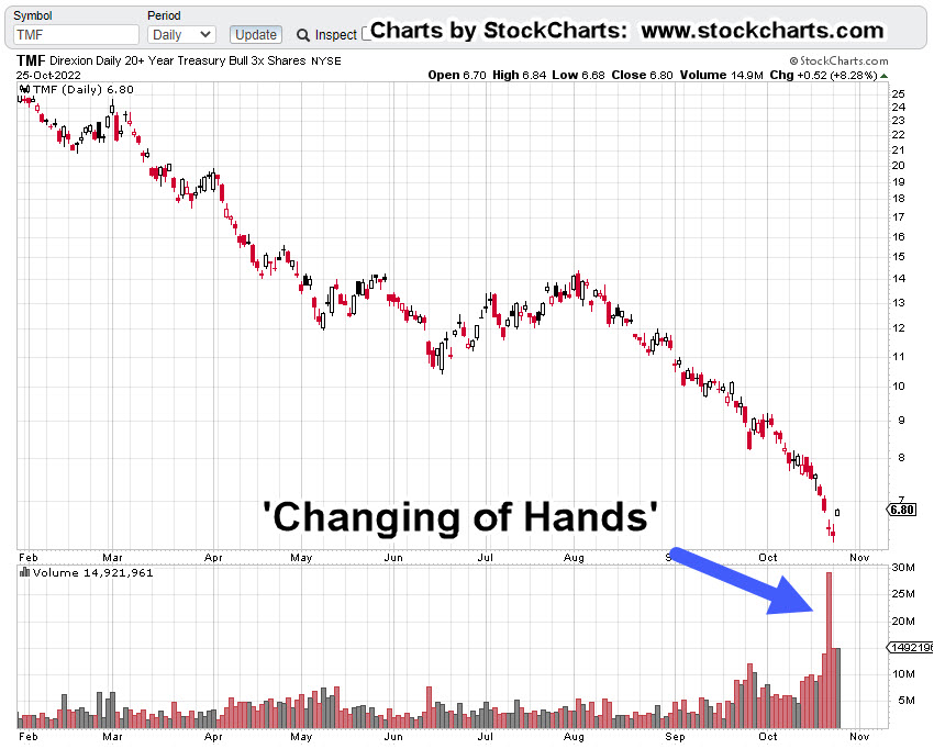
We’re going to look at another capitulation to get some idea of what to expect if indeed bonds have reversed.

This past April, the gold market (GLD) capitulated on the upside. At the time, it was quickly and correctly identified as a ‘changing of hands’.

Gold (GLD) Capitulation

From a strategic standpoint, gold has not looked back.

Down around 20% (although slightly higher in today’s pre-market), there seems to be no major catalyst to get a similar capitulation reversal.

Using that reversal model and looking at bonds, we’ll use the 3X Leveraged Fund TMF, as the example.

Leveraged funds accentuate market moves, sometimes giving a clearer picture.

Bonds (TLT) 3X Leveraged Bull Fund, TMF

As far as what might be behind a (sustainable) bond reversal, we have this report from Steven Van Metre.

Using The ‘Model’

Note in the GLD reversal, prices went lower for a while and then came back to ‘test’.

Using that, we can expect TLT, TMF, price action to rise for some (unknown) period of time; then come back to ‘test’, before continuing higher (not advice, not a recommendation).

Stay Tuned

Charts by StockCharts

Note:  Posts on this site are for education purposes only.  They provide one firm’s insight on the markets.  Not investment advice.  See additional disclaimer here.

The Danger Point®, trade mark: No. 6,505,279

The Market Set-Up … This Week

What To Watch … Gold, Bonds, & Real Estate

First off, ‘Goldman‘ says melt-up.

Not to be outdone, we have this ‘me too’ melt-up article as well.

Let’s not forget, all the ‘Fed must do something’ rumors and feigned concern by its members.

If anyone really wants to know the big picture, the overall plan (a wide majority do not), this interview may be the best explanation to-date.

With all of that, we certainly could get some kind of rally in the coming week. We’ll let the price action speak for itself.

As a reminder, Wyckoff analysis does not concern itself with press releases, rumors or ‘fundamentals’; Wyckoff himself, determined based on price action alone, they have no material effect on market movement.

In his words, ‘other forces are at work’, and it’s those forces that interest us.

Gold & Silver

As said in this update, gold (GLD) was just ‘ticks’ away from posting a new monthly low. In fact, it got just 0.24-pts, from a new low before rebounding.

Of course, each time we get any kind of rally in the metals, there’s the usual hysteria. Even though for the past seven months and counting, those rallies occur at lower and lower levels … i.e., a bear market.

Shown below, it’s in a trading channel with price action at the right-side channel line.

Gold (GLD) Weekly

The chart below gets closer-in.

From left-most contact point on the channel to the initial contact on the right side is a Fibonacci 13-weeks.

Also note, the weekly high posted at the center line is a Fibonacci 5-weeks from the left-most contact.

Highly emotional markets tend to adhere to Fibonacci until either the emotion wears off or ‘everybody’ recognizes the structure.

Obviously, to keep the channel intact, a lower open (and lower action) at the next session is needed.

Silver (SLV) has already been discussed in this update and this one.

Bond (TLT) Capitulation ?

Was this past Friday the day?

Gap-down trading on huge volume.

Looking at the daily chart of TLT below, Friday’s level of (down) volume has occurred only three times in the past three years.

Each time, there was a near immediate rebound or in the case of March 2021, the rebound came several weeks later.

Bonds (TLT) Daily

Moving in closer, we see the possibility of an ‘island-gap’ at the next open.

What could drive capital into the bond market?

Well, how about a ‘shock’ or continued market melt-down (not advice, not a recommendation).

A quick check of the local newsfeed (as of 12:45 p.m., EST) shows nothing on the horizon other than usual nuclear attack threats, power outages, child mutilation protests, marauding bears and the disarmament of Canadians.

Nothing to see here …

Real Estate

There is no mistake, events in real estate are happening at the fastest pace in recorded history.

As Scott Walters put it, over 10-million people bought into the ‘work from home’ hype and got themselves instantly (nearly) upside down in their transaction.

Now, the layoffs start.

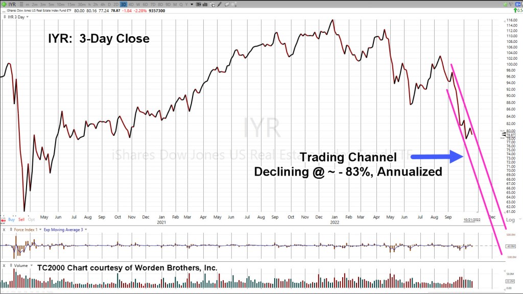
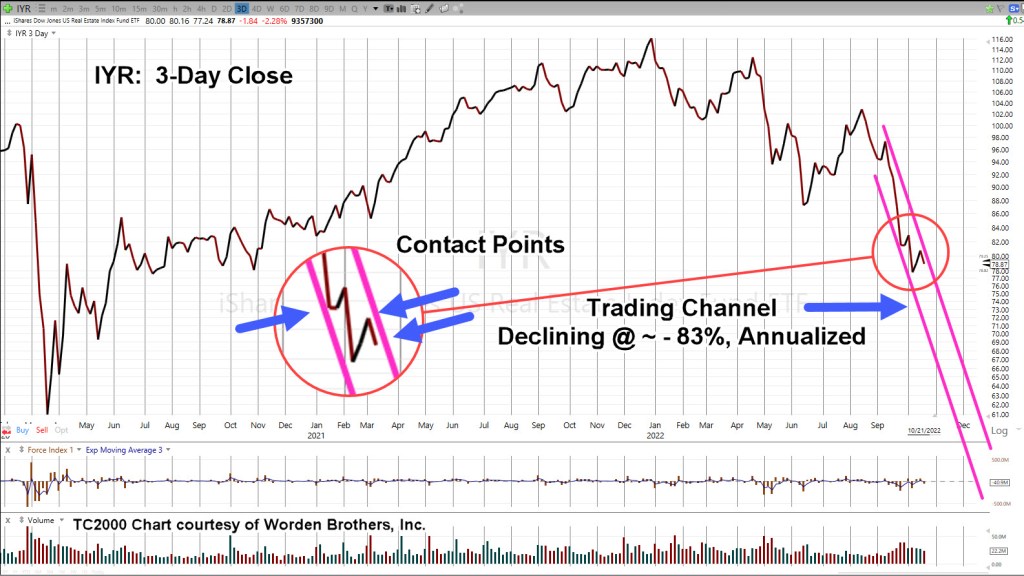
Real Estate IYR, 3-Day Close

Zoom-in, on the channel

As the last update said, we’ll know soon enough if there is more upside or if last Friday was it, and the downdraft continues.

Stay Tuned

Charts by StockCharts

Note:  Posts on this site are for education purposes only.  They provide one firm’s insight on the markets.  Not investment advice.  See additional disclaimer here.

The Danger Point®, trade mark: No. 6,505,279

Gold … The Big Picture

Weak Reversal @ 23.6%

Gold’s hanging on … just ticks away from posting a new monthly low.

It hasn’t looked good for the bulls ever since the ‘changing of hands’, discussed over seven months ago, linked here.

From that update, we have a useful quote concerning the massive GLD, volume spike, posted on March 8th:

“Such volume spikes typically indicate the potential for a long-term, sustained reversal.”

How long, is long term?

Well, it’s been seven months and counting …

The weekly chart of GLD below, shows retrace, test and reversal, at a very weak Fibonacci 23.6%.

Since the GLD, high on August 6th, 2020, it’s been over two-years of sideways-to-down.

Gold (GLD), Weekly

The blue line is the 23.6%, retrace level.

Price action has oscillated around this area which in itself, provides confirmation of validity.

The chart below has a zoom of the retrace area.

Since the ‘changing of hands’, the analysis stance on gold (and silver) has not changed; we’re trending lower until price action indicates downside capitulation … at this point, nowhere in sight.

Summary

With GLD reversing at the axis line (23.6%, level), we can now use this area via the Fibonacci Tool, to project downside targets.

Target analysis is slated for the next GLD, update.

Stay Tuned

Charts by StockCharts

Note:  Posts on this site are for education purposes only.  They provide one firm’s insight on the markets.  Not investment advice.  See additional disclaimer here.

The Danger Point®, trade mark: No. 6,505,279