Note: Posts on this site are for education purposes only. They provide one firm’s insight on the markets. Not investment advice. See additional disclaimer here.
We’re still waiting for a more definitive short-sell signal on the SOXX, but it’s the QQQs that may be setting up first (not advice, not a recommendation).
The chart below shows the QQQ’s have essentially stopped dead right above resistance.
Upside force has gone missing.
Nasdaq QQQ, Daily
Price broke out above resistance (blue line) with upside pressure diverging.
Of course, anything can happen, and price could continue to drift higher.
However, if there’s a lower daily low and lower close for the next session, the risk on a short trade via QID or similar, is well established (not advice, not a recommendation).
Note: Posts on this site are for education purposes only. They provide one firm’s insight on the markets. Not investment advice. See additional disclaimer here.
Nemont Mining (NEM), Gold, and the Oil & Gas Sector are at a critical juncture.
The rest of the major indices, Dow, S&P, QQQs, real estate (IYR), and so on, are in a similar position.
For this update, we’ll focus on Newmont (NEM), as it’s the largest cap in the Senior Mining Sector GDX, and a general representative of the commodities markets.
Financial collapse is a process, not an event.
Newmont topped-out in April, of last year. Exxon, the proxy for the Oil & Gas sector, may have reached its highs this past November.
Where’s The Inflation?
As Michael Cowan has just reported, banks are absconding with depositor’s money under the guise of ‘bail-in’.
If the fiat cash is so worthless, why are banks seizing it?
As Robert Prechter Jr., said years ago, ‘all fiat cash ultimately goes to zero’; the end game (most likely) for the dollar. However, it could be months, years, or even a decade before that happens.
For right now, today, this minute, the data is showing us, the banks want the money; ‘Show me the money‘.
With that, let’s look at the non-existent ‘inflation’ in the mining sector.
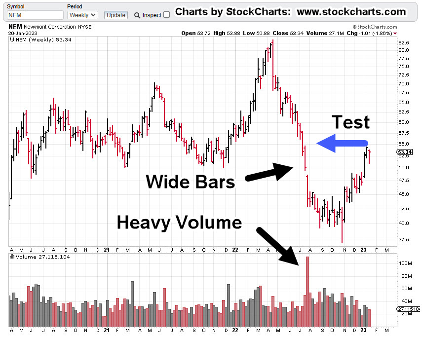
Newmont Mining NEM, Weekly
The first chart identifies the heavy volume and then test of wide price bars. This behavior is common in the markets; they tend to come back and test wide high-volume areas.
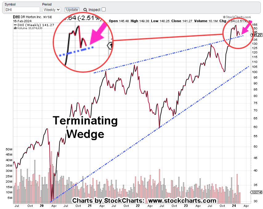
Next, we see there’s a terminating wedge developing as volume declines; the inference, is lack of significant commitment at these price levels.
We’ll get close-in on the wedge; last week printed a lower weekly low and closed lower for the week.
There’s no breakdown of the wedge … yet.
At this juncture, it’s up to the bulls to show they’re still in control.
Inflation vs. Scarcity
We have without a doubt, the effects of the event from the past three years gaining momentum. Whether or not those effects reach a peak this year, is unknown.
A lot of the mainstream and YouTuber’s alike talk about the upward move in gold as the result of ‘inflation’.
Here’s a little bit of insight you’ll not find anywhere else; how about gold rising because the above mentioned ‘effects‘ are causing production volumes to decline?
Maybe it’s because of scarcity (along with nearly everything else) that’s causing the increase in price.
Just to drive that idea home, the latest total gold production numbers, listed here.
Gold production for 2020 dropped -8.2%, from the year prior. Year 2021 was down -1%, from 2020.
From 2010 to 1019, gold production increased or was flat year over year … that is, until 2020.
Note: Posts on this site are for education purposes only. They provide one firm’s insight on the markets. Not investment advice. See additional disclaimer here.
If we use the S&P as the proxy, it hardly even lasted that long.
Going back to just four days ago, we had this (emphasis added):
“It’s well known, stocks tend to rise in the first weeks of January. Tax loss selling is over and there’s typically some type of ‘relief’.
Don’t count on it this time (not advice, not a recommendation).”
Market Meets Expectations
It was expected on the first trading day of the year, the market would continue its downtrend.
After this morning’s 15-minute blip, that’s exactly what’s happening.
We’ve already discussed real estate IYR, (here, here and here) as well as the Q’s (here).
Now, there appears to be another sign of impending price collapse … the oil sector; specifically, Oil & Gas Index XOP.
As is typical, we’ll begin the analysis with the longer time frame, the weekly.
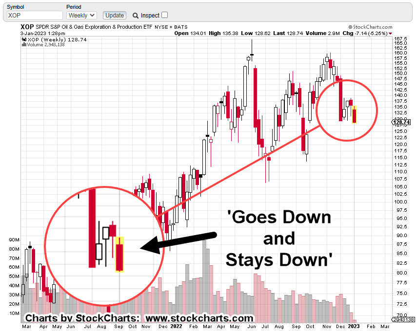
Oil & Gas Sector XOP, Weekly
There’s no secret to the chart below other than Livermore’s admonition for going short; that is, he finds a market that ‘goes down and stays down’ (not advice, not a recommendation).
The prior two down-drafts were quickly retraced; one in mid-July last year and one in September.
Not so, this time.
If we go to the daily, we have an ominous look where a downtrend could be validated.
Oil & Gas Sector XOP, Daily
The right-side trend is drawn as a dashed line, revealing the attempted breakout on the last two sessions in December.
Attempted trend line and channel breakouts are normal market behavior.
It’s clear in the case above, price action has quickly got itself back into the trading channel.
Summary
Of course, oil prices are not supposed to go down, right?
At this juncture, look at all the conflict and potential supply disruptions that are possible.
However, the price of oil and the price of the exploration/production equities are two separate things.
The price of oil could skyrocket further, and yet, the equites still collapse. Bear markets are all about price, wealth, and credit destruction.
Typical short positioning trade vehicles for this sector are DRIP (-2X) and DUG (-2X), or to short the XOP directly (not advice, not a recommendation).
Note: Posts on this site are for education purposes only. They provide one firm’s insight on the markets. Not investment advice. See additional disclaimer here.
There tends to be a period of consolidation and organized chaos, before price action enters and exhibits channel behavior.
Of course, the problem from a trading perspective, be able to wait through the chaos getting to the set-up and that’s no small feat.
Several of the major indices are in a channel right now. Those are (ETF symbol) SPY, QQQ, IYR and IWM.
We’ll discuss the Q’s farther down but first, this just out, on ZeroHedge, concerning the overall economic conditions.
That is, we’re already in full scale economic collapse and they have the data to prove it.
As incredible as it may be, there are still sectors of the population that believe, ‘the consumer is strong’.
A big wake-up call is coming for them. Oh wait, is that a telephone ringing off in the distance 🙂
The media lies appear to be crumbling at an exponential rate; there’s no guarantee it’ll all hold together into late January, or mid-February as presented only yesterday.
From a Nasdaq (QQQ), technology sector perspective, we have the following.
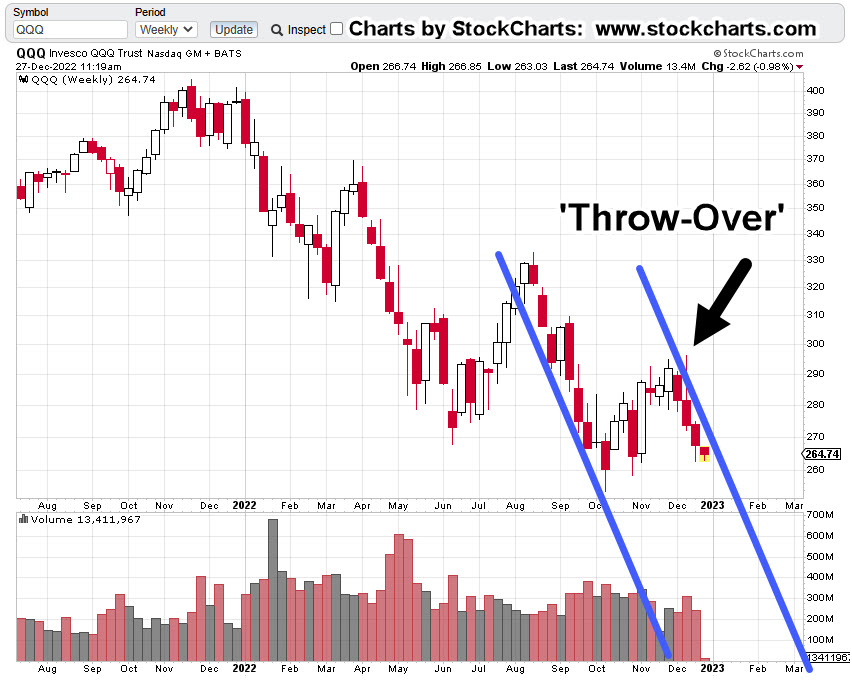
NASDAQ QQQ, Weekly
The Q’s began the week with a lower open and within the range of the prior week.
It’s a subtle clue the direction remains down and the market’s not volatile … just yet.
Next up, is the channel
It has the right ‘look’.
Moving in closer; the right-side trend line verification (hits).
There are no fewer than four weekly hits (including today) that verify the right side. The attempted push out of the channel is identified as the ‘Throw-Over’.
Attempted breakouts (and failures) are common market behaviors. We see that price action quickly got itself back into the channel.
Get In … Get Out
At this juncture, price action remains in the channel.
A short position (via QID, or equivalent) is a viable choice for the trader/speculator (not advice, not a recommendation).
For the reasons described above (the collapse), we appear to still be in the early stages of the down channel.
Obvious discretionary exit points for a short trade would be left side contact of the channel i.e., the ‘demand’ side or a decisive right-side breakout i.e., the ‘supply’ side (not advice, not a recommendation).
Summary
In a separate market, Netflix (NFLX), may have hit the right side of its own tend line as well.
Note: Posts on this site are for education purposes only. They provide one firm’s insight on the markets. Not investment advice. See additional disclaimer here.
The majority of the indices are at their right-side channel lines.
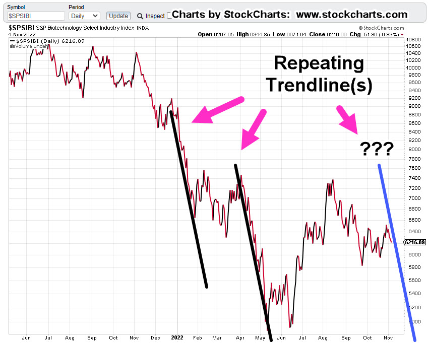
We’ll cover semiconductor SOXX, and QQQs, below. However, biotech IBB, and SPBIO, are in similar positions.
From a calendar and data standpoint, there’ll be plenty that could be used as an ‘excuse’ for market moves but let’s ignore the (intended) distractions and take a look at what the market is saying about itself.
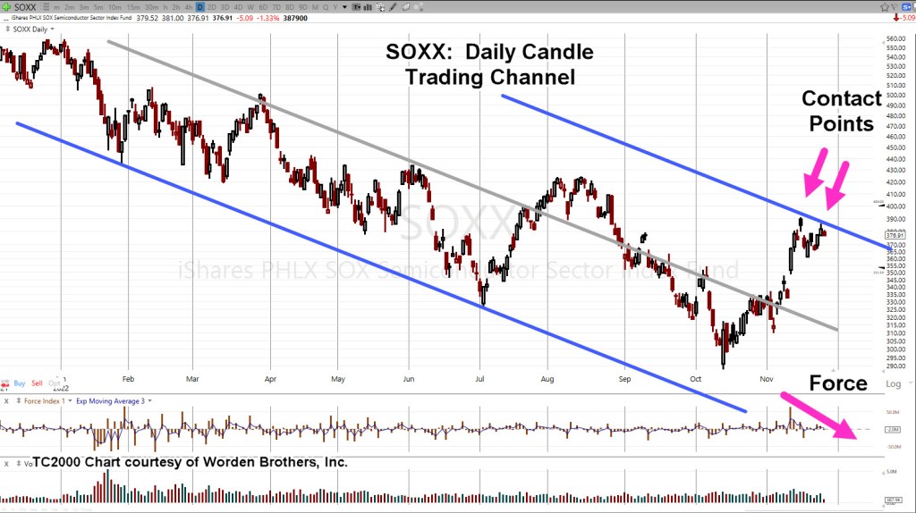
First up, is the semiconductor index, the SOXX.
Semiconductor’s, SOXX, Daily
The chart has Fibonacci retrace levels shown. Price action has retraced to 38.2% and stalled.
But wait, there’s more.
Putting in a trading channel, we could be at a reversal point.
Note the upward thrust energy (‘Force’) has dissipated.
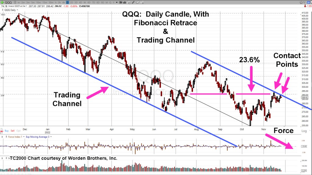
the NASDAQ is in a similar situation but weaker from a retrace standpoint.
NASDAQ, QQQ, Daily
Looking at the monthly chart for the Q’s (not shown), it’s been a Fibonacci 13-months since all-time highs.
Force dissipation and ‘Contact Points’ are near identical to the SOXX.
Summary
Biotech IBB and SPBIO, are in similar positions. In fact, the overall markets appear poised for downside reversal.
As discussed in the last update, the bond market could be signaling danger ahead with its sharp upward reversal; now (potentially) entering its sixth week.
Note: Posts on this site are for education purposes only. They provide one firm’s insight on the markets. Not investment advice. See additional disclaimer here.
There’re a lot of moving parts to biotech and it’s like a game of chicken.
Is there going to be another ‘planned’ event pulled out of the bag that requires ‘protection’ or will this side (and this one) win-out before that happens?
Price action’s always the final arbiter and right now, it’s positing lower.
Gold:
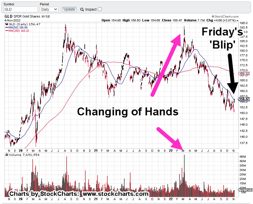
Gold (GLD) ‘blipped’ higher on Friday and the usual suspects are out touting the hyperinflation narrative.
Owning (some) precious metals seems to be a good thing.
However, the public constantly knee-jerks into this sector and is absolutely rabid in their behavior (i.e., silver stockpiles are running out!!!).
It suggests at least, there’s something else afoot.
Prechter published in the early 2000’s, Central Banks, are followers, not leaders. The fact they are buying gold at this point, may be a contrary indicator.
Talk about going against the herd. 🙂
Over and again, it’s the boring (does not generate ‘clicks’) food supply first, then gold and silver (not advice, not a recommendation).
Real Estate:
What can be said?
It’s the largest manufactured bubble in world history and it has already popped.
Thinking it’s all going to sort itself out in a year or two is delusional. We’ve probably got decades of bear market.
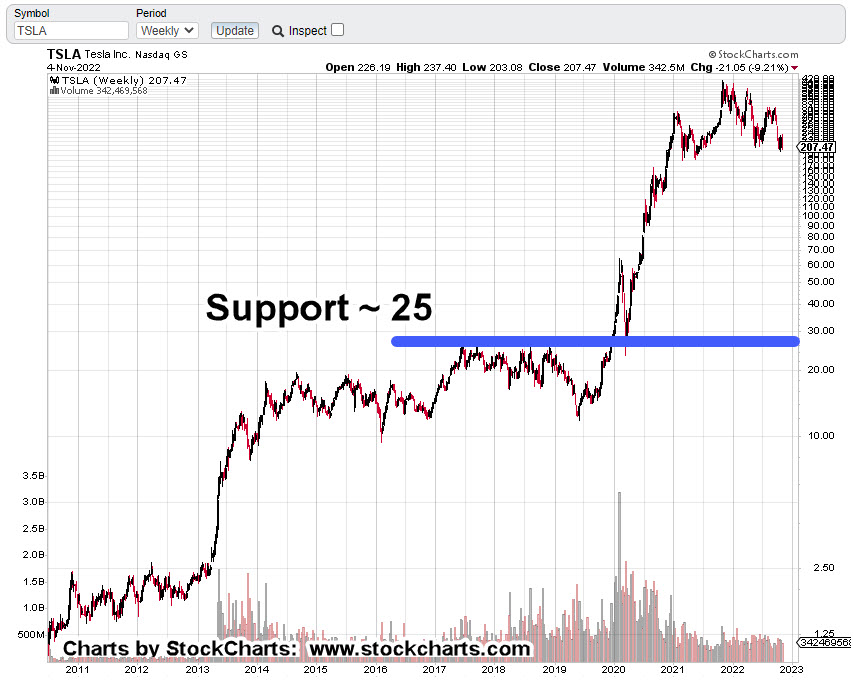
Tesla:
Anyone with an anode of research capability, knows the whole EV premise, is based on a falsehood.
However, that fact is probably not what’s going to bring Tesla (and the rest of the market) down.
Let’s stop for a moment and consider the above link which has been available for nearly four-years.
How many views? Just 9,824 (as of this post)
That equates to only 0.003% of the U.S. population.
As the global supply chains implode, getting parts and having stable infrastructure (i.e., electricity) will probably be the defining factor.
Now, on to the charts.
Biotech SPBIO, Daily Close
The following sessions will let us know if we’re at the right edge of the downtrend line.
We’ve already had an up-thrust reversal and a test of that reversal. last Friday was lower … probabilities point down.
Gold GLD, Daily
Looking at the chart on the strategic, longer term, Friday’s blip is hardly noticeable. We’ve already presented how this could be a minor up-thrust (reversal) in itself.
To keep the upside intact, price action must remain and continue above current levels.
Real Estate IYR, Daily
Real estate may be working its way into an up-thrust condition. As shown, Fibonacci Day 21 from the October 13th, low is this coming Thursday, the 10th.
According to the Economic Calendar there are several potential catalysts that may push the price above resistance (temporarily).
Note: Posts on this site are for education purposes only. They provide one firm’s insight on the markets. Not investment advice. See additional disclaimer here.
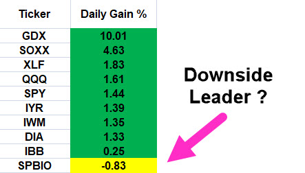
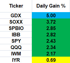
The last update, posted late in the session, said with the upward bias provided by the sizable Op-Ex event, we can look for the weakest (or one of the weakest) sectors.
The chart below summarizes yesterday’s action:
Friday 10/21/22, Single Day Gains
Gold miners GDX, is the outlier at the top and real estate IYR, the outlier at the bottom.
Before anybody gets excited about ‘hyperinflation’, just a reminder; silver SLV’s, action has retraced to a weak 38.2% (chart not shown), as it was forecasted to do from last week’s update:
“Silver (SLV) is currently at support levels; therefore, some upward action (staying below SLV: 18.5) is normal behavior.”
Price action is the final arbiter; we’ll see what happens next.
Back to real estate.
Professional Wisdom: ‘The Crash’
We’re going to use the experience and insight provided by Scott Walters concerning the potential for real estate; that is, we’re in a world-wide event the scale of which, no one alive (and possibly, ever) has seen before.
The Economic Ninja has just seconded that opinion (time stamp 3:45) with his quote:
“Right now, we are in the greatest collapse since The Great Depression; and I believe it will be as severe, if not worse, sharper, faster, than what people experienced in 1929”.
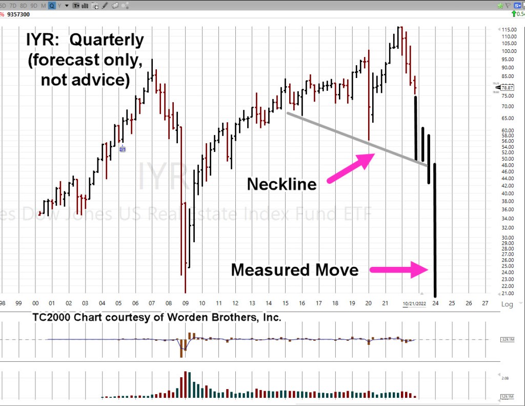
So, what would that ‘collapse’ look like on a chart of real estate, IYR?
Ah, yes. That’s the hard part.
To take useful wisdom like that above, and somehow map it into potential market behavior.
For that, we’re going to use the Quarterly chart of IYR.
Real Estate IYR, Quarterly
There are still two months and one week left to go in the 4th, Quarter.
We’re at a confluence of price action as we’ll cover in the Hourly chart farther down; first, what’s the potential?
Here is one artist’s rendition (not advice, not a recommendation).
That puts it into perspective.
We may know at the very next open, if we’re pivoting higher or continuing the decline.
Butterfly In The Amazon
Of course, the market’s not going to tell anyone its next move. We have to decipher that (read the tape) ourselves.
Sometimes, as Wyckoff said a century ago … ‘It’s as if the weight of a feather is all that’s needed, to push the market further or to reverse.’
So, let’s look at that feather (the butterfly) on the hourly chart.
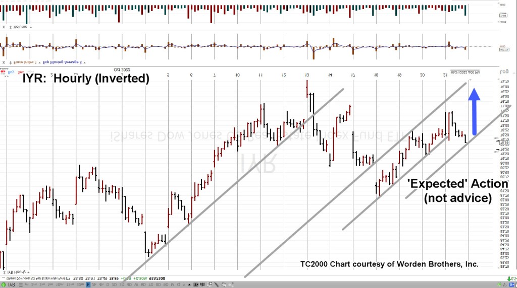
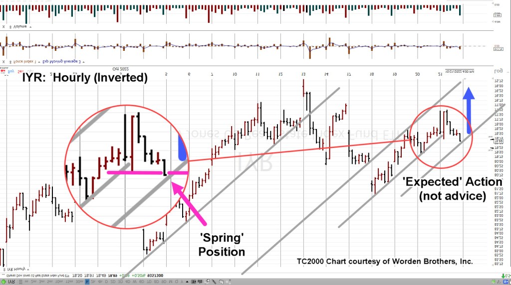
Since we’re positioned short (DRV-22-05), the chart’s inverted to mimic leveraged inverse fund DRV.
Real Estate IYR, Hourly (Inverted)
The important part is we see a repeating pattern of trendlines.
Moving in closer, we have this. The blue arrow is ‘expected’ action based on the analysis up to this point (not advice, not a recommendation).
Moving even closer, the zoom shows IYR, finished the day in Wyckoff spring position; having pushed past minor support (resistance on non-inverted).
Summary
If IYR opens lower or gap-lower, we’ll have to wait and see if it posts a new daily low (below IYR ,77.24).
If that happens, we have some confirmation lower prices are ahead and can then set a definitive stop for DRV-22-05.
Obviously, a higher open (pushing past IYR 78.91), negates the trade.
Note: Posts on this site are for education purposes only. They provide one firm’s insight on the markets. Not investment advice. See additional disclaimer here.
Well, another financial media lie has come and gone.
As Jerrimiah Babe says, time stamp 6:05, at this link:
“The good times are over.”
The Dow Jones was down over 1,000 points on the day and finished (along with the S&P, NASDAQ) right at the session lows.
Typical action for the markets under such conditions, is a follow-through at the next trading session, Monday.
Recall, it’s been presented many times on this site (Holiday Turns), major reversals tend to occur just before, during, or just after, a holiday week.
The 2008, countertrend reversal took place on the Monday (5/19/08), leading into Memorial Day Weekend. The big one in 1929, was the Tuesday (9/3/29) following the Labor Day Weekend.
The current reversal (discussed below), if it holds, has come a couple weeks early in the ‘holiday’ window.
It’s possible because of the massive size of this monster, that a week or two does not make a difference.
Let’s look at the Dow 30 and its perfect Wyckoff Up-Thrust, Reversal, and Test.
Dow 30, DIA Daily Close
Daily Close with Fibonacci retrace levels identified.
A close-in look on the reversal area.
Looking at the zoom-chart above, we had a Wyckoff Up-Thrust that touched 61.8%, then declined sharply before coming back to test at 50%.
After the test was another sharp decline. One can make the case, the up-thrust has been tested.
Continued (overall) downside is the higher probability with a ‘no Fed pivot’ providing the tailwind.
Note: Posts on this site are for education purposes only. They provide one firm’s insight on the markets. Not investment advice. See additional disclaimer here.
This just out from Activist Post, shows we’re in yet another ‘never before seen’ event.
One of the references in the article can be found at this link.
Many times on this site, the ‘reduction in size’ has been discussed.
Now, the official numbers are starting to show-up. The bottom line? Retail demand is going to evaporate.
As a side note, it’s interesting that YouTube now has videos on how to spot Myocarditis …. something we’ve (in the serfdom) have never heard of … until now.
While everyone seems to be focused on the overall markets, S&P, Dow, and QQQ, underneath the radar, gold and the miners continue to rachet themselves lower.
Senior Miners, GDX & Inverse DUST
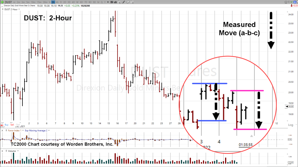
The 2-Hour chart of inverse fund DUST shows we’re still at the danger point discussed yesterday.
The zoom chart (below) has an interesting distinction.
The distance between the blue-line trading range and the magenta-line trading range, is the same. The black-dashed arrow is equal length.
This implies that yesterday’s move, along with today’s may be an ‘a-b-c’ correction. A counter-trend move.
If so, the main direction has changed from down to up (for DUST).
Summary:
Still at the danger point, we remain short this sector (not advice, not a recommendation).
The good part, if price action reverses in DUST and begins to pressure the most recent lows, it’s an indication something else is afoot and the trade is failing.
Note: Posts on this site are for education purposes only. They provide one firm’s insight on the markets. Not investment advice. See additional disclaimer here.